(Edit: updated image)
Everything's still in flux, so don't hate me if a knob or two change position or meaning before release-time comes. But this should be pretty darn close to final.
(Other color schemes will be available eventually too.)
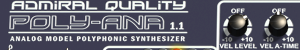
Design should be pretty much self-explanatory from what you see there, so not much to add. But stay tuned. It's some number of weeks away, not months.