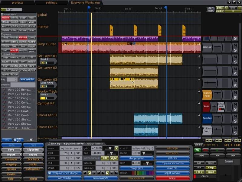
Gross; now it looks like Tracktion..bullshark wrote:You can turn off all that shadowy/gradient junk and then get a clean/uncluttered and functional interface, something like this (in which I have a custom color for the drum group for easy recognition when mixing later on, but you can turn that off too):
Reaper is not an ugly duckling anymore !
-
- KVRAF
- 5017 posts since 13 Dec, 2005 from The Void
Jens, "B.t.w.: it appears I was wrong"
-
- KVRAF
- 1893 posts since 19 Apr, 2006 from Montreal, Canada
Hey, I like Tracktion GUI too (but not the included bugs).
I'd be curious to see GUI you like, just so I can also use that vomit emoticon.
No, that wasn't me.
-
- KVRAF
- 16153 posts since 2 Dec, 2003 from Nashville, TN
Actually, I like that one more then ANY of the others in this thread. Yeah, I'm a Tracktion user, but still.
It's still not something I want to look at all day. Again, it's not the colors, gradients, or whatever that I don't like. It's more the arrangement of things and more.
Brent
It's still not something I want to look at all day. Again, it's not the colors, gradients, or whatever that I don't like. It's more the arrangement of things and more.
Brent
My host is better than your host
-
- KVRAF
- 5017 posts since 13 Dec, 2005 from The Void
I'd love to show you one, but I don't use Reaper or Tracktion, so we'll just borrow your screenshot again and I'll help you along with your vomit party:bullshark wrote:I'd be curious to see GUI you like, just so I can also use that vomit emoticon.
Ok, your turn:
Some people really come down hard on themselves..bullshark wrote:LOLLICOPT0R, MY GUI TEH SUXX0RZZ..
Jens, "B.t.w.: it appears I was wrong"
-
- KVRAF
- 5017 posts since 13 Dec, 2005 from The Void
"Save for Web" rules for battling that.bullshark wrote:So much space and bandwidth completely wasted
Jens, "B.t.w.: it appears I was wrong"
-
- KVRAF
- 1893 posts since 19 Apr, 2006 from Montreal, Canada
Just out of curiosity, what are those exactly? Curious because I left Tracktion exactly for UI usability (and bugs) issues. Things like:koolkeys wrote:Alex, while that theme is cleaner, it doesn't address the issues that some are talking about. Cool graphics and such are one thing, but actual usability in the interface is another thing.
That being said, I do try Reaper often, just out of curiosity, and I'll be happy to download one that at least looks BETTER, even though it's not there yet(for me). But my graphics complaints don't come down to the actual GRAPHICS.
Brent
No dedicated mixing view (made worst by things I wrote below)
Fiddly level and pan control
Level meter too small with no peak indicator
Control all over the place and of different sizes when you add filters
etc.
No, that wasn't me.
-
- KVRAF
- 16153 posts since 2 Dec, 2003 from Nashville, TN
I will not be the one to say that the Tracktion interface is perfect. I DO know that it has been improved, and will continue to get better.
It's hard for me to say the exact things I don't like about the Reaper UI. First and foremost, for whatever reason, I am highly NOT inspired when I open it. There was a time about three months back where I gave Reaper a SERIOUS consideration. I tried all the new versions. I tried to get excited. But I couldn't. Every time I opened it, I just went "blah". The reason for this, I'm not sure. Maybe it's just the layout. Maybe it's the fact that I've been with Tracktion for so long. But I have never ever been able to find it inspiring in any way.
I do know this. When I see it, I actually see "clutter". Not because of the AMOUNT of stuff on the screen, but just the way it all runs together. In Tracktion, I'm used to text buttons(far better then graphic buttons, IMO). In Reaper, I'm reminded a lot of Sonar(which I own, btw, for professional reasons). Icons are very cryptic, and not always as clear at a glance, IMO.
Next, what I CAN say about the layout is that there are just too many screens. I want the ability to not just put screens as floating or tabbed. I want to be able to have the main work area, then two sections on bottom, one with the browser, one with routing, etc, or at least something to that effect. Again, I'm used to Tracktion where everything IS on the one screen, but you can turn it off when you don't need it. I like how in Tracktion the properties panel is totally dynamic. It changes as you have things selected. That is KILLER for me. Saves so much screen space and a huge amount of clicks. I'll talk about this more below.
Mixer- bleh, don't need one. There is NOTHING that a mixer can do that Tracktion can't. NOTHING. I do think that the filters in Tracktion can get a bit messy with different sizes, but I also know that there have been discussions about fixing this. But regardless, a mixer is NOT necessary for anything I do. All the same exact functions are right there in Tracktion.
As for the Tracktion level meters, what are you looking for in a peak indicator? It does have peak indicators. Maybe I'm misunderstanding exactly what you want?
Anyways, back to Reaper. Little things that annoy me. I want to be able to change the color of EVERYTHING, including the browser background. Can you not change that? Like I said, a little thing, but just odd to look at when it doesn't blend in.
Popups. Yuck. Some popups are fine. But every time you route something. Every time you open the effects screen. Sure, you can dock them. But you have to dock EVERY ONE. And if you do that, the docked section can't get large enough to actually SEE all of the plugin UI. Plus the fact that you can't even see the effects chain for each track without opening up one of those windows or switching tabs. That's annoying to me. I like how both Tracktion and Sonar do this. It's all right there.
The MIDI is actually a little better looking for me then Tracktion's MIDI, but no real difference in functionality. So there is nothing here really to bring me in, as over half my tracks deal with MIDI. However, no inline MIDI editing is a pain. I don't ALWAYS want to have a window/tab(yet another screen to keep track of JUST to do basic edits).
Plus, some more things that annoy me that aren't totally UI related, but kind of. Right clicking to un-select something. You can't just click or double click elsewhere to move where you insert things. This might be just me though, as I may have missed an option. And I know you can use hotkeys. But if I can just click my mouse or double click somewhere to change the insert point, that would be preferred.
Which brings me to hotkeys. How many non-standard combinations do I need to learn? And why can't they be consistent across the application?(not UI related, but still)
Well, that should do it. There are many little things that annoy me from time to time as well. But the stuff above is what sticks out to me. I don't say this to criticize Reaper, but just to answer the question that was asked. If anything is incorrect, feel free to politely point it out.
I hope that helps.
Brent
My host is better than your host
-
- KVRAF
- 12977 posts since 29 Sep, 2003 from Ottawa, Canada
Not the best screenshot (it includes all the hideable elements and is squished into an 800X600 screen, so a bit crowded) but surely THIS doesn't offend, you, Sickle? (clicky)
A simple matter of turning all the blues and golds to grey, red, or some sinister orange, and you'd be allllll set.
As far as Reaper goes, the screenshot bullshark posted is my fave, too.
A simple matter of turning all the blues and golds to grey, red, or some sinister orange, and you'd be allllll set.
As far as Reaper goes, the screenshot bullshark posted is my fave, too.
-
- KVRAF
- 1893 posts since 19 Apr, 2006 from Montreal, Canada
There's a few thing in there I agree with and that I'd like to see in Reaper, things like FX chains that I'd like to have a quick overview off when mixing without having to open each and every channel FX browser. Inline MIDI editing is also a must nowadays, once you tasted that it is hard to go without. I also hate floating windows with a passion, but I have nothing floating when I use Reaper as everything dock nicely (the only exception to that was when I had to use the ugly and stupid floating big clock, but I don't have to anymore after compound position info was added to the transport).
Only thing I find a bit strange is the "inspiration" thing. There are a great many things that inspire me in life, but software isn't one of them; to me, software is a tool to get job X done. Labeling a piece of software inspirational I find just as weird as if my car mechanics were to tell me he's inspired by his ratchet
[edit]of course this post was made to go after koolkey's one...
No, that wasn't me.
-
- KVRAF
- 16153 posts since 2 Dec, 2003 from Nashville, TN
Well, when talking about inspiration, I'm not talking about stuff like writing songs and creating masterpieces. I'm talking about making me WANT to work with the program.
If that mechanic had a ratchet that had a handle that didn't fit the size of his hand, it wouldn't be as easy to use, and would most likely make it difficult or even annoying to use. Or if one ratchet had a dial that turned clockwise and another that turned counter-clockwise to make it tighten instead of loosen. It just wouldn't feel right to use one of them. Okay, not a great analogy, but you get the point.
Same with me. I write most of my stuff outside of the sequencer environment. So that inspiration isn't affected. But it doesn't just say "use me". Maybe it's because of all the reasons I listed. It seems more like work then fun. And even in a professional atmosphere, you gotta try and have a little fun, eh?
Brent
My host is better than your host
-
- KVRAF
- 2675 posts since 14 Jul, 2005 from Australia
Certainly nicer for my taste. A little gradient is nice too, but only very very soft I think.bullshark wrote:You can turn off all that shadowy/gradient junk and then get a clean/uncluttered and functional interface, something like this (in which I have a custom color for the drum group for easy recognition when mixing later on, but you can turn that off too):
Why are the top left icons so big in the newer version ?
Cheers
Fots
-
- KVRian
- 663 posts since 16 Jan, 2007
Ahh Brent, you're behind the times as usual (regarding Reaper).
First...the fx window is linked now, no need to dock every one. It changes as you change tracks, and remembers position.
Second...we have screensets in Reaper now, track and window. I mapped mine out to the keypad, with crtl and alt saving and loading them. Result is any view can be stored or recalled in the blink of an eye, saves me heaps of time navigating around. It can be as cluttered or barren as you like. I absolutely love this feature, there was never any going back once he coded this in.
Third...how many shortcuts do we need to learn? Obviously a mouser! The answer is, you can write your own to suit yourself for just about any operation (with the exception of the midi window, but I'm sure that'll come)...in fact I wrote some ReaperScripts for that. Most of the actions are available through right-click or in the edit menu too, if you don't like shortcuts.
Tracktion's a fine program but a little cluttered on the eyes for my taste, just my opinion of course.
- KVRAF
- 35291 posts since 14 Sep, 2002 from In teh net
Personally I think it's a bad idea incorporating such sophisticated skinning support - especially that is reliant on bitmaps. I think the first version of eXT has the same problem. The more sophisticated the skinning the more it becomes reliant on people putting a lot of work in to keep up with the latest revision - and in apps like eXT and Reaper the latest revision is often just around the corner. I have a load a skins for eXT that were developed and looked fantastic but no longer support the features of the later versions so are unusable and I can see this happening with Reaper as well - we will become increasingly reliant on a handful of people with the best skills for making skins and graphics elements to keep them up-to-date and I wonder if this is likely to happen. My own preference would be to develop a good interface once and for all and only have the option to change features like colours and layout - I suppose something like Ableton Live, Tracktion and even Cubase have. Radical changes to the gui should follow changes in the programmes functionality such a major revisions and additional features and the gui should be based on sound ergonomics, not mimickry of other daws or hardware. The last thing I want is to get used to a certain interface and then find it's outdated by the new version but no-one is around to update it (and no I'm not going to do it- I can change a few colours but I have neither the patience or motivation to make new icon sets etc)
-
- KVRAF
- 12977 posts since 29 Sep, 2003 from Ottawa, Canada
Well, not all opinions are valid, Bevoss. You might be right that Reaper has EQUAL potential for unclutter (I can't say for sure, not being a Reaper user), but it's objective fact that being able to reduce your view to get rid of everything except for the tracks (the least possible amount of clutter while still maintaining the purpose of a sequencer) is about as uncluttered as it gets.