Melda Multiband Ringmod sounds great but confusing GUI

VST, AU, AAX, CLAP, etc. Plugin Virtual Effects Discussion
RELATED
PRODUCTS

Post

Really, one of the best ringmods I've ever heard. But that GUI... so difficult! So confusing! I managed to work out, sort of, how the modulation system works. I massaged an init patch into something with two bands with modulation on the frequency of each, just to see if I could do it. But boy is it confusing!

Yes, the plugin does a lot. It's very complex, and it gives you a lot of options. Probably more than you'll mostly ever need. And I'm sure I'll get more comfortable with the layout as I use it, but I can't help but feel this dull wall of parameters with little colour or visual guidance is really putting a lot of people off.

On the flipside, Sugar Bytes WOW2 filter does a lot of stuff, it has envelope followers, audio triggering, modulatable waveshapes, lots of things influencing other things etc, but it manages to do it in a fun, visual and engaging, almost "sexy" way that kinda unifies everything into a grand symphony of control. I know Melda's productions are a bit more complicated, and I appreciate the tweakability, but am I the only one that finds their GUIs and layouts a bit... daunting?

Just a first impression, but the plugin sounds so good, and I don't want to be stuck tweaking presets :borg:
http://sendy.bandcamp.com/releases < My new album at Bandcamp! Now pay what you like!

Post

There is a plus side to all of this which is that, it seems, once you've worked out one Melda plugin, you've sort of cracked them all, bar the details, as they all use a similar system of tabs and conventions.
http://sendy.bandcamp.com/releases < My new album at Bandcamp! Now pay what you like!

Post

Sendy wrote:but am I the only one that finds their GUIs and layouts a bit... daunting?
They're somewhat of a triumph of functionality over usability.
my other modular synth is a bugbrand

Post

Sendy wrote:But that GUI... so difficult! So confusing! But boy is it confusing!
Am I the only one that finds their GUIs and layouts a bit... daunting?
No, Melda plugins have the worst GUI ever. One look and I know I would not be buying any of their plugins. :shrug:
No signature here!

Post

I agree that the GUIs really let down the Melda plugins. It is a smidge better than it used to be since v7, but digging into tabs, floating panels and menus all the time for regularly used parameters can be maddening and wastes so much time.

I use the MDynamic eq a fair bit and it just makes no sense to me that threshold for each band isn't on the main window. Vojtech's response to this criticism was that it is on the main interface for MAutoDynamic EQ. This is crazy! If it is there in one but not the other, then it is by accident and not design. Not a clearly or consistently thought out approach at all.

Having a pop up for typing in text entry on parameters is also ridiculous when you consider there is no reason whatsoever that text can't be edited directly with a double click. Faster, less clutter and again, there is no good argument or excuse for slowing down your user in this way.

There is also a huge amount of space wasted when right clicking the band/filter type. A pop up panel opens with massive icons taking up half the panel and you still have to open yet another panel within that panel to get to other commonly needed parameters such as the detection type and channel linking.

A better layout, some more thought as to placing vital functions on the main interface and less secondary and tertiary panels / pop ups would make using the plugin a lot faster and more useful.

I spent ages configuring presets and racks in ableton mapped to certain parameters that I use a lot, but are buried in melda's panels just to make it viable in a working situation.

I would prefer a tab system to all these unnecessary panels to be honest. Or at least some more sane choices such as being able to select band types from the main interface. What eq can't do that these days, it's nuts?!

Bottom line, if UIs / graphics aren't your strong point as a developer, get some outside help!

The colour schemes and typography in Melda plugins alone scream at you that vojtech has little to no knowledge / skill / interest to refine the visual and usability side of the plugins.

A big shame really as the functions and possibilities with these plugins is fantastic but with some careful thought and a LOT less bloat, they would be ten times better to actually use!

Cheers

Scorb
I once thought I had mono for an entire year. It turned out I was just really bored...

Post

djscorb wrote:I agree that the GUIs really let down the Melda plugins. It is a smidge better than it used to be since v7, but digging into tabs, floating panels and menus all the time for regularly used parameters can be maddening and wastes so much time.

I use the MDynamic eq a fair bit and it just makes no sense to me that threshold for each band isn't on the main window. Vojtech's response to this criticism was that it is on the main interface for MAutoDynamic EQ. This is crazy! If it is there in one but not the other, then it is by accident and not design. Not a clearly or consistently thought out approach at all.

Having a pop up for typing in text entry on parameters is also ridiculous when you consider there is no reason whatsoever that text can't be edited directly with a double click. Faster, less clutter and again, there is no good argument or excuse for slowing down your user in this way.

There is also a huge amount of space wasted when right clicking the band/filter type. A pop up panel opens with massive icons taking up half the panel and you still have to open yet another panel within that panel to get to other commonly needed parameters such as the detection type and channel linking.

A better layout, some more thought as to placing vital functions on the main interface and less secondary and tertiary panels / pop ups would make using the plugin a lot faster and more useful.


I spent ages configuring presets and racks in ableton mapped to certain parameters that I use a lot, but are buried in melda's panels just to make it viable in a working situation.

I would prefer a tab system to all these unnecessary panels to be honest. Or at least some more sane choices such as being able to select band types from the main interface. What eq can't do that these days, it's nuts?!

Bottom line, if UIs / graphics aren't your strong point as a developer, get some outside help!

The colour schemes and typography in Melda plugins alone scream at you that vojtech has little to no knowledge / skill / interest to refine the visual and usability side of the plugins.

A big shame really as the functions and possibilities with these plugins is fantastic but with some careful thought and a LOT less bloat, they would be ten times better to actually use!

Cheers

Scorb
+1
It's easy if you know how

Post

djscorb wrote:I use the MDynamic eq a fair bit and it just makes no sense to me that threshold for each band isn't on the main window.
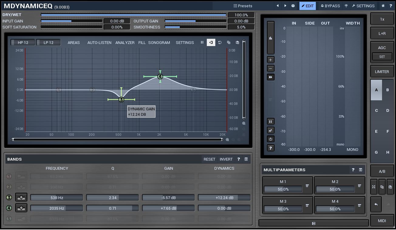
Correct me if I'm wrong but you can set the "threshold" (Dynamic Gain) on MDynamicEQ both in the bands window as well as in its settings panel in main view. Yes, I was wrong. Sorry for that.

Image

.
.
.
.
.
For the GUI look, well, it has been horrible indeed but got way better in v9 (still beta, though).

Post

Sendy wrote:Really, one of the best ringmods I've ever heard. But that GUI... so difficult! So confusing! I managed to work out, sort of, how the modulation system works. I massaged an init patch into something with two bands with modulation on the frequency of each, just to see if I could do it. But boy is it confusing!

Yes, the plugin does a lot. It's very complex, and it gives you a lot of options. Probably more than you'll mostly ever need. And I'm sure I'll get more comfortable with the layout as I use it, but I can't help but feel this dull wall of parameters with little colour or visual guidance is really putting a lot of people off.

On the flipside, Sugar Bytes WOW2 filter does a lot of stuff, it has envelope followers, audio triggering, modulatable waveshapes, lots of things influencing other things etc, but it manages to do it in a fun, visual and engaging, almost "sexy" way that kinda unifies everything into a grand symphony of control. I know Melda's productions are a bit more complicated, and I appreciate the tweakability, but am I the only one that finds their GUIs and layouts a bit... daunting?

Just a first impression, but the plugin sounds so good, and I don't want to be stuck tweaking presets :borg:
Its really not that difficult. Just watch the tutorials and it will all make sense. And by the way you can change the colors more to your liking. It might not be perfect but it might be easier to look at. I do it everytime since its hard to look at the default one.

Post

Sendy wrote:There is a plus side to all of this which is that, it seems, once you've worked out one Melda plugin, you've sort of cracked them all, bar the details, as they all use a similar system of tabs and conventions.
Or worst. Once you’ve tried to work with one Melda plugin, but just can’t stand the GUI, you’re sort of screwed for all of them!

Post

v9 GUI looks better
It's easy if you know how

Post

I have realized that if I want the "perfect GUI" I would have to develop my own plugs. You've got to meet interfaces half-way, I suppose. I kinda like Melda, but totally hear what you guys are saying.

Post

Fully agree with djscorb. I have have bought two melda plugins as the price/functionality was non pareil, and I have gotten used to using them but not to the point where I really like them. I would probably buy a lot more from Melda if they hired a proper GUI designer with a sense for space, typography, colors , alignment and usability. I really don't need a fancy rendered vintage GUI, but a professionally executed design would be nice.

From what I've seen on screenshots, the v9 GUI looks a bit better but I think there are still many alignment and space issues and too many different widget styles, engraved borders, embossed borders, black borders, no borders, useless elements and not to speak of all those pop-ups...

Of course there is no GUI that pleases everyone, but the Melda one's seem to be the most controversial as it seems...

Post

Glad I'm not the only one. Don't get me wrong, I don't mind that the plugin is overly technical. It's almost modular in it's complexity. But it's all lost in a bland maze of popups, tabs, all samey looking and very disorienting. There are a lot of similar but different features that aren't really differentiated enough, causing confusion.

I picked up MDynamicEQ the other day, as it was on promotion and I don't have a dynamic EQ so figured I'd take the plunge. I haven't tested it yet, but fingers crossed, it's a bit more intuitive than the multiband ringmodulator was. I mean, how hard can it be...?
http://sendy.bandcamp.com/releases < My new album at Bandcamp! Now pay what you like!

Post

Don't know if it helps much, but...

https://www.gearslutz.com/board/new-pro ... lable.html

Post

robotmonkey wrote:
Sendy wrote:But that GUI... so difficult! So confusing! But boy is it confusing!
Am I the only one that finds their GUIs and layouts a bit... daunting?
No, Melda plugins have the worst GUI ever. One look and I know I would not be buying any of their plugins. :shrug:
+1

Post Reply

Return to “Effects”