
See, I actually love Zebra 2's GUI. I can read every parameter. I don't mind if a synth has tons of knobs and tabs. If it's legible and I can understand what each control does, I'm fine. It's when I have to take out a magnifying glass to use a synth that I draw the line on whether or not I'll use it.
Like you said, everybody has their own definition of usable which is why there is no way we'd ever establish a "standard" for GUI design.
But does that design affect me? Absolutely. And I'll be the first to admit it. Make me ruin my eyes over your synth and I'm done with it.

Synth appearance
-

- KVRAF
- 21196 posts since 8 Oct, 2014
-
- KVRAF
- 10260 posts since 19 Feb, 2004 from Paris
Its the miniSyn'X actually in this picture. Syn'x has more envelopes, LFOs, layers, modulators and, in short ... more of all.aciddose wrote:...
I quite like syn'x, although I'd change a few things the basic layout is spot on. The features/synth however don't look appealing to me.
http://www.lelotusbleu.fr Synth Presets
77 Exclusive Soundbanks for 23 synths, 8 Sound Designers, Hours of audio Demos. The Sound you miss might be there
77 Exclusive Soundbanks for 23 synths, 8 Sound Designers, Hours of audio Demos. The Sound you miss might be there
-
- KVRAF
- 10260 posts since 19 Feb, 2004 from Paris
Many synths had more than 20 knobs from the beginning though. Then, there was an era where buttons, menus and functions were all over the place. Replacing it with knobs would have meant hundreds of knobs. Then, there are sounds, presets, instruments, call them as you want, that just cant be achieved with 20 knobs. And some people want these sounds. And well, thats all.MarlaPodolski wrote:Thanks for posting those headache-generating synth GUIs above.
I came up with what I call the "20 Knob Rule" a couple of years ago. Now, I'm not fascist about it, so it doesn't exactly mean, 'synth must have 20 knobs or less', but it truly is along those lines.
Devs and others have lost sight about what is functional, helpful, inspiring and practical when they go off the deep end with such silly, control-&-knob-over-populated monstrosities.
It got real stupid on guitars back in the late '70s: I recall chaps with those custom guitars that suddenly came with more than a dozen knobs and switches -- they spent all their times adjusting and flipping switches, just to try for one or two decent sounds ... and it really detracted ... even ruined at times their 'cool solo'.
Musicians: some of you are forgetting what it's really all about. Don't let the shiny things, false promises of complexity and related BS fool you like this!
As usual : Music, freedom, desires, diversity
http://www.lelotusbleu.fr Synth Presets
77 Exclusive Soundbanks for 23 synths, 8 Sound Designers, Hours of audio Demos. The Sound you miss might be there
77 Exclusive Soundbanks for 23 synths, 8 Sound Designers, Hours of audio Demos. The Sound you miss might be there
-
- KVRAF
- 16977 posts since 23 Jun, 2010 from north of London ON
My Buchla has many knobs and holes. 
Barry
If a billion people believe a stupid thing it is still a stupid thing
If a billion people believe a stupid thing it is still a stupid thing
-
- KVRist
- 200 posts since 12 Aug, 2013 from LA
Yes, I would not include Zebra in those, because in Zebra it is USER CHOICE whether the preset and setup becomes complicated or not. There are plenty of very simple Zebra presets that sound wonderful.wagtunes wrote:See, I actually love Zebra 2's GUI. I can read every parameter. I don't mind if a synth has tons of knobs and tabs. If it's legible and I can understand what each control does, I'm fine. It's when I have to take out a magnifying glass to use a synth that I draw the line on whether or not I'll use it.
Very good point there.
"Of course my definition of 'reasonable' may differ from yours. Looking at a glance I can see feature-wise and usability wise these are all a nightmare." Xhip's comment here, on the other hand, completely confuses me. It seems like a complete contradiction from his first sentence to his second.
Clearly, as has been mentioned many times in thread, this is a subjective subject. But there comes a point where it still becomes ridiculous. We don't allow or include those who enjoy eating their own feces in a discussion of strange and exotic gourmet foods do we? Of course not, and I suggest that some of these designs are pure feces.
-
- KVRAF
- 3959 posts since 10 Sep, 2010 from A shit hole (Ireland).
Interesting list... And I agree for the most part.Kriminal wrote:Robmobius wrote:Such as? Just out of curiosity...2ZrgE wrote:And yet there are so many un-reasonable GUIs.
Gladiator's architecture is good and pretty intuitive. But the layout is cluttered and the knobs are way too small. It definitely needs a decent overhaul, and also to improve the order of some of the features. But it's handy enough to use, and I really like the sound too.
Sub Boom Bass and Blade... Er Yes. I'd add Blue II to that. Without trying to sound nasty they are some of my least favorite designs. Aesthetically and usability wise - In the case of Blue II and Blade (which is the most egregious imo).
In fact, the only reason I sold Blue II was because I disliked it from a user's point of view. It's badly laid out, small, and it's all kinda' over the place. But sounds wonderful!
I like Rob's synths a lot, for the most part, except their design seems trapped in the 90s.
Xils designs are very hardware based... So, I can see what they are trying to do, by being faithful. I have all the Xils synths and it pains me to say, that the designs are well... hard going probably a bit too faithful.
I would love if they kept the sound and simplified their softies work flow. Xils 4 and now SynthX 2 absolute beasts.
Largo is another culprit. It's small, cluttered, and is chock full of 90s brushed steel gradients. Mod matrix is a pain. If you are going to use serious gradients please go with the Waves look. It' looks a lot more sleek and polished (pardon the pun) See - meta filter, Codex etc. They are over the top, but they look nicely rendered.
While I'm not too mad with the gradients used in Nave, it's a great interface because it does'nt get in the way and makes it really fast to program patches, etc.
Zebra works for me... Don't know why.
Toxic Biohazard - I bought that on sale. Great little synth and pretty underrated imo. Not the best interface interface ever created if we are being honest. Again with the brushed steel gradients. Looks like something out of a late 80's arcade game. Small, hard to read text. I trudged through it just because it could make some really cool sounds.
Compared to HIVE's design it looks really dated. HIVE is what it should have been if you want to go down the Hi Tech route.
Diversion is one I actually do like. Dimitri really has thought about usability and the sound is very high quality.
One thing that we should mention is that the client gets what the clients wants. What we see are the end results which has probably gone through iteration after iteration. The designer will only have as much input as the client allows.
The clients eyes are probably not trained as well as the designers. So as a designer you're going to have to let 'your baby' go even, if you think is sub par.
Case in point. I got to do a large corporate website some time back (main page designs and logo - no back end as I can't program for poo).
After the design was chipped away, by several different folks (it's never just one person) it ended up looking sub par. So I took the pay day, the client was happy. But I swept it under the carpet and it will never be in my portfolio.
Hmm... I could have said this a shorter way perhaps.
I will take the Lord's name in vain, whenever I want. Hail Satan! And his little goblins too. 
-
- KVRAF
- 3959 posts since 10 Sep, 2010 from A shit hole (Ireland).
Absolutely, my opinion is no more valid that anyone else's. Art is very subjective. Some people like 'retro' or 'hi-tech'. It's all good once it's been well executed.aciddose wrote:All the GUIs above look "reasonable" to me though, which demonstrates the subjective nature of this issue.
Some devs are actually fairly decent designers too I'm sure.
I will take the Lord's name in vain, whenever I want. Hail Satan! And his little goblins too.
-

- KVRAF
- 12354 posts since 7 May, 2006 from Southern California
I wonder if there would be as many synth enthusiasts if there wasn't as much attention being paid to user interface, beyond pure functionality. I mean if all instruments had "poor" interfaces, it would be the norm... would we still have people saying that they won't use instruments with bad interfaces?
Or if developers had decided that nothing was needed beyond the default interface provided for plug-ins by most DAWs? Would that change the way you feel about instruments that you like to use?
On a different topic...
What do you all think of an instrument like this one:
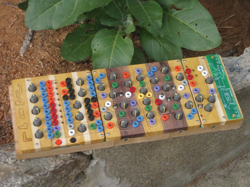
Keep in mind this is not a one-off but a commercial product.
Personally, I think Peter's instruments are beautiful and well thought out.
If a trend suddenly emerged where virtual instrument developers were focusing more on their artistic expression than pure usability, would we continue to use their products? Would the sound matter at that point?
Or if developers had decided that nothing was needed beyond the default interface provided for plug-ins by most DAWs? Would that change the way you feel about instruments that you like to use?
On a different topic...
What do you all think of an instrument like this one:
Keep in mind this is not a one-off but a commercial product.
Personally, I think Peter's instruments are beautiful and well thought out.
If a trend suddenly emerged where virtual instrument developers were focusing more on their artistic expression than pure usability, would we continue to use their products? Would the sound matter at that point?
-

- KVRAF
- 12555 posts since 7 Dec, 2004
I can only see how this would appear contradictory if you were combining "features/usability" with "aesthetic".MarlaPodolski wrote: "Of course my definition of 'reasonable' may differ from yours. Looking at a glance I can see feature-wise and usability wise these are all a nightmare." Xhip's comment here, on the other hand, completely confuses me. It seems like a complete contradiction from his first sentence to his second.
For example if you were to frame the GUI and hang it on a wall, none of these look aesthetically displeasing from my point of view to the degree that someone would become offended by the image "this doesn't belong in an art museum, this is not art! this is garbage!"
Yet, when I'm looking at the synthesizers in terms of physically, how would it feel to actually put them to use in a practical way they all appear unsatisfactory. I'm talking about if I were using them with a blind-fold.
The one which appeared most reasonable aesthetically simply did not appeal to me in a practical sense. Although apparently this is a "mini" version, I quite like the mini version. The things that do not appeal to me are the naming conventions and the configuration of certain controls (both the same thing, neither in the aesthetic sense.) These may be different in the "full" version, but at this point I may no longer be satisfied by either the aesthetic or functionality!
So I suspect you are combining aesthetic and practical impressions into one, which is why my statement which divides the two may appear to be a contradiction.
Free plug-ins for Windows, MacOS and Linux. Xhip Synthesizer v8.0 and Xhip Effects Bundle v6.7.
The coder's credo: We believe our work is neither clever nor difficult; it is done because we thought it would be easy.
Work less; get more done.
The coder's credo: We believe our work is neither clever nor difficult; it is done because we thought it would be easy.
Work less; get more done.
-
- KVRAF
- 21196 posts since 8 Oct, 2014
Which is why I said earlier that we're really talking about two different things.aciddose wrote:I can only see how this would appear contradictory if you were combining "features/usability" with "aesthetic".MarlaPodolski wrote: "Of course my definition of 'reasonable' may differ from yours. Looking at a glance I can see feature-wise and usability wise these are all a nightmare." Xhip's comment here, on the other hand, completely confuses me. It seems like a complete contradiction from his first sentence to his second.
For example if you were to frame the GUI and hang it on a wall, none of these look aesthetically displeasing from my point of view to the degree that someone would become offended by the image "this doesn't belong in an art museum, this is not art! this is garbage!"
Yet, when I'm looking at the synthesizers in terms of physically, how would it feel to actually put them to use in a practical way, they all appear unsatisfactory.
The one which appeared reasonable simply did not appeal to me. Although apparently this is a "mini" version, I quite like the mini version. The things that do not appeal to me are the naming conventions and the configuration of certain controls. These may be different in the "full" version, but at this point I may no longer be satisfied by the aesthetic or functionality!
So I suspect you are combining aesthetic and practical impressions into one, which is why my statement which divides the two may appear to be a contradiction.
A synth can be ugly as sin but be laid out so perfectly that a 5 year old could use it. Conversely, you can have a really slick looking GUI that is a nightmare to use.
Arturia's synths look just like their hardware counterparts and look really cool. But they're useless because the controls are so small.
I will take an ugly synth that is easy to navigate over a slick looking synth that is a nightmare to navigate.
Point is, the one doesn't necessarily dictate the other. A synth can look great and still suck when it comes to using it.
-
- KVRAF
- 3959 posts since 10 Sep, 2010 from A shit hole (Ireland).
Yep, Wag you said this way earlier... And I still agree.wagtunes wrote:
I will take an ugly synth that is easy to navigate over a slick looking synth that is a nightmare to navigate.
Point is, the one doesn't necessarily dictate the other. A synth can look great and still suck when it comes to using it.
I will take the Lord's name in vain, whenever I want. Hail Satan! And his little goblins too.
-
fluffy_little_something fluffy_little_something https://www.kvraudio.com/forum/memberlist.php?mode=viewprofile&u=281847
- Banned
- 12880 posts since 5 Jun, 2012
The new Xils synth looks appealing to me, albeit a bit boring, but it is rather user-friendly and clean.
Never liked the Zebra interface, was the main reason I did not buy it. Hive is better, but also far from ideal.
I still like Sylenth's friendly, light, functional hardware interface. And unlike Hive it doesn't slow down my graphics chip When I have Hive open, dragging any windows on the screen is more like making them jump around
Never liked the Zebra interface, was the main reason I did not buy it. Hive is better, but also far from ideal.
I still like Sylenth's friendly, light, functional hardware interface. And unlike Hive it doesn't slow down my graphics chip
-

- KVRAF
- 3897 posts since 28 Jan, 2011 from MEXICO
There designs that are functional but not "beautifull" as Circle, Twin2 (and everything by fabfilter), aalto and Valhalla plug ins (well they can also be beautifull to some). Pure function over forms, minimalism at its best.
And there is the other extreme: Waves, which has many plugs which difficult to use because of the super realistic GUI. Those are the ones that in MIHO are more hideous.
I guess for some the best is the best of both worlds: aesthetical pleasing but functional, as for example: Hive, Diva, Serum, Spire, Massive, etc.
I prefer functionalism/minimalism but it isn't my only criteria, sadly for me those plugs are not the ones which I find more pleasing sonically.
dedication to flying
-

- KVRAF
- 1943 posts since 17 Jun, 2005
I think these are all beautiful, not in the "it's so functional it's beautiful" sense (that too) but in the sense of "aesthetically extremely pleasing." Out of these, especially the Fabfilter stuff. It looks great!rod_zero wrote:There designs that are functional but not "beautifull" as Circle, Twin2 (and everything by fabfilter), aalto and Valhalla plug ins (well they can also be beautifull to some). Pure function over forms, minimalism at its best.

