
That looks good!H-man wrote:
Replacing metallic 3-pos swiches with something better visually might help even more.


That looks good!H-man wrote:

Completely. Those switches look like ETs among the other elements.david.beholder wrote:That looks good!H-man wrote:
Replacing metallic 3-pos swiches with something better visually might help even more.
There are few changes that might be done as well:fmr wrote:Completely. Those switches look like ETs among the other elements.david.beholder wrote:That looks good!H-man wrote:
Replacing metallic 3-pos swiches with something better visually might help even more.


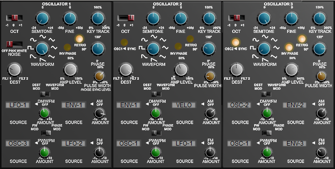


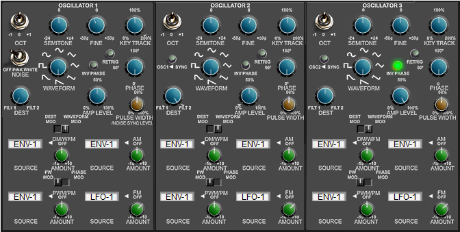
layzer wrote:my best work so far...
Gah!Frantz wrote:layzer wrote:my best work so far...Ladies and gentlemen, we have a winner! Give that man a free license.

Nothing against help but the point is what you posted was not really helpful for me, including that screenshot of the GUI drom that other plugin you posted.Norbz wrote:I'll bow out as of now - I'm trying to help you dude not attack you (a positive critique if you will), nothing on this page is attacking you and I'm giving my free time here just like you for no return and to help an up and coming designer/creative person. I actually felt sorry for you hence my .02 and how you can improve.
I completely agree. But the designer had a great help -> the main concept was na existant and proved one. He just had to adapt it. But some things that should be taken in consideration for Poly-Ana:Teksonik wrote:Guys here's just one example of the quality that is possible with a GUI. I'm not saying Poly-Ana should look like this or even have this style but I'm pointing out the quality. Notice the clarity, sharpness, the lack of aliasing, the depth and the functionality of this gui (yes there is some wasted space but who cares and yes Poly-Ana is many times more complex but try to focus on the subject of quality. This is the type of quality Poly-Ana deserves. luSH101 is another prime example.
I have every faith that given enough time we'll see skins of such quality for Poly-Ana as well......


© KVR Audio, Inc. 2000-2024
Submit: News, Plugins, Hosts & Apps | Advertise @ KVR | Developer Account | About KVR / Contact Us | Privacy Statement