

New algo reverb: Hornet Spaces
-

- KVRAF
- 40248 posts since 11 Aug, 2008 from clown world
Funny, I can't look at the original anymore. I did like it but now I think this one is much better.
Anyone who can make you believe absurdities can make you commit atrocities.
-
- KVRAF
- 2086 posts since 24 Jun, 2006 from London, England
Agreed, it looks like something submitted to the KVR Developer Challenge cira ~2001 ! So can we use poshook's skin or is it just a prototype/idea ?Aloysius wrote:Funny, I can't look at the original anymore. I did like it but now I think this one is much better.
-
- KVRAF
- 4711 posts since 26 Nov, 2015 from Way Downunder
I love what Poshook has done.
Though I have to admit the original GUI does take me back to a wonderfully nostalgic time...

Though I have to admit the original GUI does take me back to a wonderfully nostalgic time...
Last edited by MogwaiBoy on Tue Aug 30, 2016 11:08 am, edited 3 times in total.
-

- KVRian
- 1104 posts since 31 Aug, 2004
it is just prototype, there are a little bit different dimensions and placements so you needs waiting for some days I guessmcbpete wrote:Agreed, it looks like something submitted to the KVR Developer Challenge cira ~2001 ! So can we use poshook's skin or is it just a prototype/idea ?Aloysius wrote:Funny, I can't look at the original anymore. I did like it but now I think this one is much better.
-
- KVRist
- 463 posts since 18 Feb, 2011 from Italy
Hi, once i receive all the artwork from poshook allow for 3/4 days for coding and testing (mainly testing  ) and you'll find the GUI variant available on http://www.hornetplugins.com
Saverio
Saverio
My Audio plugins http://www.hornetplugins.com
-
- KVRian
- 789 posts since 13 Aug, 2012 from it's all about location!
Relax, it was just a question. But well, when talking about perfect design:xoxos wrote:earthtones are widely accepted for computing and tasking, earthy :p purples, peaceful and cerebral. nice state of mind.TheKid wrote:And purple to beige?
course, everything is slaggable when slagging. purple earthtones = gay hippies. i think the world would be much better if scientists would figure out the acceptable colour for guis then everythnig in the world can be the perfect science colour, and we can whine incessantly if anyone steps out of line by trying any hideous freedom or independent thought.
bipedal? ugh. centipede him.
do you wear black on the outside, by any chance? designer spectacles after any famous architects, perchance? is this the time on sprockets when we dance?
for god's sake. purple and f**king beige, is that alright with you or f**k your bullshit around some.
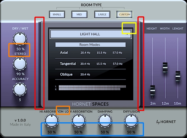
The margins (orange) are too narrow. It reads like 50% stereo although the stereo value is below the knob.
When using round corners usually round corners are used within (yellow).
What is that dark, edgy thing between the outer/purple and the grey/central region(red)? Shadow?
The shadow of the knobs disturbs the contrast of the values of the lower region (blue).
But that's just nitpicking. The GUI itself looks good.
-

- KVRian
- 1431 posts since 4 Apr, 2011 from Rio de Janeiro - Brazil
I have a question: WTF is LCARS?!? 
And I need to say. I'll probably buy this plug in the future, just waiting for the 50% off promo.
The last one, Spikes, is quite good and useful (waiting for the promo too, of course)
And I need to say. I'll probably buy this plug in the future, just waiting for the 50% off promo.
The last one, Spikes, is quite good and useful (waiting for the promo too, of course)
-
- KVRian
- 1052 posts since 17 Nov, 2010 from UK
You have good powers of observation! I suspect however that this is a mockup to gauge reaction (which has been very positive).TheKid wrote:The margins (orange) are too narrow. It reads like 50% stereo although the stereo value is below the knob.
When using round corners usually round corners are used within (yellow).
What is that dark, edgy thing between the outer/purple and the grey/central region(red)? Shadow?
The shadow of the knobs disturbs the contrast of the values of the lower region (blue).
A bit fried in the higher freqs
-
- KVRian
- 1104 posts since 31 Aug, 2004
HI, thank for you comment.TheKid wrote:Relax, it was just a question. But well, when talking about perfect design:xoxos wrote:earthtones are widely accepted for computing and tasking, earthy :p purples, peaceful and cerebral. nice state of mind.TheKid wrote:And purple to beige?
course, everything is slaggable when slagging. purple earthtones = gay hippies. i think the world would be much better if scientists would figure out the acceptable colour for guis then everythnig in the world can be the perfect science colour, and we can whine incessantly if anyone steps out of line by trying any hideous freedom or independent thought.
bipedal? ugh. centipede him.
do you wear black on the outside, by any chance? designer spectacles after any famous architects, perchance? is this the time on sprockets when we dance?
for god's sake. purple and f**king beige, is that alright with you or f**k your bullshit around some.
The margins (orange) are too narrow. It reads like 50% stereo although the stereo value is below the knob.
When using round corners usually round corners are used within (yellow).
What is that dark, edgy thing between the outer/purple and the grey/central region(red)? Shadow?
The shadow of the knobs disturbs the contrast of the values of the lower region (blue).
But that's just nitpicking. The GUI itself looks good.
Here some notices about the complaints:
1. The margins (orange) are too narrow. It reads like 50% stereo although the stereo value is below the knob.. Yes it is true and user will need some time to adapt for that.
2. When using round corners usually round corners are used within (yellow).. I do not agree. Sharp edges are standard even with rounded edges outside (check ipad, LCD, mobil phones etc.). Sharp edges inside are more effective becasue they provide rectangular display area.
3. What is that dark, edgy thing between the outer/purple and the grey/central region(red)? Shadow?. It is a base for display part. Check Akai S6000 or older Korgs PA range keyboards. Moreover who cares what is it. It is nice
4. The shadow of the knobs disturbs the contrast of the values of the lower region (blue).. Yes it is true but still visible enough. Moreover using those particular knobs is more about listening than reading the values.
-
- KVRian
- 1052 posts since 17 Nov, 2010 from UK
I could live without any text values on all of the knobs. I just turn them until stuff sounds the way I like it. I mean, what does 50% high absorption really mean? It just absorbs more of the highs than say 25%. But the knob itself indicates that. And the same for all the other knobs - they're just relative values and it's easy to see what they are.poshook wrote:Moreover using those particular knobs is more about listening than reading the values.
A bit fried in the higher freqs
-
- KVRist
- 409 posts since 24 Nov, 2012
10 pages talking about the gui and not the great plugin itself, some sound reviews would be nice. Oh boy.
If I were a plugin developer I'd make state of the art visual plugins that do nothing (ok maybe only volume changes) and I'd make tons of money. It seems some people really go for this. Maybe I should start programming already.
If I were a plugin developer I'd make state of the art visual plugins that do nothing (ok maybe only volume changes) and I'd make tons of money. It seems some people really go for this. Maybe I should start programming already.
Last edited by nickamandote on Tue Aug 30, 2016 4:21 pm, edited 2 times in total.
-
 Robert Randolph Robert Randolph https://www.kvraudio.com/forum/memberlist.php?mode=viewprofile&u=7328
 - KVRAF
- 2225 posts since 25 May, 2003 from Saint Petersburg, Florida
There were people talking about the sound. Some like, it, some don't.nickamandote wrote:10 pages talking about the gui and not the great plugin itself, some sound reviews would be nice. Oh boy.
If I were a plugin developer I'd make state of the art visual plugins that do nothing (ok maybe only volume changes) and I'd make tons of money. It seems some people really go for this. Maybe I should start programming already.
It's cheap and there's a demo. Go try it yourself.
-
- KVRAF
- 1795 posts since 17 May, 2005
Lol. Come on now..poshook wrote: 4. The shadow of the knobs disturbs the contrast of the values of the lower region (blue).. Yes it is true but still visible enough. Moreover using those particular knobs is more about listening than reading the values.
I''m just browsing through this thread and saw your picture. The very first thing i noticed was that. Low contrast of the values because of the shadow below. When i saw a user point that out i was hoping to see you reply something like, "True, i will make it contrast more".
Not, "Well you are meant to use your ears more than your eyes anyway". Kind of strange from a GUI designer.
Anyway, looking forward to hearing this! Demoing in 10, 9, 8.....
-
- KVRian
- 1104 posts since 31 Aug, 2004
Yes, you are right. I can make some more improvements but it changes the final look a bit and I toguht that tha final GUI has been accepted as is.zeep wrote:Lol. Come on now..poshook wrote: 4. The shadow of the knobs disturbs the contrast of the values of the lower region (blue).. Yes it is true but still visible enough. Moreover using those particular knobs is more about listening than reading the values.
I''m just browsing through this thread and saw your picture. The very first thing i noticed was that. Low contrast of the values because of the shadow below. When i saw a user point that out i was hoping to see you reply something like, "True, i will make it contrast more".
Not, "Well you are meant to use your ears more than your eyes anyway". Kind of strange from a GUI designer.
Anyway, looking forward to hearing this! Demoing in 10, 9, 8.....


