

Hi there, i have just updated to 3.02 and was wondering how to change the skin?
Thanks
Sylenth1 3.02 skins
-

- KVRer
- Topic Starter
- 26 posts since 15 Jul, 2004 from uk

-
- KVRer
- Topic Starter
- 26 posts since 15 Jul, 2004 from uk
thanks.. sorry about that.. i had a moment..lol found it now.. p.s are there any black skins about or in the making?
-
- KVRian
- 1302 posts since 25 Sep, 2006
Yes, more skins are coming up!

-
- KVRist
- 223 posts since 30 Sep, 2002
Sweet. Clean stuff.
Can the skin author pick different knob image stacks for the volume of each oscillator ? In other words, can I assign any knob stack image to any knob on the plugin GUI, as long as it conforms to certain size requirements ?
When I design a sound I'll often play around with different mix levels of each oscillator. I'll probably modify one of the knobs to stand out a little more with a different colour.
Will mix for fun
-
- KVRist
- 197 posts since 12 Mar, 2010 from Italy
Can't wait for this awesome masterpiece.
-
- KVRian
- 505 posts since 25 Mar, 2008
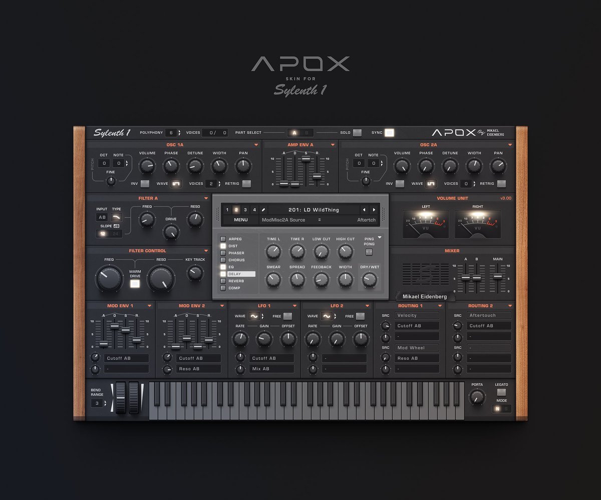
What I don't like about the Mikael Eidenberg skin are the amplifier/compressor style volume meters.
In general, that section and the mixer section could be reduced to knobs and put on top right of the sync button. Then there would be enough space for graphical envelopes, more envelopes, more LFOs or something else that is useful.
The glow effect makes the highlighted elements less readable. It would look more modern without the wood panels and the keyboard has no use, either (or does it)? Despite these comments of mine, I think it's pretty good work.
-
- KVRian
- 1107 posts since 30 Jun, 2015
The vu meter style i dont have issue with. However the effect panel where settings and preset aro reverb etc is! It looks like its a box ontop of a box almost i dislike that very much! Would like it more flatblue monk wrote:What I don't like about the Mikael Eidenberg skin are the amplifier/compressor style volume meters.
In general, that section and the mixer section could be reduced to knobs and put on top right of the sync button. Then there would be enough space for graphical envelopes, more envelopes, more LFOs or something else that is useful.
The glow effect makes the highlighted elements less readable. It would look more modern without the wood panels and the keyboard has no use, either (or does it)? Despite these comments of mine, I think it's pretty good work.
-
- KVRist
- 478 posts since 15 Aug, 2011 from Teesside
Yes... It's bevelled up instead of down. With out seeing it bevelled down i couldn't say which looks the better. it does draw out attention more to the centre, I like it.
Click for music links... Eurotrash!
MSI z390, i7 9700k OC, Noctua Cooling, NVMe 970 Pro, 64GB 3200C16, BeQuiet PSU, W10, Cubase 13, Avenger, Spire, Nexus, iZotope, Virus TI (INTERGRATED).
MSI z390, i7 9700k OC, Noctua Cooling, NVMe 970 Pro, 64GB 3200C16, BeQuiet PSU, W10, Cubase 13, Avenger, Spire, Nexus, iZotope, Virus TI (INTERGRATED).
-
- KVRian
- 505 posts since 25 Mar, 2008
Didn't notice until I took a closer look now. I agree that it would better if the center section with the effects would look on the same plane as the rest.Coockie1176ln wrote:
The vu meter style i dont have issue with. However the effect panel where settings and preset aro reverb etc is! It looks like its a box ontop of a box almost i dislike that very much! Would like it more flat
The VU meters communicate that they belong to a compressor, which they don't. Plus they take up a lot of space.
-
- KVRian
- 505 posts since 25 Mar, 2008
Virus TI:

Mikael Eidenberg's dark skin looks better in some respects. Some aspects however ask for more attention than optimal, some take unnecessary space (which however is what the original layout dictates).
Mikael Eidenberg's dark skin looks better in some respects. Some aspects however ask for more attention than optimal, some take unnecessary space (which however is what the original layout dictates).
-

- KVRAF
- 18546 posts since 16 Sep, 2001 from Las Vegas,USA
Mikael Eidenberg's Apox skin is brilliant. Wait until we get to see it in action and sized to fit our preference. Hopefully it will be soon, I'm looking forward to it a great deal.
None are so hopelessly enslaved as those who falsely believe they are free. Johann Wolfgang von Goethe
-
- KVRAF
- 18546 posts since 16 Sep, 2001 from Las Vegas,USA
The next generation of VSTi interface........
You do not have the required permissions to view the files attached to this post.
None are so hopelessly enslaved as those who falsely believe they are free. Johann Wolfgang von Goethe


