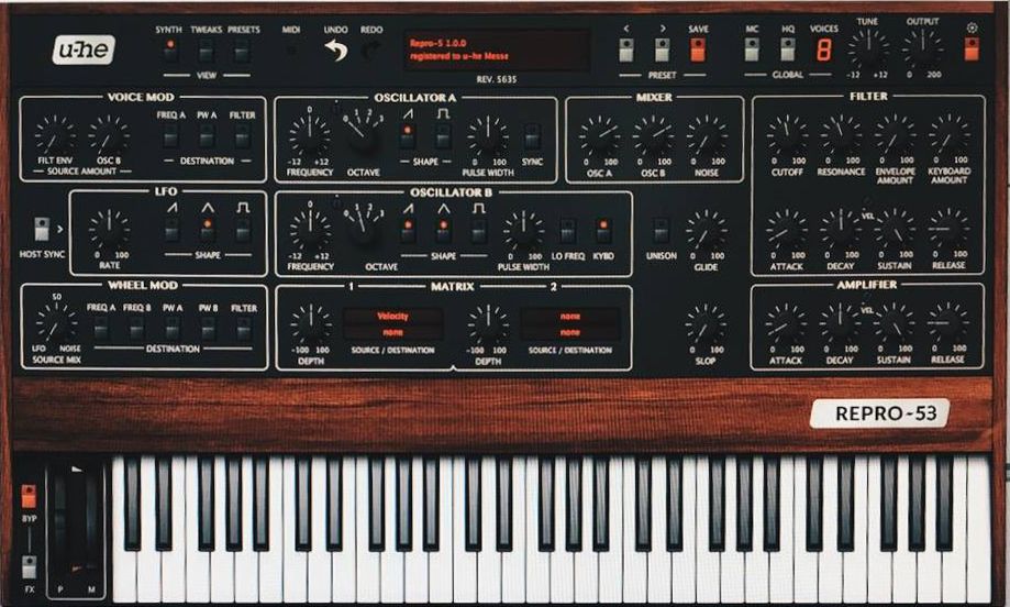
As a "mature" adult (in age, mentally I'm like 12Funkybot's Evil Twin wrote:So it's too small when it's small, but it's big when it's big? Got it.fluffy_little_something wrote:The photo where that Viktor guy is setting up Repro 5 explains where the -in my view- mediocre U-he user interfaces come fromIt is tiny, but young Viktor with his 20/20 vision obviously can read everything, while more mature people like me have to use much larger GUI sizes covering most of our entire monitors just in order to be able to read those poor labels etc.
NI Rounds, for example, is easier to read at a similar size.
u-He's' synths are skinnable, though, so they'll be alternate UIs
And in an awesome bit of irony: There's a nice skin for repro-1 that keeps the aesthetic but improves the contrast and makes it more readable, created by funkybot (his evil twin, to be exact). I'm using it as we speak
https://www.u-he.com/PatchLib/skins.html