

LVC Audio Limited-Z V2 User testing - Get a free license for participating!
-
- KVRAF
- 6828 posts since 28 Apr, 2004 from france
In my opinion, it is unified, which is a good point.
I still find the contrast a bit too bright and somewhat harsh (vidi orange + vivid red + vivid blue... it's all very saturated), but it looks good.
I still find the contrast a bit too bright and somewhat harsh (vidi orange + vivid red + vivid blue... it's all very saturated), but it looks good.
-

- KVRian
- 635 posts since 5 Sep, 2011
plexuss wrote:We've comleted the user test and got some great feedback. We are getting closer to the release of Limited-Z V2. But first I wanted to show you the GUI and get your feedback. We can't implement all your feedback, especially those that really hate the GUI, but we are looking for your reaction to this static image of the GUI in case there is something we can address before the release.
Note the yellow dots at the top: those are inter-sample peak warnings. With the ISP function on and some oversampling pretty much all the ISP risks will be mitigated to 0.
So, post your thoughts about this GUI and if you can offer more explanation than "it sucks" or "looks good" that would be helpful.
-

- KVRian
- 509 posts since 1 May, 2006 from lancaster, pa
Just to give some ideas, here is a shot with the lines turned off (well, the reduce still has a little line in there due to the code). Also, meter colors are not changed.

-
- KVRian
- 509 posts since 1 May, 2006 from lancaster, pa

-
- KVRAF
- 6828 posts since 28 Apr, 2004 from france
This is only my personal opinion, but i like the latter better : i can see myself working longer with the contrast turned down, as it is more relaxing for the eye.
-

- KVRian
- 507 posts since 30 Dec, 2011 from Europe
Yep, less contrasted is more eye friendly in the long term.
Anyway hopefully folks will get that colors in the main screen are tweak-able (just right click, options menu )
)
I made the same mistake initially, but then I saw you can change the colors in any way you want, so there's no point in complaining about them. Gui is good, in line with your other plugins. (reading the pdf manual actually help too). Just my2cents. Cheers
Anyway hopefully folks will get that colors in the main screen are tweak-able (just right click, options menu
I made the same mistake initially, but then I saw you can change the colors in any way you want, so there's no point in complaining about them. Gui is good, in line with your other plugins. (reading the pdf manual actually help too). Just my2cents. Cheers
-

- KVRAF
- Topic Starter
- 5948 posts since 8 Jul, 2009
Can you post a shot with the saturation 1/2 way bewtween 100% and 50% (presumably 75%)?random_id wrote:Here is the same thing with the saturation levels cut by 50% for everything.
#NONFR Check out my music at Bandcamp  Free Streaming!
Free music with your support on Patreon | Youtube: Music of Plexus Videos (music videos) | Youtube: Plexus Productions (audio related) Stop whining. Make music.
Free music with your support on Patreon | Youtube: Music of Plexus Videos (music videos) | Youtube: Plexus Productions (audio related) Stop whining. Make music.
-
- KVRian
- 509 posts since 1 May, 2006 from lancaster, pa
Here is everything at 75% of the original. Again, the Reduce amount still has a prominent line. I may have to add some more code to toggle the line on/off.

-
- KVRAF
- Topic Starter
- 5948 posts since 8 Jul, 2009
The 75% is pretty good. a balance between a softer contrast thats easier on the eyes but with enough contrast to bettwr differentiate the visualized data. what do y'all think?
#NONFR Check out my music at Bandcamp Free Streaming!
Free music with your support on Patreon | Youtube: Music of Plexus Videos (music videos) | Youtube: Plexus Productions (audio related) Stop whining. Make music.
Free music with your support on Patreon | Youtube: Music of Plexus Videos (music videos) | Youtube: Plexus Productions (audio related) Stop whining. Make music.
-
- KVRAF
- Topic Starter
- 5948 posts since 8 Jul, 2009
duplicate
#NONFR Check out my music at Bandcamp Free Streaming!
Free music with your support on Patreon | Youtube: Music of Plexus Videos (music videos) | Youtube: Plexus Productions (audio related) Stop whining. Make music.
Free music with your support on Patreon | Youtube: Music of Plexus Videos (music videos) | Youtube: Plexus Productions (audio related) Stop whining. Make music.
-

- Banned
- 7624 posts since 13 Nov, 2015 from Norway
Yeah agreed. It should be to ned down a bit or atleast change the color.sinkmusic wrote:Maybe something in the contrast and saturation : it's very saturated, and a bit "hurting" : i guess i could not stand in front of it for hours.Halonmusic wrote:The colors especially. Just my opinion really.plexuss wrote:If you don't mind can you list what exactly is awful and why? We can use this as an input to future re-designs.Halonmusic wrote:What an awful gui
Maybe that toning down the saturation and contrast a bit would help making it a bit more "smooth" (while keeping it "fresh") ?
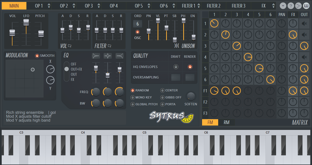
It reminds me a bit of Sytrus or EXT2 colorschemes, but both have less saturated orange, and less dark black (well, a dark grey) :

Btw Am i the only one who dislike the new look for Sytrus?
EnergyXT3 - LMMS - FL Studio | Roland SH201 - Waldorf Rocket | SoundCloud - Bandcamp
-
- KVRian
- 509 posts since 1 May, 2006 from lancaster, pa
Maybe the default could be the 75% one. With the way you can change the default settings of the plugin, I can make a factory presets for the 50% and 100% versions. Then, it will be a 3 clicks for someone to "permanently" change the default color layout of the plugin.
Any thoughts about the button colors, any other color ideas, etc.? I have already added another option to toggle on/off line traces on the waveform display.
Any thoughts about the button colors, any other color ideas, etc.? I have already added another option to toggle on/off line traces on the waveform display.
-
- Banned
- 480 posts since 28 Apr, 2017
plexuss wrote:The 75% is pretty good. a balance between a softer contrast thats easier on the eyes but with enough contrast to bettwr differentiate the visualized data. what do y'all think?
I'm liking 75% as a default.

