
You're a cheap synth, no offense!Caine123 wrote: ↑Fri Apr 12, 2019 2:20 pm i love hive's sound and u-he products i think i got over 60%, the rest i just dont need but i still dont like HIVE's gui, it looks like a cheap synth somehow with the hexagon, no offense!
i dunno if this thing doesnt block the ease of use somehow. im open for new styled and modern GUI's (not the waves ones....) but it doesnt click yet for me, i got hive in the intro sale and wasnt dissapointed with the sound, FAT, and dirty if you want and massive!
it always reminds me of DIVERSION, i like its design also not much yet.
still i cannot wait for HIVE 2!

Hive 2 is coming!
-
- KVRian
- 671 posts since 11 May, 2014
-

- u-he
- 28062 posts since 8 Aug, 2002 from Berlin
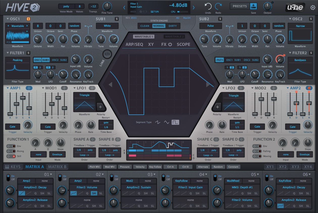
We always think of Hive as 2-part synth, much like the CS-80. In most cases, people would use it like two distinct layered synths each with their own oscillator, filter, LFOs and envelopes.whyterabbyt wrote: ↑Fri Apr 12, 2019 2:20 pmsince the osc/filter blocks and the modulator blocks are now of equal height, wouldnt it be better to have similar sections mirrored vertically rather than horizontally? (ie both osc and filter blocks on the right, both lfo/amp/env/function blocks on the left)
Hence, grouping the parts like we did keeps mousing/eyeing short while working on a part.
-

- Beware the Quoth
- 33159 posts since 4 Sep, 2001 from R'lyeh Oceanic Amusement Park and Funfair
Yeah, but plenty of synths have a visually left-right signal flow, rather than a 'left, then down'Urs wrote: ↑Fri Apr 12, 2019 2:25 pmWe always think of Hive as 2-part synth, much like the CS-80. In most cases, people would use it like two distinct layered synths each with their own oscillator, filter, LFOs and envelopes.whyterabbyt wrote: ↑Fri Apr 12, 2019 2:20 pmsince the osc/filter blocks and the modulator blocks are now of equal height, wouldnt it be better to have similar sections mirrored vertically rather than horizontally? (ie both osc and filter blocks on the right, both lfo/amp/env/function blocks on the left)
Hence, grouping the parts like we did keeps mousing/eyeing short while working on a part.
my other modular synth is a bugbrand
-
- KVRist
- 465 posts since 19 Oct, 2012
-

- KVRAF
- 18551 posts since 16 Sep, 2001 from Las Vegas,USA
Much better. I'll still want to knock the pink off of it and neutralize some of the other colors but I could work with that GUI for hours without eye strain. 
None are so hopelessly enslaved as those who falsely believe they are free. Johann Wolfgang von Goethe
-
- KVRAF
- 8489 posts since 5 Aug, 2009
and you a weirdockam03 wrote: ↑Fri Apr 12, 2019 2:25 pmYou're a cheap synth, no offense!Caine123 wrote: ↑Fri Apr 12, 2019 2:20 pm i love hive's sound and u-he products i think i got over 60%, the rest i just dont need but i still dont like HIVE's gui, it looks like a cheap synth somehow with the hexagon, no offense!
i dunno if this thing doesnt block the ease of use somehow. im open for new styled and modern GUI's (not the waves ones....) but it doesnt click yet for me, i got hive in the intro sale and wasnt dissapointed with the sound, FAT, and dirty if you want and massive!
it always reminds me of DIVERSION, i like its design also not much yet.
still i cannot wait for HIVE 2!
doesnt matter only because im the only one who said that, my opinion, again i will still upgrade and use hive a lot.
DAW FL Studio Audio Interface Focusrite Scarlett 1st Gen 2i2 CPU Intel i7-7700K 4.20 GHz, RAM 32 GB Dual-Channel DDR4 @2400MHz Corsair Vengeance. MB Asus Prime Z270-K, GPU Gainward 1070 GTX GS 8GB NT Be Quiet DP 550W OS Win10 64Bit
-
- u-he
- 28062 posts since 8 Aug, 2002 from Berlin
I know. But that's probably because this is how it is in hardware. In hardware we use two hands, so we can use one hand for Osc/Filter and the other for modulations and edit quickly. But in software we use the mouse or any other input device, and commonly just one. Hence it's less strenuous to avoid long mouse-ways by arranging related parameters in the smallest possible structure, a circle or a square maybe.whyterabbyt wrote: ↑Fri Apr 12, 2019 2:34 pmYeah, but plenty of synths have a visually left-right signal flow, rather than a 'left, then down'
-

- KVRian
- 545 posts since 9 Oct, 2006
This last look is totally perfect ! I love it ! 


U N I S O N : shoegaze/electronic wall of sound with heavenly voice
https://soundcloud.com/weareunison / https://www.facebook.com/unison666 / https://weareunison.com/
https://soundcloud.com/weareunison / https://www.facebook.com/unison666 / https://weareunison.com/
-

- Banned
- 697 posts since 29 Oct, 2016
Question: Can the functions be customized with an expression evaluator? Ie. sin(x) / x
Suggestion: Easter egg of a bee in the skin.
Or better yet, an illustration of Urs chopping madly with an axe guitar.
Suggestion: Easter egg of a bee in the skin.
Or better yet, an illustration of Urs chopping madly with an axe guitar.
SLH - Yes, I am a woman, deal with it.
-

- KVRAF
- 23101 posts since 7 Jan, 2009 from Croatia
No expression evaluator.

-

- KVRist
- 489 posts since 27 Apr, 2013 from Denmark
Looks good. My only immediate concern is the overabundance of blue, particularly with the Osc and Filter visuals. Seems to make the top elements melt together somewhat.
-
- KVRAF
- 3251 posts since 30 Dec, 2014
It's been a while since I last looked at this, but what I can say is that it looks to have been a tough balancing act to add more features while retaining what the previous versions that Hive currently has.
With that though, there are a few things which pop out at me from the most recent of screenshots which I feel could be improved.
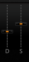
1. The AMP and MOD fader caps, look too fat, and would look better being more slimmer. Being slimmer makes it easier to accurately position the central line, and focus on that line to correctly define the relative distance between one line and another, instead of the outer proportions of the surrounding cap causing a visual anomaly which makes it difficult to see at a glance in how the positions of them actually are. Reducing the size of them also in this case not only makes the caps easier to see the distance they are apart, but also increases the amount of white space in that area rather than feeling all cramp and awkward among other surrounding elements. I'm sure there are other areas of the GUI where this applies but this is the one area that immediately stands out.
I'll post an example of what I mean, where the 3D look of the button is still there but the primary measurement / distance between the two caps are clearly defined, with minimal surrounding 3D like geometry, using colour and contrast. The caps don't need to be miniscule to the point where they are difficult to click on, but they do need to be correctly portioned in a relative scaled way, whilst being functionally more accurate.
The other aspect, is more of a feel factor thing, but the squareness of the mod section at the bottom lacks any character or style in which the previous version of Hive had. Feels all a bit too boxy for my design tastes.
There is definitely a lot more going on with this GUI design, for some that may be a little too much... so the question remains in how much if any of it can be hidden away to make it less so.... but otherwise...it's overall it's looking very promising.
(A few spelling corrections and changes)
With that though, there are a few things which pop out at me from the most recent of screenshots which I feel could be improved.
1. The AMP and MOD fader caps, look too fat, and would look better being more slimmer. Being slimmer makes it easier to accurately position the central line, and focus on that line to correctly define the relative distance between one line and another, instead of the outer proportions of the surrounding cap causing a visual anomaly which makes it difficult to see at a glance in how the positions of them actually are. Reducing the size of them also in this case not only makes the caps easier to see the distance they are apart, but also increases the amount of white space in that area rather than feeling all cramp and awkward among other surrounding elements. I'm sure there are other areas of the GUI where this applies but this is the one area that immediately stands out.
I'll post an example of what I mean, where the 3D look of the button is still there but the primary measurement / distance between the two caps are clearly defined, with minimal surrounding 3D like geometry, using colour and contrast. The caps don't need to be miniscule to the point where they are difficult to click on, but they do need to be correctly portioned in a relative scaled way, whilst being functionally more accurate.
The other aspect, is more of a feel factor thing, but the squareness of the mod section at the bottom lacks any character or style in which the previous version of Hive had. Feels all a bit too boxy for my design tastes.
There is definitely a lot more going on with this GUI design, for some that may be a little too much... so the question remains in how much if any of it can be hidden away to make it less so.... but otherwise...it's overall it's looking very promising.
(A few spelling corrections and changes)
Last edited by THE INTRANCER on Fri Apr 12, 2019 5:26 pm, edited 6 times in total.
KVR S1-Thread | The Intrancersonic-Design Source > Program Resource | Studio One Resource | Music Gallery | 2D / 3D Sci-fi Art | GUI Projects | Animations | Photography | Film Docs | 80's Cartoons | Games | Music Hardware |
