
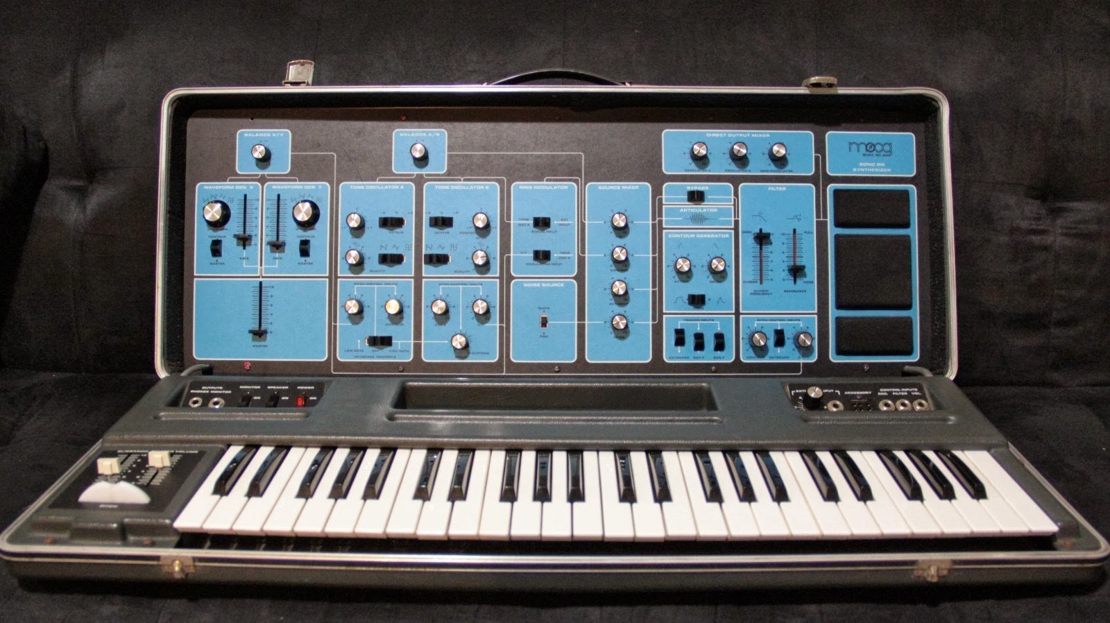
It’s not spoiled to want well-designed things. Just because you can drive a nail into a board with a rock you find doesn’t mean it’s the best and most enjoyable tool to use.wagtunes wrote: ↑Mon May 25, 2020 10:04 pm This is one of the first synths I owned. All the way at the far left, first thing...LFOs
WTF???
This is the kind of shit we grew up with. You looked for what you wanted, you grabbed a hold of it and you did whatever you were going to do with it and you didn't give a second thought to "Hey, maybe it would be better if this was over HERE."
We've become so spoiled that we go bat shit crazy over an oscillator not being the first thing in the chain.

Upcoming Synapse OB-Xa: Obsession
-
vitocorleone123 vitocorleone123 https://www.kvraudio.com/forum/memberlist.php?mode=viewprofile&u=333504
- KVRAF
- 1895 posts since 30 Jun, 2014 from Pacific NW
-

- KVRAF
- 21196 posts since 8 Oct, 2014
Except people are complaining about minutia.vitocorleone123 wrote: ↑Mon May 25, 2020 10:17 pmIt’s not spoiled to want well-designed things. Just because you can drive a nail into a board with a rock you find doesn’t mean it’s the best and most enjoyable tool to use.wagtunes wrote: ↑Mon May 25, 2020 10:04 pm This is one of the first synths I owned. All the way at the far left, first thing...LFOs
WTF???
This is the kind of shit we grew up with. You looked for what you wanted, you grabbed a hold of it and you did whatever you were going to do with it and you didn't give a second thought to "Hey, maybe it would be better if this was over HERE."
We've become so spoiled that we go bat shit crazy over an oscillator not being the first thing in the chain.
All that aside, it's done. Live with it. Otherwise, and this is IF Richard even decided to cave in and change the GUI, wait 3 to 6 more months to get this thing.

-
- KVRAF
- 21196 posts since 8 Oct, 2014
Really, first world problems. Sheesh.
-

- KVRian
- 523 posts since 26 Jan, 2020
If only there was a Youtube video showing a 10th of the GUI, then I could make a decision.
There are two kinds of people in the world. Those which can finish a tune, and those which has 300 two-bar loops.
-
- KVRAF
- 21196 posts since 8 Oct, 2014
Do you work at being an ass or does it just come naturally to you?TheMaestro wrote: ↑Mon May 25, 2020 10:29 pm If only there was a Youtube video showing a 10th of the GUI, then I could make a decision.
-
- KVRian
- 523 posts since 26 Jan, 2020
I don't know what you're talking about.
There are two kinds of people in the world. Those which can finish a tune, and those which has 300 two-bar loops.
-
- KVRAF
- 21196 posts since 8 Oct, 2014
You know very well what I'm talking about. Your subtle dig did not go over my head.
Shouldn't you be in your Arturia thread defending your synth that I only know a tenth of?
-
- KVRian
- 523 posts since 26 Jan, 2020
You don't know what you're talking about.
There are two kinds of people in the world. Those which can finish a tune, and those which has 300 two-bar loops.
-
- KVRAF
- 21196 posts since 8 Oct, 2014
Yeah, well then that makes two of us.
All I know is I hope Synapse doesn't listen to the whining children and delay this thing for God knows how long.
-
- KVRian
- 523 posts since 26 Jan, 2020
You don't know what I'm talking about.
There are two kinds of people in the world. Those which can finish a tune, and those which has 300 two-bar loops.
-
- KVRAF
- 21196 posts since 8 Oct, 2014
And at this point, I don't even care.
-
Funkybot's Evil Twin Funkybot's Evil Twin https://www.kvraudio.com/forum/memberlist.php?mode=viewprofile&u=116627
- KVRAF
- 11519 posts since 16 Aug, 2006
Let's put signal flow aside for a second [even though what works in a horizontal layout on hardware doesn't necessarily translate well to screens]. Let me ask this:
1. Why is Osc2 Detune in the Control section and not the Oscillator section?
2. Why is Crossmod in the Control section and not the Oscillator section or even the Mod section?
Only answer I can possibly think of: because a decision was made early on to use the exact same GUI dimensions as The Legend, and sticking these items in strange places was chosen as the easiest way to deal with the fundamental problem "oh sh*t there's no room in the oscillator section" without redesigning the GUI. Otherwise, maybe you gotta make knobs smaller, or move some stuff around, or maybe make the whole thing bigger, then that creates maybe an issue with the Reason Rack GUI...
..but the answer isn't "because it makes sense to have those things where they are" and that's fundamentally a sign of bad design. The mock-ups with the oscillators on top, particularly the one with Osc2 and Crossmod at least close to the Osc2 knobs, make sense for a plugin GUI where you want to put the most important things front and center. All while still also keeping the square shape that's the fundamental flaw in this whole endeavor.
If this were a hardware desktop unit, yeah, having the oscs and filters on the bottom row where they're closest to the user's hands makes sense. In a desktop unit, bottom is going to be front and center. Left to right makes sense on a keyboard with 56 knobs, where the osc and filter controls end up central and those other elements are further away and at the edges. So the oscs/filter section in the middle is front and center, with control, modulation, and envelopes off to the side and out of the way. See how that works? They're putting the important stuff where it's most physically accessible in relation to the user.
But with a plugin, we're not using our hands to physically turn knobs, or standing in front of a keyboard on a stand, we're using our eyes and a mouse, which is why GUI design for a screen is very different than hardware UI design. We also read from left to right and top down in the west, which is why our eyes expect important things to be near the top. So when designing for a screen, it's not a great idea to put the oscillators and filters at the bottom, but it's much better to put them front and center.
Is it the absolute worst thing in the world? No of course not. But it's not better. It doesn't improve the product in any way. It just kind of makes things a little less polished than they otherwise could be. If from the outset, Richard designed the GUI in a way where the Oscs and filter were front and center, and I came on here bitching about how they should be at the bottom of the GUI, you'd all think I was completely insane. But that's the argument currently being made by the testers and a few others. It's an argument of convenience. Basically saying, "it's already designed like this and 'good enough' and I don't want this to be delayed any more." I get it. But if you're going to make that argument, then you're not arguing for what's better, you're arguing for what's convenient.
-

- Banned
- 3564 posts since 22 Aug, 2019
-
- KVRAF
- 21196 posts since 8 Oct, 2014
Fair points.Funkybot's Evil Twin wrote: ↑Mon May 25, 2020 10:59 pm Let's put signal flow aside for a second [even though what works in a horizontal layout on hardware doesn't necessarily translate well to screens]. Let me ask this:
1. Why is Osc2 Detune in the Control section and not the Oscillator section?
2. Why is Crossmod in the Control section and not the Oscillator section or even the Mod section?
Only answer I can possibly think of: because a decision was made early on to use the exact same GUI dimensions as The Legend, and sticking these items in strange places was chosen as the easiest way to deal with the fundamental problem "oh sh*t there's no room in the oscillator section" without redesigning the GUI. Otherwise, maybe you gotta make knobs smaller, or move some stuff around, or maybe make the whole thing bigger, then that creates maybe an issue with the Reason Rack GUI...
..but the answer isn't "because it makes sense to have those things where they are" and that's fundamentally a sign of bad design. The mock-ups with the oscillators on top, particularly the one with Osc2 and Crossmod at least close to the Osc2 knobs, make sense for a plugin GUI where you want to put the most important things front and center. All while still also keeping the square shape that's the fundamental flaw in this whole endeavor.
If this were a hardware desktop unit, yeah, having the oscs and filters on the bottom row where they're closest to the user's hands makes sense. In a desktop unit, bottom is going to be front and center. Left to right makes sense on a keyboard with 56 knobs, where the osc and filter controls end up central and those other elements are further away and at the edges. So the oscs/filter section in the middle is front and center, with control, modulation, and envelopes off to the side and out of the way. See how that works? They're putting the important stuff where it's most physically accessible in relation to the user.
But with a plugin, we're not using our hands to physically turn knobs, or standing in front of a keyboard on a stand, we're using our eyes and a mouse, which is why GUI design for a screen is very different than hardware UI design. We also read from left to right and top down in the west, which is why our eyes expect important things to be near the top. So when designing for a screen, it's not a great idea to put the oscillators and filters at the bottom, but it's much better to put them front and center.
Is it the absolute worst thing in the world? No of course not. But it's not better. It doesn't improve the product in any way. It just kind of makes things a little less polished than they otherwise could be. If from the outset, Richard designed the GUI in a way where the Oscs and filter were front and center, and I came on here bitching about how they should be at the bottom of the GUI, you'd all think I was completely insane. But that's the argument currently being made by the testers and a few others. It's an argument of convenience. Basically saying, "it's already designed like this and 'good enough' and I don't want this to be delayed any more." I get it. But if you're going to make that argument, then you're not arguing for what's better, you're arguing for what's convenient.
My response
1. Why wasn't all this brought up by the beta testers the FIRST time they looked at this GUI? I mean NOBODY said "Holy shit Richard, this GUI is totally f**ked up!"
2. Now that this is where we are, do you really think what's BETTER is to delay this release who knows how many months during a time when the world economy is tanking and people are literally starving? For something THIS relatively trivial?
It ain't my company and I ain't the one making the decision and I sure as hell can wait 6 more months for a synth I really don't NEED in the first place.
But you gotta wonder just how much better this thing REALLY gets if we move a few knobs.


