
Zebra3 Info
-
aaron aardvark aaron aardvark https://www.kvraudio.com/forum/memberlist.php?mode=viewprofile&u=248508
- KVRAF
- 2665 posts since 22 Jan, 2011 from near Los Angeles
Of course I'm not going to complain if a future Zebra reverb sounds better, though the existing one sounds excellent to me. Maybe having choice of various reverbs would be good? I forget off hand if current Zebra has more than one type of reverb.
You can hear my original music at this link: https://www.soundclick.com/artist/defau ... dID=224436
-

- u-he
- Topic Starter
- 28063 posts since 8 Aug, 2002 from Berlin
No worries... we're not going to take the current reverb away, we'd just add another, most likely the one from Hive.
-

- KVRAF
- 23102 posts since 7 Jan, 2009 from Croatia
As a separate mode for the current reverb, or as a new FX block?
-
- KVRAF
- 5179 posts since 16 Nov, 2014
That would be great if we could use different reverbs per patch.EvilDragon wrote:As a separate mode for the current reverb, or as a new FX block?
I also like the current reverb of Zebra. It´s great and not a cpu hog. One of the most buttersmooth if you modulate the shit out of it. I also love that we get a dry and wet knob.
Or just add Protoverb to Zebra
-
- KVRAF
- 23102 posts since 7 Jan, 2009 from Croatia
You could use different reverbs per patch even if it were a different mode in the current reverb block. 
-
- KVRist
- 138 posts since 5 Oct, 2015
Spiffy. I never compared the FX of Zebra and Hive directly, but I did like the reverb and the distortion of Hive.Urs wrote:No worries... we're not going to take the current reverb away, we'd just add another, most likely the one from Hive.
Glad to hear that some technology from the newer synths goes back into Zebra. A great feature of Repro btw. is the 32 steps of the step sequencer combined with the A, B and A+B modes. I'd really like to see this in Zebra.
Best,
K
-

- KVRian
- 972 posts since 27 Nov, 2014
Yes. Arp is not as attractive in Zebra 2. I like Spire or Omnisphere Arp layout, it is visually more pleasant and you can get fast results.
-

- KVRian
- 839 posts since 8 Mar, 2008 from Crestview, Florida
I've been using the reverb less and less and the 4-tap delay more and more.
-
- KVRer
- 17 posts since 11 Nov, 2012
GUI talk: I too have to say that I totally prefer the old vector knobs. For me that's the single most identifying characteristic of the visuals of Zebra. It's the one thing that really sets it apart visually. But the vector knobs are also functionally better: it's very very easy on the eyes to see at one glance what is going on. Analog style knobs tend to be hard to read, you have to concentrate more to find where that little value mark is located, what values are dialed in; not so with Zebra's vector knobs, you see instantly what's going on. Whenever I'm working in another synth, as far as visuals go, the vector knobs are the first things I miss. Especially with many modules active the instant readability of vector knobs is key. Try the test yourself: Take the new GUI, and take the old. Now load the same patch in both GUIs, ideally a big patch with many modules. Now judge on which GUI you can read and understand that patch faster and easier? For me there's not even a contest.
-
- KVRist
- 51 posts since 2 Feb, 2016
Won't you be able to save the existing skin and continue using it in 2.8 if you prefer the vector style? Or is there new functionality in 2.8 that would require additions to the existing GUI?
-
- KVRAF
- 23102 posts since 7 Jan, 2009 from Croatia
Sure you could, but the old skin would need to be updated with new modules (wavefolder, new reverb type, etc.)
-
- u-he
- Topic Starter
- 28063 posts since 8 Aug, 2002 from Berlin
As I said: The knobs are work in progress. We want to gel a vector ring with a pseudo-realistic look, much like in ACE and Bazille, but with built-in colour options for our UI designer. This takes some extra work which hasn't been done yet.
-
- KVRist
- 442 posts since 21 May, 2014
yea I like lime green on black and grey with orange accents . I would be totally fine if u just left the existing layout exactly as is but just focused on improved map ability into daw regarding arpegg sequencer and concentrated on the actual SOUND and give us cool new SOUND creation abilities . why break it if it isn't broken----
everyone talking about visual design changes ----why ???? the visual layout is the last thing that needs any alteration whatsoever . the visual layout is the main reason I use it so much---along with the sound creation capability
I agree with other poster---I like Bigger knobs even if it is "cluttered" I like things looking "big" and easy to see----I vote against trying to re-design the gui with a mindset of making it "appear" slicker or "more neat" especially if it's at the expense of accessibility , I find that the bazille is extremely difficult to look at and opted not to buy it because even though it has a "bazzillion" knobs----they are all tiny and I can't get a good screen resolution without shrinking it into a micro size---this is for both my 42 inch led and my 13" thinkpad
Sincerely,
Zethus, twin son of Zeus
Zethus, twin son of Zeus
-
- KVRist
- 442 posts since 21 May, 2014
I think it would be unadvisable to mess with the hardcore structural elements of zebra with respect to size----the knob sizes are perfect how they are - even if it does "look" clunky----I will take clunky but extremely usable vs "chique"/nouveau/(tidy on paper) but hard on the eyes cause u can't focus on tiny knobs for too long
I can say I pretty sure I have put just as many if not more hours into using zebra than 90% of the people posting on this board , it's literally the only synth I use for serious work
the main reason I started using zebra was for its extremely adjustable and big interface; the elements are all just the right ratio from eAchother; otherwise I would have a bazille situation and not be able to purchase(use) it do to it being unusable visually .
for me---the "look"/accessibility pre-empts whether i can even use it as a sound creation device in the first place
-------
¥¥¥¥oh is there a skin we can download of the new version so I can actually compare for myself ?
----I might not even have a problem if I saw it for myself
_____
this is the problem with the Bazille layout, sure it "looks neat", but it's unusable because look how much real estate there is and the buttons are tiny, the numbers are tiny in relation to how big the actual background is, so you either have to make it so big that only a small bit of the screen is visible, or you shrink it down but then you can barely see the knobs or the numbers on them or the names
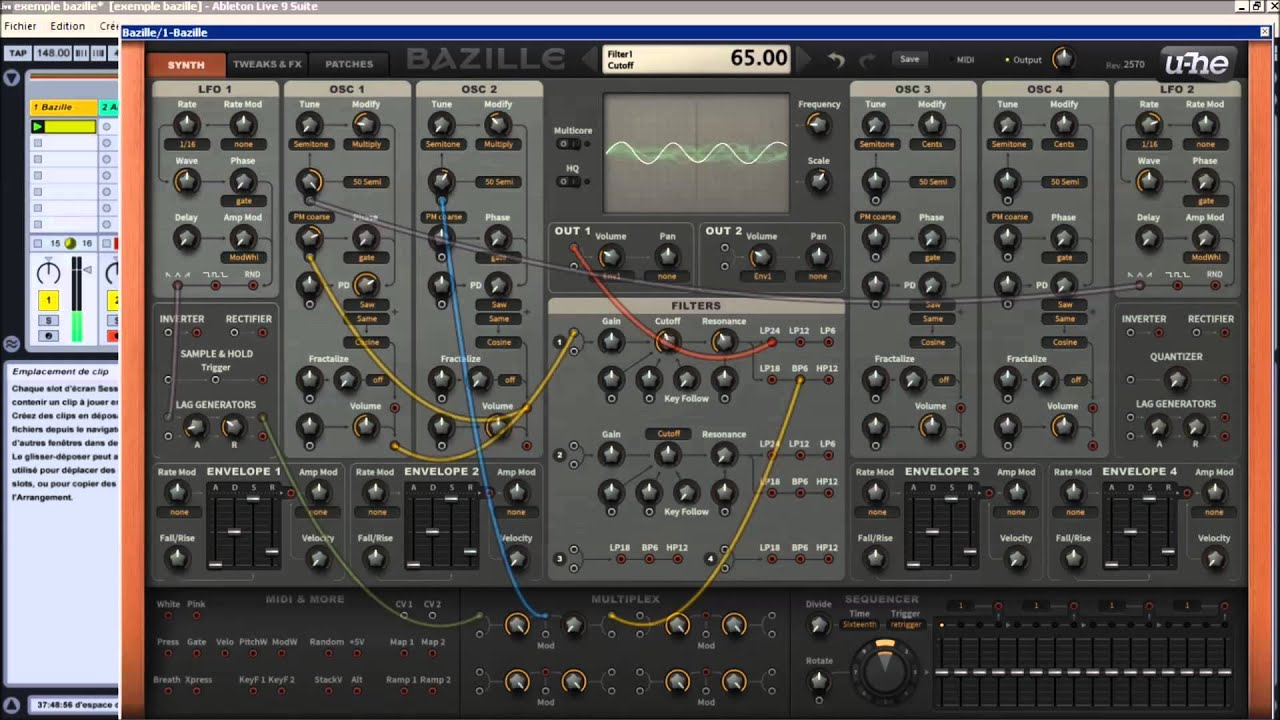
compare that to zebra, the buttons and dials are nice and big, the whole interface is big, this is what makes it so usable...and accesible, and easy to read

I can say I pretty sure I have put just as many if not more hours into using zebra than 90% of the people posting on this board , it's literally the only synth I use for serious work
the main reason I started using zebra was for its extremely adjustable and big interface; the elements are all just the right ratio from eAchother; otherwise I would have a bazille situation and not be able to purchase(use) it do to it being unusable visually .
for me---the "look"/accessibility pre-empts whether i can even use it as a sound creation device in the first place
-------
¥¥¥¥oh is there a skin we can download of the new version so I can actually compare for myself ?
----I might not even have a problem if I saw it for myself
_____
this is the problem with the Bazille layout, sure it "looks neat", but it's unusable because look how much real estate there is and the buttons are tiny, the numbers are tiny in relation to how big the actual background is, so you either have to make it so big that only a small bit of the screen is visible, or you shrink it down but then you can barely see the knobs or the numbers on them or the names
compare that to zebra, the buttons and dials are nice and big, the whole interface is big, this is what makes it so usable...and accesible, and easy to read
Sincerely,
Zethus, twin son of Zeus
Zethus, twin son of Zeus

