
yeah I understand how people have different tastes. The current version must be kept downloadable for those who love as-is Tokyo Ghost.e-musician wrote: ↑Thu Dec 03, 2020 9:03 am It was TG that made me revisit Bazille. Since then, I have been using Bazille more than ever. And the very reason is TG:
+ clean and appealing design (I could also say attractive and beautiful to look at)
+ improved workflow (as compared to the original skins)
Therefore I say: Please do not change the overall structure of the skin!
And if you do change some fonts, knobs, colours (but not the general layout), please also offer the current one as an additional variant. Not every change means progress or improvement.
Of course, this is highly subjective.
Tokyo Ghost Skin for Bazille
-

- KVRist
- Topic Starter
- 344 posts since 3 Mar, 2015 from Japan

-

- KVRAF
- 23102 posts since 7 Jan, 2009 from Croatia
Yes to alternative image 
-
Funkybot's Evil Twin Funkybot's Evil Twin https://www.kvraudio.com/forum/memberlist.php?mode=viewprofile&u=116627
- KVRAF
- 11519 posts since 16 Aug, 2006
I think I'd prefer the current state because it results in shorter cable lengths. I can see the value of grouping all the like-modules together, but I think it just results in further mouse drags. I go through periods where my wrists will be in pain through repetitive motions, so I'm always looking for ways to minimize mouse movements and that type of stuff may just stick out to me more than some other folks.
If you think it's worth pursuing, you could always introduce it as an alternate layout. Or I could not upgrade. That's ok too.
You could also go completely nuts and try to design them as different types of modules. Making it look a bit more like several different Eurorack modules from different manufacturer's (not saying you should steal IP from existing companies) in a single rack and have fun with the design. That could really allow one to play with colors, use different knobs on different modules, maybe do some face plate design. If you do a Google image search on Eurorack you can see lots of real world setups, and get a feel for what I'm imagining. That sounds like a whole lot of work though.
Also..I've mentioned this before but just so it's not forgotten, BRTH and XPRS are now CTRL A and CTRL B.
-
- KVRian
- 671 posts since 8 Jan, 2005 from Germany
I wouldnt have something against a new background. There are a few semi modulars with cables, that dont have rectangular modules like an eurorack (ARP 2600, MS20, ...).
I'm sure you'll find the perfect solution
-
 The Nerdy Music Guy The Nerdy Music Guy https://www.kvraudio.com/forum/memberlist.php?mode=viewprofile&u=475847
 - KVRist
- 172 posts since 7 Oct, 2020
It's really hard for me to judge layout changes based on screens, I'd have to actually use it. My brain doesn't work well enough to make that translation from theory to practice, I guess 
I'm sure you'll come up with something great
I'd also really like to see a dark mode, like others already mentioned.
Also, a small bug report (maybe?): The option called "Auto Versioning" is called "Generational Saves" (or something along those lines, can't check right now) the TG skin.
I'm sure you'll come up with something great
I'd also really like to see a dark mode, like others already mentioned.
Also, a small bug report (maybe?): The option called "Auto Versioning" is called "Generational Saves" (or something along those lines, can't check right now) the TG skin.
-
- KVRer
- 25 posts since 4 Oct, 2010
Hey folks,
Here's my customization of Tokyo Ghost, more of an evolution than a radical change. It's fully functional, not just a photoshop job. I would gladly share it with Plugmon if he wants to implement some of my solutions. (or share it with paid users if he approves that)
What's new:
- Relocated some controls, for more overall order and symmetry.
- Changed "digital" font for the same one used on whole GUI.
- Changed that retina-burning orange to cool pink.
- Effects section went into lower-right corner. It's more logical and makes connections from sequencer and mapping generators shorter.
- Bigger mapping generator displays.
- Removed small peak meter in mixer section, since there's already a big oscilloscope.
- Pixel-precise re-aligning of controls and labels. (OCD, can't help it)
- Text reduction where possible for clearer space between elements. Also, some labels were changed.
- Warmer shade of white for backround, easier on the eyes. Although I usually prefer darker GUIs, I like Tokyo Ghost because of it's lightness, it's vibrant to work with.
- New wood side panels. (premium walnut, not a plastic veneer)
Personally, I don't find use for ghost mode, it removes a lot of elements that leave space strangely empty, it's much easier for me just to set cables to "ghosted" when I want them out of the way.
You do not have the required permissions to view the files attached to this post.
Last edited by J1000 on Wed May 05, 2021 7:30 am, edited 1 time in total.
-
- KVRAF
- 2086 posts since 24 Jun, 2006 from London, England
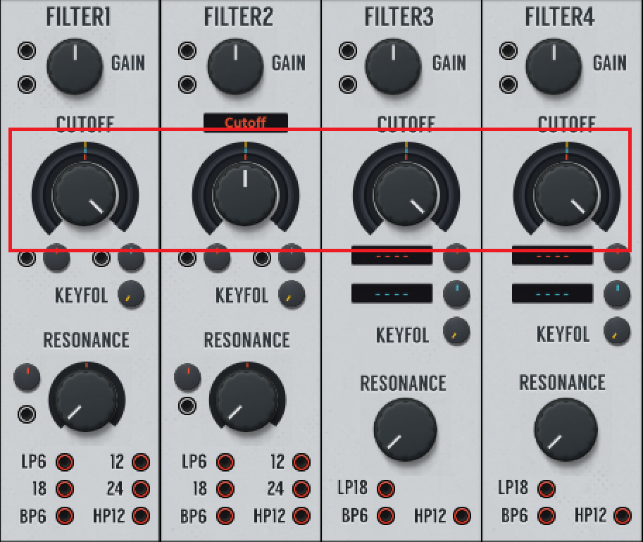
Not a huge thing but on having it on 110-130% size makes the 4 dials under cutoff ever so slightly misaligned horizontally with the outer ring values:
The rest of the skin is so beautiful it just shows up that imperfection that bit more !
The rest of the skin is so beautiful it just shows up that imperfection that bit more !
-
- KVRAF
- 6462 posts since 17 Dec, 2009
It’s really hard to make pixel perfect scalable things - and really constraining. Basically every position needs to align to a pixel if you multiply by 1.1, 1.2, 1.3, or u-he needs to render the skin @2x and interpolate down - which costs resources.
(Most of u-he stock skins are sort of “fuzzy” around the edges, so pixel disalignment is less obvious)
(Most of u-he stock skins are sort of “fuzzy” around the edges, so pixel disalignment is less obvious)

-
- KVRist
- 173 posts since 25 Jul, 2005 from Vancouver, Canada
Yeah, I have the same situation in Windows 10... happens in Ableton, Reason and Waveform...
I have been looking at how to fix it myself as it shows also VERY pixelated on my screen, it is quite distracting...
But then a strange fear gripped me
and I just couldn't ask....
and I just couldn't ask....
-
- KVRAF
- 6462 posts since 17 Dec, 2009
i'll just quote myself
you can't fix it, unless you redesign the skin in a manner that's multipliable by 1.3 across the board.Ploki wrote: ↑Tue Aug 31, 2021 7:21 pm It’s really hard to make pixel perfect scalable things - and really constraining. Basically every position needs to align to a pixel if you multiply by 1.1, 1.2, 1.3, or u-he needs to render the skin @2x and interpolate down - which costs resources.
(Most of u-he stock skins are sort of “fuzzy” around the edges, so pixel disalignment is less obvious)
this is u-he's own GearPorn skin:
@130%: @100%
regarding pixelation:
any scale over 100% will be pixellated, because u-he plugins render pixel-perfect sharp at 100%, and upscale over 100%.
that's how a lot of plugs handle scaling, but if you wanted it to be sharp at 200% resources would need to be 2x as big and 100% would actually mean 50% scaled from the original.
You do not have the required permissions to view the files attached to this post.
Last edited by Ploki on Thu Sep 02, 2021 7:41 am, edited 2 times in total.
-
- KVRAF
- 6462 posts since 17 Dec, 2009
basically what happens is:
@100%, the position of the element within the skin is i.e. 524 x 104. The hole around it is @ 522 x 102
When you scale to 200%, the position of this element is now 1048 x 208. The hole is 1044 x 204.
When you scale to 130%, the position of this element is 681.2 x 312. The hole is 678.6 x 132.6
because there's no floating point pixels, these get rounded to the nearest integer, causing a slight shift of the element.
if it wasn't shifted you'd need to render it at floating point, making the edges blurry, have all resources at 200% and downsized (as i said in previous post) - like apple does it with their retina scaling.
basically the only way to have it align is to round every element position upper left corner position to 10 pixels, and to round every element size to 10.
in practice that's really constraining.
-
- KVRist
- 41 posts since 17 Dec, 2020
Maybe it would be possible to make the black rings around the knob a bit thicker so that the knobs overlap with the rings and hide the white background. (Maybe that's why it is less obvious in the u-he plugins.)


