
If something looks ugly I just won't download it, even if it's free (and probably sounds great) I just like prefer to use nice looking things.
So, tell me, which soft synths and effects get your vote for the best UI's?


The most important for me is readable GUI with self explanation knobs which is easy to use with good sound and reasonable CPU usage. Big plus for me is if plugin has full mousewheel control (it's easier to turn knobs with mousewheel without 1.000.000.000 mouse-clicks) and no hidden functions/windows. If there is a nice GUI, it's a "must have plugin" for me.recursive one wrote:Not at all, as long as the GUI is readable.
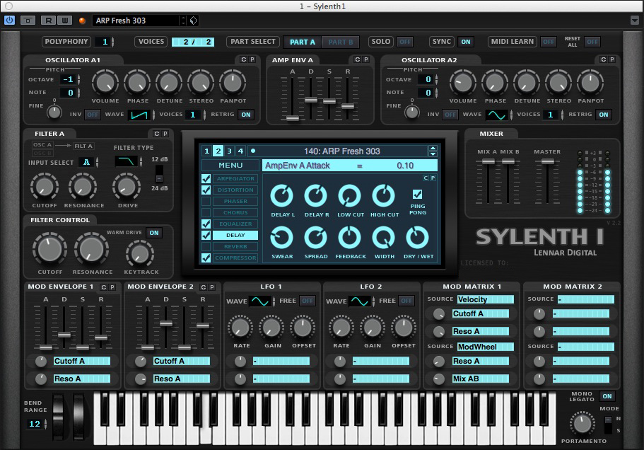
Sylenth and Z3ta2 both have ugly but functional GUIs, and both are my to-go synths.
Among the synths I have, Razor has the best combination of aesthetics and functionality.


so where did you see the complete ui?cocoazenith wrote: that new U-he Hive synth - i understand the idea but looks too much like
a H.R. Giger/geek-fantasy thingie...
audio/fault wrote:so where did you see the complete ui?cocoazenith wrote: that new U-he Hive synth - i understand the idea but looks too much like
a H.R. Giger/geek-fantasy thingie...


© KVR Audio, Inc. 2000-2024
Submit: News, Plugins, Hosts & Apps | Advertise @ KVR | Developer Account | About KVR / Contact Us | Privacy Statement

