

TAL Sampler
-
- KVRist
- 269 posts since 5 Sep, 2011
By the looks of it seems that TAL got too influenced by synths like vital, but where tabs make sense on vital where you can have lots of lfos, envelopes, fxs, filters, etc. In TAL-sampler it just slows the workflow without adding nothing new to the table.
-

- KVRAF
- 4870 posts since 19 Apr, 2002 from Utah
This comment is not aimed at any person in particular. In fact, I'm not saying anyone has said anything wrong. I'm just trying to preemptively keep the conversation constructive in case it starts to go down an unconstructive path. 
I have a tremendous amount of respect for Patrick, and I truly believe he works incredibly hard to provide the best products for his customers. If anything, may I recommend trying to stay as constructive as possible with comments and suggestions about this product? Tal-Software and Uhe are my two favorite audio software companies. I can imagine how demoralizing it would be to work hard on a shiny new update for free, just to have everyone complain. It's OK of you don't like it. It's ok to talk about it. But, please stay constructive.
I, for one, liked what I had before. At the same time, I really like the new additional features. Maybe we can come up with a suggestion for keeping what's good from what we had, while deciding the best way to add the new cool stuff, and then once we are all in agreement, we can let Patrick know our preference (as a feature request)?
Just a thought....
C/R, dongles & other intrusive copy protection equals less-control & more-hassle for consumers. Company gone-can’t authorize. Limit to # of auths. Instability-ie PACE. Forced internet auths. THE HONEST ARE HASSLED, NOT THE PIRATES.
-
- KVRist
- 269 posts since 5 Sep, 2011
I just want to make clear that I support TAL and love his products and everything I’ve said is in the best intention.
I love the tools that TAL provides and use them daily that’s why I try to give give my opinion about them when I can because I really care.
I love the tools that TAL provides and use them daily that’s why I try to give give my opinion about them when I can because I really care.
-
midi_transmission midi_transmission https://www.kvraudio.com/forum/memberlist.php?mode=viewprofile&u=298730
- KVRian
- 989 posts since 13 Feb, 2013
Absolutely. But I've not noticed any disrespect so far here. Or does anyone has a different impression?audiojunkie wrote: ↑Sat Sep 10, 2022 12:28 am I have a tremendous amount of respect for Patrick, and I truly believe he works incredibly hard to provide the best products for his customers. If anything, may I recommend trying to stay as constructive as possible with comments and suggestions about this product?
And to be honest, sometimes thing doesn't work out well even if you put a lot of effort into it. That's normal and happens to everyone. Constructive criticism is a form of respect. Without respect you would not care.
Sure, it needs to stay constructive, I fully agree and it's never wrong to remind everyone about that.
-
- KVRian
- 501 posts since 27 Oct, 2004
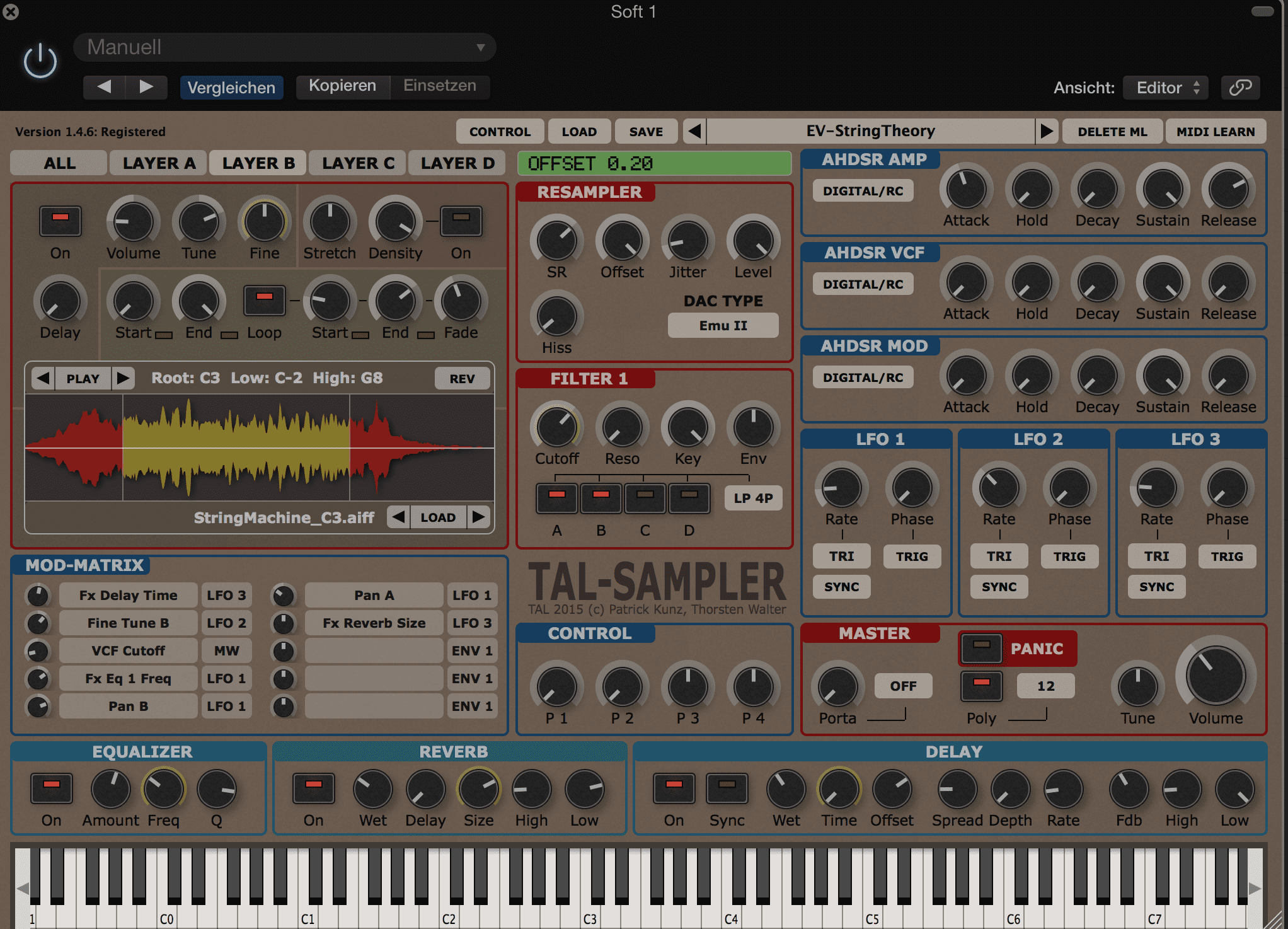
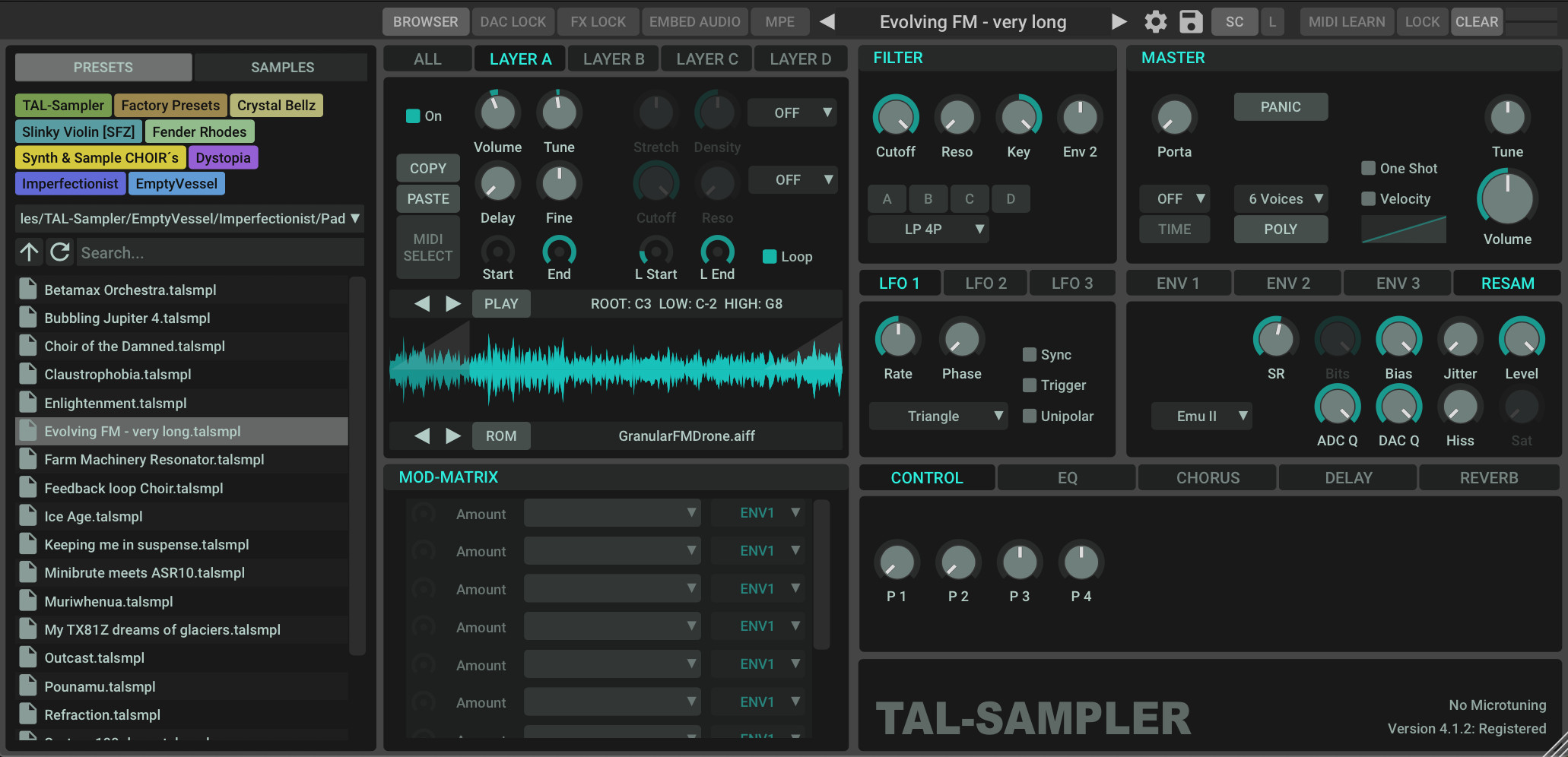
I purchased Tal Sampler only recently. My main motivation was the clean and simple UI where everything is visible at once and the resulting workflow. That's what it had over other samplers I use. With the new UI that is not the case anymore unfortunately. It looks like all the others out there and is equally cumbersome to work with now. I am sure that Patrick had very good intentions with this overhaul, but looking at the general responses I read here and elsewhere, it seems that it did not really work out well. I hope all the feedback will be considered and there will be at least an option to switch to the old GUI in a future release, since the new non-UI features are of course a great addition.
-
- KVRAF
- 8504 posts since 5 Aug, 2009
just because people dont like the new look i think it shouldnt be always seen as offensive against his works  .
.
the new GUI is really worse.... i hope Patrick will make it modular adjustable or whatever, i stick to the old version.
the new GUI is really worse.... i hope Patrick will make it modular adjustable or whatever, i stick to the old version.
DAW FL Studio Audio Interface Focusrite Scarlett 1st Gen 2i2 CPU Intel i7-7700K 4.20 GHz, RAM 32 GB Dual-Channel DDR4 @2400MHz Corsair Vengeance. MB Asus Prime Z270-K, GPU Gainward 1070 GTX GS 8GB NT Be Quiet DP 550W OS Win10 64Bit
-
- KVRAF
- 4870 posts since 19 Apr, 2002 from Utah
My comment is not in response to any previous user’s comments—I just feel it’s time to weigh in with my opinion on this update.
I’ve been looking it over and over and comparing the old and the new look. There are low level problems across OS platforms (Windows, Mac, Linux) with the way drag and drop has worked—due to differences in OS libraries that are not consistent as one would expect from a multi-platform tool. The browser is definitely an improvement there. It solves the problem that some have, even if others haven’t experienced it. I definitely like the browser. The other components are logically laid out and easily understood for the most part. The only thing I would change personally, is to re-label Env1, Env2, and Env3, to Env Amp, Env VCF, and Env Mod. Otherwise, I can’t really see the benefit of seeing everything all at once when it doesn’t relate to other components. For example, who needs to see all of the effect settings at once? Ears are used to know if there is enough or not enough of a particular effect. There is no information graph needed or used to compare one effect level against another. The only difference I see is a single added mouse click to select the tab.The added benefits and ease of use of the built in browser for those coding libraries that have drag and drop issues far outweigh the added extra mouse click. I’m not a huge fan of the black cokored theme, but as I understand it, theming colors haven’t gone away—have they? Over all, this update resolves some important problems, while still keeping everything (for the most part) just as functional. It is bound to happen and will be necessary if further features are added anyway—you cannot keep adding to the clutter without some form of space management of some type. Over all, I think the design choices were logical compromises.
Now, considering the effect on space constraints added features are going to continuously make on the overall design continuously going forward, what are constructive suggestions that can further improve on the new design? Personally, I think the changes are becoming necessary for future growth.
C/R, dongles & other intrusive copy protection equals less-control & more-hassle for consumers. Company gone-can’t authorize. Limit to # of auths. Instability-ie PACE. Forced internet auths. THE HONEST ARE HASSLED, NOT THE PIRATES.
-
midi_transmission midi_transmission https://www.kvraudio.com/forum/memberlist.php?mode=viewprofile&u=298730
- KVRian
- 989 posts since 13 Feb, 2013
-
- KVRAF
- 1525 posts since 29 Oct, 2015 from Jupiter 8
my issues with this update are not about the looks (and you can always change the color scheme anyway), but the sudden need for more clicks, scrolling, and less general overview than before.
for the moment i have no trouble staying on my old 3.x version until i'd feel missing out on too many (or too great) new features.
for the moment i have no trouble staying on my old 3.x version until i'd feel missing out on too many (or too great) new features.
The GAS is always greener on the other side!
-
 gentleclockdivider gentleclockdivider https://www.kvraudio.com/forum/memberlist.php?mode=viewprofile&u=203660
 - KVRAF
- 6113 posts since 22 Mar, 2009 from gent
I also dislike the new look , while the colours can still be changed , the knob colour and the text colour share the same colour field .
I prefer my background dark with dark knobs and white lettering , which is currently not possible .
Also , tabs for envelopes is not my cup of tea .
Really oeved the old skool look and dropped a mail to patrick , perhaps if more people do it he might think things over .
Still a superb developer , no bad word about TAL
Eyeball exchanging
Soul calibrating ..frequencies
Soul calibrating ..frequencies
-
- KVRist
- 269 posts since 5 Sep, 2011
My thoughts exactlyFapFilter wrote: ↑Sat Sep 10, 2022 8:58 pm my issues with this update are not about the looks (and you can always change the color scheme anyway), but the sudden need for more clicks, scrolling, and less general overview than before.
for the moment i have no trouble staying on my old 3.x version until i'd feel missing out on too many (or too great) new features.


