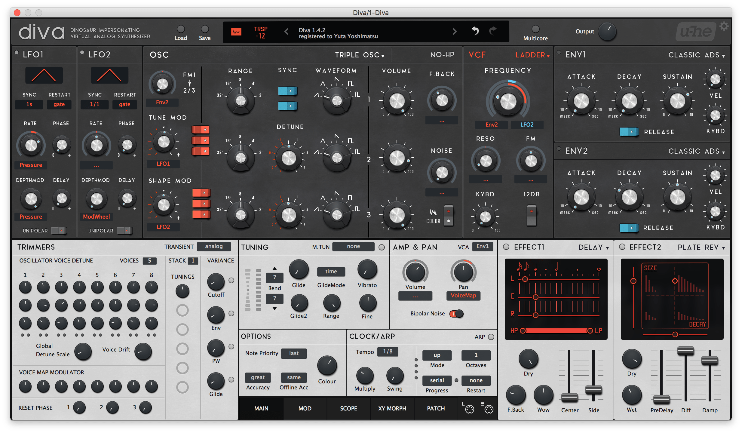
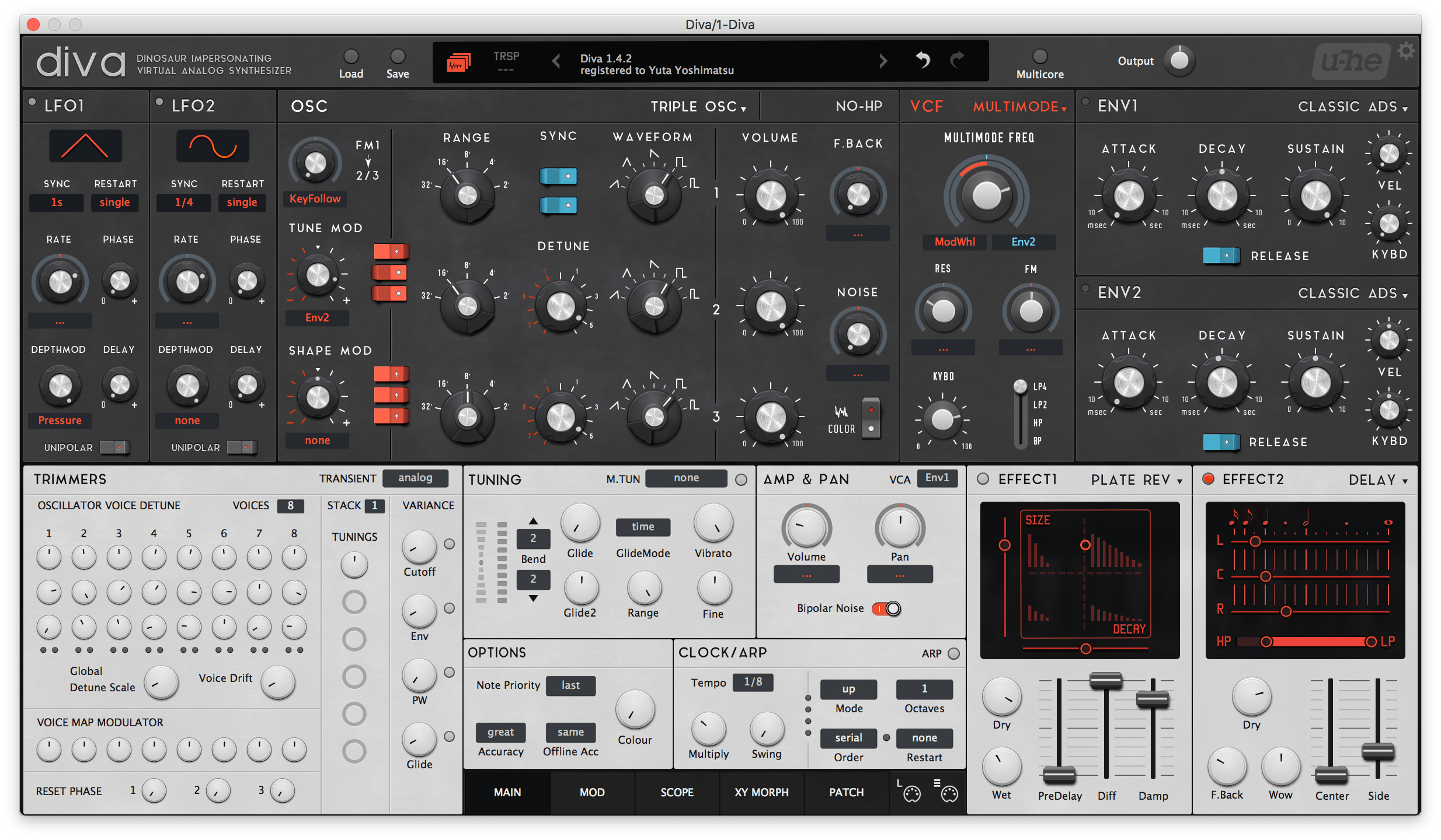
・"Massive" style modulation system.
・The new system saved the space a lot! So LFOs in the top panel.
・Trimmers in the bottom-left. Almost everything in a single pane.
・Uniformed interface never gets in your way.
・Many minor improvements.
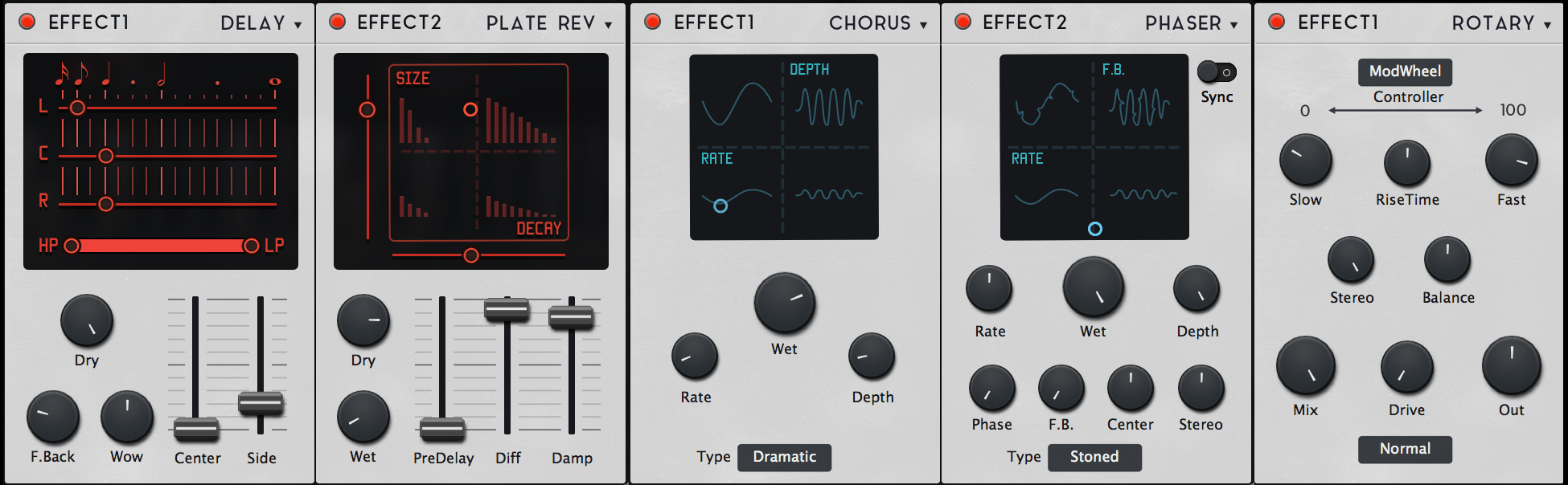
EFFECTS
are now vertical, which I think more comfortable, more like hardwares.
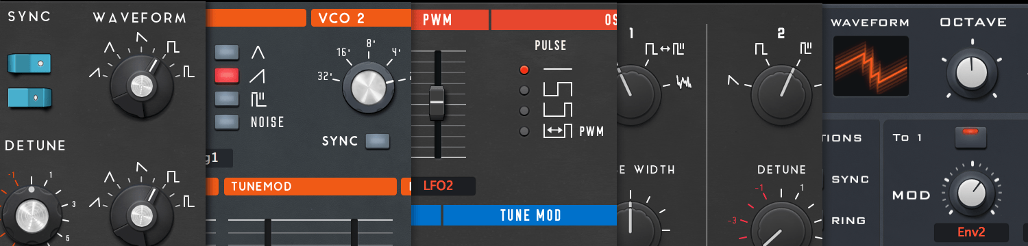
DESIGNS
Remind you of the original hardwares.
VARIATIONS
Do you need the scary dinosaurish red skin? OK! the RED skin has been added on v1.4 update.
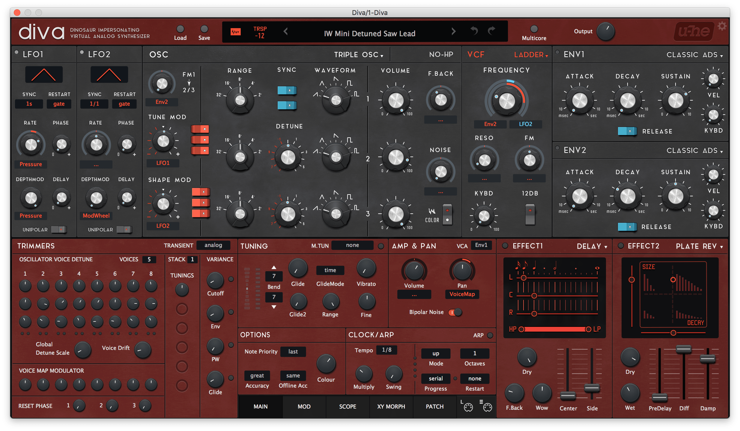
You can choose SNOW WHITE as well.
PRODUCT PAGE : https://plugmon.jp/product/aiko-for-diva/
It's commercial but there's a trial version. And it comes with a huge sound set!
Let's start the new Diva life with the new skin and the new presets.
Feedbacks are welcome!