It's even worse. I don't need this. Just I'm afraid I do want it, nevertheless...
Out Now: Filterscape 1.5 rev 15011
-
- KVRAF
- 3646 posts since 3 Nov, 2015
It's nice to see that age-old Filterscape presets are working nicely with the new version. Like for instance the presets suffixed 'SF' (1) of which I have no idea now where they come from (Groove 01 to 11, PadArp9th 01 to 04, SlowArp 01 to 03, etc...) are all working just fine.
(1) Probably German, as one of the presets is named 'Wer das liest ist doof'
(1) Probably German, as one of the presets is named 'Wer das liest ist doof'
-
- KVRist
- 459 posts since 30 May, 2019
Ahh, interesting! It's the other way around for me. Large Windows download buttons and smaller "Also available: macOS Linux"
... So u-he's website must be dynamically coded to adjust the emphasised download links to whichever OS each user happens to be browsing on. Pretty clever!
I did wonder (in passing) how u-he's product pages always seem to automatically know that I only use Windows and so put more focus on the Windows downloads than for the others. Now, I know.
-
- KVRAF
- 3646 posts since 3 Nov, 2015
That's s what I thought too since forever the Linux versions are never categorized as stable - why would u-he put them first ?MrJubbly wrote: ↑Thu Sep 14, 2023 5:17 pm Ahh, interesting! It's the other way around for me. Large Windows download buttons and smaller "Also available: macOS Linux"
... So u-he's website must be dynamically coded to adjust the emphasised download links to whichever OS each user happens to be browsing on. Pretty clever!
Clever ? Not so much. But CLAP anyways.
-
- KVRist
- 459 posts since 30 May, 2019
I meant clever as in, tailoring the marketing for each user. As in, "why yes, I do use 'X' operating system. Thankyou for making that download more accessible for me".mevla wrote: ↑Thu Sep 14, 2023 5:39 pmThat's s what I thought too since forever the Linux versions are never categorized as stable - why would u-he put them first ?MrJubbly wrote: ↑Thu Sep 14, 2023 5:17 pm Ahh, interesting! It's the other way around for me. Large Windows download buttons and smaller "Also available: macOS Linux"
... So u-he's website must be dynamically coded to adjust the emphasised download links to whichever OS each user happens to be browsing on. Pretty clever!
Clever ? Not so much. But CLAP anyways.
It's just another thing that shows that u-he care about their users and is not something you will find on many other developers websites.
There are some other developers for example, which will actually place more emphasis for an OS I don't use, (i.e. macOS) more prominently within their user download areas after I have logged in to my accounts, despite my profile already showing that I only download for Windows.
Yes, it's indeed a small minor thing, but I do always feel that it shows a lack of thought, which went into those developers user experience when they were designing their websites. They never went the extra mile, unlike u-he seem to have. That goes all the way through to each developers respective products also, imho.
- KVRian
- 1166 posts since 11 Jan, 2006 from Pittsburgh
Yeah, I never felt like I needed Filterscape, until I saw a video a few months ago of Urs showing off the new version. Now I know I do. In restrospect, now I wish I had bought it back then.
- u-he
- Topic Starter
- 28065 posts since 8 Aug, 2002 from Berlin
Hahahaha, I'm tempted to just answer this with "It's Magic!", but really I think it's a very common thing to do.
-
- KVRAF
- 3646 posts since 3 Nov, 2015
I got an early example of this when u-he gave me Filterscape way back then. As in : "you bought all of our synths so here's that last one for free". Since then on I knew it was a cool bunch of people. And it so happens that the sounds of their synths are so good, from ACE to ZebraHZ, that they remain the goto synths up to today.
-
- KVRist
- 459 posts since 30 May, 2019
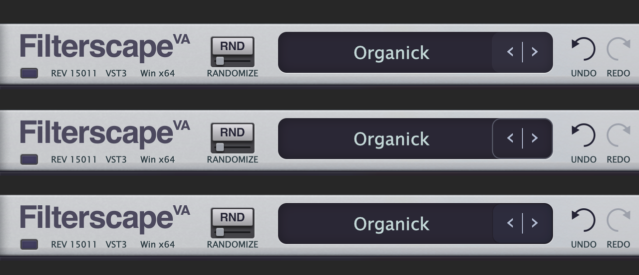
I absolutely love the new GUI design for Filterscape. However, I have one minor suggestion for (hopefully) a future update, to slightly improve useability when navigating the presets via clicking on the previous and next buttons (the left and right arrows).
I really like their positioning and how these previous and next buttons are located side by side (rather than further apart, either side of the preset name bar), as this does improve their useability, allowing fast switching between the two.
However, I have found that I am often accidentally triggering the preset pop-up menu, when I am trying to click on the the 'previous' (left-arrow) preset button, due to there being no obvious visual cue for the left-side of the 'previous' button's hitbox, to separate these two functions.
May I suggest adding a very subtle visual cue to mark the 'previous' button's hitbox? For example, something like these following mock-ups below.

i.e. Nothing too strong visually, so as not to upset the already clean aesthetic of the GUI design.
This addition would help to prevent accidentally triggering of the preset pop-up menu, when clicking on the 'previous' preset (left-arrow) button.

I really like their positioning and how these previous and next buttons are located side by side (rather than further apart, either side of the preset name bar), as this does improve their useability, allowing fast switching between the two.
However, I have found that I am often accidentally triggering the preset pop-up menu, when I am trying to click on the the 'previous' (left-arrow) preset button, due to there being no obvious visual cue for the left-side of the 'previous' button's hitbox, to separate these two functions.
May I suggest adding a very subtle visual cue to mark the 'previous' button's hitbox? For example, something like these following mock-ups below.

i.e. Nothing too strong visually, so as not to upset the already clean aesthetic of the GUI design.
This addition would help to prevent accidentally triggering of the preset pop-up menu, when clicking on the 'previous' preset (left-arrow) button.

-
- KVRAF
- 6468 posts since 17 Dec, 2009
You can easily change that yourself if you wish.MrJubbly wrote: ↑Thu Sep 14, 2023 11:00 pm I absolutely love the new GUI design for Filterscape. However, I have one minor suggestion for (hopefully) a future update, to slightly improve useability when navigating the presets via clicking on the previous and next buttons (the left and right arrows).
I really like their positioning and how these previous and next buttons are located side by side (rather than further apart, either side of the preset name bar), as this does improve their useability, allowing fast switching between the two.
However, I have found that I am often accidentally triggering the preset pop-up menu, when I am trying to click on the the 'previous' (left-arrow) preset button, due to there being no obvious visual cue for the left-side of the 'previous' button's hitbox, to separate these two functions.
May I suggest adding a very subtle visual cue to mark the 'previous' button's hitbox? For example, something like these following mock-ups below.
i.e. Nothing too strong visually, so as not to upset the already clean aesthetic of the GUI design.
This addition would help to prevent accidentally triggering of the preset pop-up menu, when clicking on the 'previous' preset (left-arrow) button.

Depends if you're on mac or PC, but you can go into either
”C:\VSTPlugins\u-he\Hive.data\Support” (i'm not sure about this one - but i think thats where default themes are)
or on mac
“Macintosh HD/Library/Application Support/u-he/Filterscape”
and then into Images/Panes and edit these files directly:
FS-Main-BG.png
Q-Main_BG.png
VA-Main-BG.png
Just do the same as in your mockup
-
- KVRist
- 41 posts since 22 Aug, 2022
Filterscape VA Demo 
https://youtu.be/8BCKgcM60V0
Feel free to share it on your social media, it's made for it
https://youtu.be/8BCKgcM60V0
Feel free to share it on your social media, it's made for it
-
- KVRist
- 129 posts since 7 Nov, 2011
I have just demoed the Filterscape VA again! It's a great upgrade!
Wish there would be knobs for Control A and Control B though.
That's because I simply cannot use Control A and B without figuring out MIDI first. Actually I also don't like MIDI. Wish Control A and B would be just standard automatable parameters (with MIDI optionally for those die hard oldschool guys). I feel this is really an oversight because with such a complex filter plugin some clever macro control is really necessary to be in control as a user. I see so many great possibilites this plugin can do but then: how on earth shall I control four cutoff knobs... If you could improve the "macro section" some more, I would definitely purchase this great plugin package!
- KVRAF
- 1904 posts since 8 Jan, 2005
I have the same problem. Since Ableton Live does not have the possibility to simply assign Knobs of its own controller (Push 2) to regular MIDI, it is impossible to map any knob on the Push 2 to Control A and Bjme-audio wrote: ↑Sun Sep 17, 2023 1:03 pm I have just demoed the Filterscape VA again! It's a great upgrade!
Wish there would be knobs for Control A and Control B though.
That's because I simply cannot use Control A and B without figuring out MIDI first. Actually I also don't like MIDI. Wish Control A and B would be just standard automatable parameters (with MIDI optionally for those die hard oldschool guys). I feel this is really an oversight because with such a complex filter plugin some clever macro control is really necessary to be in control as a user. I see so many great possibilites this plugin can do but then: how on earth shall I control four cutoff knobs... If you could improve the "macro section" some more, I would definitely purchase this great plugin package!
MacMini M2 Pro . 32GB . 2TB . . Renoise……Reason 12……Live 12 Push 2
-
- KVRist
- 129 posts since 7 Nov, 2011
Btw. the GUIs of all three plugins are alreay very fine with no additional place in between. But maybe they could be extended with a Macro Footer Area that would be common to all three plugins.


