EAReverb updated to v1.2.1

VST, AU, AAX, CLAP, etc. Plugin Virtual Effects Discussion

Should EAReverb get a new dress?

Yes, I like the new one.
16
100%
No, I don't like this new thing and I'm going to explain why I do prefer the old one.
0
No votes
 
Total votes: 16

RELATED
PRODUCTS

Post

EDIT:

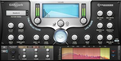
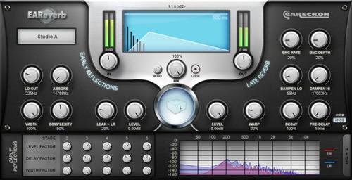
EAReverb has been updated to v 1.2.0 featuring an improved GUI (thanks for sharing your opinion about it!) and a new "Multiband Stereo" module.
This new module should help to make EAReverb sit even better in the mix by narrowing the stereo width of the low frequencies.
Of course, it can also be used for creative purposes!

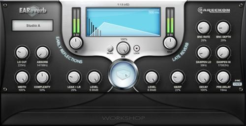
Here is a screenshot of v1.2.0:

Image

For information, Time+Space is running a sale and you can grab EAReverb for €59 from May 11 to 13, 2012 ;-)

All the best,
Philippe

--------------------------
ORIGINAL POST:

Hi everyone,

Some EAReverb users suggested the idea of an improved GUI for EAReverb.
I received these suggestions some days after the release of the ANALOG87 series (v1.1.0).

I assume a GUI update is not a major addon for most of us but while a new feature is usually not a problem for most users, updating a GUI may not be appreciated by all.
Actually, some just love the current one :oops:

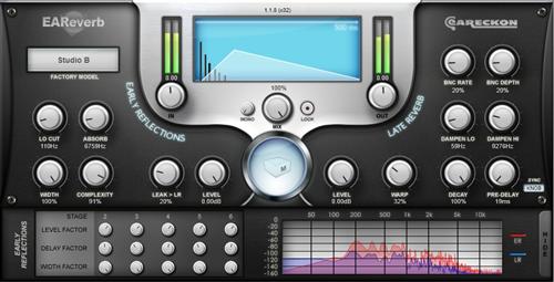
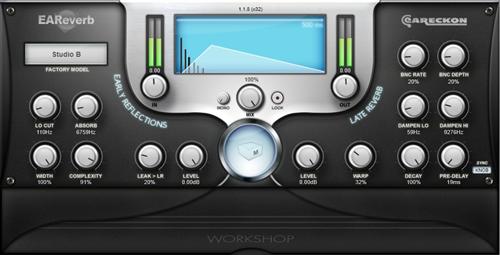
That's why I worked on something that does not modify anything related to the workflow. Shapes are the same and buttons remain unchanged. All of this is just about subtle changes (which are almost invisible on small pictures).

Again, I do not consider this eventual GUI update as a revolution and I will of course keep working on various features that will be added if they are good and user-friendly enough (Dax, I'm thinking about your suggestions) ;-)
To be honest, I was thinking that creating a thread about such a minor thing was a bit too much until I received some private messages telling me to do it... So here it is.

Please feel free to share your opinion about it in order to be sure everyone will be happy with it.

Here are the pictures:

Image
[FULL SIZE]

Image
[FULL SIZE]

All the best,
Philippe
Last edited by PFozz on Mon May 28, 2012 4:17 pm, edited 2 times in total.
Image

Post

I think the new one is a clear improvement.

A few suggestions:

1. You left out the "factory model" label.
2. The factory model selector might be better off centered horizontally on the same axis as BNC rate/depth knobs to add visual stability. (so slide it down a few pixels and add the label back in)
3. The EAReverb logo seems "floaty" and doesn't match the look of the rest of the UI, might want to try to visually glue it in, or match style with the lovely EAReckon logo.

8)
noise and beats: Negutyv Xeiro do people actually click these?
gearlust: Roland JP-8000, too much/not enough eurorack
machinecode by: u-he, Bitwig, Fabfilter, NI, et al

Post

Many thanks, xybre.
I agree on everything you said and will post a new version very soon.

All the best,
Philippe
Image

Post

Here is a modified version:

Image
[FULL SIZE]

Image
[FULL SIZE]

All the best,
Philippe
Image

Post

I also prefer the new look. This is definitely the right direction :tu:

Although the shadows under the IN and OUT controls are a little dark imo.

One thing I would add to the interface is previous/next arrows for preset selection. I'm not really a preset user, but I do appreciate the importance of quick and easy auditioning of presets. I remember this being mentioned before somewhere.

The one thing that has always puzzled me about the GUI is the envelope/ER display window. The displayed ERs occupy a tiny space in the blue box. Xtrem mode @ full width takes up just more than half the box; I think you could utilise the space a little more. Scaling them to the box may work, but that would probably require changes.

Also the envelope doesn't change shape or length, instead it moves when you adjust predelay. Maybe if it changed length with 'reverb type' and 'decay', it would visually reflect the sound better than current. Same thing with the '500ms' label; it's static. I know that you're not really into visual cues, but this sort of attention to detail can alter the perception of a plugin, imo. It's mostly psychological, I know.

Post

Why can't all the dials and knobs dealing with early reflections be on top, and the ones for the actually reverb at the buttom?
Then use the space left and right for setting coarse characteristics and quick presets perhaps?

Post

Thanks for your comments and suggestions.
the shadows under the IN and OUT controls are a little dark imo.
Right. They are too much "rounded" as well. I will correct that.
previous/next arrows for preset selection
It should be possible to add two buttons there. I will think about it.
the envelope/ER display window
This window has been formally thought to provide an easy way to set the pre-delay value and the the 2x6 "most significant" early reflections (via the workshop). I thought it could be usefull to have a visual representation of how the late reverb and early reflections "melt" together.
However, a scale/zoom feature may be a nice add-on, especially when working on a very small room (or an extremely large one). I will think about it but I'm not sure it will appear in the next update ;-)
Why can't all the dials and knobs dealing with early reflections be on top, and the ones for the actually reverb at the buttom?
Then use the space left and right for setting coarse characteristics and quick presets perhaps?
It would be a drastic modification of the interface and I'm sure some early users will not appreciate such a change. I want the interface to be as intuitive as possible. That's why advanced features can be hidden behind the bottom "Workshop" panel. In the future, I will probably add various things in the workshop. All of this will take time, though.
Actually, I even wish I could have found another place for the factory models menu (which is finally located in the ER section)...

I will come back with a new version very soon.
Thanks again!
All the best,
Philippe
Image

Post

I like the new interface, but there is also nothing wrong with the original one. I think it's a little dangerous giving everyone an opinion on the interface - as everyone has their own ideas about what the ideal interface should look like ;-)

I personally don't mind whether the background changes or not...
John Braner
http://johnbraner.bandcamp.com
http://www.soundclick.com/johnbraner
and all the major streaming/download sites.

Post

It really looks the same. Don't waste your time on such little meaningless things. We're only getting older.

Post

John,
Many thanks for your message (and your precious help over the years).

You are right about this thread being a bit risky :oops:
Actually, I have a personal preference for this new GUI but I wanted to be sure users are ok with it or at least just don't care about a possible change.
Finally, I just hope to get 0% votes for "I do prefer the old one" ;-)

Geroyannis,
Thanks for your message.
I do not want to bring major changes to the GUI. I just wanted it to be a bit more "textured". I do not plan to spend a lot of time on this minor graphical update. But well, today is a rainy sunday and I needed a pause between two very busy coding sessions (working on interfaces is something I love to do).
Actually, the ANALOG87 Series and BloXpander recently took most of my time.
Hopefully, v1.1.1 of the ANALOG87 Series is now released and a first (private) beta of BloXpander 1.3.0 should be ready soon.
I should then have the opportunity to work on my other projects (including EAReverb).

(...and to be honest, it's also a real pleasure to get some feedback from KVR members ;-) )

All the best,
Philippe
Image

Post

Hey P,
What about going down to the pub for a break? :hihi:
John Braner
http://johnbraner.bandcamp.com
http://www.soundclick.com/johnbraner
and all the major streaming/download sites.

Post

I'd better follow your tips, John.
I took a break and went to a musical instruments shop yesterday.
...no drums to try (just stacked shells, ...).
I don't know... maybe do they prepare themselves for 2012/12/21 :wink:
At least there was some coffee and Belgian chocolate.
Next time I will try a pub... it should be more difficult to pile up pool tables! :D
Image

Post

I like the old GUI, I like the new GUI.

As I said in another thread, personally I'm not a huge fan of the curvy lines on EAReverb and would prefer straight lines but as nobody else has mentioned it, I guess I'm in a minority of one.

Post

i like the new design a lot better!

there is also an update out: http://www.kvraudio.com/news/eareckon-u ... dule-18985

strangely this time i got no email about it.
Finally!

Post

Many thanks Cyphersuit!
I have not sent my newsletter yet. You should receive it soon ;-)

All the best,
Philippe
Last edited by PFozz on Sun Mar 30, 2014 3:30 pm, edited 1 time in total.
Image

Post Reply

Return to “Effects”