
May be a few things can be optimized, but it looks definitly better than before!
Thanks to you guys!


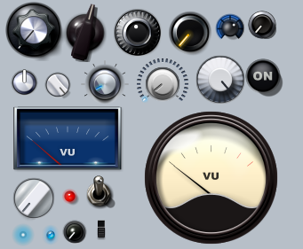


 (click to enlarge)


 [/url]
 Put something like this as a .bmp into the texture folder and apply the texture to the knob (30% or so).Filch wrote:
comments, changes, suggestions welcome
"Lighting - Specular": 0 deg, 20%Filch wrote:I've also made my first attempt at a trying to copy the horizontal sliders from the Largo UI. I can't seem to get it quite right. The red bar doesn't look as curved or as glassy, or rich in redness. I can't quite dial that in.

You probably want to add a custom texture to them to make the surface appear less smooth and give it a brushed (or whatever that's called) look. You could try something as simple as noise with a "spin" blur (usual you find what you need from under radial blur).Filch wrote:
comments, changes, suggestions welcome
WOK wrote: Put something like this as a .bmp into the texture folder and apply the texture to the knob (30% or so).
I reduced the offset of the shadow and it's not as pronounced now. I wanted to make the knob look taller by offsetting the knob shadow more, but since it's just a circle, once it gets too far out it doesn't work anymore.mystran wrote: You probably want to add a custom texture to them to make the surface appear less smooth and give it a brushed (or whatever that's called) look. You could try something as simple as noise with a "spin" blur (usual you find what you need from under radial blur).
Also the inner shadow with the outer ring is probably overdone, as it makes it look as if the outer ring is as high as the knob itself.
But yeah, not bad at all.
The lighting trick worked well enough for me. I tried the layered trick but I couldn't quite get it to look right. It would get too hard to see the slider ticks beneath. I'll have to try experimenting more with that.WOK wrote:"Lighting - Specular": 0 deg, 20%Filch wrote:I've also made my first attempt at a trying to copy the horizontal sliders from the Largo UI. I can't seem to get it quite right. The red bar doesn't look as curved or as glassy, or rich in redness. I can't quite dial that in.
or make it darker, copy the object, make the upper copy a little smaller, with lighter color and blur it.
Place a third copy over it, make it bigger, blur it max. and Alpha 40% or so.

© KVR Audio, Inc. 2000-2024
Submit: News, Plugins, Hosts & Apps | Advertise @ KVR | Developer Account | About KVR / Contact Us | Privacy Statement