Many of the images here are very large I would guess 60-100px. I understand that we make them large and then reduce the size, but a good deal of detail is still lost when that is done, fine lines and subtle shadows make no quantifiable difference at 34px. Normally I reduced knobs to about 24-40px and place the shadows on the background when I can (as Mr. Sanford just pointed out above for the faders). As about 89% of my stuff is done exclusively for the Reaktor instruments that I make, I am always obsessed how much monitor space I am consuming, I need to keep things extremely small so that I can have multiple instruments displayed at one time. So I am always aiming for something smaller and more compact even if that means getting rid of subtle details, simply a condition of the program that I am using, although its also helpful when working in Cubase and not just Reaktor in stand-alone.
1. What's the normal size of the knobs that you guys use.
2. Do you worry much about the amount of monitor space that is consumed by the plug-in.
Although I think the example skin above is lovely, and I understand that it was just to work things out, it's far too big for anything I would use in Reaktor, I would have made it less then half that size, especially for an FX. That would make buttons and lamps around 12-16px and the knobs not much over 26-30px. I, myself, did make something's that size but only because I wanted to make special details, like vibrating speakers to create a sense of an amp cab, but then offered a version that was a third of the size with no special CPU consuming tricks as the cool one had no real purpose for the monitor size it consumed it was just for fun.
I have to ask as I don't use much beyond Reaktor. Most of the plug-ins I that I use beyond Reaktor do consume a good deal of my monitor and it's a drag after being able to access 5-10 things at one time, the way I do in Reaktor, without overlapping anything. Just curious if this is something that is of concern here, how it's approached and managed. Do you simple make the skin the size that makes it look best or do you reduce the size so that it optimizes monitor space. Then there are the concerns for people who don't have 20/20 vision or higher, I can make it as small as an ant but no one would want to try and see it.
So guess what I am asking is where do you draw the line between detail and actual space used?

KnobMan/SkinMan Examples
-

- KVRAF
- 2117 posts since 24 Feb, 2004 from Germany


-
- KVRian
- 774 posts since 1 Oct, 2006
That is a good challenge for practice. I love those foot switches had to try that part out as well.Leslie Sanford wrote:More UI practice
The original
Done with KnobMan/SkinMan:
Turned out pretty well. The footswitches are the biggest weakness. Those round LED buttons... they look a little funny. That's all I'm sayin'.
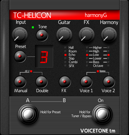
Those beveled chrome pieces are a pain the butt to get.
Last edited by Hlis93 on Thu Jun 18, 2009 3:29 am, edited 1 time in total.
-
Leslie Sanford Leslie Sanford https://www.kvraudio.com/forum/memberlist.php?mode=viewprofile&u=131095
- KVRAF
- Topic Starter
- 1640 posts since 4 Dec, 2006
I would say less than half of the size I post here.Hlis93 wrote: 1. What's the normal size of the knobs that you guys use
Absolutely. I learned this lesson with Cobalt. Its initial UI was large. Enough people complained about it till we did a much smaller version.2. Do you worry much about the amount of monitor space that is consumed by the plug-in.
For me the biggest challenge for making the size of the UI economical is making the text readable. grymmjack commented on this upthread. I'm convinced that text on software UI's needs to be proportionally larger in relationship to the controls they label than they do with actual hardware.
Take a picture of any hardware device. Scan it in and reduce its size to that it fits comfortably on the screen. The knobs, switches, sliders, etc. may still be large enough to be useable, but I'm betting the text will be almost unreadable.
Also, space considerations help determine what kind of control to use. While a switch with multiple choices would work on a hardware device, it may get too crowded on a software UI. In which case a different control may be called for such as a drop down box.
Anyway, I'm still a noob, and what I'm finding is that most of my initial efforts at designing a UI result in them being too large. This is definitely an issue I'm interested in.
-
Leslie Sanford Leslie Sanford https://www.kvraudio.com/forum/memberlist.php?mode=viewprofile&u=131095
- KVRAF
- Topic Starter
- 1640 posts since 4 Dec, 2006
Very nice!Hlis93 wrote: took another shot at it...

-
- KVRian
- 774 posts since 1 Oct, 2006
Yes, the text is so frustrating for me.Leslie Sanford wrote: I'm convinced that text on software UI's needs to be proportionally larger in relationship to the controls they label than they do with actual hardware.
1. Because it needs to be legible to others.
2. Two because abbreviations can look very silly and mess the flow of the controls up.
I struggle with that all the time. I will do the skin for myself first but then spend hours trying to think of myself as someone else asking if I understand what going on.
When I can, I like use panel elements that are very realistic but they are very large in size at 50-80px to retain the detail necessary, this also increase the relative size of everything else to retain a sense of proportion…so not good most of the time. This detail is where I normally compromise. For me a relatively simple knob, fader, buttons that are small yet easy to recognize their indicator line for the needed information is more effective. I do try to match that with a very clean background that is detailed and realistic looking; personally I feel it makes up of the lack of details in the panel elements and works out alright.Leslie Sanford wrote:Also, space considerations help determine what kind of control to use. While a switch with multiple choices would work on a hardware device, it may get too crowded on a software UI. In which case a different control may be called for such as a drop down box.
-----------------------------------------
side personal rant...
I looked at the upper-end UI's with all the 3D stuff and I feel they are making the opposite choice focusing on large 3D and realistic panel elements and mute or not so detailed backgrounds. They look impressive but I personally am not convinced. I did some work with the 3D modeling and just didn't really feel the pay off once I had it all reduced to a size I could use. It forced me to altar clarity of everything for spiffy 3D appearance, that I honestly feel now isn't practical or needed for a plug-in but I guess in justifies the $$$.
-
Leslie Sanford Leslie Sanford https://www.kvraudio.com/forum/memberlist.php?mode=viewprofile&u=131095
- KVRAF
- Topic Starter
- 1640 posts since 4 Dec, 2006
An attempt at rendering both slider thumb and track bar in KnobMan:

Slider with Track
I prefer rendering the track as part of the background, but to include a track effect like the light meter, you really have to render both in KnobMan.
Slider with Track
I prefer rendering the track as part of the background, but to include a track effect like the light meter, you really have to render both in KnobMan.
-
- KVRist
- 144 posts since 10 Nov, 2005 from Dortmund, Germany
let's talk about numbers in knobman!
Is it possible to get number strips with left- or right-aligned numbers?
ciao herw
Is it possible to get number strips with left- or right-aligned numbers?
ciao herw
-
- KVRian
- 897 posts since 9 Aug, 2004 from Rome, Italy
Absolutely right:Leslie Sanford wrote:Take a picture of any hardware device. Scan it in and reduce its size to that it fits comfortably on the screen. The knobs, switches, sliders, etc. may still be large enough to be useable, but I'm betting the text will be almost unreadable.
Any audio rack is 450 mm.wide - my 19 inches monitor is just 380 mm !!!
"For some reason everyone on this site hates Roger Nichols, loves Zebra, doesn't need a Virus (unless it's TI), uses Reaper, and thinks the Kaoss pad is cool: remember these rules and you'll be popular." (blackboyrockinit)
-
- KVRian
- 774 posts since 1 Oct, 2006

Heres the link to the panel elements. They are just pngs compiled from the original knobman creation and edited in Photoshop. I resized and exported them from knobman. There are some funny artifacts in the knob due to the fact that I didn't spend much time on editing them, if you look close when it rotates you can see that the highlights jitter about 1px or so. I havent had the time to fix it yet.
http://www.box.net/shared/tqtxhqyg3q
Last edited by Hlis93 on Mon Nov 17, 2008 7:51 pm, edited 1 time in total.
-
- KVRian
- 774 posts since 1 Oct, 2006
I gave up on that. Depending on what you need to do it is easier to use a PNG file and the animask tool.herw wrote:let's talk about numbers in knobman!
Is it possible to get number strips with left- or right-aligned numbers?
ciao herw
Last edited by Hlis93 on Thu Jun 18, 2009 3:30 am, edited 1 time in total.
-
- KVRian
- 774 posts since 1 Oct, 2006
In the example skin I made just the font is not even large enough to be clear and thats at 24px. The skin is the max size I would use for such a thing so the problem is clear when it comes to font size, smaller panel elements to make room for fonts.Acrobat wrote:Absolutely right:Leslie Sanford wrote:Take a picture of any hardware device. Scan it in and reduce its size to that it fits comfortably on the screen. The knobs, switches, sliders, etc. may still be large enough to be useable, but I'm betting the text will be almost unreadable.
Any audio rack is 450 mm.wide - my 19 inches monitor is just 380 mm !!!
_________
"For some reason everyone on this site hates Roger Nichols, loves Zebra, doesn't need a Virus (unless it's TI), uses Reaper, and thinks the Kaoss pad is cool: remember these rules and you'll be popular." LOL I don't have Zebra, I have a Virus(A), I don't like Reaper, and I didn't know who Roger Nichols was until now so can't hate him. I guess I need to sign out and go away.
-
- KVRAF
- 7879 posts since 16 Apr, 2003 from -on the outside looking in
Well, I really should be sharing, but I can't compete with the realistic/vintage stuff: I just don't know it very well  I have benefited greatly from this community, so I'll upload some of my wacky.
I rehashed some LED's to something I really like - think they work well at a number of sizes
Red LED

Red LED Small

Blue LED
Blue LED Small
And some steampunk stuff I was toying with.
VUMeter
Marble Knobs (left is label=I did an ADSR series)
Reticle Knob -looks good on black (scalloped out)
I rehashed some LED's to something I really like - think they work well at a number of sizes
Red LED
Red LED Small
Blue LED
Blue LED Small
And some steampunk stuff I was toying with.
VUMeter
Marble Knobs (left is label=I did an ADSR series)
Reticle Knob -looks good on black (scalloped out)
Last edited by ouroboros on Tue Nov 18, 2008 9:53 pm, edited 3 times in total.
..what goes around comes around..