

In no particular order:
Omnisphere
Synplant
Bazille (forthcoming)
Iris
Unicorn Spew

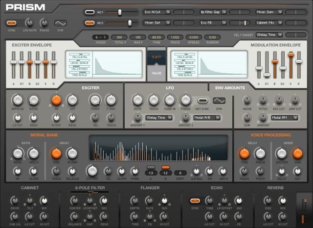
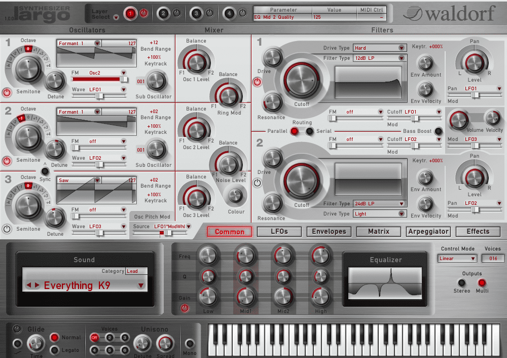
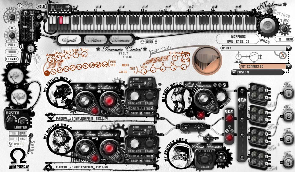
Top 5 Most Beautiful Virtual Synth Interfaces
-
- KVRAF
- 5524 posts since 5 May, 2007 from Mars Colony



"You don’t expect much beyond a gaping, misspelled void when you stare into the cold dark place that is Internet comments."
---Salon on internet trolls attacking Cleveland kidnapping victim Amanda Berry
---Salon on internet trolls attacking Cleveland kidnapping victim Amanda Berry
-
- KVRian
- 900 posts since 5 Jun, 2001
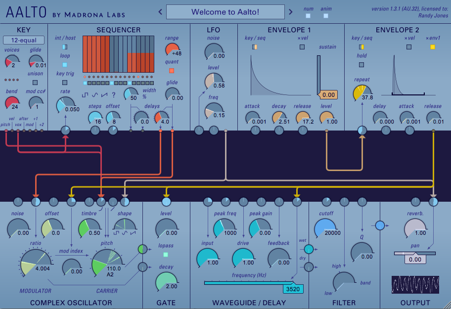
aalto has a lovely interface, i wish all synths that have patch cables handled them the way aalto does
-

- KVRAF
- 37518 posts since 14 Sep, 2002 from In teh net
I miss the black and red skin - the beige one is boring imho.cryophonik wrote:

-
- KVRAF
- 37518 posts since 14 Sep, 2002 from In teh net
-
- KVRAF
- 37518 posts since 14 Sep, 2002 from In teh net

-

- KVRAF
- 25849 posts since 20 Jan, 2008 from a star near where you are
-
- KVRAF
- 37518 posts since 14 Sep, 2002 from In teh net
-
- KVRAF
- 2065 posts since 14 Sep, 2004 from $HOME
Charlatan. A synth I only recently discovered but took to instantly because of the clear, uncluttered layout, the big knobs, readable labels and switches that precisely display what state they're in. I like that. I will gladly swap any spectacular designed Vst with hyper real 3D graphics for an average looking one with big knobs and big type. I cannot help it, I'm heading forty and have bad eyesight...
After checking out many plugins (synths and effects, free and commercial) in the past weeks just for fun, this is something I noticed: a lot of them lack usability in my opinion, mostly they don't follow my favorite design principle " form follows function". In a way I can understand that, because in a competitive market you try to stand out, and visuals are a very important part of that (those people who say that thy don't care for looks, they care only for inner values are lying :*)
Nevertheless, I just hate tiny knobs and switches where you have to guess whether they are clicked or not.
BTW: not an instrument, but I totally like the also-recently-discovered Valhalla products and bought the vintageverb mainly because of the looks (it being a great reverb and excellent bargain for 50 bucks helped, sure...)
After checking out many plugins (synths and effects, free and commercial) in the past weeks just for fun, this is something I noticed: a lot of them lack usability in my opinion, mostly they don't follow my favorite design principle " form follows function". In a way I can understand that, because in a competitive market you try to stand out, and visuals are a very important part of that (those people who say that thy don't care for looks, they care only for inner values are lying :*)
Nevertheless, I just hate tiny knobs and switches where you have to guess whether they are clicked or not.
BTW: not an instrument, but I totally like the also-recently-discovered Valhalla products and bought the vintageverb mainly because of the looks (it being a great reverb and excellent bargain for 50 bucks helped, sure...)
Last edited by fese on Mon Apr 15, 2013 11:44 am, edited 1 time in total.
-
- KVRAF
- 25849 posts since 20 Jan, 2008 from a star near where you are
Maybe, but the logo doesn't fit the GUI, remove that and it would look much better.aMUSEd wrote:Not when it's moving.
Last edited by Numanoid on Mon Apr 15, 2013 10:42 am, edited 1 time in total.
-
- KVRAF
- 25849 posts since 20 Jan, 2008 from a star near where you are

-
fluffy_little_something fluffy_little_something https://www.kvraudio.com/forum/memberlist.php?mode=viewprofile&u=281847
- Banned
- 12880 posts since 5 Jun, 2012
Yep. When a user interface impresses me at first glance, it usually sucks in terms of usability. I am a bit older than you and also don't feel like staring at a control label for 5 seconds and guessing what it might say. Many developers seem to have no clue of fonts, size, contrast, etc. (I never used Rapture, but judging from the screenshot below it is way too dark, Diva also seems to use some tiny labels...)fese wrote:Charlatan. A synth I only recently discovered but took to instantly because of the clear, uncluttered layout, the big knobs, readable labels and switches that precisely display what state they're in. I like that. I will gladly swap any spectacular designed Vst with hyper real 3D graphics for an average looking one with big knobs and big type. I cannot help it, I'm heading forty and have bad eyesight...
After checking out many plugins (synths and effects, free and commercial) in the past weeks just for fun, this is something I noticed: a lot of them lack usability in my opinion, mostly they don't follow my favorite design principle " form follows function". In a way I can understand that, because in a competitive market you try to stand out, and visuals are a very important part of that (those people who say that thy don't care for looks, they care only for inner values are lying :*)
Nevertheless, I just hate tiny knobs and switches where you have to guess whether they are clicked or not.
BTW: not an instrument, but I totally like the also-recently-discovered Valhalla products and bought the vintageverb mainly because of the looks (it being a great reverb and excellent bargain for 50 bucks helped, sure...)
I guess one of the culprits is the fact that most windows cannot be resized, forcing developers to find a compromise, which of course won't work when some people use 14" notebooks while others use 24" monitors.
-
- KVRAF
- 10171 posts since 2 Jan, 2005 from somewhere in the woods



and

"It dreamed itself along"
-
- KVRAF
- 2065 posts since 14 Sep, 2004 from $HOME
Maybe, but even 14" notebooks nowadays have quite high resolution and even with 1024x768 you can use readable font sizes (or is it "legible"? I don't know the difference...) . I think one problem is also that the Plugin SDKs offer no help at all regarding UI programming.fluffy_little_something wrote:
Yep. When a user interface impresses me at first glance, it usually sucks in terms of usability. I am a bit older than you and also don't feel like staring at a control label for 5 seconds and guessing what it might say. Many developers seem to have no clue of fonts, size, contrast, etc. (I never used Rapture, but judging from the screenshot below it is way too dark, Diva also seems to use some tiny labels...)
I guess one of the culprits is the fact that most windows cannot be resized, forcing developers to find a compromise, which of course won't work when some people use 14" notebooks while others use 24" monitors.
And yes, Diva's text labels are also quite small and fuzzy, which still annoys me, but hey, sometimes you have to cave in to the sound...
-
- Waaaaahhh
- 2224 posts since 30 Jul, 2001 from montreal, quebec,canada
i really dig Absynth's Gui
If your plugin is a Synth-edit/synth-maker creation, Say So.
If not Make a Mac version of your Plugins Please.
https://soundcloud.com/realmarco
...everyone is out to get me!!!!!!!
If not Make a Mac version of your Plugins Please.
https://soundcloud.com/realmarco
...everyone is out to get me!!!!!!!