Making music artwork. Alternatives to Adobe?
-

- KVRer
- 12 posts since 5 Feb, 2026 from Arizona
Anyone try arcbrush?
-

- GRRRRRRR!
- 17699 posts since 14 Jun, 2001 from Somewhere you're not!
Wow! That looks f**king great. It seems to have a really useful toolset and the flexibility of a node-based set-up is not to be underestimated. And I like the idea of one-off payments for AI, rather than a monthly subscription. I bought a (second-hand) laptop last week, this is going on it as soon as I get the upgraded SSD into it. Thanks for the heads-up.
ARCBRUSH
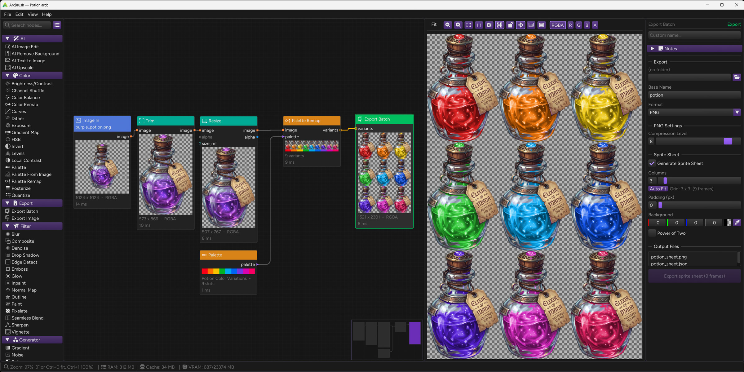
ARCBRUSH
NOVAkILL : Legion GO, AMD Z1x, 16GB RAM, Win11 | Audient EVO 8 | Lumi Keys | Studio Pro 8
Korg Odyssey, bx-oberhausen, Proxima, PolyMax, GR8, JP6K, Union, Atomika,
Invader 2, Flow Motion, Olga, TRK 01, Thorn, Spire, VG Iron
Korg Odyssey, bx-oberhausen, Proxima, PolyMax, GR8, JP6K, Union, Atomika,
Invader 2, Flow Motion, Olga, TRK 01, Thorn, Spire, VG Iron
-
- GRRRRRRR!
- 17699 posts since 14 Jun, 2001 from Somewhere you're not!
Photoshop used to be the same. I installed GIMP a few months ago. I opened it a coupe of times but it's been too long for me, too, I just can't be bothered. As much as I really don't like Photoshop, I know it inside out and it makes sense to keep using it.GaryG wrote: Sat Nov 01, 2025 5:52 pmI found some GIMP project files from ~17 years ago on a backup recently so I've given it many gos over the years but still it just doesnt click for me. I just find it so unintuitive, adding alpha channels before you can cut things out(?) and stuff.
Blender's development has been incredible. I first started playing around with it in 1999-2000. I bought the tutorial book and CD-ROM and did all the tutorials but the usability just wasn't there. I basically forgot about it for 20 years and when I rediscovered it, it absolutely blew me away. And the pace of development is mind-blowing. The business model they have now seems to really work for them and their customers. It's the gold-standard of what open source should be (but almost never is).satYatunes wrote: Sat Nov 01, 2025 8:07 pmThe only open source app that I like is Blender and it has come a long way.
I gave both their apps a red-hot go but I don't like their workflow any more than Photoshop's. It feels a bit more like CorelPAINT but, overall, I feel like I wasted money on them. I haven't installed them in years and couldn't justify the upgrade price to v2. Free seems to be about what they are worth to me.Now that Affinity is free, anyone who wants jump from Adobe or any other app should give it a try. Affinity Designer is a fantastic program.
NOVAkILL : Legion GO, AMD Z1x, 16GB RAM, Win11 | Audient EVO 8 | Lumi Keys | Studio Pro 8
Korg Odyssey, bx-oberhausen, Proxima, PolyMax, GR8, JP6K, Union, Atomika,
Invader 2, Flow Motion, Olga, TRK 01, Thorn, Spire, VG Iron
Korg Odyssey, bx-oberhausen, Proxima, PolyMax, GR8, JP6K, Union, Atomika,
Invader 2, Flow Motion, Olga, TRK 01, Thorn, Spire, VG Iron
-

- KVRist
- 488 posts since 24 Feb, 2008 from Germany
The (nearly) unchangeable grey in grey theme in Affinity Canva is killing me. Same as with Blender and the monochrome icons. I get headaches after ten minutes in both. My old eyes needs contrast. Lucky me that i still have Affinity Photo. And Bforartists ...
“The biggest crime of a musician is to play notes instead of making music.”
Isaac Stern
Isaac Stern
-

- KVRAF
- 8465 posts since 29 Sep, 2010 from Maui
Arcbrush would be cool if it did animation. For compositing, nodes are cool, for actual painting I don't think so. They are great for brushes though, like they are in BlackInk for example. IMO, YMMV
https://blackink.bleank.com/
https://blackink.bleank.com/
-
- GRRRRRRR!
- 17699 posts since 14 Jun, 2001 from Somewhere you're not!
Not everybody paints. Black Ink looks really good, too, but the toolset in ArcBrush is much more aligned to the kind of graphic design work I do.
The thing is, lots of contrast is bad for working with colour and images. You need neutral greys so you can get a clear perspective on how the thing you are working on actually looks. There is a SMPTE standard on user interface design that goes right into the nitty-gritty of it.Tiles wrote: Thu May 21, 2026 6:55 amThe (nearly) unchangeable grey in grey theme in Affinity Canva is killing me. Same as with Blender and the monochrome icons. I get headaches after ten minutes in both. My old eyes needs contrast. Lucky me that i still have Affinity Photo. And Bforartists ...
NOVAkILL : Legion GO, AMD Z1x, 16GB RAM, Win11 | Audient EVO 8 | Lumi Keys | Studio Pro 8
Korg Odyssey, bx-oberhausen, Proxima, PolyMax, GR8, JP6K, Union, Atomika,
Invader 2, Flow Motion, Olga, TRK 01, Thorn, Spire, VG Iron
Korg Odyssey, bx-oberhausen, Proxima, PolyMax, GR8, JP6K, Union, Atomika,
Invader 2, Flow Motion, Olga, TRK 01, Thorn, Spire, VG Iron
-
- KVRist
- 488 posts since 24 Feb, 2008 from Germany
Yeah, that's what they want you to believe. Photoshop worked just well with its initial bright interface. I've been there 
Mh, i think there is a misunderstanding here. Unfortunately, I have to go into a bit of detail.
One of the old golden rules long before SMPTE discussions was having at least around 160 greyscale steps of contrast between icon / text and background for solid readability. (which is why it is a bad idea to start with a neutral background of 128 of 255 greyscales, you are already below this value). And while some of those older UIs were arguably ugly, they were often far more readable.
The original idea behind neutral grey UIs was reducing visual bias while still keeping controls clearly readable. Unfortunately, in quite a few modern apps this somehow turned into making the UI nearly invisible. And not longer readable at all. A lot of creative software completely overdoes it with dark grey on slightly different dark grey, ultra thin fonts, low contrast icons, and barely visible states.
That does not reduce eye strain. It increases it, because your eyes constantly have to search and decode the interface. And the reason is the lack of contrast. And also lack of color. Color coding can help so much.
Good ergonomic UI design is not about turning the screen into a glowing white flashlight or a Christmas tree or making it completely invisible. That's the two extremes. It is about maintaining enough contrast for instant readability while keeping the overall interface subdued enough that it does not constantly feel aggressive or overwhelming. (There is more that you can do here, proper grouping with enough whitespace, tools in hierarchies instead everything top UI level, and much more. But that's another issue then)
The real challenge is finding that balance, and unfortunately this is exactly where discussions tend to turn into a kind of belief war.
But there are rules that you can follow. To pick two online available sources:
https://developer.mozilla.org/en-US/doc ... _Luminance?
https://uinica.com/contrast-ratio-in-ui/
And this is exactly the problem of Blender and Affinity Canva. There is a reason why I get headaches after ten minutes in them. Even an SMPTE designed UI can have a good readabilty. These two are not.Low Contrast vs High Contrast in UI
Low contrast interfaces often rely on subtle color differences, such as light gray text on white backgrounds. While visually minimal, these designs can reduce reading speed by nearly 40 percent and significantly increase eye strain. Users may miss critical information or interactive elements without realizing why.
“The biggest crime of a musician is to play notes instead of making music.”
Isaac Stern
Isaac Stern
-
- KVRAF
- 8465 posts since 29 Sep, 2010 from Maui
I haven't tried the latest in a while, but you can make blender look however you want pretty much. You can make it do, whatever you want actually, if properly knowledgeable.
-
- KVRist
- 488 posts since 24 Feb, 2008 from Germany
Ah no, the monochrome icons remains monochrome 
Well yeah, you can change the source code. We at Bforartists are doing exactly that since 2015. At the icons, and so much more.
Well yeah, you can change the source code. We at Bforartists are doing exactly that since 2015. At the icons, and so much more.
“The biggest crime of a musician is to play notes instead of making music.”
Isaac Stern
Isaac Stern
-
- KVRAF
- 8465 posts since 29 Sep, 2010 from Maui
Never had a problem with it myself. I actually liked the old UI, back when it was still owned by Not a Number. Was kinda funky, but easy once you got used to it. I still use the original blender mappings.
-
- KVRist
- 488 posts since 24 Feb, 2008 from Germany
2.xx? It had no UI to speak of, just a hotkey list and the occasional graphical experiment gone wrong. Just to remember, see attachment. I came from trueSpace, that's what one could call a graphical UI. I loved to work with it. And it was me a pleasure to be even a beta tester for a while.
But yeah, we drift a bit offtopic here
In the end allowed is what works.
But yeah, we drift a bit offtopic here
In the end allowed is what works.
You do not have the required permissions to view the files attached to this post.
“The biggest crime of a musician is to play notes instead of making music.”
Isaac Stern
Isaac Stern
-
- KVRAF
- 8465 posts since 29 Sep, 2010 from Maui
Heh that's it. I never used it for much back then. Mostly I worked with Maya or Softimage.Tiles wrote: Fri May 22, 2026 8:28 am 2.xx? It had no UI to speak of, just a hotkey list and the occasional graphical experiment gone wrong. Just to remember, see attachment. I came from trueSpace, that's what one could call a graphical UI. I loved to work with it. And it was me a pleasure to be even a beta tester for a while.
But yeah, we drift a bit offtopic here
In the end allowed is what works.
Anyway, a long time ago...
-
- KVRist
- 488 posts since 24 Feb, 2008 from Germany
Softimage <3
I had the modtool installed for a while. trueSpace lacked a few things ...
I had the modtool installed for a while. trueSpace lacked a few things ...
“The biggest crime of a musician is to play notes instead of making music.”
Isaac Stern
Isaac Stern
-
- GRRRRRRR!
- 17699 posts since 14 Jun, 2001 from Somewhere you're not!
I'm a 3D Studio Max guy. I used it from v1.2 up to about v 2009. I haven't touched it in 12 or 13 years but I guarantee I could get on it again tomorrow and be productive straight away. (Maybe not a new version but certainly an old one from 2009.) It's baked into my brain. OTOH, I have been keeping my Blender installs up to date for the last 4 or 5 years but all I ever do is fiddle around. It would take me months to be proficient with it but who has the time?
See, even though the text is half the size of the text in the forum, it is still perfectly legible.
Yeah, scientists and engineers, what the f**k do they know, right? It works and the proof is in any of the hundreds (thousands?) of optical illusion memes out there. Of course, lighting is also key but nobody seems to pay much attention to that, either. Unless/until you get into the serious end of the business, like Industrial Light & Magic, Weta Digital, Digital Domain, etc. Those guys take it all very seriously.Tiles wrote: Fri May 22, 2026 6:01 amYeah, that's what they want you to believe. Photoshop worked just well with its initial bright interface. I've been there
Under what lighting conditions? You're talking generalities, professional software is not for use in well lit rooms or broad daylight and professionals shouldn't be working in those conditions. It's too fatiguing. Control the lighting and you don't need nearly as much contrast. And when you're working with colour, don't you think you have prioritise the images you're working on over ultimate utility of your GUI?One of the old golden rules long before SMPTE discussions was having at least around 160 greyscale steps of contrast between icon / text and background for solid readability.
Can you give an example because it's not something I have ever encountered. Studio Pro lets you play around with it yourself, so I suppose t is possible to make it unusable but that's just down to personal preference. I just use a shade of grey that doesn't hurt my eyes during long sessions, which turns out to be a bit darker than neutral, but not much.Unfortunately, in quite a few modern apps this somehow turned into making the UI nearly invisible.
I imagine that's so the Ui gets out of the way, allowing you to concentrate on the content. But, again, it's not something I can recall encountering.And not longer readable at all. A lot of creative software completely overdoes it with dark grey on slightly different dark grey, ultra thin fonts, low contrast icons, and barely visible states.
You either need to overhaul your working environment or get an eye test because Blender is NOT greyscale, icons are coloured, and the contrast between the background and text elements is, if anything, excessive. Seriously, the text and icons are tiny on my monitor but easily legible from my longer than normal viewing distance (90cm, about 50% further than at work).And this is exactly the problem of Blender and Affinity Canva. There is a reason why I get headaches after ten minutes in them. Even an SMPTE designed UI can have a good readabilty. These two are not.
See, even though the text is half the size of the text in the forum, it is still perfectly legible.
You should have seen it before v2. The whole UI was drawn using OpenGL and you could zoom in and out of toolbars just like they were viewports. It's was very weird and particularly ugly.pekbro wrote: Fri May 22, 2026 8:37 amHeh that's it. I never used it for much back then. Mostly I worked with Maya or Softimage. Anyway, a long time ago...
You do not have the required permissions to view the files attached to this post.
NOVAkILL : Legion GO, AMD Z1x, 16GB RAM, Win11 | Audient EVO 8 | Lumi Keys | Studio Pro 8
Korg Odyssey, bx-oberhausen, Proxima, PolyMax, GR8, JP6K, Union, Atomika,
Invader 2, Flow Motion, Olga, TRK 01, Thorn, Spire, VG Iron
Korg Odyssey, bx-oberhausen, Proxima, PolyMax, GR8, JP6K, Union, Atomika,
Invader 2, Flow Motion, Olga, TRK 01, Thorn, Spire, VG Iron