Yikes! I've gone blind!valhallasound wrote:
As far as "hurting the eyes," this color scheme got rejected during the development process:
ValhallaVintageVerb 1.7.1. Two new reverb modes (Chaotic Hall, Chaotic Chamber)
-

- KVRAF
- 3878 posts since 28 Jun, 2009 from Wherever I lay my hat
-
el-bo (formerly ebow) el-bo (formerly ebow) https://www.kvraudio.com/forum/memberlist.php?mode=viewprofile&u=208007
- KVRAF
- 17994 posts since 24 May, 2009 from A galaxy, far far away
so, you've been moonlighting for ikmultimedia gui departmentvalhallasound wrote:
As far as "hurting the eyes," this color scheme got rejected during the development process:
-

- KVRAF
- 2138 posts since 8 Feb, 2007
Yikes !valhallasound wrote:As far as "hurting the eyes," this color scheme got rejected during the development process:
Talk about the psychedelic 60's...
Professional technicians are assessed by the abilities they possess.
Amateur technicians are assessed by the tools they possess - and the amount of those tools, with an obvious preference to the latest hyped ones.
(Gabe Dumbbell)
Amateur technicians are assessed by the tools they possess - and the amount of those tools, with an obvious preference to the latest hyped ones.
(Gabe Dumbbell)
-
- angelboy
- 4586 posts since 21 Aug, 2001 from Larnaca, Cyprus
valhallasound wrote:
As far as "hurting the eyes," this color scheme got rejected during the development process:
Goddamn! If it looked like that it'd be the first ValhallaDSP product I wouldn't own.
-
- KVRist
- 278 posts since 18 Dec, 2007 from Germany
How many posts will we be able to make with this quotevalhallasound wrote:
As far as "hurting the eyes," this color scheme got rejected during the development process:
before christmas eve?
Greetings
D.
"There's a certain detail seen here."
-
- angelboy
- 4586 posts since 21 Aug, 2001 from Larnaca, Cyprus
A lot, probably.Debby747 wrote:How many posts will we be able to make with this quotevalhallasound wrote:
As far as "hurting the eyes," this color scheme got rejected during the development process:
before christmas eve?
Greetings
D.
-

- KVRAF
- Topic Starter
- 3426 posts since 15 Nov, 2006 from Pacific NW
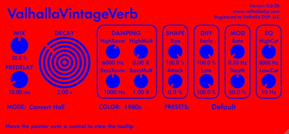
That GUI color scheme came out of some research on "colors that hurt the eyes."Tp3 wrote:Yikes !valhallasound wrote:As far as "hurting the eyes," this color scheme got rejected during the development process:
Talk about the psychedelic 60's...

A LOT of the proposed 1980s color schemes were almost this painful, but not intentionally. It turns out that the distinctive 1980s colors, when you put them in a GUI, are pretty horrible. I'm sure there's a way of making hot pink and teal work in a GUI, but I sure as heck wasn't able to pull it off.
Sean Costello
-
- KVRAF
- Topic Starter
- 3426 posts since 15 Nov, 2006 from Pacific NW
You're probably right.TristezaOrange wrote:A lot, probably.Debby747 wrote:How many posts will we be able to make with this quotevalhallasound wrote:
As far as "hurting the eyes," this color scheme got rejected during the development process:
before christmas eve?
Greetings
D.
-
el-bo (formerly ebow) el-bo (formerly ebow) https://www.kvraudio.com/forum/memberlist.php?mode=viewprofile&u=208007
- KVRAF
- 17994 posts since 24 May, 2009 from A galaxy, far far away
you're probably right that he's probably rightvalhallasound wrote:You're probably right.TristezaOrange wrote:A lot, probably.Debby747 wrote:How many posts will we be able to make with this quotevalhallasound wrote:
As far as "hurting the eyes," this color scheme got rejected during the development process:
before christmas eve?
Greetings
D.
*shit, i really gotz to get a life...............
-
 Sampleconstruct Sampleconstruct https://www.kvraudio.com/forum/memberlist.php?mode=viewprofile&u=191286
 - KVRAF
- 16750 posts since 12 Oct, 2008 from Here and there
Ahh, me tooel-bo (formerly ebow) wrote:you're probably right that he's probably rightvalhallasound wrote:You're probably right.TristezaOrange wrote:A lot, probably.Debby747 wrote:How many posts will we be able to make with this quotevalhallasound wrote:
As far as "hurting the eyes," this color scheme got rejected during the development process:
before christmas eve?
Greetings
D.
*shit, i really gotz to get a life...............

-
- KVRAF
- Topic Starter
- 3426 posts since 15 Nov, 2006 from Pacific NW
The problem is, every time this gets quoted, the GUI gets smaller and smaller, and therefore less obnoxious. You lose the effect of the "hot plate" DECAY dial, and the tricks that it plays on your eyes when you stare at it.Sampleconstruct wrote:Ahh, me tooel-bo (formerly ebow) wrote:you're probably right that he's probably rightvalhallasound wrote:You're probably right.TristezaOrange wrote:A lot, probably.Debby747 wrote:How many posts will we be able to make with this quotevalhallasound wrote:
As far as "hurting the eyes," this color scheme got rejected during the development process:
before christmas eve?
Greetings
D.
*shit, i really gotz to get a life...............
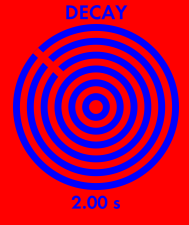
LOOK AT THE DECAY DIAL. STARE AT IT. DO NOT LOOK AWAY.
-
el-bo (formerly ebow) el-bo (formerly ebow) https://www.kvraudio.com/forum/memberlist.php?mode=viewprofile&u=208007
- KVRAF
- 17994 posts since 24 May, 2009 from A galaxy, far far away
valhallasound wrote:
LOOK AT THE DECAY DIAL. STARE AT IT. DO NOT LOOK AWAY.
-
- KVRian
- 1134 posts since 8 Oct, 2004 from Australia
valhallasound wrote:
The problem is, every time this gets quoted, the GUI gets smaller and smaller, and therefore less obnoxious. You lose the effect of the "hot plate" DECAY dial, and the tricks that it plays on your eyes when you stare at it.
LOOK AT THE DECAY DIAL. STARE AT IT. DO NOT LOOK AWAY.

-
- KVRAF
- 4692 posts since 28 Jan, 2003 from In these very interwebs