Yeah, same here. Although I tend to use light color schemes on forums, for better readability. (At least I can read better then.)Teksonik wrote: Fri Jun 03, 2022 7:36 pm I think the real question is how many people actually use white GUIs unless they have no other choice?
I find bright white GUIs very hard on the eyes for long periods so always switch them out if there is an option.

What Instruments Have White GUIs ?
-
- KVRAF
- 35715 posts since 11 Apr, 2010 from Germany
-
- KVRAF
- 9529 posts since 6 Oct, 2004
SynthMaster 2 and SynthMaster One have light-colored alternatives, but not white-white
You do not have the required permissions to view the files attached to this post.

-
- KVRAF
- Topic Starter
- 3497 posts since 30 Dec, 2014
Some of you might be able to figure out why I'm asking this question given my project work, but it's my guess that in a few hours time, Bones will turn up trying to argue his points about white GUI's.
KVR S1-Thread | The Intrancersonic-Design Source > Program Resource | Studio One Resource | Music Gallery | 2D / 3D Sci-fi Art | GUI Projects | Animations | Photography | Film Docs | 80's Cartoons | Games | Music Hardware |
-

- KVRAF
- 2397 posts since 9 Jan, 2014 from Worldwide
I prefer darker GUIs too. Something that annoys me more than super bright GUIs is lots of PURPLE!Teksonik wrote: Fri Jun 03, 2022 7:36 pm I think the real question is how many people actually use white GUIs unless they have no other choice?
I find bright white GUIs very hard on the eyes for long periods so always switch them out if there is an option.
However, I do like the colour purple, but it really puts me off using synths with lots of it. I prefer blues, reds, and oranges on synths for highlights.
Dune 3 presets! - https://newloops.com/collections/dune-presets
Diva, Hive, Repro, Presets - https://newloops.com/collections/u-he-synths-presets
185 Omnisphere Presets https://newloops.com/products/omnispher ... -2-presets
Diva, Hive, Repro, Presets - https://newloops.com/collections/u-he-synths-presets
185 Omnisphere Presets https://newloops.com/products/omnispher ... -2-presets
-
 gentleclockdivider gentleclockdivider https://www.kvraudio.com/forum/memberlist.php?mode=viewprofile&u=203660
 - Banned
- 6787 posts since 22 Mar, 2009 from gent
Eyeball exchanging
Soul calibrating ..frequencies
Soul calibrating ..frequencies
-

- KVRAF
- 19886 posts since 16 Sep, 2001 from Las Vegas,USA
Yes it's because you've been working on this:THE INTRANCER wrote: Sat Jun 04, 2022 12:13 am Some of you might be able to figure out why I'm asking this question given my project work, but it's my guess that in a few hours time, Bones will turn up trying to argue his points about white GUI's.
I'm not arguing points just giving my opinion but I could not use that skin. It's ugly to me and hard on my eyes.
If you start a thread be prepared for people to write things you don't like. If you're constantly looking for attention don't be shocked if some of that attention is negative.
You do not have the required permissions to view the files attached to this post.
None are so hopelessly enslaved as those who falsely believe they are free. Johann Wolfgang von Goethe
-
- KVRAF
- 19886 posts since 16 Sep, 2001 from Las Vegas,USA
I'm not a fan of purple on a GUI either. I like red for clothing but not on GUIs although I do like orange for both. My favorite color when it comes to GUIs is grey tilted slightly towards blue like RGB 115,115,117.Biome_Digital wrote: Sat Jun 04, 2022 11:01 amI prefer darker GUIs too. Something that annoys me more than super bright GUIs is lots of PURPLE!Teksonik wrote: Fri Jun 03, 2022 7:36 pm I think the real question is how many people actually use white GUIs unless they have no other choice?
I find bright white GUIs very hard on the eyes for long periods so always switch them out if there is an option.

However, I do like the colour purple, but it really puts me off using synths with lots of it. I prefer blues, reds, and oranges on synths for highlights.
Then with a nice accent color that stands out like orange it becomes something I can look at for hours at a time without eye strain.
One thing I really abhor are multi colored GUIs as the tend to look toy like to me.....
None are so hopelessly enslaved as those who falsely believe they are free. Johann Wolfgang von Goethe
-

- KVRian
- 707 posts since 7 Feb, 2017
Biome_Digital wrote: Sat Jun 04, 2022 11:01 amI prefer darker GUIs too. Something that annoys me more than super bright GUIs is lots of PURPLE!Teksonik wrote: Fri Jun 03, 2022 7:36 pm I think the real question is how many people actually use white GUIs unless they have no other choice?
I find bright white GUIs very hard on the eyes for long periods so always switch them out if there is an option.
However, I do like the colour purple, but it really puts me off using synths with lots of it. I prefer blues, reds, and oranges on synths for highlights.
-
- KVRAF
- 5648 posts since 18 Jul, 2002
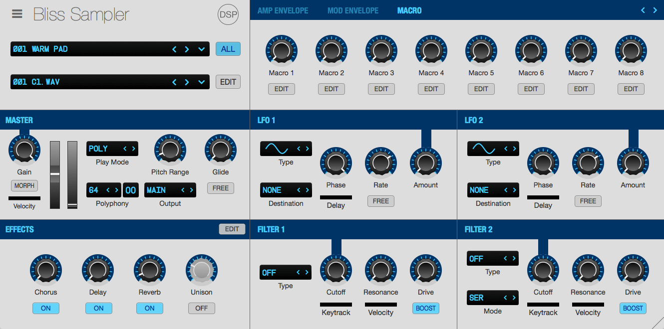
Corona and Bliss have got white GUI skins.
-

- addled muppet weed
- 111335 posts since 26 Jan, 2003 from through the looking glass
-
- KVRAF
- Topic Starter
- 3497 posts since 30 Dec, 2014
Which is the purpose of this thread, in that people can actually highlight examples of white interfaces during the process in which I develop new interfaces. Interfaces people can use, and I can actually provide for users at the end of the day, like the free Dune 3.5 interface set I posted a few weeks ago. The image you posted is that of one where I've said it's still a bit of WIP project, there is still a lot to do yet but what I can say is that it will look far easier on the eyes and really cool as I bring a fresh new design to the table which hasn't been seen before. No point in being part of a community if you don't use it to your advantage.Teksonik wrote: Sat Jun 04, 2022 5:10 pm
Yes it's because you've been working on this:
I'm not arguing points just giving my opinion but I could not use that skin. It's ugly to me and hard on my eyes.
If you start a thread be prepared for people to write things you don't like. If you're constantly looking for attention don't be shocked if some of that attention is negative.
KVR S1-Thread | The Intrancersonic-Design Source > Program Resource | Studio One Resource | Music Gallery | 2D / 3D Sci-fi Art | GUI Projects | Animations | Photography | Film Docs | 80's Cartoons | Games | Music Hardware |
-
- KVRAF
- 3050 posts since 23 Jun, 2006 from Hungary