RAPID Synthesizer | Rapid 1.8.0 released | Free "SP - Granular Elements"

VST, AU, AAX, CLAP, etc. Plugin Virtual Instruments Discussion
Locked New Topic

Post

parawave wrote:Unfortunately I can't improve things if people are not ready to post a somehow more constructive critic. DETAILS! So what do you dislike?
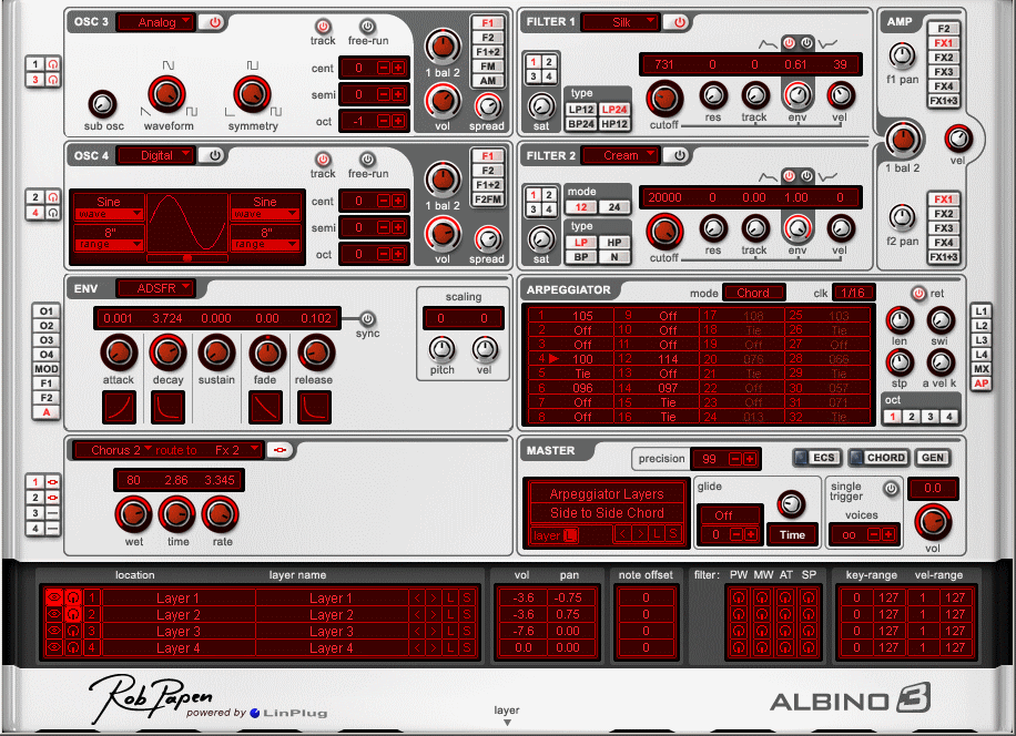
To me one thing is the fonts pseudo 3d fx. The edges are to bright and that makes it hard to read. More generel it seems there are different font faces used in displays, in edits and in the background.
I personally dislike that the 7 fx slots dont line up with at the bottom with the effects container. There's a bigger gap :D With greetings from my OCD :D

Post

ATS wrote:you seem pretty sure you are right even though a lot disagree with you. :)
...I most likely know what I'm talking about and I wouldn't call four people a lot - I'm sorry... :) And I guess, I'm not completely wrong with my assumption.
parawave wrote:Unfortunately I can't improve things if people are not ready to post a somehow more constructive critic. DETAILS!
Hi, Rene - as I've said, no offence, hopefully, and thanks for being interested in suggestions. It's very late, so I won't elaborate it today. (Actually, I've written a detailed paragraph before, but when I wanted to provide some links for my explanations, I accidentally closed the wrong browser tab and unfortunately KVR doesn't seem to have an auto-safe function for the forum posts).

I guess, the main issue is the way and the amount of shading you're trying to do. It's too much and you shouldn't use black all the time as well as an "inner glow" layer effect (I suppose you're using PS). It makes it look like a pencil drawing with smudged edges, thus giving it a "dirty" look. This is even more apparent on the "illuminated" screens. It's not "realistic". Since you're going for a skeuomorphism yourself, it is appropriate to pay attention to how things look in reality. The knobs' shadows indicate a light from 90° above, the black glow suggests that the synth modules have a bulge on every side and corner and, yet, there is no realistic gradient. For instance, the top area of the gradient would look differently than the bottom, even with a "surface material", that isn't supposed to reflect light. And even if it isn't an object with a glossy surface, it would still look differently depending on the light, and more importantly, the colour of the light. So, you wouldn't find just a neutral white, grey or black surface in reality as well as the bright areas aren't just white and the dark ones just black. And this inner glow effect makes it rather look like it has been standing beside a chimney for too long, instead of indicating a shadow or an area that's more in the dark.

The screens, the dispersion of light and its colour, are also problematic (again, the black makes it look dirty and does it not glow?). Before I've written a lot about colour and coloured light, but unfortunately, that's gone now. So, in short, the blue-green spectrum is, let's say, much more "forgiving" when you want to draw or create illuminations. "Warmer" colours and especially the reds are more difficult when you're using the appropriate blend modes or you're trying to find matching dark and bright colours within a light, respectively. Colours from the line of purples are difficult, too.

I'd also give the whole thing slightly more space to "breathe", the patterns and the colours of the effect are just horrible (I'm really sorry!) and I don't like the fonts (Ok, that's maybe personal). There are some issues with brightness, contrast & saturation as well, but the shading and the colouring is the main thing in my opinion.

However, as it uses similar colours as Rapid, maybe a good & practical orientation could be the evolution of the Diversion skin. Even though both versions differ vastly and current one might be a render (I guess, The Legend isn't btw) it might be a good example to have a look at how the things I have adressed have been done there and then draw your conclusions. However, not saying, it's a particularly good GUI - the orange-blue cliche is a bit exaggerated in the current version in my opinion, but it might give you some inspirations. And if all the perspective and lighting stuff is too much right now, you could also consider a flat skin in the future.

Image

Image

Hope, some things could help - all the best! :tu:

Post

Oh wow, I always hated the Diversion skin, please none of that. Love the synth and the dev though.

loachm, you are not the only one who knows what they are talking about and your trying to pass your opinion off as fact, which is pretty egotistical.
my music: http://www.alexcooperusa.com
"It's hard to be humble, when you're as great as I am." Muhammad Ali

Post

wagtunes wrote:
zxant wrote:
parawave wrote:
knowix wrote:I like the crisp wavetable sounds I've heard in the video demos, but I really hate that GUI.
I guess everyone who dislikes the GUI is expecting something like "The Legend" (another skeuromorphic 3D prerender?) and especially dislikes the color orange? Unfortunately I can't improve things if people are not ready to post a somehow more constructive critic. DETAILS! So what do you dislike? Is it the white/orange theme, or is it the pixel-perfect bitmap graphic? Or is it the layout, what is it? I'm willing to improve things, but can't without details. I somehow think it's the orange color. Studies showed that males (apparently 95% of synthesizer users) tend to like the color blue. Yes. Should have chosen blue : D

As announced previously, eventually RAPID will get an alternative skin possibility. A combination of vector/pixel/custom theme thingy, with settable colors.

...
For me the orange/brown/white thing is just why I like it so much . :love: :love: :love:

I despise al those dark blue/black GUI's of nowadays.


I grew up in the 70's and it's a bit reminiscent of that.

('member the 70's? ;) )


Gives me a warm, fuzzy feeling :hug: (for me it's corresponding very much with the sound of Rapid. ;) )
I grew up in the 60s but I'm curious, just what is it about this color that reminds you of the 70s aside from some of the ugly tie died shirts I used to own?
Well, it was the dominant color scheme in everything (design, interior etc.) in the years before my care-givers suddenly passed on and I had to go into the 'System'! :(

So yes, those years and times I'll always treasure (and what reminds me of it!)


('member the 70's? Oh yes, I 'member ;) )

Post

I'm waiting for Black Friday Sale / Christmas Sale...

Post

I think Rapid is very good on ergonomics, I only wish to be able to see more than 6 modulation slots at time. Maybe place the mod slots into several rows? When I want to overview a patch I don't like that I have to scroll the mod assignments.

Otherwise it is very good, everything is easily accessible and self-explanatory.

As for the eye pleasing aspect, I don't like Rapid GUI at all. It is not that important for me cause a synth should sound good rather than look good but I don't like how it looks, it resembles a washing powder pack with cheap print on cheap cardboard. Sorry I don't know anything about graphic design so I can't give any advice, I can only show the GUIs I like.

Great GUIs

Image
Image

Good GUIs

Image
Image

OK GUIs

Image
Image
You may think you can fly ... but you better not try

Post

THE RAPID GUI IS PERFECT!
The average bored guy

Post

To me it looks like a soft synth from the 90ies, and even if it's usability is great, marketing plays an important role when selling a soft synth. And beautiful things are normally easier to sell...

If I compare this thing with the Avenger screenshots I have seen..I know what I'd choose.

Post

Mirko R. wrote:I remembered that some people said "RAPID sounds digital and not analog enough". i build a preset in RAPID similar to a preset from Diva. I took the same midis and played booth. So now it is your turn. Whhich demo is RAPID and which one is Diva? :-)

https://soundcloud.com/mirkoruta/rapid-vs-diva-vst
thanks mirko, maybe you could do the same with avenger? :)
DAW FL Studio Audio Interface Focusrite Scarlett 1st Gen 2i2 CPU Intel i7-7700K 4.20 GHz, RAM 32 GB Dual-Channel DDR4 @2400MHz Corsair Vengeance. MB Asus Prime Z270-K, GPU Gainward 1070 GTX GS 8GB NT Be Quiet DP 550W OS Win10 64Bit

Post

ATS wrote:Oh wow, I always hated the Diversion skin, please none of that. Love the synth and the dev though.

loachm, you are not the only one who knows what they are talking about and your trying to pass your opinion off as fact, which is pretty egotistical.
Alex, I wasn't endorsing the Diversion skin as a good design (I explicitly did not). Instead I might have referred to some of the examples that recursive one has posted.

Parawave was specifically looking for some advice. So I thought, these might help as a practical example, as they use a similar colour scheme as Rapid and you can compare a lot of the aspects about a relatively "flat" and more abstract design vs. a more realistic 3D approach within two versions of the basically the same GUI. Whether or not it is helpful or if he adopt things, it is up to him. I'm not passing off my opinion as a fact, I try to argue and explain what I mean - again, anyone can agree to that or not.

You are right, that it wasn't a good thing to get involved here, as I certainly have no interest in damaging a product and a developer (quite the opposite, I really sympathise!), as well as Rapid does not actually interest me. So, you're right if you think, why does this idiot bother and doesn't f*ck off instead.

But then again, exactly that may be interesting for Parawave, as my criticism is exactly the reason, why - though this type of synth is currently interesting to me - it is very unlikely that I might pick Rapid. And thus, others might, too - so it may be of concern for him. It's not only about some fancy looks - graphics as well as a corporate appearance communicate something. And developing and releasing a product on your own is some very hard work and I thought, I'd need to try to make up for my bad behaviour and deliver some of what he has asked for. I had a weak moment and was triggered by Toby's remark, though, while my manner was impertinent, I don't think my message is unobjective and I stand by that. But, I really do apologise for my behaviour - to Parawave and to Toby, of course.

However, I don't seem to be the only one who would have some issues with the GUI, so I guess, I adressed a crucial aspect. And since Parawave seems to have acknowledged it, it is only fair to offer some feedback & help (as this is what a forum is meant for) - even more after making an offensive remark. (And did I already mention, it has been specifically asked for an opinion?)

You can call that egotistical, as much as you like, though at this point I assume, you might reconsider. I've pissed in the pool and it would be egotistical, if I'd just left or had continued pissing. But I stayed and tried to clean it up. So, it's up to you, if you'd like to continue pissing in mine by passing off your opinion about me as a fact (I guess, you see how that can make one smile, as you know how we'd both call such behaviour). But I'd rather have it, if you'd do what Parawave has asked for, if you also know what you are talking about. If you'd like to and have the time you could surprise those who may care with an unexpected reply. :)

Post

loath wrote:...And since Parawave seems to have acknowledged it, it is only fair to offer some feedback & help...
Fair enough.

Post

Serum GUI is perfect, cause you see all modulations and envelopes trigger. RAPIDs GUI ist also perfect and act on the same level as serum does. Unfortunately RAPID is twice expensive as it should be. 200,-EUR is a nogo.

Post

loachm wrote:Parawave was specifically looking for some advice.

.. and deliver some of what he has asked for.

And since Parawave seems to have acknowledged it, it is only fair to offer some feedback & help..

.. if you'd do what Parawave has asked for..
Just because you write things down, they don't magically become true. I never asked for "advice" and didn't acknowledged or ask for expertice. Again, assumptions. Don't assume and base everything on that! What I wrote was merely a hint that I read critics, but when people criticize, preferably at least in a constructive way. Constructive critic is not equal to a more detailed summary of more subjective things. I only read subjective critics to get a feel for the generally preferred taste.

For me one thing is clear, you have a background in graphic design and suffer from the what I call "I can do it better-Syndrome". All the small things you mentioned are totally subjective, from a best-practice designer standpoint or rather esoteric. This becomes clear if you ask yourself the question: "Does it improve anything?" Choosing blue over orange because you can better work with overlays, really?

e.g. Comparing the two different Diversion skins, one is looking a bit fancier, but that's it! There is zero improvement in a real objective sense. This is polish and perfectionism at best.

By the way, inner glow and vignette are a way to mimic ambient occlusion. If you look closely there is also gradient. The task is not to create the most realistic and plausible render, it's to provide a responsive control of synthesis parameters.
loachm wrote:.. as I certainly have no interest in damaging a product and a developer, .. , as well as Rapid does not actually interest me.
Then don't do it and stop stating subjective opinions as fact. I heard that sentence multiple times, so I aks: If you are not interested, then what is your intention here? A Samaritan trying to improve the world by starting with synth GUIs? I'm willing to improve things for customers who have real problems and criticize things that really stand in their way of working with Rapid. And that's not how accurate a shadow, glow or color scheme is.
Things like "the font is too small to read from a 4K display", or generally a re-sizeable GUI, because they work in a studio environment where big screens are used. Theses things are the only valid point. And now that I triggered your desire to clear things up and write another story about how a line is off by one pixel. Again, really ask yourself the question: "Does it improve anything?"

Sounds rather harsh. Don't take it personally, like I didn't take you excerpt personally. What I state here is that you shouldn't assume to much and don't treat Rapids GUI like it's still in development and an unfinished product. In that sense Rapid is complete. People are now happily working with Rapid without any problems. They use it in the intended way - to produce music. Everything I want to provide here is improvement for real issues, so it will be better to use, not to fulfill personal design tastes.

The only real objective issue is the sizeable GUI, because in the future more people will use higher resolutions. Until this is fixed, and I'm really planning to focus on that after the Mac release, people have to wait. So you may or not like the GUI and post about it, this won't change things immediately. Many people wrote they underestimated Rapid and after testing the demo and hearing the presets and the sound, they truly started appreciate the workflow an ease of use. To you I recommend to focus on the real deal here - the sound.

Post

bite_me wrote:THE RAPID GUI IS PERFECT!
Lovely. :-)
I think too, the RAPID gui is really great. Everything is directly in view and you have totally access to everything and really qick. But that's not the reason why I write now. I want to show You again two awesome analog sounding sounds i build wit this monster.

It is a live and improvisated plaing. Okay some timingsproblem but I thing the harmonics and of course the sound is really fascinating and hey,... it was really improvisated playing. ;-) hope you like it!

First one is a trumpet liked synth:
https://soundcloud.com/mirkoruta/rapid- ... mirko-ruta

And second one is a triplet played Sound:
https://soundcloud.com/mirkoruta/rapid- ... lter-sound

Edit: Damn, I forgot to turn the Macros. I will remember when I make the next demo. :-)

Post

loachm wrote: I certainly have no interest in damaging a product and a developer
I didn't read all that but this caught my eye. Again you are not that powerful to damage this great synth. Ego...
my music: http://www.alexcooperusa.com
"It's hard to be humble, when you're as great as I am." Muhammad Ali

Locked

Return to “Instruments”