

I second these 3 suggestions.soundpalace wrote:1. You can type a value directly for any parameter
2. Every parameter is labelled so you know exactly what it is
3. Each option per parameter is a full description, not a single letter. For instance, rather than F, S, U modes in Crunchessor, we should have "Fast", "Slow", "Crush" or something like that, it doesn't bother most people to have a larger GUI to fit these things on.

Voxengo on ProSoundweb.com
-

- KVRAF
- 9064 posts since 1 Aug, 2003
-
- KVRAF
- 3745 posts since 29 Sep, 2002 from Killafornia
I'm definitely not gonna argue with Aleksey on anything sound related. 
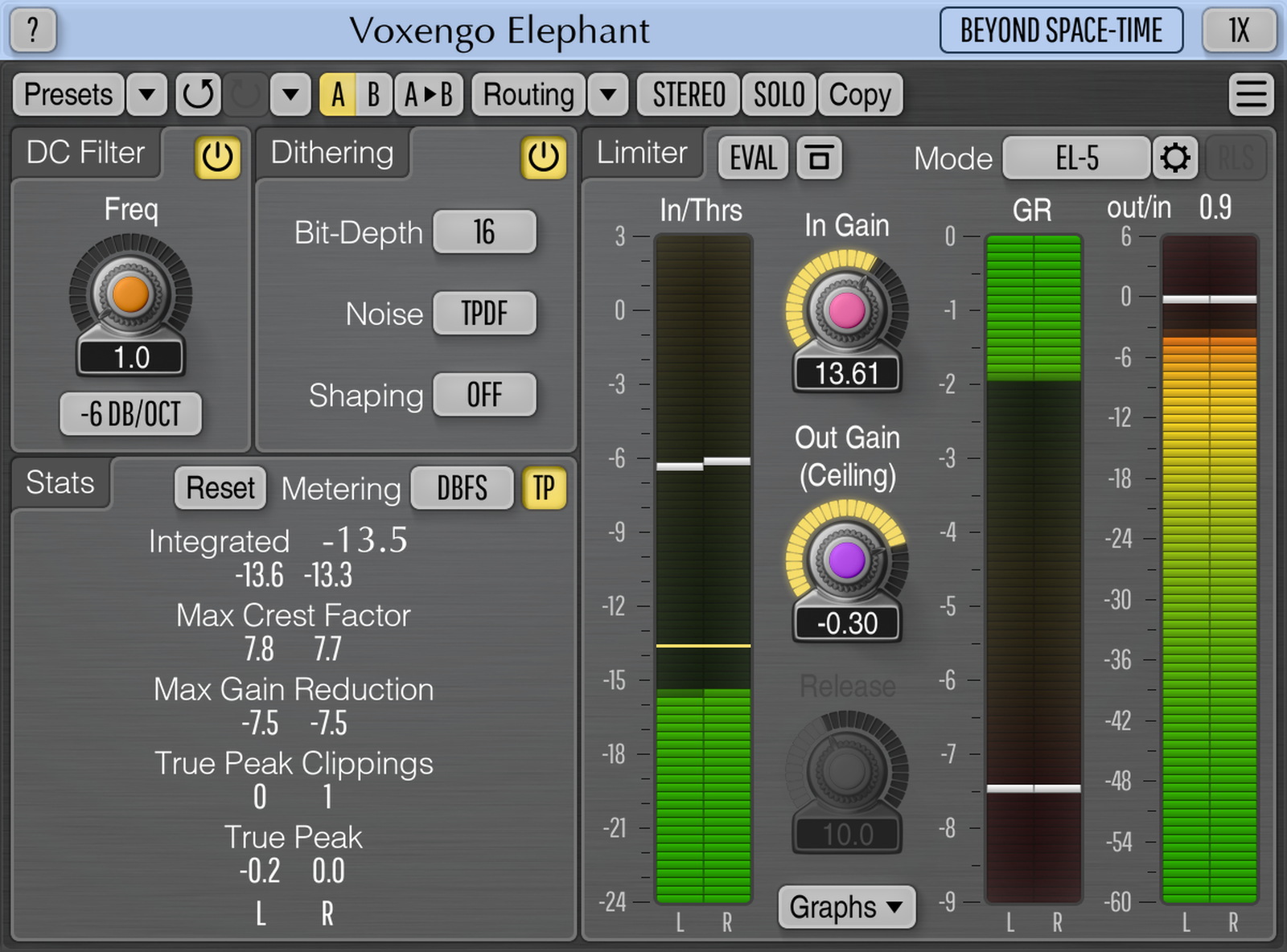
But GUI wise, I think E.A and the new Wavearts interfaces are just plain more appealing visually. For example Eqium uses different shades to mark different sections. Its easier on the eyes to me than looking at a lot of small black numbers with all the same typeface. Maybe its just me.

But GUI wise, I think E.A and the new Wavearts interfaces are just plain more appealing visually. For example Eqium uses different shades to mark different sections. Its easier on the eyes to me than looking at a lot of small black numbers with all the same typeface. Maybe its just me.

-
- KVRAF
- 3125 posts since 6 Dec, 2002 from Ljubljana/ Slovenia
Aleksey Vaneev wrote:Moreover, as an independent one-man developer I cannot say I'm dissatisfied with the sales. If they continue with their current pace I'll have to hire 'support department' to answer various questions.

-
- KVRAF
- 1527 posts since 3 Apr, 2002 from desolation row
I love the voxengo GUi's, personally.
...
-
- KVRer
- Topic Starter
- 13 posts since 13 Sep, 2004
The ergonomics of any tool is important and can effect workflow, fatigue and quality of user output. At the extreme end of the scale, something that is butt ugly and is awkward to use will utimately irritate, alienate the user and the tool will fall into disuse. On the other hand, a tool that is well designed (ergonomically) and is a pleasure to use will maintain entusiasm on the part of the user and yield better results. Erganomic design can even be a health issue! At least this is the prevailing wisdom of the manufacturing community who invest a lot of money researching these things. They may be wrong, of course, but I've never wanted to buy a car that didn't look good. Designers ignore ergonomics at their peril. A VST plugin, of course, is not a car, but nevertheless..."Look is not inspiring" - that's not what I'm striving to do. Inspiring look is probably a look of something that costs thousand dollars in hardware form. I do not like that hype. On the other hand, the most inspiring look will get boring after several production sessions.
-
- KVRAF
- 1527 posts since 3 Apr, 2002 from desolation row
Interesting. I think that there are actually two issues here- ergonomics and aesthetics. It seems to me that the ergonomic dimensions are centred more around the pc and the real environment you work in, while GUI design, and preferences, are more about personal aesthetic tastes and how these relate to functional use and the psychology of creativity.IainDearg wrote:The ergonomics of any tool is important and can effect workflow, fatigue and quality of user output. At the extreme end of the scale, something that is butt ugly and is awkward to use will utimately irritate, alienate the user and the tool will fall into disuse. On the other hand, a tool that is well designed (ergonomically) and is a pleasure to use will maintain entusiasm on the part of the user and yield better results. Erganomic design can even be a health issue! At least this is the prevailing wisdom of the manufacturing community who invest a lot of money researching these things. They may be wrong, of course, but I've never wanted to buy a car that didn't look good. Designers ignore ergonomics at their peril. A VST plugin, of course, is not a car, but nevertheless..."Look is not inspiring" - that's not what I'm striving to do. Inspiring look is probably a look of something that costs thousand dollars in hardware form. I do not like that hype. On the other hand, the most inspiring look will get boring after several production sessions.
...
-

- KVRAF
- 4030 posts since 7 Sep, 2002
AD80, hope WaveArts FinalPlug sounds as good as it looks. 

-

- KVRAF
- 2744 posts since 5 Dec, 2003 from Harlan's World
So the question becomes...are Voxengo plugins not well designed from an ergonomic perspective??? If so then it boils down (as always) to a matter of personal taste - I find them very easy to work with.
My Soundcloud Too many pieces of music finish far too long after the end. - Stravinsky
-
- KVRAF
- 5200 posts since 17 Aug, 2004
GUI is not important to me realy. Before i didn think so, but now sound is what i count. And sound from Voxengo plugs is....uhm... 
(Aleksey, no i didnt forgott some things, but i work on some projects (important to me) now )
(Aleksey, no i didnt forgott some things, but i work on some projects (important to me) now
)-
- KVRAF
- 9064 posts since 1 Aug, 2003
Not to my eyes. That WaveArts plug looks kinda nice, but it isn't half as "easy on the eyes" as Voxengo Elephant. The WaveArts' colour scheme isn't quite there IMO.AD80 wrote:Its easier on the eyes to me than looking at a lot of small black numbers with all the same typeface. Maybe its just me.
-

- KVRAF
- 3846 posts since 15 Mar, 2002 from Underworld
Elephant is excellent looking and brilliantly functional. The only two things it lacks IMHO is input of values by hand or at least precision to 0.01db as it's supposed to be used in mastering. Possibly nice K-system VU-Meters on outputs instead of just values would be nice, too... but nothing is perfect in this world, anyway , don't you think? Of course, this is only my subjective opinion and I haven't bought the thing yet, but I'm planning to as I had heard it and it's magnificent, oh yes . Highly recommended.
Cheers!
, don't you think? Of course, this is only my subjective opinion and I haven't bought the thing yet, but I'm planning to as I had heard it and it's magnificent, oh yes . Highly recommended.Cheers!
It is no measure of health to be well adjusted to a profoundly sick society. - Jiddu Krishnamurti
-
- KVRist
- 339 posts since 9 May, 2001 from Greece
Judging by that Elephant screenshot, the main "problem" I can identify is with the use of color and text labels.
The light drop-shadow on the labels I find to be of rather bad taste. In fact, I just realized that it may be intended to give the impression of engraved text? hmmm....
The realtime value display looks plain in appearance. That is ok but if you look at the whole interface as a whole, both labels and values, it looks as a collection of text with a few graphics inbetween. Not enough visual separation for the various elements I believe.
I think that it only takes a small bit of polishing to the current theme to make it much more easy on the eye. Nothing fancy really. Add some slight variations, e.g. darker background for label text, lose the white drop-shadow thing etc etc... Nothing drastic and it will look a lot better.
Just a few thoughts
The light drop-shadow on the labels I find to be of rather bad taste. In fact, I just realized that it may be intended to give the impression of engraved text? hmmm....
The realtime value display looks plain in appearance. That is ok but if you look at the whole interface as a whole, both labels and values, it looks as a collection of text with a few graphics inbetween. Not enough visual separation for the various elements I believe.
I think that it only takes a small bit of polishing to the current theme to make it much more easy on the eye. Nothing fancy really. Add some slight variations, e.g. darker background for label text, lose the white drop-shadow thing etc etc... Nothing drastic and it will look a lot better.
Just a few thoughts
-

- KVRAF
- 5913 posts since 17 Aug, 2004 from Berlin, Germany
The WaveArts GUIs are nice. As far as I know, the interface was designed by another (design or graphics?)company. Also Elemental Audios interfaces - very eye candy.
rarely a good coder is also a good graphics designer
rarely a good coder is also a good graphics designer
 | Links
-
Reverse Engineer Reverse Engineer https://www.kvraudio.com/forum/memberlist.php?mode=viewprofile&u=9129
- KVRAF
- 4968 posts since 23 Sep, 2003 from Glasgow
I'm not saying Voxengo stuff looks like shit (i am quite happy with their looks  ) when i say this, but i have noticed that a LOT of really good quality plugs don't cut it at all when it comes to GUI implementation. Just as a small example, look at http://www.museresearch.com/kvr/i/b/hexter.gif Hexter here. Awful looking thing (even 5+ years ago,) but my god, you couldn't fault its sound at all.
) when i say this, but i have noticed that a LOT of really good quality plugs don't cut it at all when it comes to GUI implementation. Just as a small example, look at http://www.museresearch.com/kvr/i/b/hexter.gif Hexter here. Awful looking thing (even 5+ years ago,) but my god, you couldn't fault its sound at all.-
- KVRAF
- 5913 posts since 17 Aug, 2004 from Berlin, Germany
ACK... Text should not have 3D-effects, only a light shadow can sometimes help if the background is too dark. Also the textlabels should be implemented as an ownerdrawn text-window.Evan wrote:...
Insted a threshold/drive/out knob, fader besides the levelmeter.
The interface looks something "rough" for me.
| Links