Correct. The manual is mostly written with the full version in mind, those two buttons being the only difference with the different band limit anyway.A.M. Gold wrote:I thought he said preset loading doesn't work in the free version.

New linear-phase EQ - SplineEQ
-
- KVRian
- Topic Starter
- 1057 posts since 6 May, 2008 from Poland
-
- KVRian
- Topic Starter
- 1057 posts since 6 May, 2008 from Poland
tl;dr I need beta testers
I've been working on new features as first steps towards a SplineEQ 2.0/Pro, and I would need people to try the current beta and tell me their opinions or how it works for them or even suggestions.

As you can see from the screenshot it's work in progress.
Here's what I've added since the last public release:
I've been working on new features as first steps towards a SplineEQ 2.0/Pro, and I would need people to try the current beta and tell me their opinions or how it works for them or even suggestions.
As you can see from the screenshot it's work in progress.
Here's what I've added since the last public release:
- -The handles can be extended or shortened, giving much better control over the shape of the curve. As a result they behave quite differently and I'd need to hear how that works for you.
-As a result you might end up having the handles going off screen much more often, so if a handle goes off-screen now you have a diamond/square control that allows you to bring the handle back from beyond the edge.
-I've added an analysis curve (turned off by default). As of now it represents the input, not the output, I'm not sure what to do about the output. The colours represent the pan, as of now cyan is centre, yellow is left and magenta is right. Not too sure about the colours, but that feels about right.
-
- KVRist
- 154 posts since 20 Jan, 2006
Your EQ is amazing!
May I join the beta testing?
Cheers
May I join the beta testing?
Cheers
-
- KVRian
- 724 posts since 15 Feb, 2012 from France
I really like the sound of that EQ, I really do... but I can't figure out how to overcome the latency in Ableton Live.
I'd love to use it on my tunes but the audible latency drives me nuts. I'm quite new to AL8 for producing, I've recently switched to it so maybe there's a quite simple workaround. I've already tried to switched on and off the delay compensation but without much success. I tend to use SplineEQ on real-tme synthesis. Any suggestions ?
Thanks !
-

- KVRAF
- 37393 posts since 14 Sep, 2002 from In teh net
I like the 3D visualiser - is that a new feature or does the current version do that?A_SN wrote:tl;dr I need beta testers
I've been working on new features as first steps towards a SplineEQ 2.0/Pro, and I would need people to try the current beta and tell me their opinions or how it works for them or even suggestions.
As you can see from the screenshot it's work in progress.
Here's what I've added since the last public release:
- -The handles can be extended or shortened, giving much better control over the shape of the curve. As a result they behave quite differently and I'd need to hear how that works for you.
-As a result you might end up having the handles going off screen much more often, so if a handle goes off-screen now you have a diamond/square control that allows you to bring the handle back from beyond the edge.
-I've added an analysis curve (turned off by default). As of now it represents the input, not the output, I'm not sure what to do about the output. The colours represent the pan, as of now cyan is centre, yellow is left and magenta is right. Not too sure about the colours, but that feels about right.
-
- KVRer
- 12 posts since 8 May, 2008
Maybe this:A_SN wrote:I'd just like to see what's the best compact implementation out there that gives all the information you need (as in, not like most plugins which have tiny knobs with no values at all indicated anywhere). As it is I think my knobs are too big while the display is too small.
... same space, larger fonts. Drag left-right to adjust full-scale with the mouse; drag up-down to fine adjust. Double-click in the right half to enter a value from the keyboard; double-click in the left half to reset.
-
- KVRer
- 12 posts since 8 May, 2008
I just discovered this plug-in yesterday, and purchased a full version half an hour ago.
What impressed me so much is how easy and intuitive it is to use. I was looking though other EQ VSTs last night, trying to figure out what makes the difference. I decided it's the "through the points" curve, and the fact that the interface is large enough to see what I'm doing.
So, while I can see how someone used to thinking of EQ in terms of bands would find this disconcerting, it's great for those of us (like me) who don't have enough experience to need to unlearn the methodology imposed by hardware equalizers.
I also like the visualisation. To me, plotting a spectral graph over an EQ curve is counter-intuitive. The mind wants to see the height of the EQ curve and the height of the signal as related, but (unlike, say, the threshold of a compressor and its input), they aren't. (One is an amplification factor and the other is an absolute scale.) It is, at least subliminally, misleading. By using a different dimension (visual intensity instead of y-coordinate) to display the spectrum, that is avoided.
Something does bother me about the visualisation, though: at least testing in Reaper (32-bit, Windows), its timing seems to be aligned with the input. Since the user is generally hearing the output, that makes the display a bit confusing at high latencies. (Granted, I don't suppose there's any way you can correct for additional plug-in delays that might follow SplineEQ—at least not automatically—but I don't think there would be any harm in taking the plug-in's own delay into account.)
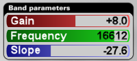
A very minor nit-pick: I think the label Gain is confusing in the visualisation section; perhaps Sensitivity would convey what you mean a little better?
What impressed me so much is how easy and intuitive it is to use. I was looking though other EQ VSTs last night, trying to figure out what makes the difference. I decided it's the "through the points" curve, and the fact that the interface is large enough to see what I'm doing.
So, while I can see how someone used to thinking of EQ in terms of bands would find this disconcerting, it's great for those of us (like me) who don't have enough experience to need to unlearn the methodology imposed by hardware equalizers.
I also like the visualisation. To me, plotting a spectral graph over an EQ curve is counter-intuitive. The mind wants to see the height of the EQ curve and the height of the signal as related, but (unlike, say, the threshold of a compressor and its input), they aren't. (One is an amplification factor and the other is an absolute scale.) It is, at least subliminally, misleading. By using a different dimension (visual intensity instead of y-coordinate) to display the spectrum, that is avoided.
Something does bother me about the visualisation, though: at least testing in Reaper (32-bit, Windows), its timing seems to be aligned with the input. Since the user is generally hearing the output, that makes the display a bit confusing at high latencies. (Granted, I don't suppose there's any way you can correct for additional plug-in delays that might follow SplineEQ—at least not automatically—but I don't think there would be any harm in taking the plug-in's own delay into account.)
A very minor nit-pick: I think the label Gain is confusing in the visualisation section; perhaps Sensitivity would convey what you mean a little better?
-
- KVRian
- Topic Starter
- 1057 posts since 6 May, 2008 from Poland
Yes, I'll PM you a link soon.gemada wrote:Your EQ is amazing!
May I join the beta testing?
Cheers
You can't compensate for that because Ableton can't know you'll press a key before you donilhartman wrote:I tend to use SplineEQ on real-tme synthesis. Any suggestions ?
I have no idea which part of the screenshot you're referring to sorry, there's nothing 3D at all in there.aMUSEd wrote:I like the 3D visualiser - is that a new feature or does the current version do that?
Thanks for the mock-up, that would work except that it's not cohesive with the hardware visual metaphor for the interface (which I only break once for the tip text above the visualisation area), and the hardware metaphor is an important part of a quality plugin interface. And I think people like to use round knobs, or so I inferred from the fact that pretty much every plugin with a decent interface mostly uses round knobs.Coises wrote:Maybe this:A_SN wrote:I'd just like to see what's the best compact implementation out there that gives all the information you need (as in, not like most plugins which have tiny knobs with no values at all indicated anywhere). As it is I think my knobs are too big while the display is too small.
... same space, larger fonts. Drag left-right to adjust full-scale with the mouse; drag up-down to fine adjust. Double-click in the right half to enter a value from the keyboard; double-click in the left half to reset.
However maybe a small knob with the visualisation text next to it would do the trick. I'm just concerned that whatever I do will end up taking up more space on the screen, and SplineEQ is getting more knobs added to the interface as it goes along.
The visualisation necessarily lags behind both the input, generally more so than the output. It lags behind the input by 93 ms (but if you take into account the graphics part it's probably more like 120 ms), so it lags behind the output by that much minus how much the output lags behind the output (93 - 46 = 47 ms with the default settings). I didn't bother to do anything about when the output lags more than the visualisation because in most cases there won't be a significant lag between the two. Your threshold of perception of asynchrony between visual and audio is in the 50-100 ms range by the way. So if you turn up the Resolution you should make sure to turn down Delay, you shouldn't want that much latency (200+ ms) in the output anyway. I'll make a preferences panel eventually, maybe I can have a setting for adding delay to the visualisation? If I'm gonna do that I would also implement automatic adjustment based on the output latency.Coises wrote:Something does bother me about the visualisation, though: at least testing in Reaper (32-bit, Windows), its timing seems to be aligned with the input. Since the user is generally hearing the output, that makes the display a bit confusing at high latencies. (Granted, I don't suppose there's any way you can correct for additional plug-in delays that might follow SplineEQ—at least not automatically—but I don't think there would be any harm in taking the plug-in's own delay into account.)
A very minor nit-pick: I think the label Gain is confusing in the visualisation section; perhaps Sensitivity would convey what you mean a little better?
As for the Gain label, I couldn't think of anything that would be short enough to fit in there. Sensitivity sounds a bit esoteric
-
- KVRAF
- 37393 posts since 14 Sep, 2002 from In teh net
The visualiser line is bigger and blurry on the left and smaller on the right which gives the effect of receding into the distance and depth of field which is what makes it look 3 dimensional - I guess that is unintentional but in that case what makes the line blurry and larger on the left then?A_SN wrote:I have no idea which part of the screenshot you're referring to sorry, there's nothing 3D at all in there.aMUSEd wrote:I like the 3D visualiser - is that a new feature or does the current version do that?
-
- KVRian
- Topic Starter
- 1057 posts since 6 May, 2008 from Poland
Oh I see what you mean. The lack of resolution in the lower frequencies makes it blurrier. It's much better than making it a thin angular line all the way, it looks somehow more natural (looks smoother too) and more reflective of the lack of the resolution. And to answer your question yes it's a new feature and it's controlled by the yet unlabelled knob in the bottom right of the screen (you control the relative height of curve so that you might use it as a reference when designing a curve).aMUSEd wrote:The visualiser line is bigger and blurry on the left and smaller on the right which gives the effect of receding into the distance and depth of field which is what makes it look 3 dimensional - I guess that is unintentional but in that case what makes the line blurry and larger on the left then?A_SN wrote:I have no idea which part of the screenshot you're referring to sorry, there's nothing 3D at all in there.aMUSEd wrote:I like the 3D visualiser - is that a new feature or does the current version do that?
-
- KVRian
- 1401 posts since 9 Feb, 2012
Will there be a charge for the SplineEQ 2.0/Pro update?
-
- KVRian
- Topic Starter
- 1057 posts since 6 May, 2008 from Poland
Yeah, basically you can see it as a third variant. There's free SplineEQ, SplineEQ (both which will remain available as they are) and then there will be SplineEQ Pro with a different price tag. I'll make sure that people who've bought SplineEQ before a certain future date will get a more advantageous upgrade price though.antithesist wrote:Will there be a charge for the SplineEQ 2.0/Pro update?
-

- KVRAF
- 6504 posts since 25 May, 2002 from Bobo-dioulasso\BF__Geneva/CH
If you allow me a suggestion about the color scheme :A_SN wrote:tl;dr I need beta testers
I've been working on new features as first steps towards a SplineEQ 2.0/Pro, and I would need people to try the current beta and tell me their opinions or how it works for them or even suggestions.
As you can see from the screenshot it's work in progress.
Here's what I've added since the last public release:
- -The handles can be extended or shortened, giving much better control over the shape of the curve. As a result they behave quite differently and I'd need to hear how that works for you.
-As a result you might end up having the handles going off screen much more often, so if a handle goes off-screen now you have a diamond/square control that allows you to bring the handle back from beyond the edge.
I've added an analysis curve (turned off by default). As of now it represents the input, not the output, I'm not sure what to do about the output. The colours represent the pan, as of now cyan is centre, yellow is left and magenta is right. Not too sure about the colours, but that feels about right.
Though IMO the color scheme you've chosen is very esthetic artistically talking if you'd choose red and green for each sides and yellow for the center...
(as at least by coïncidence it is the case in metasynth : red = left and green = right)
...it might be relevant to illustrate the -6db loss of extreme pan settings
Indeed, absolute gray level of both red and green at the most of their color intensity are very similar (if not identical depending on the nuances you would choose for both extremes)
Unlike yellow that is the lighter of all pure colors at the top of it intensity
So such a color scheme (with yellow = C, red and green = L/R) might very likely at the best kinesthetically illustrate it acoustic counterpart !
-
- KVRian
- Topic Starter
- 1057 posts since 6 May, 2008 from Poland
I tried that and that doesn't really work, though I knew it wouldn't before trying itKrakatau wrote:If you allow me a suggestion about the color scheme :
Though IMO the color scheme you've chosen is very esthetic artistically talking if you'd choose red and green for each sides and yellow for the center...
(as at least by coïncidence it is the case in metasynth : red = left and green = right)
...it might be relevant to illustrate the -6db loss of extreme pan settings
Indeed, absolute gray level of both red and green at the most of their color intensity are very similar (if not identical depending on the nuances you would choose for both extremes)
Unlike yellow that is the lighter of all pure colors at the top of it intensity
So such a color scheme (with yellow = C, red and green = L/R) might very likely at the best kinesthetically illustrate it acoustic counterpart !

Th first and third peaks to the left are green. As you can see it's not very different from the yellow parts of the curve. The curve on the right offers much more colour detail.