This new SSL channel strip from IK Multimedia looks great
-
- KVRian
- 1392 posts since 1 May, 2010
Wow, after i try it i find the sound to be really good. But i definitely won't buy it unless there's a gui changes. I cannot stand the looks. I like your previous gui approach, why must you change it now?
musisikamar.com
-

- KVRAF
- 2707 posts since 23 Mar, 2005 from Detroit
or perhaps just use more diluted less saturated rings around the knobs so you still have color coded knobs, that way it is easier on the eyes and the text pops a bit more

-
- Banned
- 1373 posts since 5 May, 2007 from Finland
Happy T-RaXmas to everyone!

It's a British Christmas tree
It's a British Christmas tree
-

- KVRist
- 293 posts since 3 Mar, 2011
Yep she's proper fugly but she does sound good. I jumped in and upgraded from deluxe to grand - but I do hope there's a new GUI on the way!

-
- KVRian
- 1401 posts since 9 Feb, 2012
Remember that this has a lot more controls and indicators than any of the other t-racks gear. To me, that would mean making things a lot more simple. Then you've got what looks like blurry stuff and sharp stuff, etc. and of course, the colors. That one without the colored knobs looks a lot better, but:


WEASEL: World Electro-Acoustic Sound Excitation Laboratories
-
- KVRer
- 11 posts since 13 Nov, 2012
Looks do matter quite a bit.
A professional GUI implies that the company which makes it takes the plugin seriously in all regards.
Just like in a store the quality of packaging is to some extent an indicator of the quality of the product. Is this always the case? Of course not, but for the most part, high quality products have sleeker, more aesthetically pleasing packages. (I'd say this is mainly due to higher quality products often being produced by companies with decent-sized marketing budgets who are able to do preference studies etc. - which is of course an indicator of the company's success because they can afford to pay artists to design artwork and pay panels to evaluate various versions.)
Looking at the plugin, I honestly am appalled by the garish look for two reasons. One is the reason above - it looks cheap and unprofessional. It looks like a free plugin. The other is the fact that it does not fit in with the style and theming of the rest of the T-Racks plugins. It doesn't look like it was developed with regard to how it will look next to the other TRacks devices.
It may sound great, and I will likely demo it tonight, but I would have just purchased the upgrade already if it looked more professional. I can't see myself spending money on this until the GUI is fixed. I say fixed - the visual cacophony is enough to put me off - because I think it really is bad enough that for me to consider buying it I'd want IK to improve the GUI.
I vote with my dollars, and I am not going to vote for IK multimedia and reward them for creating what I consider a bad GUI. I am going to take my dollars somewhere else where they know how to make stuff look good. I will happily reward IKM with dollars when they get around to publishing a flagship level GUI for one of their new Flagship level plugins.
(To Echo the sentiment above - it really should have been called the English Channel)
Know. Think. Choose. Do.
-
- KVRAF
- 1580 posts since 22 Apr, 2011 from The House of Zaid
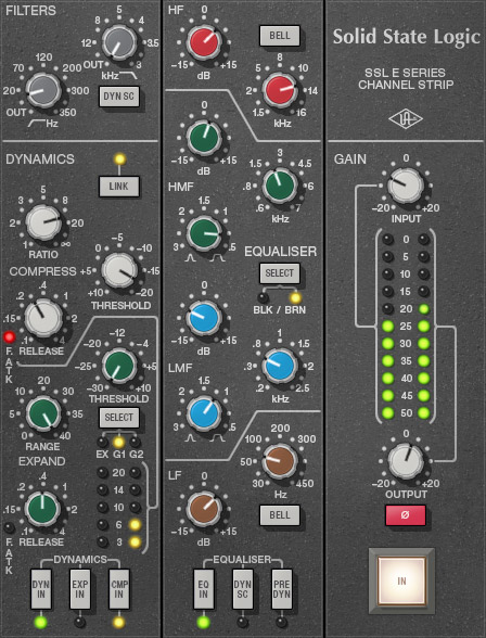
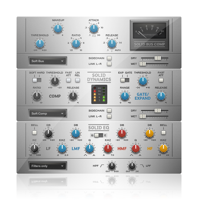
Waves E-Channel has the best GUI and is also the only one that looks like it was made by someone who has actually studied user interface design. The UAD one isn't bad, but, not as professional as the Waves.
Has anybody ever really been far even as decided to use even go want to do look more like?
-
- KVRAF
- 42529 posts since 21 Dec, 2005
I love those kinda colors on a guitar, not on a gui with a backlit monitor  My eyes hurt enough squinting with gui's that don't have large enough lettering (can you say markstudio bass 2? I knew you could!)
Again......120 credits?????????? Wow, that's greedy considering the 99'ish top street on others. Oh, but it says "british" on it
Again......120 credits?????????? Wow, that's greedy considering the 99'ish top street on others. Oh, but it says "british" on it
-
- KVRian
- 1401 posts since 9 Feb, 2012
Yeah, I think that was the original Waves SSL channel, and later they added the G, which looks to me like they washed out too much trying to make it look different. It's also worth noting that all of the ones I posted, except the IK, are "official." There's also unofficial stuff like this:@midnight wrote:Waves E-Channel has the best GUI and is also the only one that looks like it was made by someone who has actually studied user interface design. The UAD one isn't bad, but, not as professional as the Waves.


WEASEL: World Electro-Acoustic Sound Excitation Laboratories
-
- KVRAF
- 42529 posts since 21 Dec, 2005
that's exactly what I was thinking.metalifuxx wrote:or perhaps just use more diluted less saturated rings around the knobs so you still have color coded knobs, that way it is easier on the eyes and the text pops a bit more
-
- KVRAF
- 1710 posts since 15 Aug, 2003 from Indianapolis
I learned long ago to buy software for what it is not for what I hope it becomes. Come to your senses, and update the gui, then maybe I'll try it. I'd bet there are a lot more who would.Peter - IK Multimedia wrote:But on a better note, if you tried it and liked it, you could hope we come to our senses and consider updating the GUI...
-
- KVRian
- 1401 posts since 9 Feb, 2012
And the less-SSL-like:


WEASEL: World Electro-Acoustic Sound Excitation Laboratories
-
- KVRAF
- 1710 posts since 15 Aug, 2003 from Indianapolis
takeabow wrote:Looks do matter quite a bit.
A professional GUI implies that the company which makes it takes the plugin seriously in all regards.
Just like in a store the quality of packaging is to some extent an indicator of the quality of the product. Is this always the case? Of course not, but for the most part, high quality products have sleeker, more aesthetically pleasing packages. (I'd say this is mainly due to higher quality products often being produced by companies with decent-sized marketing budgets who are able to do preference studies etc. - which is of course an indicator of the company's success because they can afford to pay artists to design artwork and pay panels to evaluate various versions.)
Looking at the plugin, I honestly am appalled by the garish look for two reasons. One is the reason above - it looks cheap and unprofessional. It looks like a free plugin. The other is the fact that it does not fit in with the style and theming of the rest of the T-Racks plugins. It doesn't look like it was developed with regard to how it will look next to the other TRacks devices.
It may sound great, and I will likely demo it tonight, but I would have just purchased the upgrade already if it looked more professional. I can't see myself spending money on this until the GUI is fixed. I say fixed - the visual cacophony is enough to put me off - because I think it really is bad enough that for me to consider buying it I'd want IK to improve the GUI.
I vote with my dollars, and I am not going to vote for IK multimedia and reward them for creating what I consider a bad GUI. I am going to take my dollars somewhere else where they know how to make stuff look good. I will happily reward IKM with dollars when they get around to publishing a flagship level GUI for one of their new Flagship level plugins.
(To Echo the sentiment above - it really should have been called the English Channel)