..via Program Change messages, yes please!layzer wrote:....are ya ready? PRESET HANDLING!


Obxd synthesizer
-

- KVRist
- 119 posts since 6 Jul, 2014
-
- KVRist
- 317 posts since 16 Mar, 2014
layzer wrote:thanks for the feedback on the OBX-a skin, funky, breeze, dragon, winny, Fmr... i tamed down the glare and dulled and gave the blue stripes a more turquois tint. i realize this oberheim design may NOT be everyones cupa, i started it mostly for myself and maumoondog. as we both got a soft spot for the OBX-a black & blue design. it is therefore a side-skin project. i'll be concentrating more on the original OBX "baby blue" gui in the next few weeks working with 2Dat on the arangement of the new features controls....including....are ya ready? PRESET HANDLING!

-

- KVRAF
- 24414 posts since 7 Jan, 2009 from Croatia
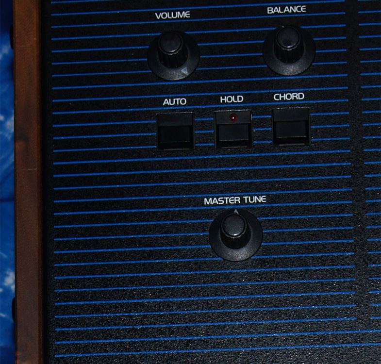
Black and blue of the background are still not very good... those buttons seem almost invisible against that eye-shattering background. You need to make the blue lighter and a bit more transparent, and black not so black but more gray. That'll improve the contrast.layzer wrote:
-

- KVRAF
- 11162 posts since 16 Mar, 2003 from Porto - Portugal
If I remember well, the buttons were more grey than black, and with that background, you better make them grey (as well as the knobs). This is to say that I agree with EvilDragon: I basically do not see the buttons in the current state.EvilDragon wrote:Black and blue of the background are still not very good... those buttons seem almost invisible against that eye-shattering background. You need to make the blue lighter and a bit more transparent, and black not so black but more gray. That'll improve the contrast.layzer wrote:
But if you are also updating the current skin, it's fine for me - I never complained about it
Fernando (FMR)
-
- KVRist
- 317 posts since 16 Mar, 2014
Something like a light black ?EvilDragon wrote: Black and blue of the background are still not very good... those buttons seem almost invisible against that eye-shattering background. You need to make the blue lighter and a bit more transparent, and black not so black but more gray. That'll improve the contrast.
-
- KVRAF
- 1895 posts since 13 Oct, 2002
Technically, the problem with the black and blue is that there's supposed to be a lot more horizontal lines making the entire surface lighter and make the switches and knobs stand out. Just google the pics of the OB-Xa. My previous post kinda implied this as I had a hard time seeing how black on black was going to work. Another option would be to backlight the switches... or make a lighter area under or around the switches and knobs. All this for the side-project of course... 
I'm personally hoping for the white design for clarity, and because it might be an opportunity to make the controls a little more 3D and realistic.
BTW, I don't know if Juce allows this, but if the color choice was procedural, we could have a dial that went from white through the rainbow and satisfy everyone.
-
Funkybot's Evil Twin Funkybot's Evil Twin https://www.kvraudio.com/forum/memberlist.php?mode=viewprofile&u=116627
- KVRAF
- 12455 posts since 16 Aug, 2006
Agree that the white UI would be great for v2.
Regarding the stripe version, I like it, but agree with the other comments: more, and tighter stripes would add to the contrast. The stripes probably needed to be lighter in shade too. Also, as pointed out, the buttons could use more contrast (i.e. Gray buttons).
Like it though. Especially the logo.
-

- KVRian
- 1188 posts since 24 May, 2006 from Our Amazing Oasis in Space - USA Section
Haha, I didn't even realize this striped layout had switches in place (laptop not particularly well calibrated)! For me, it's another case of copying poor design in the first place, like reproducing small hard to read LCD displays ("because the original had it!"), or annoying surface glares. 
I thought Layzer did a fine job on the original as it was clean, legible, well organized, with a good workflow utility, which is foremost in my mind. And if you can make it look all cool and groovy along the way - all the better!
If the layout is going to radically change from the original (which I totally don't follow!), I would hope a new design would start at clear and legible and work out from there. One of Layzer's brushed aluminum styles might even be interesting! But for me the clear, clean organization of v1 will be hard to beat! (maybe the blue could be toned down a bit)
But beyond a clear and legible interface, it's all about the sound and function of the synth for me. The attractiveness of the UI is just icing.
All the best!
Last edited by SciFiArtMan on Wed Oct 29, 2014 5:27 am, edited 1 time in total.
-

- KVRAF
- 4536 posts since 17 Jun, 2013 from very close to Paris, France
For me it will not be usable, simply because the numerous horizontal lines trouble my vision. And I'm even not astigmatic. Remember that these horizontal lines (and sometimes the vertical lines) are the nightmare of all the astigmatic persons, a very common eyesight trouble after 40 y.o. (more than 30% of the population of all ages, more than 45% of the persons being aged of 40+), a trouble which is also the cause of many headaches in the evening when the eyes are tired of the work along the day.
But I recognize that artistically it is a beautiful GUI. Superb.
I don't ask a GUI "for me", be quiet. I think that the best solution would be that 2DaT accepts (if he would have the ability and the time of course) to externalize the GUI so that it allowed to multiply the skins for the pleasure (and sometimes the eyesight) of everyone.
Layzer, your new GUI is really beautiful (the previous one too, by the way). Impossible to use for me, yes (except by a total automation with my BCR2000, it's only this way that I can use OBXD since the beginning)... but frankly you're really an artist!
Build your life everyday as if you would live for a thousand years. Marvel at the Life everyday as if you would die tomorrow.
I'm now severely diseased since September 2018.
I'm now severely diseased since September 2018.
-
- KVRAF
- 1895 posts since 13 Oct, 2002
@Black Whinny: I just read your long post on eye issues. I'm one of the lucky ones only suffering of age related farsightedness but readability is still an issue mostly because of monitor resolution changes and GUI design color choices. Older plugins that haven't been updated to higher resolutions are particularly bad (esp. when using single-pixel text on today's large screens).
With regards to color choices: does the inversion mode of the Microsoft Magnifier help at all? If the black and white GUI is chosen, maybe toggling white to black and vice-versa might not be too hard..??
With regards to color choices: does the inversion mode of the Microsoft Magnifier help at all? If the black and white GUI is chosen, maybe toggling white to black and vice-versa might not be too hard..??
-

- KVRAF
- 7691 posts since 11 Jun, 2006
its getting there... lightened the background, more finer lines it looks good to me, if not to you...sorry. calibrate your monitor. 

Last edited by layzer on Wed Oct 29, 2014 8:37 am, edited 2 times in total.
HW SYNTHS [KORG T2EX - AKAI AX80 - YAMAHA SY77 - ENSONIQ VFX]
HW MODULES [OBi M1000 - ROLAND MKS-50 - ROLAND JV880 - KURZ 1000PX]
SW [CHARLATAN - OBXD - OXE - ELEKTRO - MICROTERA - M1 - SURGE - RMiV]
DAW [ENERGY XT2/1U RACK WINXP / MAUDIO 1010LT PCI]
HW MODULES [OBi M1000 - ROLAND MKS-50 - ROLAND JV880 - KURZ 1000PX]
SW [CHARLATAN - OBXD - OXE - ELEKTRO - MICROTERA - M1 - SURGE - RMiV]
DAW [ENERGY XT2/1U RACK WINXP / MAUDIO 1010LT PCI]
-
- KVRAF
- 3330 posts since 18 May, 2003 from Sweden
In principle, negative text (white on dark background) is harder to read than black on a light background. With that in mind, the font used for the parameters is too thin.
Yes, I downloaded the png so that I can check it in 1:1 scale, and I do have rather good eyesight, too.
Also, "PULS" should be "PULSE".
/Joachim
Yes, I downloaded the png so that I can check it in 1:1 scale, and I do have rather good eyesight, too.
Also, "PULS" should be "PULSE".
/Joachim
If it were easy, anybody could do it!
-
- KVRAF
- 24414 posts since 7 Jan, 2009 from Croatia
That's better now. You could still make the black a bit less intense, I think. I dislike the font used for labels in general, though... It's not oberheimish at all.
Try this one: https://drive.google.com/file/d/0B1rOKP ... sp=sharing
Try this one: https://drive.google.com/file/d/0B1rOKP ... sp=sharing
-
- KVRAF
- 7691 posts since 11 Jun, 2006
EvilDragon wrote:That's better now. You could still make the black a bit less intense, I think. I dislike the font used for labels in general, though... It's not oberheimish at all.
Try this one: https://drive.google.com/file/d/0B1rOKP ... sp=sharing

the only real difference i see in the current font, compared to the obx-a font is the rounded E and L letters...
so, just for you i hand rounded them...
Last edited by layzer on Wed Oct 29, 2014 9:57 am, edited 1 time in total.
HW SYNTHS [KORG T2EX - AKAI AX80 - YAMAHA SY77 - ENSONIQ VFX]
HW MODULES [OBi M1000 - ROLAND MKS-50 - ROLAND JV880 - KURZ 1000PX]
SW [CHARLATAN - OBXD - OXE - ELEKTRO - MICROTERA - M1 - SURGE - RMiV]
DAW [ENERGY XT2/1U RACK WINXP / MAUDIO 1010LT PCI]
HW MODULES [OBi M1000 - ROLAND MKS-50 - ROLAND JV880 - KURZ 1000PX]
SW [CHARLATAN - OBXD - OXE - ELEKTRO - MICROTERA - M1 - SURGE - RMiV]
DAW [ENERGY XT2/1U RACK WINXP / MAUDIO 1010LT PCI]
-
- KVRAF
- 7691 posts since 11 Jun, 2006
nm
HW SYNTHS [KORG T2EX - AKAI AX80 - YAMAHA SY77 - ENSONIQ VFX]
HW MODULES [OBi M1000 - ROLAND MKS-50 - ROLAND JV880 - KURZ 1000PX]
SW [CHARLATAN - OBXD - OXE - ELEKTRO - MICROTERA - M1 - SURGE - RMiV]
DAW [ENERGY XT2/1U RACK WINXP / MAUDIO 1010LT PCI]
HW MODULES [OBi M1000 - ROLAND MKS-50 - ROLAND JV880 - KURZ 1000PX]
SW [CHARLATAN - OBXD - OXE - ELEKTRO - MICROTERA - M1 - SURGE - RMiV]
DAW [ENERGY XT2/1U RACK WINXP / MAUDIO 1010LT PCI]