Looks neat,ENV1 wrote:OK, ive found some odd font (Khmer UI) which would let me use bold and retain the original width without looking totally messed up. It came at the cost of quite a bit of sharpness though, so thats still far from what i would call optimal. Please let me know what you think, and if you think it looks crap, just say it looks crap. I wont take it personally.
PS: Martin, if youd rather i take this to my own thread, just let me know.
click for fullsize

PG8X (inspired by the JX8P): new beta version uploaded
-

- KVRian
- 671 posts since 14 Jan, 2014 from The North.

-
- KVRAF
- 2802 posts since 31 Aug, 2011
Well, thats how the original device looks.Kriminal wrote:im not knocking your work, but its all a bit too much of the same...gets hard to look at very quickly. Some colour of some sort for say the sliders or something would be 'nice'
its good quality, but its just too much of the same colour for me
Cant take too much artistic license here, otherwise it wouldnt be true to the real thing anymore.
-
 thecontrolcentre thecontrolcentre https://www.kvraudio.com/forum/memberlist.php?mode=viewprofile&u=76240
 - KVRAF
- 37262 posts since 27 Jul, 2005 from Scottish Borders
That looks really nice to meENV1 wrote:(Khmer UI) which would let me use bold and retain the original width without looking totally messed up. It came at the cost of quite a bit of sharpness though, so thats still far from what i would call optimal. Please let me know what you think, and if you think it looks crap, just say it looks crap. I wont take it personally.
PS: Martin, if youd rather i take this to my own thread, just let me know.
click for fullsize
-
- KVRAF
- 2802 posts since 31 Aug, 2011
White is the unsharpest looking tone on this grey background. (Besides Red, which is totally unbearable.) Even black appears much sharper, but of course looks crap for other reasons. The colored fonts on the other hand blend rather well and thus look much more 'integrated'. (Rather than 'sticking out'.) The buttons are also meant to be color-coded (see original UI) so i figured i ought to keep it this way.DrewDale wrote:Looks neat,I would opt for white text on the buttons that run along the bottom though
Last edited by ENV1 on Sun Feb 08, 2015 5:26 pm, edited 1 time in total.

-
- Banned
- 18651 posts since 2 Oct, 2001 from England
maybe just a little...? The original in post one is visually more usable long term... (but the green leds are bad)ENV1 wrote:Well, thats how the original device looks.Kriminal wrote:im not knocking your work, but its all a bit too much of the same...gets hard to look at very quickly. Some colour of some sort for say the sliders or something would be 'nice'
its good quality, but its just too much of the same colour for me
Cant take too much artistic license here, otherwise it wouldnt be true to the real thing anymore.
-
- KVRAF
- 2802 posts since 31 Aug, 2011
Green LEDs?
Are we talking about the same skin?
(Limiter6 V2 has green LEDs, (and i agree they could and should be improved), but this one doesnt have any leds yet at all because i havent made them yet.)
Are we talking about the same skin?
(Limiter6 V2 has green LEDs, (and i agree they could and should be improved), but this one doesnt have any leds yet at all because i havent made them yet.)
-
- KVRAF
- 2802 posts since 31 Aug, 2011
Thanks, glad to hear im on the right track.bftucker wrote:I have a PG 300..
This looks very good..."very true to the original."
Ignore those who suggest improvements!


As for suggestions, no problem with them, i can always take what i like and leave what i dont.
Feedback is good.
-
- Banned
- 18651 posts since 2 Oct, 2001 from England
ENV1 wrote:Green LEDs?
Are we talking about the same skin?
(Limiter6 V2 has green LEDs, (and i agree they could and should be improved), but this one doesnt have any leds yet at all because i havent made them yet.)
I meant martins gui on page one
Nevermind tho, doesnt matter.
-

- KVRAF
- 24415 posts since 7 Jan, 2009 from Croatia
OK, Khmer UI font looks a lot better!
As for the buttons along the bottom, can you try tinting them to the color of the text they currently have, and then try with black (or white) text on them?
Martin - what the hell is Bend Range doing in the LFO section? We have two controls called Bend Range now... this one needs renaming.
As for the buttons along the bottom, can you try tinting them to the color of the text they currently have, and then try with black (or white) text on them?
Martin - what the hell is Bend Range doing in the LFO section?
-
- KVRian
- 671 posts since 14 Jan, 2014 from The North.
Fair commentENV1 wrote: White is the unsharpest looking tone on this grey background. (Besides Red, which is totally unbearable.) Even black appears much sharper, but of course looks crap for other reasons. The colored fonts on the other hand blend rather well and thus look much more 'integrated'. (Rather than 'sticking out'.) The buttons are also meant to be color-coded (see original UI) so i figured i ought to keep it this way.
-
AdmiralQuality AdmiralQuality https://www.kvraudio.com/forum/memberlist.php?mode=viewprofile&u=83902
- Banned
- 6657 posts since 10 Oct, 2005 from Toronto, Canada
In a plug-in, don't we need to check this is set every call to processReplacing() as it's possible the host or another plug-in has changed it on us?Ichad.c wrote:Global Constructor/Destructor should be fine, it does persist - hence why they call it a 'sticky' flag, returning the state is just good coding practice. Only set it once, and return it once. All 64bit code is SSE math(because by default it uses the SSE fp unit) - just not vectorized. That's why setting the compiler flags to "-mfpmath=sse" with 32bit code is important, otherwise it uses the x87 floating point unit.martin_l wrote: Hi Andrew,
at which point, exactly, would you have to insert this code? At every entry and exit point to a routine, using SSE math? Or does it persist, and you can set it somewhere in the constructor, or initialisation routines?
That would be the cherry on the cake. Btw, did you ever get the 'exporting patches' form old to new version thing sorted? (I'm on the SE usergroup too btw). That seems like a real pita.martin_l wrote: As for the gating, I will do that. In fact, I am planning to implement a sleep for the downsampler, when all voices are sleeping. Just have not done it yet.
I do have the information on every voice whether it is active or sleeping; I just need to sum them up to get information on whether all are asleep, and then stop the whole engine.
(And thanks for that Ichad, I was googling a little too fast there.)

-
AdmiralQuality AdmiralQuality https://www.kvraudio.com/forum/memberlist.php?mode=viewprofile&u=83902
- Banned
- 6657 posts since 10 Oct, 2005 from Toronto, Canada
I certainly don't hear it. But suspected it might be the scope as well so I tried it with Poly-Ana... no wiggles during silence.martin_l wrote:AdmiralQuality wrote:Here's a weird one, Martin.
I just put it up on an oscilloscope to take a look at what the "pulse" waveform looks like and I noticed, when PG-8X first instantiates, it produces noise output. (I can't hear it, but I clearly see it in the 'scope.) This stops as soon as I play the first note.
This is with the default INIT patch/bank loaded. Just the simple open filter, single sawtooth sound. Chorus Noise is off. Filter Noise is at the default (mid) position, but of course we shouldn't be hearing a filter as the gates and envelopes should (you'd think) instantiate to a closed state.
Oh wait, it came back! About 30 seconds after the last note ends (regardless of whether VCA is in Env or Gate mode) the noise comes back. It looks rather low frequency and again, I can't readily hear it, but it must be there as it disappears from the 'scope as soon as I bypass or remove PG-8X.
Certainly not a show-stopper, but weird and possibly indicative of another issue?
I think, what you see is an artefact of the JS gfxscope.
With that scope, I can reproduce it, but with no other scope plugin.
If you open the edit pane of the scope, you see what happens: When there is silence, the values oscillate randolmy (due to the de-normal noise) between something like 224.999990 and 225.0000001. gfxscope seems to have implemented a simple truncation to integer when plotting, hence the wiggly line.
Why does it not show up just after releasing a note? Due to the asymmetry of the wave functions, there is a tiny DC offset, which only slowly dies to 0 (in the anti alias filter). Only when this bias falls below the level of the denormal noise, you start seeing the noise in the scope. If the noise falls into the range 225.000001 to 225.000002, you don't see it.
So, everything seems fine (apart from the other bugs...)
Cheers,
Martin
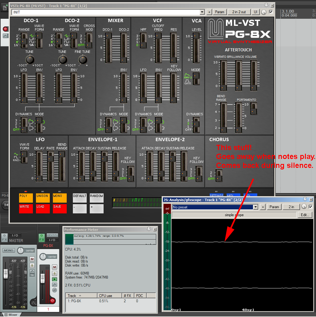
And yes, of course it's trunced or rounded to integers, pixels are discreet and there's no anti-aliasing in the display of that little scope. But silence does show as a flat line.
I'll try another scope plug-in on it.
And again, I think it's highly irregular to have denormal noise when the voices aren't running. Don't quite understand what you're doing there.