Most pleasant GUI - Your choice?

Audio Plugin Hosts and other audio software applications discussion
Post Reply New Topic
RELATED
PRODUCTS

Post

Dúnedain wrote:
musiclover55547 wrote:You can adjust the piano roll's hue in Logic's Advanced Tools, click the checkbox "Bright Background."
Yes I know. But the velocity pane in my copy of LPX is still dark btw. At your screenshot it has the same color as the pane or the notes. You used a mod?
Dúnedain, I have another concurrent thread offering two themes free, one darker in tone (which I like. Not a fan of LP9.) This theme is lite. Here is the link:

http://www.kvraudio.com/forum/viewtopic ... 7&t=453657

The themes are posted on Jus' site on wordpress. It was fun making them, another creative outlet. Just choosing customer icons is a fun diversion, at times.
You do not have the required permissions to view the files attached to this post.
***************************************
* AKAI, KRK, UAD, Softube Vol 1, Soundtoys
* Live, Logic, Serum, Spire, Dune 2, Hive

Post

musiclover55547 wrote:However, put it up against the other traditional DAWs-- Logic, Cubase, and DP, and IMO no contest. Actually you can extend that to its pretty mediocre plugins too, Melodyne of course excluded. I'll leave Pro Tools out as I don't know what Avid does, though I saw they've had a new release. Perhaps marketing revisited their pricing strategy with this version, but Avid has financial strains at hand elsewhere.

S1 appears to have a good compressor & EQ. Their sampler seems piss poor and what's the name of their synth? It looks just like the sampler, that's all I recall.

DP actually is looking quite good to me, too.
So all you recall about S1 is that the sampler seems piss poor and that their synth looks like the sampler, so basically you have never used v3 but you make wide ranging comments about its effects and looks hahahaha, trust me, I use S1 version 3 and there is so much to bitch and whine about in it that stuff doesn't need to be made up hahahaha (A lot of the effects are the best thing about S1), it is the least complete DAW i 'currently' own, and their updates are few and far between and contain very little (Cue the standard FB nonsense)

But that being said, i have no color issues with my eyes (Rare for a male) and find the UI easily readable at all times, however i do tend to be biased towards the more bland less contrasty UIs.
Last edited by bungle on Fri Jan 01, 2016 5:17 pm, edited 2 times in total.
Duh

Post

doubled
Duh

Post

Yes, my comments are based on objective data from Gearslutz, CM, FM, and other videos I've watched on Youtube from the likes of ADSR and Point Blank.

The rest of your post supports what I've gleaned, so we're on the same page, but arrived via different routes.
***************************************
* AKAI, KRK, UAD, Softube Vol 1, Soundtoys
* Live, Logic, Serum, Spire, Dune 2, Hive

Post

e@rs wrote:I love Studio One v2's shades of grey.
kinky Image

(edit - oh, joke done several times across the thread already...)

*panic* errr... Cubase, best GUI. Cause it's the only one I ever use. (I actually liked Orion's simplicity in it's GUI, but I doubt that one's coming back any time soon.)

Post

FL12. Not the prettiest in still shots(Logic looks almost perfect going by one of the screens earlier in this thread, not a mac guy so no experience using it...) but the animation goes a long way and makes it feel more responsive. Best MIDI editor/piano roll too, spend most of my time staring at that or the playlist so it matters more than the now washed out contrastless toolbars/plugins/channel rack/browser. I don't know why none of the newer DAWs that have come along since haven't just straight up ripped off IL's piano roll. Studio One is my runner up, better color palette and the layout is really logical, testing it so far I haven't had to reference the manual at all, but sometimes it hiccups and the piano roll isn't as smooth.

Also some tracker love, Renoise and Sunvox are great. Renoise for color customization and for avoiding window hell. Everything in it's place. I like the style of DSP chains with minimalist host effects that programs like Renoise, Live, and Bitwig have employed. Sunvox for having that animated quality like FL and being more bold with it's brightly saturated glowing against dark background. I don't use sunvox but it's nice to look at
Last edited by TheNickC on Sat Jan 09, 2016 12:27 pm, edited 2 times in total.

Post

fandango wrote:
e@rs wrote:I love Studio One v2's shades of grey.
kinky Image
That smilie is great. :D

Post

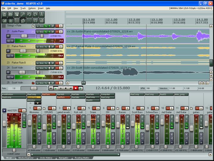
I like the Reaper v2 look, even to this day I still use this theme in the current version :)
beats the dark grey on more dark grey look of everything these days!

It's so clear
Image
Image

Post

Babya Logic

Post

If only the FabFilter folks would do the UI for a DAW...

Post

TheoM wrote:I must admit even now using cubase, Logic is still the only daw that never makes my eyes have to squint or twitch.

I am all about minimalism, and i think it's the only major daw that pulls that off - it may be all dark grey but it has that contrast separation and very easy to know what's selected or not.

Plus no matter if every editor is open, the info is not overwhelming, you can take it all in at a glance.

I keep trying to see in the demo, what i am missing in studio one cause SO many love the gui, and i just don't get how... I am actually confused cause even everything in life is subjective, there is NO contrast, NO separation, it's just a minefield of identical looking things with numbers everywhere. I've set up THE most basic S1 V3 project here, just 5 audio tracks, but opened everything to be showing.. here's a full screenshot.. how is that not headache inducing?

This took me about the last 30 minutes to do because my eyes kept watering and i kept on getting lost. I even had the V2 theme on which is much better than the default (imo) - studio one V2 was just SO much easier to navigate!

Can you guys honestly tell me this looks good and clearly understandable?

Image
But just to be fair, rarely will anyone probably actually NEED all those things open at once. Not only is that image apparently from a lower resolution monitor, making everything more squished, but everything is open at once. I can't recall ever needing everything being open. Pretty much everything in your screenshot can be hidden, and likely will be most of the time.

I am one who actually loves the Studio One V3 interface. It CAN get busy, but most hosts can if you open everything. I'm not saying that Studio One has the BEST interface(I'm personally a huge fan of the Logic and Cubase looks, though I don't use either one), it is by no means any more complex than most hosts out there. And it is at least unified.

I've also been a fan lately of the Bitwig interface(though I don't use it either, lolol). Sonar, Reaper and Samplitude are all kind of a mess to me, even with different themes. The interfaces don't seem consistent or unified enough, and they try too hard at being slick without actually accomplishing it because of the little details.

But as for Studio One, I find that in a normal session, the interface is great. It doesn't get in your way, doesn't have too many extra visual distractions, and allows you to open what you need and hide what you don't. If I were on Mac, I'd probably give Logic a shot. But otherwise, I'm perfectly fine with Studio One 3.

YMMV, of course.

Brent
My host is better than your host

Post

koolkeys wrote:
TheoM wrote:I must admit even now using cubase, Logic is still the only daw that never makes my eyes have to squint or twitch.

I am all about minimalism, and i think it's the only major daw that pulls that off - it may be all dark grey but it has that contrast separation and very easy to know what's selected or not.

Plus no matter if every editor is open, the info is not overwhelming, you can take it all in at a glance.

I keep trying to see in the demo, what i am missing in studio one cause SO many love the gui, and i just don't get how... I am actually confused cause even everything in life is subjective, there is NO contrast, NO separation, it's just a minefield of identical looking things with numbers everywhere. I've set up THE most basic S1 V3 project here, just 5 audio tracks, but opened everything to be showing.. here's a full screenshot.. how is that not headache inducing?

This took me about the last 30 minutes to do because my eyes kept watering and i kept on getting lost. I even had the V2 theme on which is much better than the default (imo) - studio one V2 was just SO much easier to navigate!

Can you guys honestly tell me this looks good and clearly understandable?

Image
But just to be fair, rarely will anyone probably actually NEED all those things open at once. Not only is that image apparently from a lower resolution monitor, making everything more squished, but everything is open at once. I can't recall ever needing everything being open. Pretty much everything in your screenshot can be hidden, and likely will be most of the time.

I am one who actually loves the Studio One V3 interface. It CAN get busy, but most hosts can if you open everything. I'm not saying that Studio One has the BEST interface(I'm personally a huge fan of the Logic and Cubase looks, though I don't use either one), it is by no means any more complex than most hosts out there. And it is at least unified.

I've also been a fan lately of the Bitwig interface(though I don't use it either, lolol). Sonar, Reaper and Samplitude are all kind of a mess to me, even with different themes. The interfaces don't seem consistent or unified enough, and they try too hard at being slick without actually accomplishing it because of the little details.

But as for Studio One, I find that in a normal session, the interface is great. It doesn't get in your way, doesn't have too many extra visual distractions, and allows you to open what you need and hide what you don't. If I were on Mac, I'd probably give Logic a shot. But otherwise, I'm perfectly fine with Studio One 3.

YMMV, of course.

Brent
I'm beginning to get used to it, and even kinda like it, as well.

I've adjusted the colors a little so there's a bit more contrast, and a slight blue hue, so it's not as difficult to use.

I'd prefer that they stuck with the light theme of V2 and allowed you to adjust from there, but this isn't too bad, now. It works, it doesn't hurt my eyes (as some have claimed), and I can look at it for long periods of time. I'm planning on going with a UHD monitor soon, so it will become even less crowded than it is now.

I got used to Cubase's interface, but decided against Cubase clone interfaces when I was using Reaper. For Reaper, I preferred a hardware-inspired interface. Busy? Yes, but functional, with enough contrast to make everything clear and easy to use.
Blue Phase Music

Post

[DELETED]

Post

TheoM wrote:it's a retina monitor, not low res.

i would have the mixer and inspector at least open at all times.. was too much for me. The bit at the top with the warp tool i wouldn't usually have open, and the browser only when necessary
Did you have DPI scaling on? Because I have a 1080p laptop and I just recreated your screenshot(using the normal track height as you do, the mixer expanded to the same height, etc.), and it isn't that crowded. Sure, it is a bit busy with all those things open, but there is more space than what your screenshot shows.

If you are on a retina monitor, there has to be some DPI scaling turned on(Studio One turns it on my default, I believe, if you have a high resolution monitor- I turned it off). Because the buttons and toolbars are way too big for the resolutions you are running(that's why I assumed a lower resolution).

It may not help you like the interface any more, but just suggesting it in case you wanted to mess around with it a bit.

Brent
My host is better than your host

Post

Koolkeys, is that you?

Image

Post Reply

Return to “Hosts & Applications (Sequencers, DAWs, Audio Editors, etc.)”