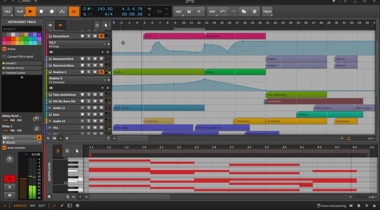
What do you think with this Ableton UI?? :D
-
- KVRist
- 151 posts since 11 Aug, 2016

-
- KVRAF
- 2140 posts since 16 Jan, 2013 from USA
I will say that having the headers on the right has always bugged me. I don't really know why. I doubt if they'll ever switch though. But a pop-up browser would be nice. So would an inspector.
Personally, I've always wondered why they don't put the help function in the bottom info field. Doesn't seem to give you a lot of info.
-
- KVRAF
- 5144 posts since 3 Oct, 2013
it's somehow familiar to me, but yepp as in Cubase/Bitwig, dunno why he track headers have been put to the right side originally


"Where we're workarounding, we don't NEED features." - powermat
-
twolegstoneworks twolegstoneworks https://www.kvraudio.com/forum/memberlist.php?mode=viewprofile&u=7585
- KVRian
- 1426 posts since 12 Jun, 2003 from Denmark
Think it's a signal-flow visualization thing. Tracktion has a bit of the same.xbitz wrote:..dunno why the track headers have been put to the right side originally![]()
- Banned
- 11467 posts since 4 Jan, 2017 from Warsaw, Poland
There are two things that bug me with Live's GUI
1) The fact, that there's no proper mixer in arrangement view - I don't care where channel strips are located (left or right), but they're so small and cryptic / minimalist, that I simply don't use them at all; I always go to Session and make my adjustments there
2) The fact, that Live has a full-screen mode (F11), but sometimes you need to go back to windowed mode to do something from the menu, that's not available in right-click / shortcuts
Otherwise I really love the minimalist, utilitarian and - still, after all those years! - futuristic look.
BTW, both of those issues are elegantly solved in Bitwig:
1) Via full mixer (with plugin/devices icons) that can be invoked in a lower panel in Arranger,
2) Via dynamic tiles up top and the Inspector (although there's little consistency on what's where, eg. muting or reversing things)
What I miss in Bitwig is the ability to have a mixed view with regards to tracks' height: they're either single-line high like in @xbitz' screenshot, or double-line+ (freely expandable), which is very inconvenient, because most of the time I'd like to work on 1-2 tracks, while having the rest of them minimised.
1) The fact, that there's no proper mixer in arrangement view - I don't care where channel strips are located (left or right), but they're so small and cryptic / minimalist, that I simply don't use them at all; I always go to Session and make my adjustments there
2) The fact, that Live has a full-screen mode (F11), but sometimes you need to go back to windowed mode to do something from the menu, that's not available in right-click / shortcuts
Otherwise I really love the minimalist, utilitarian and - still, after all those years! - futuristic look.
BTW, both of those issues are elegantly solved in Bitwig:
1) Via full mixer (with plugin/devices icons) that can be invoked in a lower panel in Arranger,
2) Via dynamic tiles up top and the Inspector (although there's little consistency on what's where, eg. muting or reversing things)
What I miss in Bitwig is the ability to have a mixed view with regards to tracks' height: they're either single-line high like in @xbitz' screenshot, or double-line+ (freely expandable), which is very inconvenient, because most of the time I'd like to work on 1-2 tracks, while having the rest of them minimised.
- Beware the Quoth
- 35517 posts since 4 Sep, 2001 from R'lyeh Oceanic Amusement Park and Funfair
Well, generally, there's more 'stuff' on the track header that actually affects the signal as it is after the output from the track. The main stuff being mute/solo, inserts, sends, volume, output routing etc.xbitz wrote: dunno why he track headers have been put to the right side originally![]()
Metering fits either side (ideally both) but the main stuff that affects the input to the track is really just input routing, and record arming etc.
The most 'realistic' representation, really, in terms of visualising the signal flow, is to have the controls etc related to the input to the track on the left, and controls related to the output from the track on the right. Only Tracktion does this though, AFAIK.
An idiot on Set Theory:
"In some cases there is an object called red that contains everything that is red. In much the same way a pot is a plate."
- Banned
- 11467 posts since 4 Jan, 2017 from Warsaw, Poland
Well technically, I'd say it should be inverse - the arrangement moves (as it plays) to the left, eg. if you have a waveform or MIDI clip its content will be played at the left edge first and then move to right. So, output-related controls should be on the left (volume fader, solo/mute, output routing), while input-related on the right (input routing, record arm, sends).whyterabbyt wrote:The most 'realistic' representation, really, in terms of visualising the signal flow, is to have the controls etc related to the input to the track on the left, and controls related to the output from the track on the right. Only Tracktion does this though, AFAIK.
I don't care either way really (it's just a convention) as long as it's readable and usable.
- Beware the Quoth
- 35517 posts since 4 Sep, 2001 from R'lyeh Oceanic Amusement Park and Funfair
Well, we're talking about them being inputs to/outputs from the track, which is the container for clips, so placed relative to that container. Signal flow rather than signal source.antic604 wrote:Well technically, I'd say it should be inverse - the arrangement moves (as it plays) to the left, eg. if you have a waveform or MIDI clip its content will be played at the left edge first and then move to right.
Also, I'd expect that most people see the DAW UI as containing a scrolling view of the track contents rather than a cursor which is dragging the whole DAW UI along with it. (cf the playhead of tape machines, the device that linear DAWs basically started off replicating the functionality of)
Furthermore, it makes no sense for Session-type views, since we're talking about Live. Replace top/bottom with left/right and it still works in terms of the signal flow Im talking about, but not your clip-centric reversion of it.
An idiot on Set Theory:
"In some cases there is an object called red that contains everything that is red. In much the same way a pot is a plate."
- Banned
- 11467 posts since 4 Jan, 2017 from Warsaw, Poland
Regardless of how you look at DAW's UI, the audio information appears first on the right and scrolls to the right. Hence my post: signal enters the DAW "to the right" of the arranger window and leaves it "to the left" of it. But as I said, it's merely a convention - probably derived from how we read text, which in turn influenced musical notation - and only really relevant when moving between DAWs that have them placed differently.whyterabbyt wrote:Well, we're talking about them being inputs to/outputs from the track, which is the container for clips, so placed relative to that container. Signal flow rather than signal source.
Also, I'd expect that most people see the DAW UI as containing a scrolling view of the track contents rather than a cursor which is dragging the whole DAW UI along with it. (cf the playhead of tape machines, the device that linear DAWs basically started off replicating the functionality of
I don't think anyone mentioned Session View here, in context of channel strip placing?whyterabbyt wrote:Furthermore, it makes no sense for Session-type views, since we're talking about Live. Replace top/bottom with left/right and it still works in terms of the signal flow Im talking about, but not your clip-centric reversion of it.
- Beware the Quoth
- 35517 posts since 4 Sep, 2001 from R'lyeh Oceanic Amusement Park and Funfair
And yet I'm specifically talking about looking at placement of elements of the DAW's UI, as a representation of the signal flow.antic604 wrote:Regardless of how you look at DAW's UI, the audio information appears first on the right and scrolls to the right.
And yes, it is a left-right reading bias, something that's prevalent enough that it makes sense to maintain. Nitpicking over that makes no sense, the best UI design would allow either.
It doesnt really matter whether it was already mentioned, the point was that if you have multiple UI views, then maintaining consistency between the elements of those views justifies the decision of how to place the elements in the first place. It could easily be a mixer view or any other vertical arrangement.I don't think anyone mentioned Session View here, in context of channel strip placing?
My point was that ideally the elements should reflect the signal flow, and, despite its ubiquity in DAWs, having all a layout with all those elements on the same 'side' doesnt do that.
edited : to correct misattribution of the second quote block
Last edited by whyterabbyt on Thu Jan 04, 2018 6:27 pm, edited 1 time in total.
An idiot on Set Theory:
"In some cases there is an object called red that contains everything that is red. In much the same way a pot is a plate."
-
- KVRAF
- 2140 posts since 16 Jan, 2013 from USA
Yes, it absolutely follows the signal flow. It bugs me simply because it's not what I'm used to.
But just because something bugs me, doesn't mean it shouldn't be that way.
That said, in a language that's read left to right, and headings are always to the left, we're trained from birth (excuse me right-to-left language folks) to expect them there.
However, following that argument, as Live is a performance program first and foremost, then perhaps that arrangement should be to the left as that's where you want the user focus.
To be perfectly honest, I find Live's I/O and mixer sections in arrangement mode very confusing visually. Both when they're static, and when elements are constantly appearing and disappearing depending on how tall the track is. So I wouldn't mind at all if there were a an option for the mixer in the bottom pane. Or for that matter, an option to put the headers on the left and the browser on the right.
And I do mean options. I would never want to disturb the work that untold users have put in to become facile with the program!
All of this is just mulling over the MO of an already brilliant program that has certainly carved out a huge niche. But if Ableton allowed more layout (and key command) customization, and the ability to do so certainly seems to be there, they'd probably steal users from the more traditional DAWs in droves. What I would NOT want them to do is to mess with the core workflow which, because it's meant to be used live is very very quick once you learn it.
But just because something bugs me, doesn't mean it shouldn't be that way.
However, following that argument, as Live is a performance program first and foremost, then perhaps that arrangement should be to the left as that's where you want the user focus.
To be perfectly honest, I find Live's I/O and mixer sections in arrangement mode very confusing visually. Both when they're static, and when elements are constantly appearing and disappearing depending on how tall the track is. So I wouldn't mind at all if there were a an option for the mixer in the bottom pane. Or for that matter, an option to put the headers on the left and the browser on the right.
And I do mean options. I would never want to disturb the work that untold users have put in to become facile with the program!
All of this is just mulling over the MO of an already brilliant program that has certainly carved out a huge niche. But if Ableton allowed more layout (and key command) customization, and the ability to do so certainly seems to be there, they'd probably steal users from the more traditional DAWs in droves. What I would NOT want them to do is to mess with the core workflow which, because it's meant to be used live is very very quick once you learn it.
- Beware the Quoth
- 35517 posts since 4 Sep, 2001 from R'lyeh Oceanic Amusement Park and Funfair
dang, mispost. ignore this.
An idiot on Set Theory:
"In some cases there is an object called red that contains everything that is red. In much the same way a pot is a plate."
-
- KVRAF
- 2140 posts since 16 Jan, 2013 from USA
Neck issues don't allow me to use dual displays. I can't even like those ultra wide thingies. But good point. 