Even if I think this all doesn't matter at all...I also think that is a point very important for the sale success of a product... unfortunately. People seem to want to have shiny surfaces...
... not important for me as I highly appreciate AuroraFM and products from MeldaProduction for what they are but most people do not like the graphical aspect. As if that would matter. In fact that are just pixels and for sure pixels do not make a single sound in the end, do they?

Aurora FM - New Win(32/64) VSTi FM synthesizer - Introductory pricing
-
- KVRian
- 900 posts since 22 Nov, 2017
-
- KVRAF
- 2418 posts since 9 Nov, 2016
I guess you could play a synth by typing in the midi instructions but nobody does that right?
People are graphically oriented. Pixels matter.
People are graphically oriented. Pixels matter.
-
- KVRian
- 900 posts since 22 Nov, 2017
For one person more for another less.
-
 gentleclockdivider gentleclockdivider https://www.kvraudio.com/forum/memberlist.php?mode=viewprofile&u=203660
 - Banned
- 6787 posts since 22 Mar, 2009 from gent
I also prefer non shinny flat surfaced gui's when well executed . ( izotope plugs etc )nichttuntun wrote: Tue Nov 27, 2018 11:24 am Even if I think this all doesn't matter at all...I also think that is a point very important for the sale success of a product... unfortunately. People seem to want to have shiny surfaces...
... not important for me as I highly appreciate AuroraFM and products from MeldaProduction for what they are but most people do not like the graphical aspect. As if that would matter. In fact that are just pixels and for sure pixels do not make a single sound in the end, do they?
Aurora is on the right track , personally I find the gradient colours distracting .
They mess with your head when changing the algoritm and the placement of the operators / gradient colours , resulting in a fake 3d , bevelled illusion
Eyeball exchanging
Soul calibrating ..frequencies
Soul calibrating ..frequencies
-
- KVRAF
- 2332 posts since 24 Jun, 2006 from London, England
Yeah I think it's just the gradient and colour saturation that makes things a little too much in your face. The flat muted colours (with optional further tweaking of the colours using a colour picker) of TAL stuff always seems to balance simplicity & clarity

-

- KVRAF
- 11162 posts since 16 Mar, 2003 from Porto - Portugal
TAL plug-ins also don't use a different color for each box, use clear colors (and at the same time allow user to pick its favorite color scheme) and have big and clear handles for every control (knobs or faders). At the same time they also have a clear display where values are shownmcbpete wrote: Wed Nov 28, 2018 3:10 pm Yeah I think it's just the gradient and colour saturation that makes things a little too much in your face. The flat muted colours (with optional further tweaking of the colours using a colour picker) of TAL stuff always seems to balance simplicity & clarity
And visual elements (like sample editing or sample maps, or, in the case of an FM synth, algorithm editing, if that exists, and big envelope editors) would be called in a secondary window from the main window.
Just "small" details that make a "huge" difference.
Fernando (FMR)

-
- KVRian
- 1134 posts since 22 Aug, 2004 from Edge City, the Low Country
Now that's awful! The colors are so muted that at the most dimmed setting (which I very much prefer due to my migraine!) of my monitor I cannot distinguish a single thing on that GUI!mcbpete wrote: Wed Nov 28, 2018 3:10 pm Yeah I think it's just the gradient and colour saturation that makes things a little too much in your face. The flat muted colours (with optional further tweaking of the colours using a colour picker) of TAL stuff always seems to balance simplicity & clarity
And that's why I
-
- KVRian
- 900 posts since 22 Nov, 2017
Just a very spontanious reaction to that TAL skin:
TAL uses a kind of generic Style which hasn´t character of its own. This skin tries to imply something, it relies on something people seem to like because they know it...a bit of the Roland TB 303 style. This is mimicing something what isn´t there. That´s okay for me but I don´t fall in love with it either and when I would use this TAL instrument I wouldnd even mind because my focus would be programming and making music and not design-spotting.
Ryan made a design-decision. Why does it seem to be so hard for many people to accept things like they are? It´s NOT important for making sound-design how the thing looks, isn´t it? You may think that but it isn´t at all. And if you think something isn´t an inspiration for your creativity...and blame that on the looks of a software instrument...you can´t be more mislead and you are for sure searching the "wrong" area.
-
- KVRAF
- 2332 posts since 24 Jun, 2006 from London, England
So for me I like the muted colours and so the above works - For you, you want/need the contrast so you'd want something brighterZeePok wrote: Wed Nov 28, 2018 5:58 pm Now that's awful! The colors are so muted that at the most dimmed setting (which I very much prefer due to my migraine!) of my monitor I cannot distinguish a single thing on that GUI!
So you could have this
or this
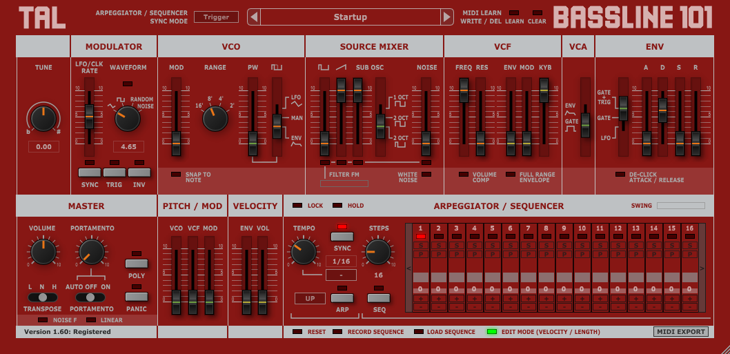
or this
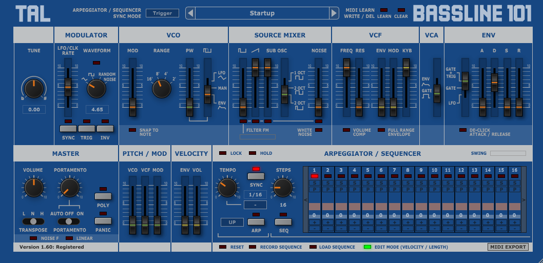
or any other colour combination you want to use, using the colour picker in each of the plugins.
-
- KVRAF
- 2418 posts since 9 Nov, 2016
I don't mean to 'overdo' this discussion but that 's so very wrong my friend.nichttuntun wrote: Wed Nov 28, 2018 6:15 pm It´s NOT important for making sound-design how the thing looks, isn´t it?
The way a product handles and looks like is very important.
In fact, in airplanes, the design means/meant the difference between life and death.
Before we had digital altimeters, you had analog altimeters with 3 arrows/pointers.
Numerous planes crashed because the pilots could not read the analog altimeter (remember: 3 arrows) fast enough in a crisis situation.
The plane stuck into the ground before they had the time to assess their situation.
No kidding, this is a case right out of my ergonomics textbook.
In modern ages you have people complaining because they have to click one time too much in a application or website. I think it is exaggerated (and a logical design is more important than the number of clicks) but it does show how important it is to users.
-

- KVRist
- Topic Starter
- 233 posts since 1 Feb, 2008 from Regina, SK
The fact that in the previous couple of posts we have evidence of people who love the GUI's on the TAL plugins right next to people who hate the GUI's on the TAL plugins, paralleling the same for Aurora FM, should be enough to remind the people who hate my GUI to quit acting like they're RIGHT and the rest of us are wrong. Your opinion is different, but it's not more valid.
To muddy the issue, I'm going to opine that I like the TAL GUI's quite a bit. And I'm sure there are people out there who hate both, rounding out the set of all possible opinions...
But even though I find TAL-Sampler to be superficially aesthetically pleasing (brown's one of my favourite colours), I think it suffers from too much homogeneity and not enough compartmentalization, as I think many other plugins do too. They miss out on opportunities to make better use of colour-coding or other mechanisms that are conducive to providing better, quicker visual feedback.
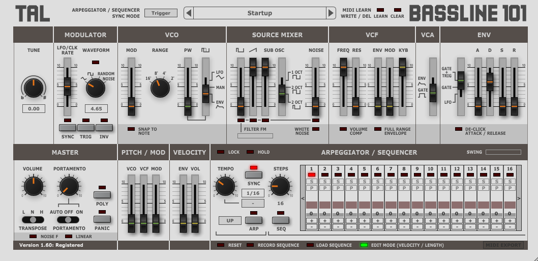
(I also mostly hate skeuomorphism, but I think TAL Bassline pulls it off very tastefully and appropriately).
And really, "your sales will increase."? Really? Are you a psychic? Omnipotent? Do you represent The League of People Who Hate Aurora FM's GUI and Would Definitely Buy A Copy If It Weren't For That Horrible GUI, and all of its thousands of members?
Did you know that I almost went into graphic design? Of course you didn't. Why are you so convinced that I'm this atrociously inept designer who needs to move out of the way for A Real Design Professional to do the job, because if only A Real Design Professional did the GUI, then of course everybody in the world would love it absolutely and nobody would dislike it the slightest bit and there wouldn't be any disagreement whatsoever and for the very first time in history every person would be in complete agreement....?
I have no intention whatsoever of getting someone else to do the GUI, because A) HAhaHAHha, with what f**king money?!?, and B) because f**k no, I'm doing the GUI because I WANT to do the GUI! That's just as much a part of creating this plugin as doing the coding is, and I'm doing all of this because I WANT to.
Now if you were to rephrase that as "Since some people have different preferences than what you're providing, you could consider catering to their preferences since it could possibly be beneficial to the success of your synth", then I'd agree with you.
And that's why there's a new theme in the newest version that does what some of you have been asking for - remove the big, bad, evil, maligned gradients.
To muddy the issue, I'm going to opine that I like the TAL GUI's quite a bit. And I'm sure there are people out there who hate both, rounding out the set of all possible opinions...
But even though I find TAL-Sampler to be superficially aesthetically pleasing (brown's one of my favourite colours), I think it suffers from too much homogeneity and not enough compartmentalization, as I think many other plugins do too. They miss out on opportunities to make better use of colour-coding or other mechanisms that are conducive to providing better, quicker visual feedback.
(I also mostly hate skeuomorphism, but I think TAL Bassline pulls it off very tastefully and appropriately).
Come on, man... What's the point of saying such silly, childish, obvious things? This doesn't contribute anything meaningful to the discussion. No, I'm not going to "just take the advice" because you say so, because the "advice" given to me, including yours, is just an opinion, it's not any more "right" than anything else, and it's certainly not more "right" than the way that I want to make MY plugin. Right?Stefken wrote: Tue Nov 27, 2018 11:17 am Just take the advice or let someone else do the UI.
There is a saying: most good coders are bad graphical designers and vice versa.
Let a designer do the Ui. No more discussions and your sales will increase.
And yes you can't become a designer overnight or by reading an article. Nor can people explain to you in 2 paragraphs how to change it. You can't explain how to code a synth in 2 paragraphs can you ? It takes years of experience just like coding does.
And really, "your sales will increase."? Really? Are you a psychic? Omnipotent? Do you represent The League of People Who Hate Aurora FM's GUI and Would Definitely Buy A Copy If It Weren't For That Horrible GUI, and all of its thousands of members?
Did you know that I almost went into graphic design? Of course you didn't. Why are you so convinced that I'm this atrociously inept designer who needs to move out of the way for A Real Design Professional to do the job, because if only A Real Design Professional did the GUI, then of course everybody in the world would love it absolutely and nobody would dislike it the slightest bit and there wouldn't be any disagreement whatsoever and for the very first time in history every person would be in complete agreement....?
I have no intention whatsoever of getting someone else to do the GUI, because A) HAhaHAHha, with what f**king money?!?, and B) because f**k no, I'm doing the GUI because I WANT to do the GUI! That's just as much a part of creating this plugin as doing the coding is, and I'm doing all of this because I WANT to.
Now if you were to rephrase that as "Since some people have different preferences than what you're providing, you could consider catering to their preferences since it could possibly be beneficial to the success of your synth", then I'd agree with you.
And that's why there's a new theme in the newest version that does what some of you have been asking for - remove the big, bad, evil, maligned gradients.
-
- KVRist
- Topic Starter
- 233 posts since 1 Feb, 2008 from Regina, SK
New version up!

- Improved custom GUI scaling. Now there's a handle in the bottom-right corner for on-the-fly continuous resizing as opposed to the old method which destroyed and recreated the GUI at each new size. The new method is much quicker at resizing. You can still use CTL/SHIFT + mousewheel on the main window to change the size in 5% increments, plus you can double-click on the main window to reset the size to unity.
- Improvements to the envelope / key scale controls:
- Increased the size of the cursor hitbox for the point handles by a couple of pixels.
- You can now distinguish when the cursor's over a point. The point handle is highlighted more when the cursor's over it as opposed to when it's the currently displaying point.
- A 2nd theme to placate users who don't like the gradients. It doesn't have any gradients and has slightly higher-contrast text in a few places.
- Minor graphical tweaks.
-
- KVRAF
- 11162 posts since 16 Mar, 2003 from Porto - Portugal
You could maybe write the plug-in in a away that it could use external graphics, and allow reskining. That way, people culd build whatever GUi they ant, and you would not have to pay anyone for it.RyFi wrote: Mon Dec 03, 2018 12:54 am I have no intention whatsoever of getting someone else to do the GUI, because A) HAhaHAHha, with what f**king money?!?, and B) because f**k no, I'm doing the GUI because I WANT to do the GUI! That's just as much a part of creating this plugin as doing the coding is, and I'm doing all of this because I WANT to.
Different skins is you answerRyFi wrote: Mon Dec 03, 2018 12:54 am Now if you were to rephrase that as "Since some people have different preferences than what you're providing, you could consider catering to their preferences since it could possibly be beneficial to the success of your synth", then I'd agree with you.for - remove the big, bad, evil, maligned gradients.
Your attitude seems very close to that of Admiral Quality. He too refused the evidence that his GUI was ugly and keep many potential customers away of his product. Until he admited, and allowed skinning. But then it was too late.RyFi wrote: Mon Dec 03, 2018 12:54 am And that's why there's a new theme in the newest version that does what some of you have been asking for - remove the big, bad, evil, maligned gradients.
You are following the same path, and can't admit that there are many who find your approach ugly and uninspiring, and your "color theory" something to laugh about. And no, I'm not "bitching" about the "new theme" because I wouldn't even bother installing the demo just to check it, after what you wrote. Anyway, I'm well served in what concerns FM synths, and my curiosity feel satisfied now. Good luck
Fernando (FMR)
-
- KVRAF
- 2418 posts since 9 Nov, 2016
It's not silly and was actually meant to give you a push and help. It's based on my years of experience as an actual designer in a development team.RyFi wrote: Mon Dec 03, 2018 12:54 am Come on, man... What's the point of saying such silly, childish, obvious things? This doesn't contribute anything meaningful to the discussion. No, I'm not going to "just take the advice" because you say so, because the "advice" given to me, including yours, is just an opinion, it's not any more "right" than anything else, and it's certainly not more "right" than the way that I want to make MY plugin. Right?
While design is a more fuzzy subject than e.g. physics, there is still a set of rules there is consensus about. So, no it's not all a matter of opinion. There is also extensive theory about how to use colors and your implementation is way off my friend.
Obviously there is no hate towards your gui; I know gui's can become like your child but it is also part of the learning process of a designer to be able to take a step back and accept criticism. It's a tough nut to crack, I know. But it's part of the job. And sorry your gui still needs a lot of work.
So don't be a childish stubborn one man project and learn to accept some criticism.
Your choice. This is the last thing I'm saying about it.
Last edited by Stefken on Mon Dec 03, 2018 11:13 am, edited 1 time in total.