Won't be a big deal for any of the 3rd party skin designers to tint it into non-toyish territory

Hive 2 is coming!
-

- u-he
- 30253 posts since 8 Aug, 2002 from Berlin
-
- u-he
- 30253 posts since 8 Aug, 2002 from Berlin
It's last chance to include changes before release. We hope to release right after Superbooth (first week of May IIRC)Touch The Universe wrote: Wed Jan 30, 2019 1:33 pm I like it. Is april the start of beta or release?
-
- u-he
- 30253 posts since 8 Aug, 2002 from Berlin
I'm sure it'll look fine. It might even become part of the keyboard control, as the keyboard control is on the verge to inherit more tasks (scale-based quantisations and stuff)mcbpete wrote: Wed Jan 30, 2019 1:31 pm Looking real nice - Does the microtuning box light up if there's anything other than 'none' set, that's the only box for me that looks a little unclear
-

- KVRAF
- 14498 posts since 16 Feb, 2005 from Planet Earth, Somewhere
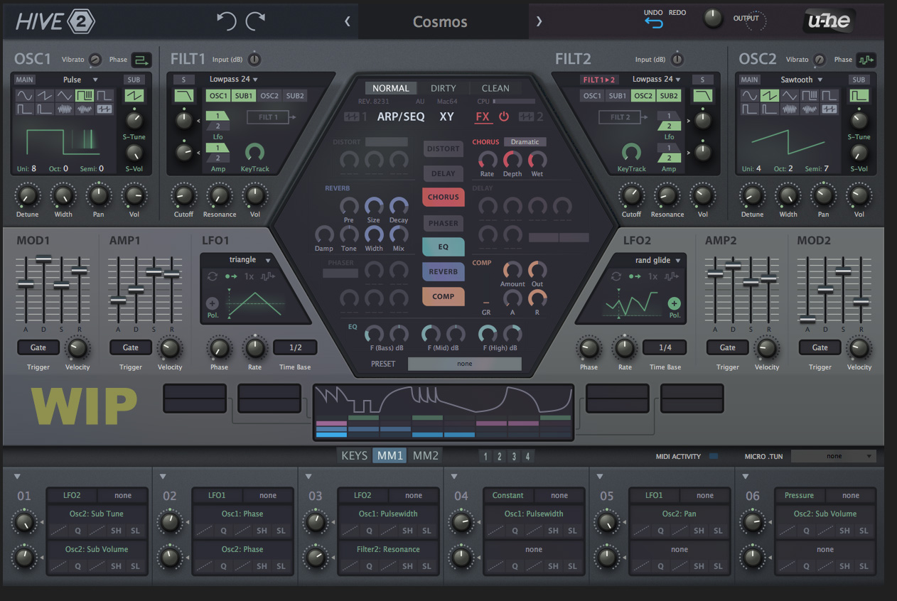
I like it except for the sliders which seems like they are from some other unrelated GUI to me.Urs wrote: Wed Jan 30, 2019 1:25 pm Not finished in terms of contrasts and stuff, but a rough glimpse at what we're going for:
Thoughts?
(we've got until, say, early April to change things...)
rsp
sound sculptist
-
- u-he
- 30253 posts since 8 Aug, 2002 from Berlin
-

- KVRAF
- 19886 posts since 16 Sep, 2001 from Las Vegas,USA
No of course not but that skin does not inspire me to purchase the Hive 2 upgrade especially if I have to then purchase a third party skin that does not look toyish (to my eyes).......
None are so hopelessly enslaved as those who falsely believe they are free. Johann Wolfgang von Goethe
-
- u-he
- 30253 posts since 8 Aug, 2002 from Berlin
-
- KVRAF
- 14498 posts since 16 Feb, 2005 from Planet Earth, Somewhere
And at the unbelievable price of 20 not 79 Euros I am sure he can afford a third party skin 
Maybe I missed it but what is this section all about?
rsp
Maybe I missed it but what is this section all about?
rsp
You do not have the required permissions to view the files attached to this post.
sound sculptist
-

- KVRAF
- 24456 posts since 7 Jan, 2009 from Croatia
I like it mostly. The part that somewhat throws me off is those knobs very close to the displays in OSC and FILT sections (S-Tune, S-Vol, and those two mod amount knobs I guess that's what they are). Makes sense to have those knobs below the displays with that padding there, but right next to the displays, looks a bit off. I'd much rather have the arc-based knobs there, like in the hexagon. The way it looks now looks as if knobs are glued onto the display itself. It's better done in the mod matrix where knobs are clearly on a very different background area (matching how Cut/Res/etc. knobs are - which is why that looks much better to me).
Also not a fan of S-Tune, S-Vol parameter names. It seems like Sub Tune and Sub Vol would fit, perhaps with some small widening of that display area.
Also why is Lfo not capitalized
Also not a fan of S-Tune, S-Vol parameter names. It seems like Sub Tune and Sub Vol would fit, perhaps with some small widening of that display area.
Also why is Lfo not capitalized
The new modular-inspired modulator.
-
- KVRist
- 139 posts since 28 Aug, 2017
Don't know, hard to explain: the old Hive had a modern UI with some technological aspect within its glossy graphics that immeadiately gave it character and showed what sounds/audience it is targeting (like Diva has a classical touch). This new UI looks flat, steril, cold, non-inspiring and a bit like directly out of StudioOne  It just isn't an eyecatcher anymore.
-
- KVRian
- 874 posts since 28 Nov, 2016
Something's making it hard to 'quickly get a read on', for me. Maybe not enough contrast in the group boundaries, or not enough negative space (for the sake of 'visual breathing room') or something. I like the overall design a lot, though.
-
- KVRist
- 360 posts since 26 Oct, 2018
Hmm, here is my take on it. Ill start off with the bad, and end with the good.Urs wrote: Wed Jan 30, 2019 1:25 pm Not finished in terms of contrasts and stuff, but a rough glimpse at what we're going for:
Thoughts?
(we've got until, say, early April to change things...)
The Bad
I prefer the interface of Hive1 better. It looks more solid and less plasticy, the mod/amp middle section on new UI being the worst offender. Looks very flat versus Hive1’s bold and robust look. The colors of the selected regions on Hive1 have a glow that pops out, whereas Hive2 seems like they are highlighted with a marker. I can imagine Hive1 being a real synth, that is hefty and can actually be used in a dark nightclub (glowing knobs and sliders.) Hive2, not so much. Cant picture that being a real synth. And if it was, I would still like Hive1 more.
The Good
I like the color matching on FX but some might say it’s too much. A possible solution is just to color match the fx name, but leave all the parameters/knobs the same color.
Edit*
Anything you put out Urs/Uhe team, will be fantastic as far as sound, but a lot of what makes people want to use a synth is the feeling you get when you use it. Ive made all types of sounds on Zebra2, but since I bought Hive I noticed Ive been using Hive more and get into “the zone” a little more with Hive. I open it, see that thing glowing at me, and feel like I need to make some crazy futuristic techno sounds. Dont get me wrong, Zebra2 is very capable of making ANY sound, but Hive gives me a different vibe, just because of the UI.
Last edited by Butwug on Wed Jan 30, 2019 2:36 pm, edited 1 time in total.