
Hive 2 is coming!
-

- u-he
- 30254 posts since 8 Aug, 2002 from Berlin
-
- KVRAF
- 2418 posts since 9 Nov, 2016
* Still suffers from the previous design. Why would you separate osc1 from osc2; why would you separate filter1 from filter2.Urs wrote: Wed Jan 30, 2019 1:25 pm Not finished in terms of contrasts and stuff, but a rough glimpse at what we're going for:
Thoughts?
(we've got until, say, early April to change things...)
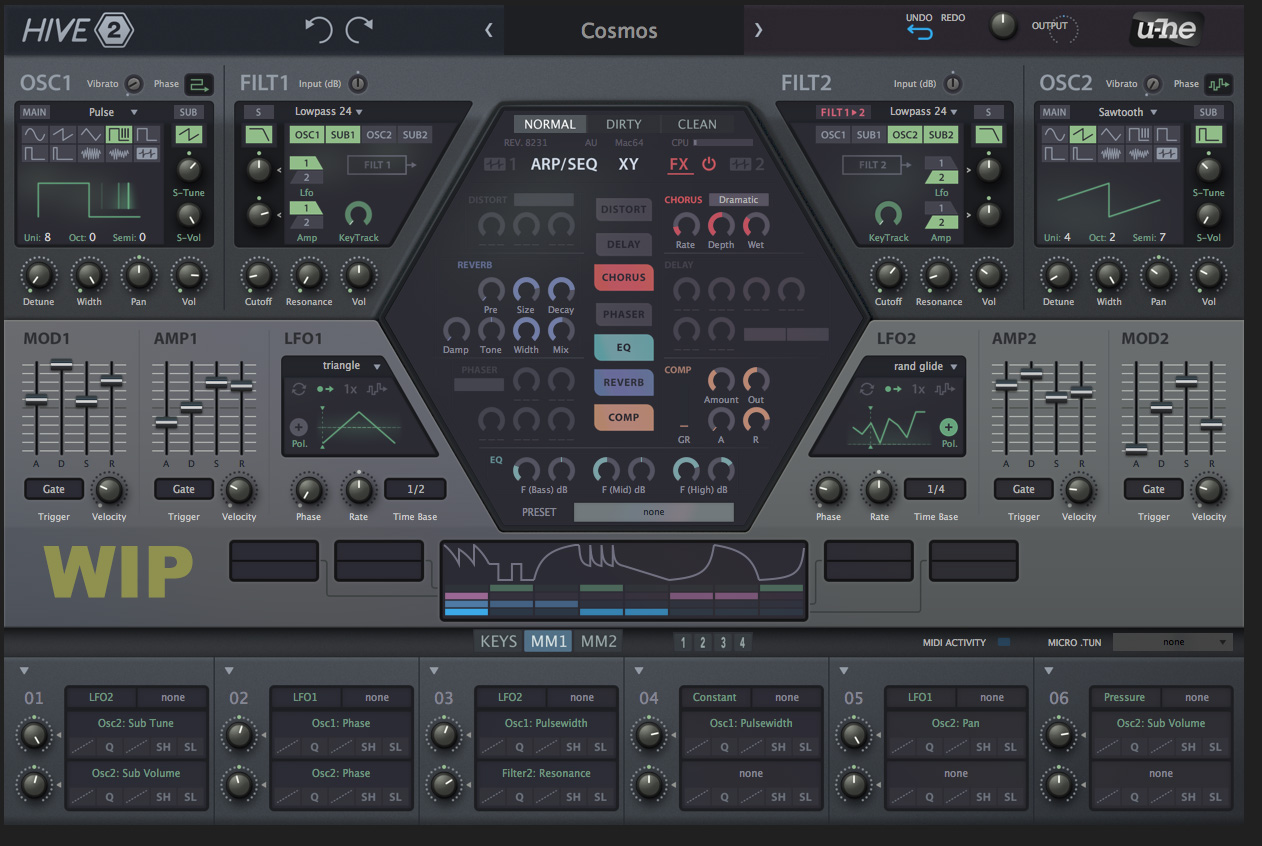
* The filter and osc sections are (very) important sections yet very cramped. The MM section could probably be constructed more efficiently in terms of screen real estate.
* It's a flatter look. I think it's easier on the eyes. I would flatten the 3d knobs more because now they kinda pop up from the UI.
* I like the separation you created between the osc+ filt / LFO+AMP+MOD / MM sections. It gives a clearer visual hierarchy. You might want to pump the contrast a tad more and see what gives.
* Yet the visual hierachy gives the impression that osc + filt and effects (that hexagon again
* The colors in the hexagon are OK for me. It also looks ok for colour blind people. They can see the difference (https://www.color-blindness.com/coblis- ... simulator/ )
* Why don't you house the arp in the WIP section? Plenty of horizontal space there.
* How much visualisation will there be? Serum and Pigments are highly praised for their real time visualisation. And there is a tendency for increased visualisation in soft synths (great benefit of a soft synth versus hardware). From what I can see the visualisation will be moderate at best.
* What is the difference between the arrows top left and the undo redo arrows? I guess you're still going to put things like polyfony, voices, save and stuff on the top 'banner'. I'm guessing this section is still very incomplete.
-

- KVRAF
- 11162 posts since 16 Mar, 2003 from Porto - Portugal
Funkybot's Evil Twin wrote: Wed Jan 30, 2019 3:13 pmNo, I got that (the modulation). I meant I'm curious in seeing how the "not visible from the teaser" Wavetable editor fits into the GUI. Where it goes, how it looks, etc.Urs wrote: Wed Jan 30, 2019 3:07 pmThat's not a wavetable editor, it's a modulation source.4. Curious what the wavetable editor looks like and how it fits in. Kinda like it in the Hexagon.
Fernando (FMR)
-
- u-he
- 30254 posts since 8 Aug, 2002 from Berlin
Symmetry. Typically, Hive is used as a dual layer synth, with both parts visible at once. While one can route freely, most presets don't use that feature.Stefken wrote: Wed Jan 30, 2019 3:19 pmWhy would you separate osc1 from osc2; why would you separate filter1 from filter2.
Yes, possibly. I want to use it before I make a final judgement.* The filter and osc sections are (very) important sections yet very cramped.
Maybe the top bar, yes, but not much. Depends on whether or not more elements pop up next to the white triangles. maybe it's missing labels or something, or maybe they can be left out. That's part of the process ahead.The MM section could probably be constructed more efficiently in terms of screen real estate.
* It's a flatter look. I think it's easier on the eyes. I would flatten the 3d knobs more because now they kinda pop up from the UI.
Experience tells me that, once the final layout is set in stone, there'll be a phase where the background gets more depth. It's been like this will all designs we did, including twangström and Colour Copy, which don't look too "flat".
Good idea. I'll bring it up and we might try it.* Why don't you house the arp in the WIP section? Plenty of horizontal space there.
I was going to check out options to do something similar to Serum, but I still can't cope with dancing/orbiting parameter visualisation balls. There is an idea for an optional detailed modulation overview on each knob, but I'm not sure how to do that for controls which are not knobs.* How much visualisation will there be? Serum and Pigments are highly praised for their real time visualisation. And there is a tendency for increased visualisation in soft synths (great benefit of a soft synth versus hardware). From what I can see the visualisation will be moderate at best.
Very incomplete, yes.* What is the difference between the arrows top left and the undo redo arrows? I guess you're still going to put things like polyfony, voices, save and stuff on the top 'banner'. I'm guessing this section is still very incomplete.
-
- KVRAF
- 11162 posts since 16 Mar, 2003 from Porto - Portugal
Please DON'T. Knobs are to be moved, so, they better pop up from the surface. Actually, I would like the envelope faders to pop up a little more too.Stefken wrote: Wed Jan 30, 2019 3:19 pm
* It's a flatter look. I think it's easier on the eyes. I would flatten the 3d knobs more because now they kinda pop up from the UI.
Fernando (FMR)
-
- u-he
- 30254 posts since 8 Aug, 2002 from Berlin
On second thought, people might want to see arpeggiator + sequencer and shape sequencer at once. It might be bad to make viewing them mutually exclusive.Urs wrote: Wed Jan 30, 2019 3:36 pmGood idea. I'll bring it up and we might try it.* Why don't you house the arp in the WIP section? Plenty of horizontal space there.
-
- KVRist
- 84 posts since 27 Nov, 2018
It would be great, if the routing of the synth could be shown somewhere like in plugmons skin. It gives a much quicker overview how everything is routed.
Maybe at the WIP area.
Maybe at the WIP area.
-
- KVRAF
- 11162 posts since 16 Mar, 2003 from Porto - Portugal
Sorry - second language problems - I meant inadequate (unsuitable). To my eyes, the font feels like an ET in that environment (this is just a feeling, a personal taste - I tend to not like Arial/Futura styled fonts)mcbpete wrote: Wed Jan 30, 2019 3:05 pm Think we'll have to agree to disagree about the typeface itself though, really like it (not sure what 'unadequated' means)
Last edited by fmr on Wed Jan 30, 2019 3:43 pm, edited 1 time in total.
Fernando (FMR)
-
- KVRist
- 84 posts since 27 Nov, 2018
I think ARP and Sequencer should be on the same page/area.Urs wrote: Wed Jan 30, 2019 3:38 pmOn second thought, people might want to see arpeggiator + sequencer and shape sequencer at once. It might be bad to make viewing them mutually exclusive.Urs wrote: Wed Jan 30, 2019 3:36 pmGood idea. I'll bring it up and we might try it.* Why don't you house the arp in the WIP section? Plenty of horizontal space there.
-
- u-he
- 30254 posts since 8 Aug, 2002 from Berlin
Honestly, I don't think it's necessary in Hive. Two oscillators + two subs into two filters is not rocket science.flocked wrote: Wed Jan 30, 2019 3:40 pm It would be great, if the routing of the synth could be shown somewhere like in plugmons skin. It gives a much quicker overview how everything is routed.
The actual complexity comes from the modulation routing.
-
- KVRAF
- 2418 posts since 9 Nov, 2016
To a big extend a matter of preference. My advice is not to mingle a flat implementation and a 3d implementation. Make everything (pretty) flat or everything (pretty) 3d. If there are resources for it, U-he can make 2 skins and everybody's happy...fmr wrote: Wed Jan 30, 2019 3:38 pmPlease DON'T. Knobs are to be moved, so, they better pop up from the surface. Actually, I would like the envelope faders to pop up a little more too.Stefken wrote: Wed Jan 30, 2019 3:19 pm
* It's a flatter look. I think it's easier on the eyes. I would flatten the 3d knobs more because now they kinda pop up from the UI.
-

- KVRAF
- 19894 posts since 16 Sep, 2001 from Las Vegas,USA
I never said there was....I only said this skin will not inspire me to upgrade. You asked for thoughts and I gave you mine. I simply find that skin ugly. No offense to whoever created it but we clearly have a difference in tastes. Sorry, just being honest........
It's painfully obvious that no one skin will please everybody. Never has, never will. That's why it wouldn't hurt to have some choices.
That skin won't prevent me from upgrading if the other features are worth it but I will immediately start searching for a more professional looking skin.
None are so hopelessly enslaved as those who falsely believe they are free. Johann Wolfgang von Goethe
-

- KVRAF
- 27005 posts since 3 Feb, 2005 from in the wilds
If the FX were in a bottom tab, then you could not have Matrix and FX at the same time and you lose drag-n-dropFunkybot's Evil Twin wrote: Wed Jan 30, 2019 2:58 pm My quick impressions:
2. Effects would be better suited in a tab at the bottom of the GUI and laid out horizontally like RePro or the Plugmon Hive skin IMO.
-
- KVRAF
- 27005 posts since 3 Feb, 2005 from in the wilds
Perhaps the FX could go in the WIP instead? Not sure how to do the ordering... hmmmUrs wrote: Wed Jan 30, 2019 3:38 pmOn second thought, people might want to see arpeggiator + sequencer and shape sequencer at once. It might be bad to make viewing them mutually exclusive.Urs wrote: Wed Jan 30, 2019 3:36 pmGood idea. I'll bring it up and we might try it.* Why don't you house the arp in the WIP section? Plenty of horizontal space there.
-
- u-he
- 30254 posts since 8 Aug, 2002 from Berlin