I'm sure they will!

Hive 2 is coming!
-

- u-he
- 30255 posts since 8 Aug, 2002 from Berlin
-
- KVRist
- 35 posts since 24 Jan, 2019 from Cincinnati, OH
Huge u-he fan, any ideas on when the beta will surface?
-
- u-he
- 30255 posts since 8 Aug, 2002 from Berlin
-

- KVRist
- 104 posts since 30 Nov, 2018 from U.S.
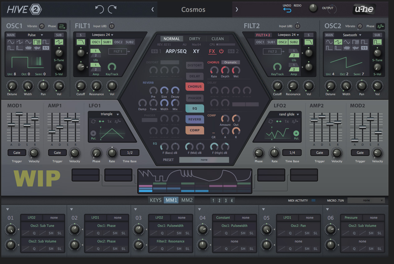
This looks really cool, very nice looking.Urs wrote: Wed Jan 30, 2019 1:25 pm Not finished in terms of contrasts and stuff, but a rough glimpse at what we're going for:
Thoughts?
(we've got until, say, early April to change things...)
Ableton Live 10 / Push
-
- KVRist
- 195 posts since 5 May, 2016
Hi Urs,
I think you're on the right track here. I like it a lot better than v1. The so called "military hardware" color scheme makes it look robust, almost dependable. Meanwhile the hexagon's colors balance that, evoking a promise of fun and flexibility. Very elegant and easy on the eyes overall.
If there is anything I'd suggest you work on, it would be better use of space, as some other members suggested. But above all please think deeply about the dials:
Some dials are used way more than others and in different ways. As a sound designer, I like it when dials are sized in accordance with their role and usage frequency.
I usually like to scrub the Cutoff in a very fine movements looking for sonic interest. Which is why I always welcome bigger dials there.
When I look at the filter sections in your mockup, I notice how the small Cutoff dials are almost identical in size to the KeyTrack scaler. How often would you use KT scale compared to the Cutoff? You may also notice how much space the KT is eating away in that section.
Another thing about dials within synths anywhere: It might look fun to shape them like their real world counterparts, but there is something crucial most designers overlook: We move them around with a good ol' mouse!
Imagine if you were asked to program a Moog, but prohibited from using your fingers as a caveat: "Use anything stick shaped but no fingers"...how much fun would that be?
So my suggestion here is: Think deeply about the most elegant design for a "Dial" that feels natural and comfortable to use under a mouse pointer. If you're interested I can expand on this with you in private.
Wishing you continued success!
Last edited by MrM777 on Wed Jan 30, 2019 9:23 pm, edited 3 times in total.
-
- KVRian
- 721 posts since 4 Feb, 2017
Second that.Gregorius wrote: Wed Jan 30, 2019 2:28 pm The pastel shades and all backgrounds in grey make depressive. Hive 1 interface had energy and encouraged me to tweak it, but this looks like a tool for my grandmotherI feel I don't want to open it more often that I'd need to.
Like the idea of color coding the FX, but it's too much. The rectangular display in the diagonal shaped LFO sections are ugly, Hive1 had a knob that fitted into this corner. OSC & FILT looks a bit overwhelming while the rest of the screen feels more empty.
I dislike the fact that de AMP2 and MOD2 are switched places. Because both envelopes look similar I predict that I will often adjust the wrong slider here.
I like the new layout of the top half though and the new hexagon section is also an improvement.
-

- KVRAF
- 4114 posts since 24 Oct, 2000 from A Swede Living in Budapest
Superbooth you say... that would be fantastic! And great design BTW.
/C
/C
Underpowered Analog Drifting - Unique Sounds for Arturia Pigments 7
HARDWARE SAMPLER FANATIC - Akai S1100/S950/Z8 - Casio FZ20m - Emu Emax I - Ensoniq ASR10/EPS
HARDWARE SAMPLER FANATIC - Akai S1100/S950/Z8 - Casio FZ20m - Emu Emax I - Ensoniq ASR10/EPS
-
- KVRAF
- 4751 posts since 22 Nov, 2012
boomshaka that's gorgeous. those muted pastels are EXACTLY what i love.Urs wrote: Wed Jan 30, 2019 1:25 pm Not finished in terms of contrasts and stuff, but a rough glimpse at what we're going for:
Thoughts?
(we've got until, say, early April to change things...)
-
- KVRAF
- 2082 posts since 13 Dec, 2016
The GUI elements are from Zebra 2.8 ? Or is this a prototype design?
Last edited by enCiphered on Wed Jan 30, 2019 9:32 pm, edited 1 time in total.
Its over for Bitwig--CUBASE WON !!!!!!!!!!!!!!!!!!!!!!!!!!!!!!!!!
-
- KVRAF
- 2418 posts since 9 Nov, 2016
I concur. What is pretty much the first knob people will twiddle with on a hardware subtractive synth?MrM777 wrote: Wed Jan 30, 2019 8:26 pm
Some dials are used way more than others and in different ways. As a sound designer, I like it when dials are sized in accordance with their role and usage frequency.
I usually like to scrub the Cutoff in a very fine movements looking for sonic interest. Which is why I always welcome bigger dials there.
When I look at the filter sections in your mockup, I notice how the small Cutoff dials are almost identical in size to the KeyTrack scaler. How often would you use KT scale compared to the Cutoff?
And here it is a small dial with very little graphic interest in terms of position, size, separation, graphical properties, ...
-
- KVRist
- 360 posts since 26 Oct, 2018
Never felt like I needed the cutoff knob to be bigger or different than the rest of the knobs. Just putting a shortcut for minor adjustments is sufficient. Like cntrl+cursor movement or mouse wheel doing micro adjustments is plenty. Plus, isn’t the knob just a visual. You can put a huge knob that only does macro adjustments, or a tiny knob that does more accurate micro adjustmentsStefken wrote: Wed Jan 30, 2019 9:32 pm
I concur. What is pretty much the first knob people will twiddle with on a hardware subtractive synth?
And here it is a small dial with very little graphic interest in terms of position, size, separation, graphical properties, ...
-
Funkybot's Evil Twin Funkybot's Evil Twin https://www.kvraudio.com/forum/memberlist.php?mode=viewprofile&u=116627
- KVRAF
- 12517 posts since 16 Aug, 2006
Now that I'm home and not looking at it on my phone screen, I see the Wavetable section is basically unchanged except instead of saying WT1, there's an icon and a 1. I'm not sure that the icon is more clear. I missed it completely while looking on my phone. Overall, the greenish tint and text don't do it for me either, but I could see it as being very easy on the eyes.Funkybot's Evil Twin wrote: Wed Jan 30, 2019 4:21 pm ...when I said Wavetable Editor, I meant the existing wavetable screen from Hive with the position, loop, etc. Wavetable options screen I guess? What do we call that? Didn't mean building a full blown editor.
-

- KVRAF
- 24463 posts since 7 Jan, 2009 from Croatia
Satya does great work but that skin could've been much better. It is too uniform, to a fault, making it look drab and uninspiring. It appears as looking cool, but I'd find it much less usable in practice.pdxindy wrote: Wed Jan 30, 2019 5:11 pmOh, please no... there is no visual differentiation. I don't like that skin at all. If I had to work with that skin I would go in and change the backgrounds of the different modules and make them color coded so that there was visual separation.Teksonik wrote: Wed Jan 30, 2019 4:52 pm
For an example of what I consider professional look no further than the Spartan Gray skin by satYatunes:
-
- u-he
- 30255 posts since 8 Aug, 2002 from Berlin
It's the current state of Hive 2.0 design. We've taken the feedback from the screenshots we posted a year or two ago, and combined those into a design which keeps the hexagon.enCiphered wrote: Wed Jan 30, 2019 9:31 pm The GUI elements are from Zebra 2.8 ? Or is this a prototype design?
We've removed some of the excess space from Hive's original skin, in order to create space for addtional modulation sources. Those modulation sources are work in progress, but the UI widgets are close to being final. We also visualize the ModMatrix modifiers (curve, slew etc.) below the target slots.
Everything else is more or less the same.
-
- KVRAF
- 2418 posts since 9 Nov, 2016
The whole graphical user interface is 'just' a visual so you might just as well refrain from doing anything interesting, right ?? Just like music is just notes in a sequence so who cares what notes you play, right.