

There is simplicity and simplicity. In your example there is no UI. I have talked about simple UI without unusable junk. And yes even shadows and reflection on UI is distracting. Compare Ozone 5 with 8.
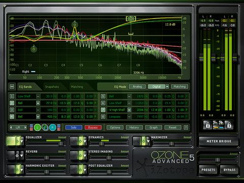

Do you think v 5 is more readable then v8? With all that shiny junk around?


