Hive 2 is coming!

VST, AU, AAX, CLAP, etc. Plugin Virtual Instruments Discussion
Locked New Topic
RELATED
PRODUCTS
Hive 2

Post

Urs wrote: Fri Apr 12, 2019 1:55 pm
Funkybot's Evil Twin wrote: Fri Apr 12, 2019 1:37 pm 2. The Cutoff and Resonance knobs are burried in the filter section (burying the lede). I'd probably put Cutoff and Responance where the Input and Volume knobs are, and adjust some things in that bottom row.
Lots of discussions here. We can refine this if necessary. We've planned to do some tests, but nothing set in stone.
Here's my thinking after looking at this again (1-3 were suggested yesterday, #4 is new):

1. Move Cutoff and Resonance where Input and Volume are currently located. This gives the most important controls the most prominence in the filter section. Hint: there's some empty space above, so you could even space them out a little more (from the row below) and maybe make them bigger if desired.

2. Move the Input knob to the far left of the bottom row in the filter section.

3. Move the Volume knob to the far right of the bottom filter row.

4. Now...on the right-side of the GUI, begin with the Cutoff and Resonance knobs on the far left for filter 2, then put the filter routing control to the right of that. So that top row would visually mirror what's happening in Filter1. Bottom row of knobs would follow the same layout as right-hand side.

I think those tweaks to the filter section would make the GUI both more symmetrical, but also more logical (most prominent knobs are displayed more prominently, input on the far left final output on the right to mirror flow).

Post

:lol:
SLH - Yes, I am a woman, deal with it.

Post

spunkmuffin wrote: Fri Apr 12, 2019 11:31 pm The beige band accross the centre and the thin curved divider lines remind me of Dmitry Sches Diversion.
I thought the same at first glance. Although I like it, it is definitely reminiscent of Diverson.
Bitwig Certified Trainer

Post

Funkybot's Evil Twin wrote: Sat Apr 13, 2019 4:27 pm1. Move Cutoff and Resonance where Input and Volume are currently located. This gives the most important controls the most prominence in the filter section. Hint: there's some empty space above, so you could even space them out a little more (from the row below) and maybe make them bigger if desired.
If you move the cutoff up there... how do you arrange the two modulator knobs and their switches?

Post

I did a quick mock up to illustrate the point, but didn't think it added any value so didn't save it. It works perfectly on the left side as described. On the right side, it can work if you raise the vertical position of the cutoff and resonance knobs. There's room above. You could also nudge the cutoff and res closer to the point created by the hexagon if the link is made smaller or moved. There was a lot one could do to play around with that layout to make it work.

Post

billcarroll wrote: Sat Apr 13, 2019 5:45 pm
spunkmuffin wrote: Fri Apr 12, 2019 11:31 pm The beige band accross the centre and the thin curved divider lines remind me of Dmitry Sches Diversion.
I thought the same at first glance. Although I like it, it is definitely reminiscent of Diverson.

quite a few synths have that dark/light combo, such as predator, helix etc

Post

AnX wrote: Sat Apr 13, 2019 6:37 pm
billcarroll wrote: Sat Apr 13, 2019 5:45 pm
spunkmuffin wrote: Fri Apr 12, 2019 11:31 pm The beige band accross the centre and the thin curved divider lines remind me of Dmitry Sches Diversion.
I thought the same at first glance. Although I like it, it is definitely reminiscent of Diverson.

quite a few synths have that dark/light combo, such as predator, helix etc
But there can be only one.

Post

The choice of colours and layout also reminded me of Satyatunes. IMO, his skins are good, but, not perfect. I also found the colour choice of the earlier GUI mockups a bit more consistent. Anyway, it's both a improvement to the default Hive 1 GUI.

Post

AnX wrote: Sat Apr 13, 2019 6:37 pm quite a few synths have that dark/light combo, such as predator, helix etc
I think it's more about the specific color of beige, too similiar. Personally, I like the sci-fi look of Hive 1. I don't think I'm at risk of getting lost because of a lack of color separation between the sections. Once you get to know a synth, none of that matters anyhow.

Post

This is a huge improvement compared to Hive 1 GUI, I was not a fan of that one. But, I am sure Urs is aware that he cannot please all the people...and he shouldnt be discouraged, he should simply go on with Hive 2 GUI forward, its top notch, easy on eyes and everything is clear and understandable, at least to me.

Post

Yes.

To me it's like switching from black and green monitors to modern LED screen.

Post

Urs wrote: Sat Apr 13, 2019 8:16 pm Yes.

To me it's like switching from black and green monitors to modern LED screen.
Your new monitor has arrived... :lol:

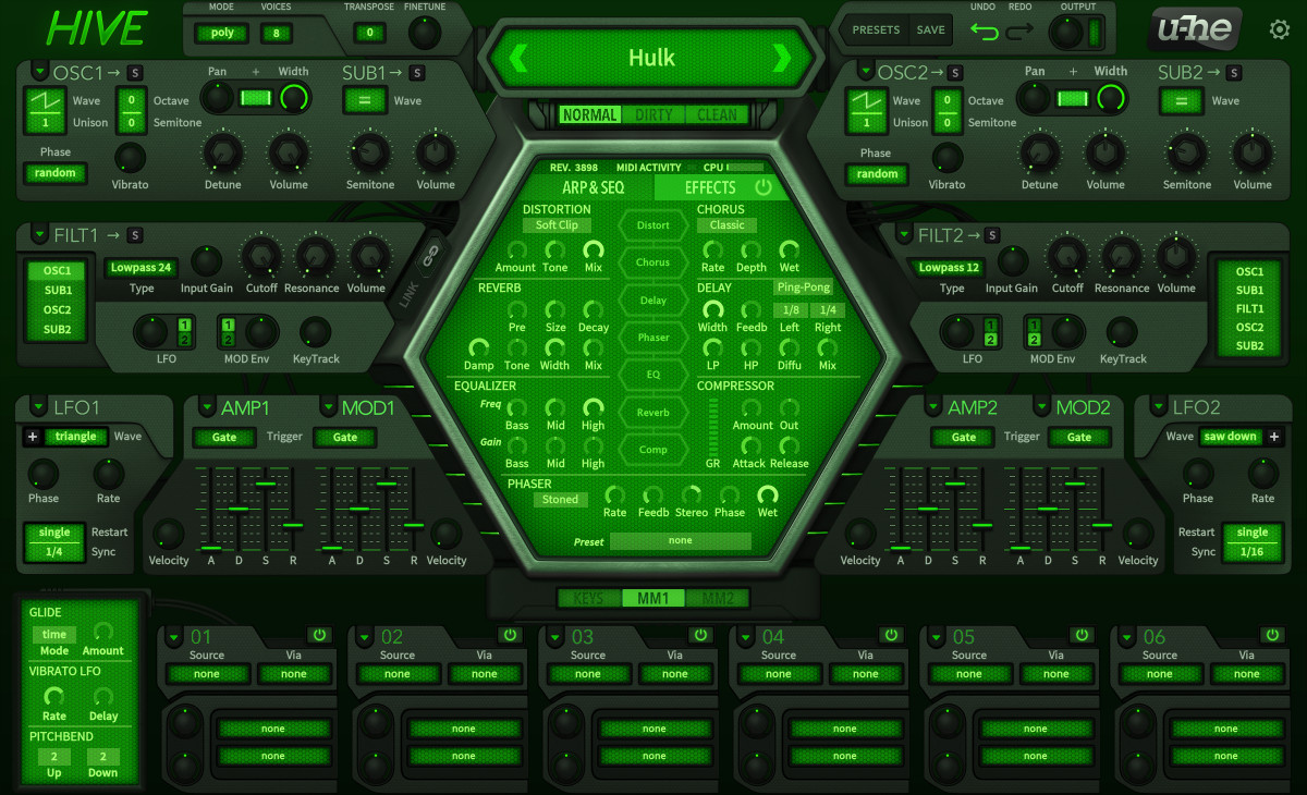
Image
KVR S1-Thread | The Intrancersonic-Design Source > Program Resource | Studio One Resource | Music Gallery | 2D / 3D Sci-fi Art | GUI Projects | Animations | Photography | Film Docs | 80's Cartoons | Games | Music Hardware |

Post

e@rs wrote: Sat Apr 13, 2019 7:12 am
BONES wrote: Fri Apr 12, 2019 10:50 pm I also like the mirror symmetry in this one, it makes a lot more sense than the way it is now in 1.2.
I personally hate it. Why do you think it makes more sense this way?
It's just what I'd expect. You probably look at it as left and right, where I look at it as inside and outside. Things on the outside are more isolated and easier to get at, so you put your important things there. Things on the inside are surrounded by clutter and feel less important. Maybe it's a graphic designer thing but it works for my brain.
e@rs wrote: Sat Apr 13, 2019 7:42 am Those LFO Polarity switches are way too big imho and they also stick out like they're the most important functions of the synth.
You say that but I had to look at your image very carefully to see what you were talking about. The colour deemphasises it a lot. I don't see a problem at all. The space is there, why not use it?
Yorrrrrr wrote: Sat Apr 13, 2019 2:53 pm Hive 2 looks amazing:
Very Cyclop/ArcSyn like. A bit fiddly to set up but it looks pretty thorough in its implementation.
NOVAkILL : Asus RoG Flow Z13, Core i9, 16GB RAM, Win11 | EVO 16 | Studio One | bx_oberhausen, GR-8, JP6K, Union, Hexeract, Olga, TRK-01, SEM, BA-1, Thorn, Prestige, Spire, Legend-HZ, ANA-2, VG Iron 2 | Uno Pro, Rocket.

Post

The "mirrored symmetry" makes sense for the LFOs since the round edge with the polarity button lines up with the hexagon, but the amp and mod envelopes don't really need to be "mirrored" imo. Just my two cents.

Post

generaldiomedes wrote: Sat Apr 13, 2019 8:06 pm
AnX wrote: Sat Apr 13, 2019 6:37 pm quite a few synths have that dark/light combo, such as predator, helix etc
I think it's more about the specific color of beige, too similiar. Personally, I like the sci-fi look of Hive 1. I don't think I'm at risk of getting lost because of a lack of color separation between the sections. Once you get to know a synth, none of that matters anyhow.
I think u-he looked at the MassiveX skin which has 2 x large beige bands and panicked. But they didn't have the balls to go all the way so now Hive is one-third beige. :hihi:
:hyper: M O N O S Y N T H S F O R E V E R :hyper:

Locked

Return to “Instruments”