And to answer your first question, someone wrote something like this many pages ago (albeit in a different context): the worst beta test team ever

Upcoming Synapse OB-Xa: Obsession
-

- Banned
- 3564 posts since 22 Aug, 2019
What makes you think such a minor change would take months to implement?! Shouldn't take more than 3 days.
And to answer your first question, someone wrote something like this many pages ago (albeit in a different context): the worst beta test team ever
And to answer your first question, someone wrote something like this many pages ago (albeit in a different context): the worst beta test team ever
-

- KVRAF
- 22906 posts since 8 Oct, 2014
So you're an expert coder. You know exactly how long GUI changes take. You know all the ins and outs of creating a synth and everything that goes into it.e-crooner wrote: Mon May 25, 2020 11:12 pm What makes you think such a minor change would take months to implement?! Shouldn't take more than 3 days.
And to answer your first question, someone wrote something like this many pages ago (albeit in a different context): the worst beta test team ever
You should start your own company and start making some money creating world class synths. I know I'd buy one if it was really good.
-
Echoes in the Attic Echoes in the Attic https://www.kvraudio.com/forum/memberlist.php?mode=viewprofile&u=180417
- KVRAF
- Topic Starter
- 12019 posts since 12 May, 2008
Nobody has to worry about the synth being delayed for months due to GUI stuff. Richard himself posted the image on the beta forum that was sent to him by someone here suggesting to move the mod section down and asked some opinions about layout. He would not be doing that if it would significantly delay things. There are still a few things being discussed, but I'm pretty sure Synapse wants to release it more than anyone else and can make up their own mind about what minor GUI changes they might make. He's very receptive but surely wouldn't delay the schedule unnecessarily, so I think people can chill about that question.
-
- Banned
- 3564 posts since 22 Aug, 2019
Who knows, I am using the Corona downtime to learn programming...wagtunes wrote: Mon May 25, 2020 11:23 pmSo you're an expert coder. You know exactly how long GUI changes take. You know all the ins and outs of creating a synth and everything that goes into it.e-crooner wrote: Mon May 25, 2020 11:12 pm What makes you think such a minor change would take months to implement?! Shouldn't take more than 3 days.
And to answer your first question, someone wrote something like this many pages ago (albeit in a different context): the worst beta test team ever
You should start your own company and start making some money creating world class synths. I know I'd buy one if it was really good.
-
Funkybot's Evil Twin Funkybot's Evil Twin https://www.kvraudio.com/forum/memberlist.php?mode=viewprofile&u=116627
- KVRAF
- 12443 posts since 16 Aug, 2006
I don’t think it’s better to delay at this point. But I hope it gets updated at a later time.
Because making some of the changes we’ve been discussing would make it better IMO.
Because making some of the changes we’ve been discussing would make it better IMO.
-
vitocorleone123 vitocorleone123 https://www.kvraudio.com/forum/memberlist.php?mode=viewprofile&u=333504
- KVRAF
- 2491 posts since 30 Jun, 2014 from Pacific NW
Very true!
And we are arguing the little stuff. I’ve no doubt it’s going to sound great and the UI won’t be any stranger to learn than any other synth.
It would have to be shockingly bad for me not to buy it on release day.
-
- KVRist
- 439 posts since 4 Oct, 2002
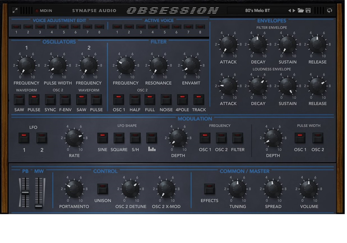
Because it was not in Oscillator section but in Control section on OB-XaFunkybot's Evil Twin wrote: Mon May 25, 2020 10:59 pm 1. Why is Osc2 Detune in the Control section and not the Oscillator section?
Because it was not present at all on OB-Xa.Funkybot's Evil Twin wrote: Mon May 25, 2020 10:59 pm 2. Why is Crossmod in the Control section and not the Oscillator section or even the Mod section?
GUI is perfectly good as it is right now, these ideas to "improve" it would just fu*k it up.
-

- GRRRRRRR!
- 17729 posts since 14 Jun, 2001 from Somewhere you're not!
That screen could have been placed anywhere, it was a deliberate decision to put it where you think the filter should go.e-crooner wrote: Mon May 25, 2020 9:57 pmUnlike the Xa, Dune 3 has a big display, else the filter would probably be to the right of the oscillators.
This is a question for Oberheim, not Synapse.Funkybot's Evil Twin wrote: Mon May 25, 2020 10:59 pm 1. Why is Osc2 Detune in the Control section and not the Oscillator section?
I imagine it's because they wanted to preserve the original layout of the hardware, which doesn't have that control at all, so they stuck where there was a space.2. Why is Crossmod in the Control section and not the Oscillator section or even the Mod section?
Correct, so the only way to go is down, which would look weird.Only answer I can possibly think of: because a decision was made early on to use the exact same GUI dimensions as The Legend... Otherwise, maybe you gotta make knobs smaller, or move some stuff around, or maybe make the whole thing bigger, then that creates maybe an issue with the Reason Rack GUI...
It is if you are trying to emulate something that exists in the real world. You try not to change it any more than is necessary, don't you?..but the answer isn't "because it makes sense to have those things where they are"
I would argue that in practice, the oscillator section is one of the least important parts of a synth UI. You don't interact with it nearly as much as you do with the filters, envelopes or other modulation sources. It's much more a "set and forget" part of the process.The mock-ups with the oscillators on top, particularly the one with Osc2 and Crossmod at least close to the Osc2 knobs, make sense for a plugin GUI where you want to put the most important things front and center.
If that makes sense then so does your positioning of the UI window within your host application and, here again, having those things on the bottom puts them closer to hand during that time when you are likely to be flicking from one to the other. (That's assuming your piano roll is at the bottom of your host's UI, like Cubase.)If this were a hardware desktop unit, yeah, having the oscs and filters on the bottom row where they're closest to the user's hands makes sense.
Of course it is and it meets your criteria, too. What's most important? Global parameters that effect everything, like the main Volume control. But synths aren't generally organised along those lines, they try to follow the signal path, which is why the main Volume is often the last thing, not the first. Modulators like LFO aren't in the signal path, so you can put them wherever you like. As I've pointed out several times already, in signal flow diagrams it is more common to see modulators above the main signal path than below, so it doesn't feel wrong at all to have the LFO above the oscillators and filter.We also read from left to right and top down in the west, which is why our eyes expect important things to be near the top. So when designing for a screen, it's not a great idea to put the oscillators and filters at the bottom, but it's much better to put them front and center.
It has very little to do with Richard, Tom Oberheim designed the OB-Xa that way. Rich is just trying to follow the original.If from the outset, Richard designed the GUI in a way where the Oscs and filter were front and center, and I came on here bitching about how they should be at the bottom of the GUI, you'd all think I was completely insane.
No, what we're saying is that it is designed like this for good and valid reasons and it makes no difference to the usability of the synth. You just have trouble reading that and remembering it, because it doesn't suit you to.Basically saying, "it's already designed like this and 'good enough'
No, it would just make it different. Adding a SEM filter would make it better, doubling the polyphony would make it better but rearranging the GUI would just make it different. Changing it after it was released would also piss off a lot of people who got used it the way it is.Funkybot's Evil Twin wrote: Mon May 25, 2020 11:33 pmI don’t think it’s better to delay at this point. But I hope it gets updated at a later time. Because making some of the changes we’ve been discussing would make it better IMO.
NOVAkILL : Legion GO, AMD Z1x, 16GB RAM, Win11 | Audient EVO 8 | Lumi Keys | Studio Pro 8
Korg Odyssey, bx-oberhausen, Proxima, PolyMax, GR8, JP6K, Union, Atomika,
Invader 2, Flow Motion, Olga, TRK 01, Thorn, Spire, VG Iron
Korg Odyssey, bx-oberhausen, Proxima, PolyMax, GR8, JP6K, Union, Atomika,
Invader 2, Flow Motion, Olga, TRK 01, Thorn, Spire, VG Iron
-

- KVRAF
- 14440 posts since 16 Feb, 2005 from Planet Earth, Somewhere
Tom Oberheim also made it Left to Right, not Top to Bottom and as I had mentioned before the OSC/Filter/Envelope takes up about 60% of the Hardware's Interface.
Anyway it is what it is..... if it sounds great I will I am sure get accustomed to it as it is.
rsp
Anyway it is what it is..... if it sounds great I will I am sure get accustomed to it as it is.
rsp
sound sculptist
-
- KVRAF
- 22906 posts since 8 Oct, 2014
The apocalypse must be coming because I totally agree with Bones.
I better mark my calendar.
I better mark my calendar.
-

- KVRAF
- 19803 posts since 16 Sep, 2001 from Las Vegas,USA
I don't care if they change the GUI or not. I won't be baffled, confused, or intimidated by it one way or the other. 
There is absolutely nothing wrong with the way it is but if changing it will shut people up then by all means do so....

There is absolutely nothing wrong with the way it is but if changing it will shut people up then by all means do so....
Probably because it's not f**ked up and beta testers have actually used the plugin instead of just viewing a screenshot.wagtunes wrote: Mon May 25, 2020 11:09 pm
1. Why wasn't all this brought up by the beta testers the FIRST time they looked at this GUI? I mean NOBODY said "Holy shit Richard, this GUI is totally f**ked up!"
None are so hopelessly enslaved as those who falsely believe they are free. Johann Wolfgang von Goethe
-
- GRRRRRRR!
- 17729 posts since 14 Jun, 2001 from Somewhere you're not!
If you look at it, I think it might shut two or three people up. Most people don't really seem to care one way or the other and I think it would be stupid to change anything because two or three people had a whinge.
First off, Tom's imperative was that he had a 5 octave keyboard sitting below it, so horizontal made the most sense. Rich's imperative is that it has to fit in the Reason rack, so he has had to compromise but at least he has followed the same section/parameter order as Mr Oberheim. I'd also suggest the osc/filter/env sections might take up 60% of the width but that part isn't very deep, with the patch banks below, so I reckon it's only 30% overall, just as it is in OBSession.zvenx wrote: Tue May 26, 2020 3:20 am Tom Oberheim also made it Left to Right, not Top to Bottom and as I had mentioned before the OSC/Filter/Envelope takes up about 60% of the Hardware's Interface.
NOVAkILL : Legion GO, AMD Z1x, 16GB RAM, Win11 | Audient EVO 8 | Lumi Keys | Studio Pro 8
Korg Odyssey, bx-oberhausen, Proxima, PolyMax, GR8, JP6K, Union, Atomika,
Invader 2, Flow Motion, Olga, TRK 01, Thorn, Spire, VG Iron
Korg Odyssey, bx-oberhausen, Proxima, PolyMax, GR8, JP6K, Union, Atomika,
Invader 2, Flow Motion, Olga, TRK 01, Thorn, Spire, VG Iron
-
- KVRist
- 108 posts since 14 Jan, 2020
I gotta say this "the most important things should be at the top" mantra strikes me as just wrong, and not reflected in most of the software we use regularly. what's more important in a browser, the page display or the file menu? the toolbar in a word processor or the actual text?
the focal point of your screen is not the top. where are you looking when you read this text? the most important things should be in the middle so as to minimise mouse travel time and eye strain.
the focal point of your screen is not the top. where are you looking when you read this text? the most important things should be in the middle so as to minimise mouse travel time and eye strain.
-
- KVRAF
- 4227 posts since 1 Sep, 2016
The original didn't have shimmer fx or bandpass filter so really that kind of argument is invalid.urosh wrote: Tue May 26, 2020 2:38 amBecause it was not in Oscillator section but in Control section on OB-XaFunkybot's Evil Twin wrote: Mon May 25, 2020 10:59 pm 1. Why is Osc2 Detune in the Control section and not the Oscillator section?
Because it was not present at all on OB-Xa.Funkybot's Evil Twin wrote: Mon May 25, 2020 10:59 pm 2. Why is Crossmod in the Control section and not the Oscillator section or even the Mod section?
GUI is perfectly good as it is right now, these ideas to "improve" it would just fu*k it up.
-
- Banned
- 133 posts since 26 May, 2020
+ 1
I have some nitpicks:
- 'Voice adjustment edit' sounds dumb, and 'Loudness envelope' sounds dumb.
- The knobs are obnoxious, esp. the inner 'starry' part and the 'material'
- Does it have to look like a pensioner's jacket suit?
- Obsessed with italics, are we at a Formula 1 race?
EDIT: But it has wood panels!