I like it be in some ways is a bit overwhelming. I get it because it can do a ton, but the layout is a bit... muchRazzia wrote: Mon Mar 01, 2021 2:21 pm I still think for utility per square inch it's hard to beat Avenger. It's not the most eye pleasing UI ever but it does its job and packs a million things into a UI that is neither cluttered nor confusing. I Just wish the browser wasn't always open, maybe expand the FX section so you could work more comfortably with the FX a la phase plant.


Skins you're most impressed by
-

- KVRist
- Topic Starter
- 413 posts since 29 Apr, 2019
-
- KVRAF
- 3496 posts since 30 Dec, 2014
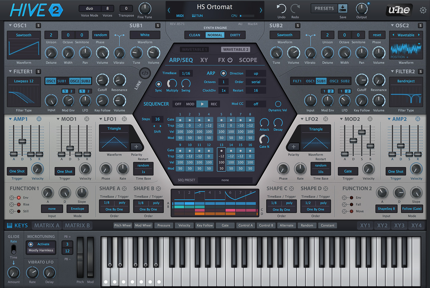
My reskin of Hive 2.

Original
Original
KVR S1-Thread | The Intrancersonic-Design Source > Program Resource | Studio One Resource | Music Gallery | 2D / 3D Sci-fi Art | GUI Projects | Animations | Photography | Film Docs | 80's Cartoons | Games | Music Hardware |
-
- KVRAF
- 4751 posts since 22 Nov, 2012
-

- KVRian
- 1426 posts since 30 Mar, 2014
I still do not understand or agree with Massive X's departure from Massive. Name me one thing about the synth that is the same? They didn't use the same design language (blue color, the logo, the fonts, the grid-like layout and UI elements) and it's certainly unrelated in the actual DSP and functionality.EnGee wrote: Sat Feb 27, 2021 11:39 am Anyway, from the most inviting GUI and design, Original Massive and Razor. I can spend long hours editing sounds with a smile using those two synths! I just love everything about them
Original Massive.jpg
It's a new synth, not Massive.
/rant over
-
- KVRAF
- 9144 posts since 7 Oct, 2005
There are many things similar, but also Massive X came with new things. The routing also is much more flexible than the original Massive.dangayle wrote: Tue Mar 02, 2021 10:18 pmI still do not understand or agree with Massive X's departure from Massive. Name me one thing about the synth that is the same? They didn't use the same design language (blue color, the logo, the fonts, the grid-like layout and UI elements) and it's certainly unrelated in the actual DSP and functionality.EnGee wrote: Sat Feb 27, 2021 11:39 am Anyway, from the most inviting GUI and design, Original Massive and Razor. I can spend long hours editing sounds with a smile using those two synths! I just love everything about them
Original Massive.jpg
It's a new synth, not Massive.
/rant over
Well, although I like the colours and design of original Massive more, I still think that Massive X is a masterpiece. Maybe when computers become faster after few years, MX will be more popular.
Using: Cubase Pro 15, Reason 13, Tascam US-4x4HR, MODX6, DM12D, LaunchKey 49, Yamaha guitar(Pacifica 612v) and bass (BB234) and some virtual instruments and synths.
-
 neverbeeninariot neverbeeninariot https://www.kvraudio.com/forum/memberlist.php?mode=viewprofile&u=350084
 - KVRian
- 1077 posts since 3 Feb, 2015 from UK
Aye, the promo vids, esp. the first one for MISHBY, are a fun, if not slightly unnerving watch
The crime hole is a nice touch if you're short of few sheckels.
-

- Banned
- 4491 posts since 8 Jul, 2008 from UK
I absolutely hate Avengers GUI, its the reason I won't buy it. Cramped, hard to work with and thats a deal breaker for me.Razzia wrote: Mon Mar 01, 2021 2:21 pm I still think for utility per square inch it's hard to beat Avenger. It's not the most eye pleasing UI ever but it does its job and packs a million things into a UI that is neither cluttered nor confusing. I Just wish the browser wasn't always open, maybe expand the FX section so you could work more comfortably with the FX a la phase plant.
Don't trust those with words of weakness, they are the most aggressive
-
- KVRAF
- 5664 posts since 7 Feb, 2013
Sorry, but that's a good example of a skin made to look "impressive" but barely useable.
Everything is too dark, almost no contrast. The original Hive skin is much better in this aspect (and looks better overall, IMO)
Another example is a skin posted in the Vital thread with a bit similar color scheme, it looked nice on a screenshot but when I installed that skin it turned out that I don't really enjoy using it (actually can barely read it).
You may think you can fly ... but you better not try
-
- KVRAF
- 2685 posts since 14 Jul, 2005 from Australia
I tend to agree. What many people don't seem to understand about dark themes, is that something which is too dark is just as fatuiging as something bright.recursive one wrote: Wed Mar 03, 2021 9:36 amSorry, but that's a good example of a skin made to look "impressive" but barely useable.
Everything is too dark, almost no contrast. The original Hive skin is much better in this aspect (and looks better overall, IMO)
Another example is a skin posted in the Vital thread with a bit similar color scheme, it looked nice on a screenshot but when I installed that skin it turned out that I don't really enjoy using it (actually can barely read it).
Even the big boys like Microsoft don't understand this, check out the Settings panel in dark mode on Windows 10, it's horrible.
While I'm a happy Windows 10 user again now, I will absolutely admit that Apple "gets it" when it comes to dark mode. macOS in dark mode looks absolutely stunning and it seems that 3rd party apps respect this design language too. It's so gentle and pleasing on the eyes.
Of course, more power to anyone creating their own skins, and we all see the world differently.
-
- KVRian
- 659 posts since 10 Oct, 2018
I tend to disagree with disagreement.recursive one wrote: Wed Mar 03, 2021 9:36 am Everything is too dark, almost no contrast. The original Hive skin is much better in this aspect (and looks better overall, IMO)
The dark skin works for me fine. The only thing which doesn't - the knob position has been made less readable.
It's a shame the picture's gone.
Weapons of choice (subject to change):
Godin Redline, Kuassa, Fuse Audio, Audiority, Roland A-500pro, Dune, Dagger, TAL, Reaper for Rock & Synthwave pleasures; Viper and FL Studio for guilty EDM pleasures
Godin Redline, Kuassa, Fuse Audio, Audiority, Roland A-500pro, Dune, Dagger, TAL, Reaper for Rock & Synthwave pleasures; Viper and FL Studio for guilty EDM pleasures

-

- KVRAF
- 4546 posts since 12 Jan, 2019
I made an Ableton skin some time ago. I used a website with an app for it. But it was not easy balancing all the components.
I first wanted to make a really dark one--but visible for my bad eyes. I like thing dim to avoid the blare of backlit screens. I could not achieve this, however. When too dark, gridlines were hard to see. Labels were hard to see. And there are a good number of button types and pull-down menus to consider. When I finished, it was not dark at all. And somehow, the buttons on groups are really hard to see, and the unselected loop bar is hard to see. I just settled on this:

Diva's stock skin really got me. Before I got Diva--but when I had in mind to get it--I kept thinking of it every time I saw a deep red colored car. Not bad marketing effect.
I first wanted to make a really dark one--but visible for my bad eyes. I like thing dim to avoid the blare of backlit screens. I could not achieve this, however. When too dark, gridlines were hard to see. Labels were hard to see. And there are a good number of button types and pull-down menus to consider. When I finished, it was not dark at all. And somehow, the buttons on groups are really hard to see, and the unselected loop bar is hard to see. I just settled on this:
Diva's stock skin really got me. Before I got Diva--but when I had in mind to get it--I kept thinking of it every time I saw a deep red colored car. Not bad marketing effect.
Doing nothing is only fun when you have something you are supposed to do.
-
- KVRian
- 567 posts since 21 May, 2016
To each his own. Lots of knobs close together, sure, but I don't personally feel that it's any more cramped than something like Hive, which I also love. Although I do agree that the always-open browser makes it feel more cramped than need beLeVzi wrote: Wed Mar 03, 2021 9:20 amI absolutely hate Avengers GUI, its the reason I won't buy it. Cramped, hard to work with and thats a deal breaker for me.Razzia wrote: Mon Mar 01, 2021 2:21 pm I still think for utility per square inch it's hard to beat Avenger. It's not the most eye pleasing UI ever but it does its job and packs a million things into a UI that is neither cluttered nor confusing. I Just wish the browser wasn't always open, maybe expand the FX section so you could work more comfortably with the FX a la phase plant.
What I love about it is the logical layout and the economy of space relative to the ridiculous amount of features. Lots of things that take up almost no space but save a bunch of hassle. Like each oscillator has its own white noise knob, and that noise osc has its own built in filter via rightclick + drag, and a small slider just beneath it with sample rate reduction for the noise osc. Same sort of deal with oscillator sync. In like a square centimeter of screen space you got something that potentially saves you a whole bunch of steps.
-

- KVRAF
- 26943 posts since 3 Feb, 2005 from in the wilds
I find MX quite good on the CPU.EnGee wrote: Tue Mar 02, 2021 11:11 pm Maybe when computers become faster after few years, MX will be more popular.
MX will be more popular when they add a browser, midi learn/automation and MSEG's.