I think you got lost. This is general hosts & applications........
Take the first turning left and then right for the Bitwig fanclub forum
I think you got lost. This is general hosts & applications........

You can also save different filter setups for the different places that open the browser. An empty instrument track opens instruments. Clicking before an instrument, opens the note effects. Clicking after an instrument opens to FX. Etc. Each of those can be configured and saved independently.mholloway wrote: Sat May 29, 2021 9:47 pmOh sweet! I honestly never realized that was possible. Saw this and checked, sure enough a right-click presents nodes for every column to be turned on / off -- radness. Thx! (I'm still mostly a Live user but also enjoy having BWS, but as a result I'm not thoroughly versed in all of its configurability. this is def a welcome tweak to know).
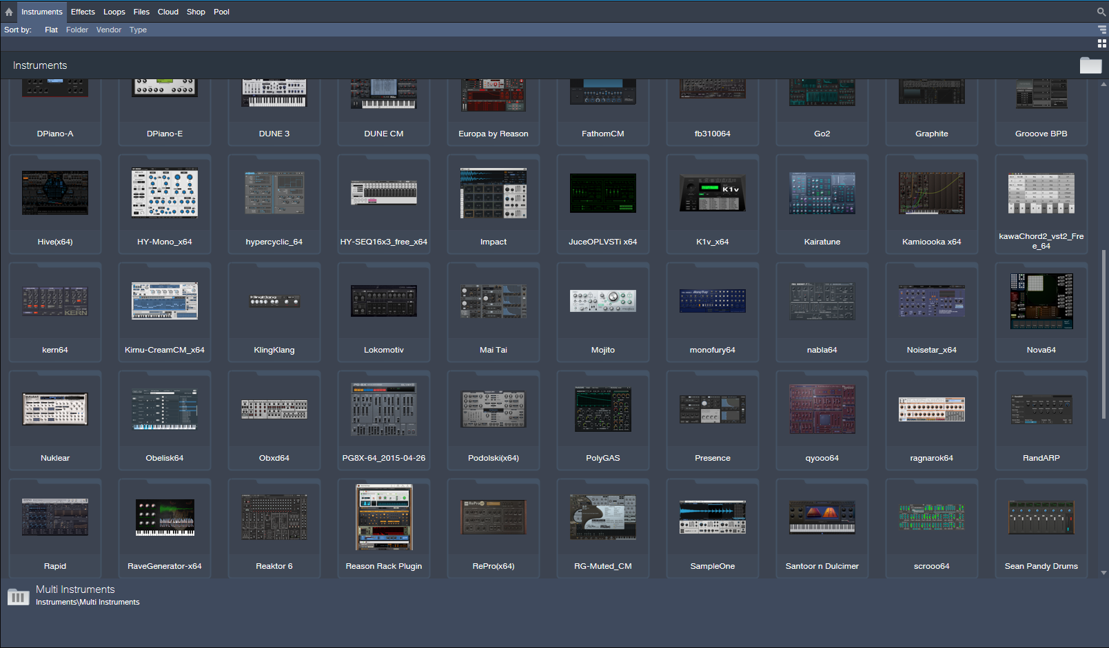

Yeah I really hope they don't go there, on the laptop here those thumbs look like indistinct blobs. So you can look at 50 blobs, great. You can look at probably 500 device names in the same window. I would rather a few usability changes to the browser as it is, than this. With a browser you have categories, IMO this is the way to narrow down a search when you're looking for a new device.THE INTRANCER wrote: Sun May 30, 2021 12:23 am With Studio One 4.5 and up you can actually show 50 plugin thumbnails of instruments at any one time at standard 1080P resolution. Just a matter of dragging the window across and dragging them to the left arrangement area to open. It's easy to manage them with ones you want to hide or use.
That is a terrible workflow! Bitwig is already 20x better/faster than that! I could have any plugin on a track before my eyes could even track a portion of that page.THE INTRANCER wrote: Sun May 30, 2021 12:23 am With Studio One 4.5 and up you can actually show 50 plugin thumbnails of instruments at any one time at standard 1080P resolution. Just a matter of dragging the window across and dragging them to the left arrangement area to open. It's easy to manage them with ones you want to hide or use. I mean if Bitwig was ableto do this, then Bigwig would be more inviting and modern.

Hmm, for me it comes off as cluttered and old school. I used to spend hours clicking on thumbnails back in the dial up days.THE INTRANCER wrote: Sun May 30, 2021 12:23 am I mean if Bitwig was ableto do this, then Bigwig would be more inviting and modern.
On 1080P 23.6 screen, they look pretty bold and clear to what they are, which is helped by the text below them because I honestly don't use them all, of which there is just over 100 in total. It is otherwise a fantastic way to get an overview of the instruments rather than just being presented with the obscurity of just a name you may not recognise. Better way to manage your favourites of which you would naturally have less than fifty of. Bitwigs fonts and that of which I view them look pretty terrible in Bitwigs browser I find, that 500 device names would certainly look like hell on a stick lol. Studio One's text isn't great either but that's not something that matters because you can recognise things just by the design of the thumbnail. In S1 it saves a lot of time in not having to open plugins just to see what they are like. You can use free screen colour utilities to colour code groups of plugin thumbnails when capturing a snapshot as well if not editing them directly in a photo editor. Such a utility can be found here... viewtopic.php?f=7&t=497277&hilit=negative+screen Sure it's a different way to go about things but it's more than what you can do with just a plugin name.machinesworking wrote: Sun May 30, 2021 12:34 amYeah I really hope they don't go there, on the laptop here those thumbs look like indistinct blobs. So you can look at 50 blobs, great. You can look at probably 500 device names in the same window. I would rather a few usability changes to the browser as it is, than this. With a browser you have categories, IMO this is the way to narrow down a search when you're looking for a new device.THE INTRANCER wrote: Sun May 30, 2021 12:23 am With Studio One 4.5 and up you can actually show 50 plugin thumbnails of instruments at any one time at standard 1080P resolution. Just a matter of dragging the window across and dragging them to the left arrangement area to open. It's easy to manage them with ones you want to hide or use.
It reminds me of Armageddons track selection preferences in that they actually limit your choices in favor of UX, i.e. if Bitwig used selection to adjust volume then adjusting an individual volume would not be possible without deselecting everything, which could be a PITA if you surgically selected tracks. So to me the Info panel for adjusting grouped tracks is preferable.

There's nothing clear looking about that Reaktor icon, and it looks like about 5 other icons in that collection. It's just a bad idea to use a full screen GUI as a thumbnail, as I pointed out in the post above.THE INTRANCER wrote: Sun May 30, 2021 3:58 am On 1080P 23.6 screen, they look pretty bold and clear to what they are,
So you are 20 times slower in locating, recognising and selecting an image to drag than typing.... but what if you don't remember the name of the plugin (let alone know how to spell it), how are you going to recognise it from a list of perhaps hundreds, because I certainly don't remember the names of half my plugin names, but I'm pretty certain I'll remember from a thumbnail image in what they are and whether I want to us them or not and that's in fractions of a second before I even move a muscle. In Bitwig you simply don't have that option.pdxindy wrote: Sun May 30, 2021 2:50 amThat is a terrible workflow! Bitwig is already 20x better/faster than that! I could have any plugin on a track before my eyes could even track a portion of that page.THE INTRANCER wrote: Sun May 30, 2021 12:23 am With Studio One 4.5 and up you can actually show 50 plugin thumbnails of instruments at any one time at standard 1080P resolution. Just a matter of dragging the window across and dragging them to the left arrangement area to open. It's easy to manage them with ones you want to hide or use. I mean if Bitwig was ableto do this, then Bigwig would be more inviting and modern.
There is a difference between clutter and organised chaos.machinesworking wrote: Sun May 30, 2021 4:02 am The biggest issue with it isn't even it's waste of space, it's that dozens of plug ins have similar GUI's and at the size they're presented you're really not getting much visual feedback in the first place. I mean it's like Prosonus never looked at custom GUI's in Logic for the last 15 years? Personally you almost immediately realize that snapshots of the full plug in interface adds nothing but clutter, it's just not as visually appealing. Icons in Logic quickly became about logos that made sense for the plug in, like this:
Because these, just add clutter:
These are even more identifiable than the ones that Intrancer showed, but it's still IMO a mess at 128 or less pixels.
Tell me there's any information at all to glean from that Reaktor thumbnail? I'm flatly not going to believe you if you say it's worth the .. clutter!THE INTRANCER wrote: Sun May 30, 2021 5:00 am There is a difference between clutter and organised chaos.
You kinda sorta encircled your argument killer there.Dionysos wrote: Sun May 30, 2021 6:18 am This is a bit of a silly discussion. Plugin thumbnails don't compete with type-to-search, they serve different modes of browsing. Think about why online shops don't just contain a big search box, or just category pages for browsing.
Sometimes you don't exactly know what you're looking for, or maybe you're new to the system and aren't familiar with what's available yet.
Plugin screenshots can help with that. And yes, they're also better than icons because they directly relate to the UI you may vaguely remember. I've been using Bitwig for a bit more than a year now and I still sometimes forget the difference between Polysynth and Polymer when looking at them in the instrument list. And yes, even tiny fuzzy screenshots would help with that.
I kind of get why Bitwig doesn't have them, though. Bitwig's native devices have a very consistent design, and some smaller plugins even have very similar knob setups, or don't look like much without other devices nested in them. So in general, they're harder to tell apart in general, as opposed to random VST collections that consist of plugins of all shapes, colours and sizes.
Flatly dismissing the feature because a plugin search exists is misguided, in any case.
Submit: News, Plugins, Hosts & Apps | Advertise @ KVR | Developer Account | About KVR / Contact Us | Privacy Statement
© KVR Audio, Inc. 2000-2026