THE INTRANCER wrote: Tue Jun 29, 2021 1:28 amYeah to you that is .chk071 wrote: Mon Jun 28, 2021 8:40 pm
. I've been drawing concept art since my primary school days in the 80's so I know what looks good.
It takes balls and experience to be self critical , none of which you have shown over the past few years .
Studio One 5 Effects Plugins: Some GUI's Are Just Terrible
-
 gentleclockdivider gentleclockdivider https://www.kvraudio.com/forum/memberlist.php?mode=viewprofile&u=203660
 - Banned
- 6787 posts since 22 Mar, 2009 from gent
Eyeball exchanging
Soul calibrating ..frequencies
Soul calibrating ..frequencies
-
gentleclockdivider gentleclockdivider https://www.kvraudio.com/forum/memberlist.php?mode=viewprofile&u=203660
- Banned
- 6787 posts since 22 Mar, 2009 from gent
[quote="THE INTRANCER"
. I've been drawing concept art since my primary school days in the 80's so I know what looks good.
[/quote]
Yeah to you that is .
It takes balls and experience to be self critical , none of which you have shown over the past few years .
. I've been drawing concept art since my primary school days in the 80's so I know what looks good.
[/quote]
Yeah to you that is .
It takes balls and experience to be self critical , none of which you have shown over the past few years .
Eyeball exchanging
Soul calibrating ..frequencies
Soul calibrating ..frequencies
-

- GRRRRRRR!
- 17814 posts since 14 Jun, 2001 from Somewhere you're not!
They are different but both get the job done. If I had to pick one, I'd go with the darker one but the light grey one is OK, too.THE INTRANCER wrote: Tue Jun 29, 2021 1:28 am Anyway here's just one example I mentioned in how the design pre-version 5 is just better imop.
NOVAkILL : Legion GO, AMD Z1x, 16GB RAM, Win11 | Audient EVO 8 | Lumi Keys | Studio Pro 8
Korg Odyssey, bx-oberhausen, Proxima, PolyMax, GR8, JP6K, Union, Atomika,
Invader 2, Flow Motion, Olga, TRK 01, Thorn, Spire, VG Iron
Korg Odyssey, bx-oberhausen, Proxima, PolyMax, GR8, JP6K, Union, Atomika,
Invader 2, Flow Motion, Olga, TRK 01, Thorn, Spire, VG Iron
-
- KVRian
- 1405 posts since 17 Oct, 2018
I like the bigger buttons in the new one. The only real complain I have is that the Attack went from a knob to buttons, other than that it's fine imo.BONES wrote: Tue Jun 29, 2021 4:35 amThey are different but both get the job done. If I had to pick one, I'd go with the darker one but the light grey one is OK, too.THE INTRANCER wrote: Tue Jun 29, 2021 1:28 am Anyway here's just one example I mentioned in how the design pre-version 5 is just better imop.
Studio One // Bitwig // Logic Pro // Ableton // Reason // FLStudio // MPC // Force // Maschine
-

- KVRist
- 262 posts since 16 Oct, 2016
Lazerlight doesn't count.THE INTRANCER wrote: Tue Jun 29, 2021 1:28 amI do get PM's from people offering to buy my GUI skin designs, so I'm obviously doing something right
What? Too soon?
-
- KVRian
- 591 posts since 10 Nov, 2005 from New York City
From a strictly UI design standpoint (at a professional level), Presonus is not winning any awards with Studio One. It's been a recurring complaint - and UI improvements are one of the top voted features on Answers right now. The OP's post is a harsh, but not particularly wrong critique.
-
- KVRian
- 1405 posts since 17 Oct, 2018
The only issue I've ever had with S1's UI is that its not resizable but other than that I like it. I even liked it back when everyone was calling it ugly (2.x). I like the sleek clean look. I do agree with some that there are some UI regressions after they moved to the 3.x UI. Things that were clearer in 2.x are a little harder to read in +3.x.5Lives wrote: Thu Jul 01, 2021 5:23 am From a strictly UI design standpoint (at a professional level), Presonus is not winning any awards with Studio One. It's been a recurring complaint - and UI improvements are one of the top voted features on Answers right now. The OP's post is a harsh, but not particularly wrong critique.
Studio One // Bitwig // Logic Pro // Ableton // Reason // FLStudio // MPC // Force // Maschine
-

- Banned
- 11467 posts since 4 Jan, 2017 from Warsaw, Poland
If you enagble Options / General / high-DPI Mode, it will follow Windows scaling. Sounds like you don't have it enabled?apoclypse wrote: Thu Jul 01, 2021 2:36 pmThe only issue I've ever had with S1's UI is that its not resizable but other than that I like it. I even liked it back when everyone was calling it ugly (2.x). I like the sleek clean look. I do agree with some that there are some UI regressions after they moved to the 3.x UI. Things that were clearer in 2.x are a little harder to read in +3.x.
-
- KVRAF
- 35679 posts since 11 Apr, 2010 from Germany
For the record: I didn't say that.gentleclockdivider wrote: Tue Jun 29, 2021 2:57 amTHE INTRANCER wrote: Tue Jun 29, 2021 1:28 amYeah to you that is .chk071 wrote: Mon Jun 28, 2021 8:40 pm
. I've been drawing concept art since my primary school days in the 80's so I know what looks good.
It takes balls and experience to be self critical , none of which you have shown over the past few years .
-
- KVRist
- 335 posts since 24 Oct, 2015
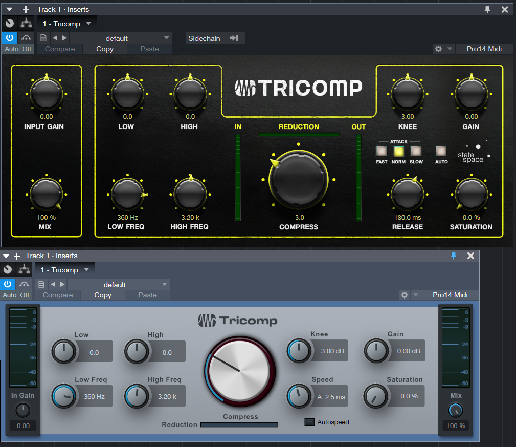
This to me is a pretty good example of the importance of GUI design. Even though the basic layout is mostly the same, on the lower one it’s immediately clear to me where things are and what does what, whereas on the Top one my eyes wonder around for a bit and I have to look for the controls to find them.THE INTRANCER wrote: Tue Jun 29, 2021 1:28 am In any case, I've barely posted any threads during the past 6 months, I've barely posted as well. I've been drawing concept art since my primary school days in the 80's so I know what looks good.
As for my own re-designs, I've done many including for Studio One... Never afraid to show the beginning stages of a GUI design either. It's what's makes my designs better in helping one's direction in which to focus on in something new. I do get PM's from people offering to buy my GUI skin designs, so I'm obviously doing something right, but generally I design and give them away for people to use right on this forum because it's fun.
Anyway here's just one example I mentioned in how the design pre-version 5 is just better imop.
-
- KVRAF
- 12104 posts since 2 Dec, 2004 from North Wales
I much prefer the meter look and positions on the lower one. I can also see the knob positions on the lower one at a glance. the lower one is far better IMO.
X32 and 24C mixers, S88MK3, Live + PUSH 3, Osmose, RedShift 6, Pro3, S4, Tempera, Syntakt, Digitone, OP1-F, OPXY, TR-1000, Eurorack, TD27 Drums, Guitars, Basses, Amps and of course lots of pedals!
-
- KVRAF
- Topic Starter
- 3496 posts since 30 Dec, 2014
Yeah, the symmetry is broken, there is a complete disconnect in how the thing operates from logical input to output - (Left to right). Additionally, what is probably also making your eyes wander is the additional light sources under the knobs as well as on the top. You have yellow text but you have white light that cancels out the yellow light. It's like.. lets have some big fancy under/over lit knobs and the rest of the design and principles can go to hell. Make the small text even smaller and plonk the small additional buttons somewhere. For me I think this one was rushed without much thought...but like has been said before.. I don't know why they couldn't keep a consistent GUI design ethos for all the effect devices.Dalle wrote: Thu Jul 01, 2021 7:16 pm This to me is a pretty good example of the importance of GUI design. Even though the basic layout is mostly the same, on the lower one it’s immediately clear to me where things are and what does what, whereas on the Top one my eyes wonder around for a bit and I have to look for the controls to find them.
KVR S1-Thread | The Intrancersonic-Design Source > Program Resource | Studio One Resource | Music Gallery | 2D / 3D Sci-fi Art | GUI Projects | Animations | Photography | Film Docs | 80's Cartoons | Games | Music Hardware |