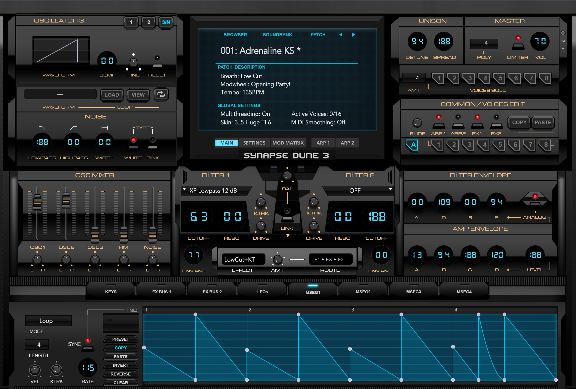
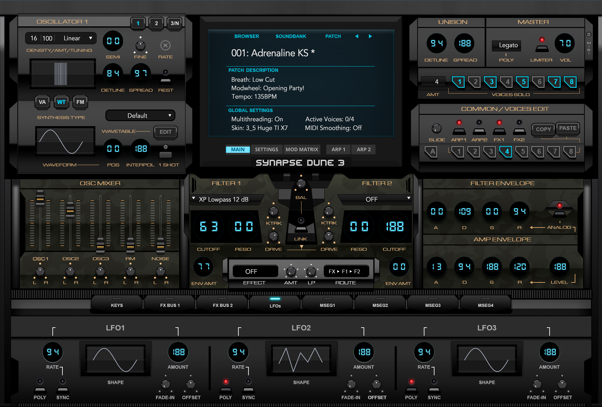
The central section has been changed to work with the new design, and adds some more white space with the black surround.
Message display is now more of an electronic LCD.

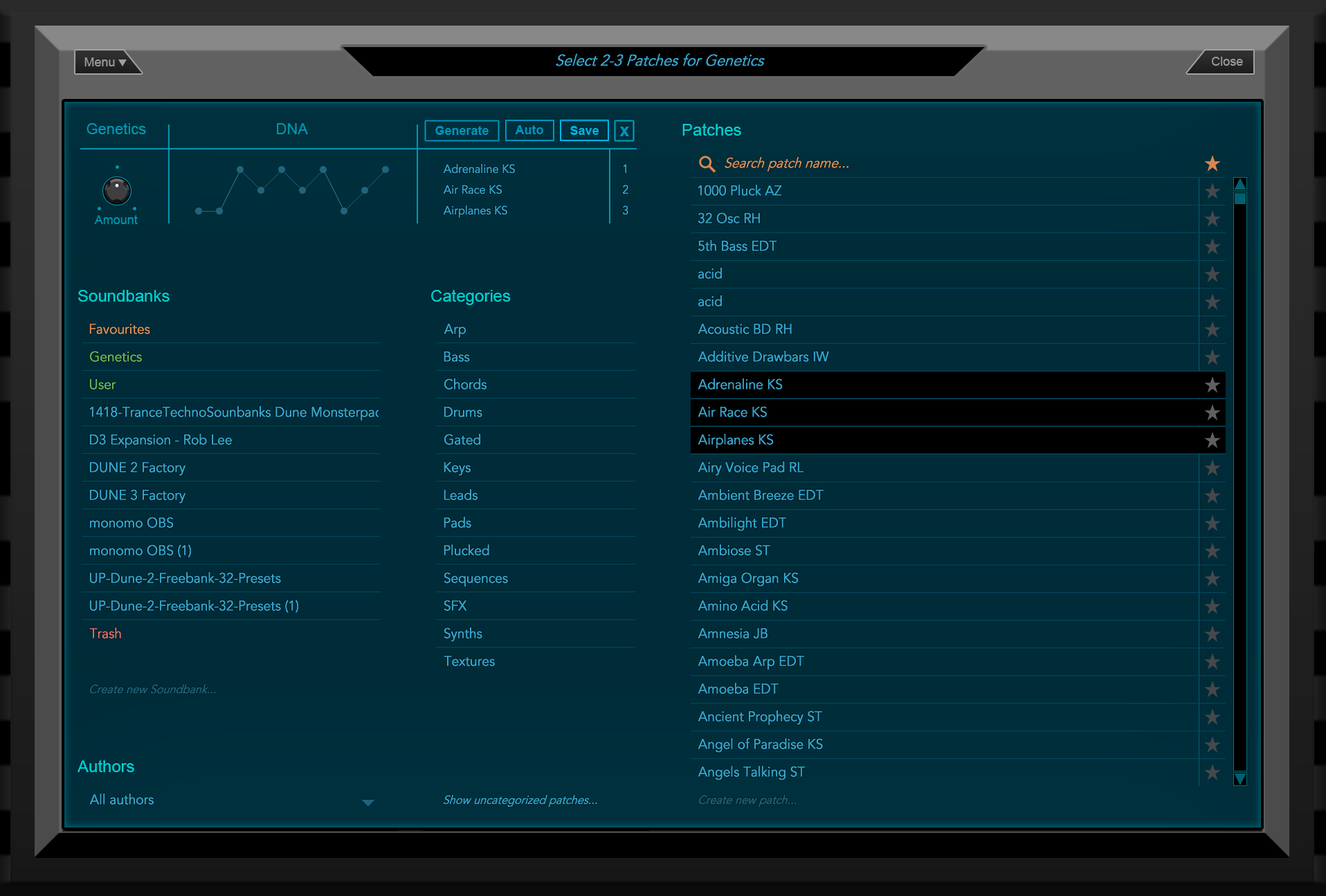
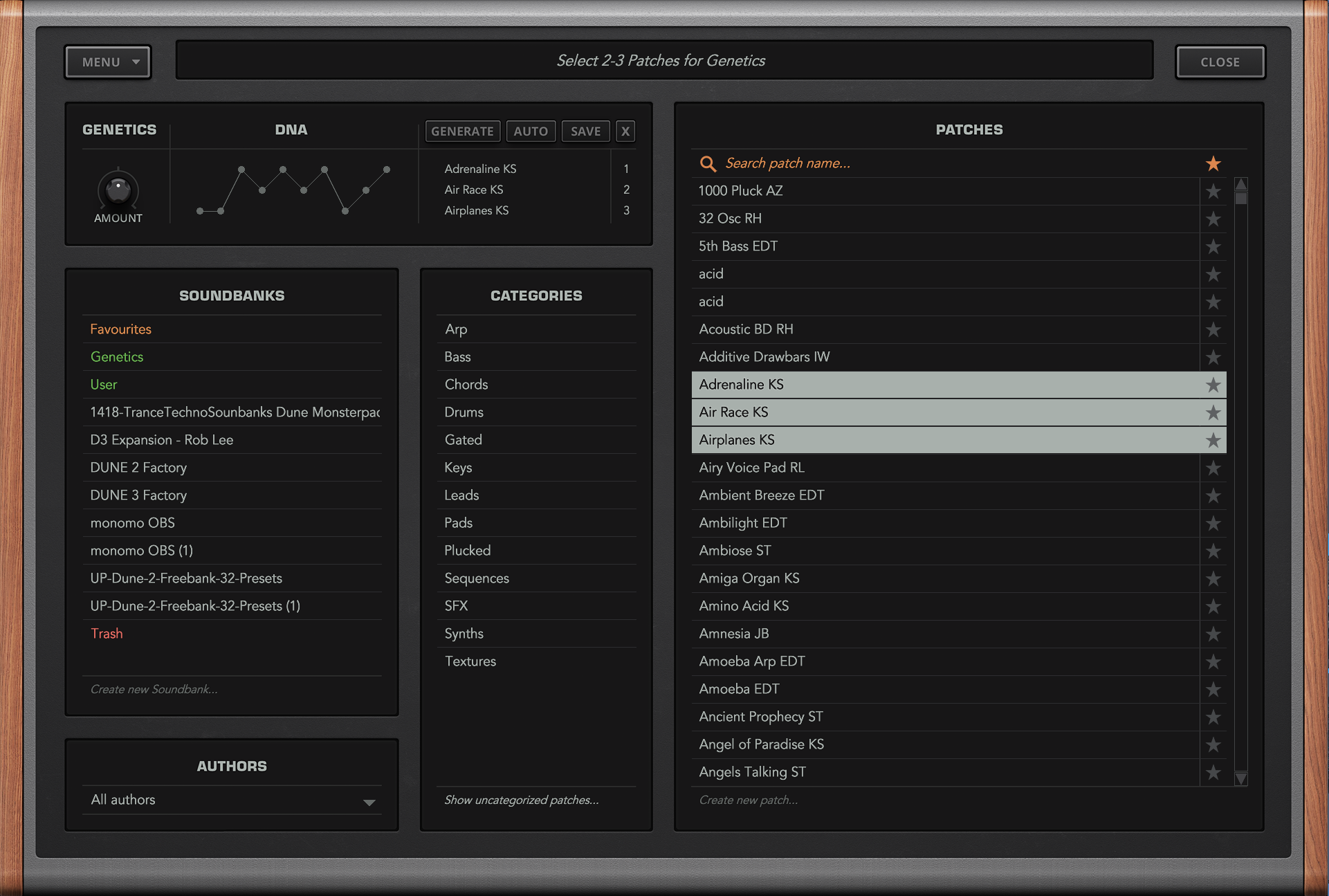

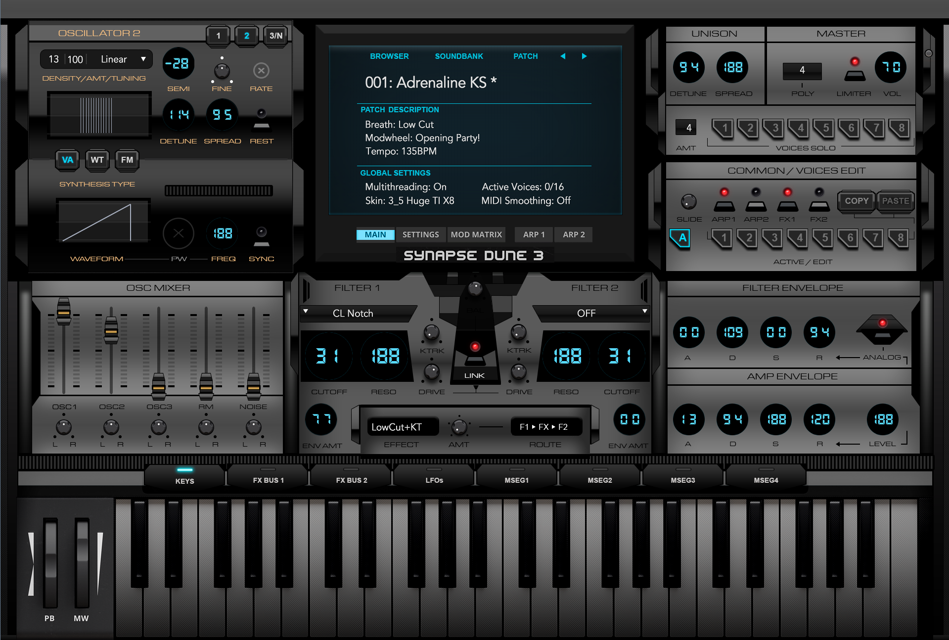
Actually, you do gain something, the removal of unnecessary windowing aids in the removal of visual jarring one can have when viewing listed text content. The less windowing, the less visual clutter in effect, and it adds more visual white space, whilst being more free flowing. Heading titles are changed to be less foreboding than all caps. The Genetics screen is modified to look as though it's part of the computer like display screen. Outer borders are limited to two levels rather than three.Teksonik wrote: Wed Feb 02, 2022 12:31 am They're both one screen designs. You just took out the dividers between the sections.
Looks good but you're not really gaining anything. The original is far more readable in my opinion but that's just due to the color choices.

It must be opinion because I much prefer the clear separation in the original. If you added those dividers it would look great,THE INTRANCER wrote: Wed Feb 02, 2022 1:19 amActually, you do gain something, the removal of unnecessary windowing aids in the removal of visual jarring one can have when viewing listed text content. The less windowing, the less visual clutter in effect, and it adds more visual white space, whilst being more free flowing. Heading titles are changed to be less foreboding than all caps. The Genetics screen is modified to look as though it's part of the computer like display screen. Outer borders are limited to two levels rather than three.Teksonik wrote: Wed Feb 02, 2022 12:31 am They're both one screen designs. You just took out the dividers between the sections.
Looks good but you're not really gaining anything. The original is far more readable in my opinion but that's just due to the color choices.

Teksonik wrote: Wed Feb 02, 2022 12:31 am They're both one screen designs. You just took out the dividers between the sections.
Looks good but you're not really gaining anything. The original is far more readable in my opinion but that's just due to the color choices.
You may think you gain something but I prefer the original. It's more orderly and not in the least bit "visually jarring".THE INTRANCER wrote: Wed Feb 02, 2022 1:19 amActually, you do gain something, the removal of unnecessary windowing aids in the removal of visual jarring one can have when viewing listed text content. The less windowing, the less visual clutter in effect, and it adds more visual white space, whilst being more free flowing. Heading titles are changed to be less foreboding than all caps. The Genetics screen is modified to look as though it's part of the computer like display screen. Outer borders are limited to two levels rather than three.Teksonik wrote: Wed Feb 02, 2022 12:31 am They're both one screen designs. You just took out the dividers between the sections.
Looks good but you're not really gaining anything. The original is far more readable in my opinion but that's just due to the color choices.
The underlines for each listed patch are essentially a visible border between each section, so the need for further bordering doesn't add anything (just more visual clutter), whilst there is already plenty of space between each section. Lists are indented from the top headings of them also.Biome_Digital wrote: Wed Feb 02, 2022 9:24 am It must be opinion because I much prefer the clear separation in the original. If you added those dividers it would look great,
No, as I've explained above, there is a reason for the changes. If I had simply changed the colours, then you might have had a point, but I've done far more than that.Your concept is simply different for the sake of being different with no real advantage.
Like I said, it is opinion. But it's your skin, you will do it how you want and that's fine!THE INTRANCER wrote: Thu Feb 03, 2022 3:47 amThe underlines for each listed patch are essentially a visible border between each section, so the need for further bordering doesn't add anything (just more visual clutter), whilst there is already plenty of space between each section. Lists are indented from the top headings of them also.Biome_Digital wrote: Wed Feb 02, 2022 9:24 am It must be opinion because I much prefer the clear separation in the original. If you added those dividers it would look great,
In practice, though, it feels more fluid to drag patches across one flat screen than what feels like looking at a shop store from across a street with multiple windows and things listed on them. For me, I prefer the open look rather than the constrained look.
Hive 2 is one example where there is no need for vertical dividing lines between patches, and even the Windows 7 / 10 / 11 operating system doesn't have border-lines between folders when viewing them from your drive.
The genetics panel of Dune 3 is actually dynamic in popping up as well, so having an LCD screen look is more authentic to reality when it switches to and from its normal state.
No, as I've explained above, there is a reason for the changes. If I had simply changed the colours, then you might have had a point, but I've done far more than that.Your concept is simply different for the sake of being different with no real advantage.
Will the Camo Skin be available to download soon?THE INTRANCER wrote: Fri Apr 08, 2022 7:27 pm Other than this image, other hidden panel sections have been changed such as the wave form editor.
Camo Design
Well, it's really atm just to show an alternate design in which almost everything has been changed. Currently, there is only one size, and that is 'Huge', and with there being dozens of graphics, I don't really plan on creating any more sizes, as I don't have the patience to do it or go through scripting again.
The above skins have not been released yet but subsequent skins were posted in the most recent skin thread here.Lovecoach wrote: Wed Apr 27, 2022 3:13 pm Hi!
The Intrancer, your work is amazing, really... But after first post where there were downloadale zip links, I can't see any download links... In case those are free of course.
Submit: News, Plugins, Hosts & Apps | Advertise @ KVR | Developer Account | About KVR / Contact Us | Privacy Statement
© KVR Audio, Inc. 2000-2026