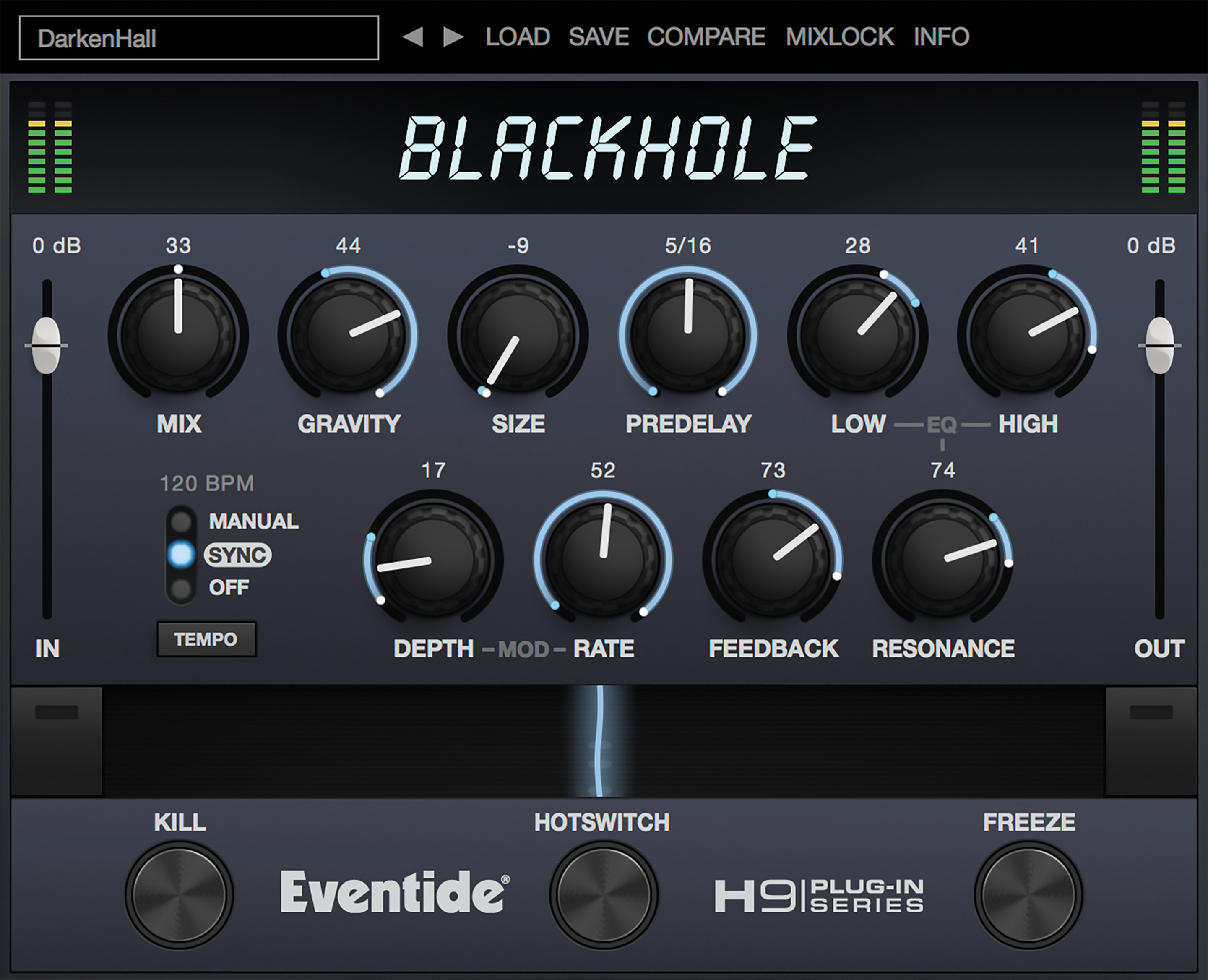
Confession: I can't use ugly plugins.
- KVRAF
- 2542 posts since 20 Apr, 2005
Sure, but it's helpful to know it can boost lows and also cut mids.BONES wrote: ↑Tue May 24, 2022 12:40 am Do you not have ears? Can you not turn the attenutation knob and hear for yourself what it does?
No, you misunderstand. I think channel strips in and of themselves are mostly a stupid idea. Everything that the designers of all those classic consoles were trying to achieve is embodied in the standard mixer in every DAW - total transparency - and you guys want to go and add back in all that shit they were trying to get rid of. It's madness! If was going to use a channel strip at al, I'd jsu tuse theone that ships with Studio One. Butit'sa mootpoint because I'd never use one at all.
Call me old fashioned but I don't see any reason to use any tool that I don't understand. i.e. If I can't work out what it's doing by using it then it's a pretty safe bet I don't need it.
I tend to not use channels strips on any of the main elements I'm mixing, but for less important elements I find they can be really useful. Especially if I'm trying get avoid a couple of elements from clashing. I appreciate a consistent UI across multiple channels, and think that the use of similar eqs can lend a bit of cohesion. I also have better channel strips than come with the DAW. You don't have to use one, for it to be useful to me...
Perhaps you rule out some great tools that a few minutes reading would have otherwise allowed you to use. I get some things, yes simple is best, but some parts of audio engineering can also be a bit complicated and sometimes a bit of time to learn the more complex tool can be helpful.
i.e. this bus compressor has a low pass filter, how does that work, how do I test it to understand what it will actually do?
C'mon Bones. Growth Mindset, Man!
- KVRAF
- 10361 posts since 3 Feb, 2003 from Finland, Espoo
I'm not all that concerned with color schemes so I just use the original. The only thing I changed was in the "global Voxengo" options panel. There I changed to "Flat meters" which gets rid of all the rasterized or whatever it's called, meters. It just makes them plain flat and non-graded. Easier on the eyes in my opinion._leras wrote: ↑Tue May 24, 2022 10:26 am I use Elephant most of voxengo plug ins I have, and this is only in a few places during a project and doesn't need too much time so I live with the 'functional'. I prefer not to spend time on tweaking how something looks unless I use it a lot.
But - I'll see if the options have changed, my preferred darker colour also changes the meter colours to a less standard colour grading.
Totally agree with you about the overall layout and colors! SSL make some great looking stuff (hardware and software!). Unfortunately for me, their choice of 3D perspective and shadows on their latest plugins triggers something in my brain that makes me nauseous. It's probably some kind of condition that I have as it gets triggered by other sources too. Some 3D holograms with wonky perspective can trigger it too.. like some of those nasty 3D hologram holiday/birthday cards! One of my kids got a huge 3D hologram card with a Ferrari F40 on it, and because it's been one of my favorite sports cars ever, I wanted to look at all the cool details and almost vomited right then and there!_leras wrote: ↑Tue May 24, 2022 10:26 am re: SSL - yeah, I can get that the slight 3d ness could be jarring. And though I don't really mind that, I get that some do. For me though, they have a great colour scheme, crisp meters and are very nicely and logically laid out. This was just an example I thought would show a good comparison. Of course, it's really not hard to find other examples of better looking GUIs.
"Wisdom is wisdom, regardless of the idiot who said it." -an idiot
- KVRAF
- 10361 posts since 3 Feb, 2003 from Finland, Espoo
One man's unnecessary is another man's distraction. Exploring this notion seems to be the whole point of this thread and thus in my opinion quite a valuable discussion. Throwing this kind of generalization of yours isn't worth much.. in fact, your own sentence describes yourself and your need to comment in this thread, doesn't it?
"Wisdom is wisdom, regardless of the idiot who said it." -an idiot
- GRRRRRRR!
- 15955 posts since 14 Jun, 2001 from Somewhere else, on principle
You mean like every other EQ I've ever used? That's kind of what they're for and the labels on the controls make it quite clear that's what they can do.
That's why I use Pro EQ2, that and the fact I can see and interact with it right in the mixer. Of course, "cohesion" isn't an issue for me as I hardly ever use any EQ these days. Mostly it's just on the drums track (I don't bother separating my drums any more, either.) You may gasp in horror but I'm absolutely doing my best work this way.I appreciate a consistent UI across multiple channels, and think that the use of similar eqs can lend a bit of cohesion.
Unlikely. As I said, i rarely use any effects at all.Perhaps you rule out some great tools that a few minutes reading would have otherwise allowed you to use.
It only gets complicated when you make it complicated. After 40 years I've learned that keeping it simple is the easiest way to get the best results.I get some things, yes simple is best, but some parts of audio engineering can also be a bit complicated and sometimes a bit of time to learn the more complex tool can be helpful.
Is that a question you really need to ask? It's a low pass filter, it does exactly what you'd expect and to hear how it affects your signal, you use it. This is what I mean, this stuff ain't rocket science and pretty much everything you need to know is printed on the front panel.i.e. this bus compressor has a low pass filter, how does that work, how do I test it to understand what it will actually do?
IMHO, way too many people around here need to think a lot less and learn to trust their ears. If it sounds good, then it is f**king good. End of story. You don't need to keep adding more and more shit, you should be looking for things to get rid of. Again, it's the Colin Chapman ethos - simplify, then add lightness - and you can't argue with Colin Chapman (because he's dead).
NOVAkILL : Asus RoG Flow Z13, Core i9, 16GB RAM, Win11 | EVO 16 | Studio One | bx_oberhausen, GR-8, JP6K, Union, Hexeract, Olga, TRK-01, SEM, BA-1, Thorn, Prestige, Spire, Legend-HZ, ANA-2, VG Iron 2 | Uno Pro, Rocket.
- KVRAF
- 4021 posts since 7 Sep, 2002
But don't forget they look that way to drive sales. Maybe you need to open your mind to people that do like that kind of UI/UX. Funnily enough, this does prove we all are a bit different in our perceptions of the world around us. On business side, I do not want to climb a cliff that already has winners on top of it. Doing this usually does not work, plenty of examples in the real world._leras wrote: ↑Tue May 24, 2022 10:27 amSorry, this is a thread about how plug ins look. Do stay on topic.Aleksey Vaneev wrote: ↑Tue May 24, 2022 9:06 am Well, it's business, it's not a beauty competition. A lot more factors are in play beside ugliness.
- KVRAF
- 2542 posts since 20 Apr, 2005
Aha... well you see it actually only filters the amount of the side chain input that is triggering the compressor and not the signal itself. So it reduces pumping a kick might cause. I know that because I read what it did.BONES wrote: ↑Tue May 24, 2022 12:52 pmIs that a question you really need to ask? It's a low pass filter, it does exactly what you'd expect and to hear how it affects your signal, you use it. This is what I mean, this stuff ain't rocket science and pretty much everything you need to know is printed on the front panel.
IMHO, way too many people around here need to think a lot less and learn to trust their ears. If it sounds good, then it is f**king good. End of story. You don't need to keep adding more and more shit, you should be looking for things to get rid of.
Generally though, I agree with what you're saying. Reading can help only gets you so far, you have to do it to learn. (and use your ears, and sometimes tools)
And for sure - simplifying it in the first place can make everything easier.
-
- addled muppet weed
- 105853 posts since 26 Jan, 2003 from through the looking glass
im somewhere between the two of you with manuals, i get stuck in, tweaking and expecting things to work a certain way (audio goes in one end out the other) and only when something does something "different" or i get shite results even though ive heard great results from the tool before, then i reach for a manual.
unless, it's something with multiple modes/menus to get things done, then even after years of use, i keep the manual to hand because there's only so much you can remember.
unless, it's something with multiple modes/menus to get things done, then even after years of use, i keep the manual to hand because there's only so much you can remember.
-
- KVRist
- 287 posts since 15 Dec, 2019
I installed Cherry Audio's Polymode and must say that visually it doesn't inspire me that much. Well, I would call it ugly. I like their plugins, but some are quite rough to look at. I don't need Arturia level beauty, but plugins don't have to be ugly. PSP stuff are not the best looking plugins, but I'm still a fan.
-
- KVRAF
- 15517 posts since 13 Oct, 2009
For me, if something looks like an old-school plugin then it often triggers the perception that it hasn't been updated in years. I feel this way about the Ina-GRM plugins. Also Sound Toys. It's little things, like the aforementioned 3d parameter popout surround on the Voxengo plugins.Lazarus451 wrote: ↑Tue May 24, 2022 4:13 pm I installed Cherry Audio's Polymode and must say that visually it doesn't inspire me that much. Well, I would call it ugly. I like their plugins, but some are quite rough to look at. I don't need Arturia level beauty, but plugins don't have to be ugly. PSP stuff are not the best looking plugins, but I'm still a fan.
If you don't want people to think that your plugins haven't been updated since 1997, then updating the U/I can have an impact. I'm not really a fan of the SSL plugins, nothing personal, I just don't really need them, but, they did update their GUIs. Even if you don't like them, it conveys that they are concerned about updating their products.
Same thing with the Waves classic plugins. I still don't like them anymore than I did before, but, I give them credit for giving them a fresh look so that they don' t look like they've been around for decades.
- KVRAF
- 4021 posts since 7 Sep, 2002
There's problem with SSL-alike interfaces: they are over-filled with numbers and hairlines around knobs, looks a bit heavy. Another common UX problem is that there's no indication which knob is currently being adjusted. If your attention "twinkles", you lose connection to the knob you are dragging. Popout circle around knobs in Voxengo can be switched off, but then you immediately lose attention "anchoring". In Sobor and Peakbuster kind of UIs this was achieved by high-lighting the knob being dragged, that's also a solution.
-
- KVRAF
- 15517 posts since 13 Oct, 2009
Yes, and moreover, I agree with the other poster, they give me vertigo as well. That wasn't my point though. They don't look old, but they did. SSL updated them. Now they just look weird because the perspective is all wrong.Aleksey Vaneev wrote: ↑Tue May 24, 2022 5:54 pm There's problem with SSL-alike interfaces: they are over-filled with numbers and hairlines around knobs, looks a bit heavy.
If you're referencing my post, that's not what I'm talking about. I'm talking about the weird 3d column that the parameters sit on top of underneath the knobs.Popout circle around knobs in Voxengo can be switched off, but then you immediately lose attention "anchoring". In Sobor and Peakbuster kind of UIs this was achieved by high-lighting the knob being dragged, that's also a solution.
I'm also not talking about UX, highlighting a knob can apply to any knob. The knobs in your older plugins, like what I posted above, look very dated to me and, IMHO, aren't attractive. If I'm not mistaken, you introduced that basic style around 2008, no? At any rate, your newer knobs (and colors) look a bit better, but I think the old stuff that clutters your web site un-updated probably contributes to the perception.

It's not one thing, I think, it's a combination of many little things. I find your older interfaces distracting enough to be unusable, and I find this kind of interface to function well and look good enough that it's "beauty," or lack thereof, isn't a distraction. YMMV and all that.

-
- KVRAF
- 7400 posts since 17 Feb, 2005
I think knobs in general are a problem on 2d screens. Not enough plugins use vertical sliders, which IMO are much easier to group and look at. Having controls too close together is also bad, sometimes it leads to a misclick on the wrong control.


