I actually like Helix's UI. The high-gain guitar tones though... terrible IMO.whassup wrote: Wed Jan 29, 2025 12:54 pm Yeah, guitar plugin suites like Bias, Amplitube, Helix, etc. are horrible GUI wise.

Looking cool VS usable GUIs
-
- KVRian
- 891 posts since 22 Jan, 2022
-
- KVRian
- 891 posts since 22 Jan, 2022
Minimal Audio makes exceptional UIs. Very usable and well thought out, with just enough eye candy added to make the plugins pleasant to look at. Great visual feedback as well.
The visual feedback is something that's too often overlooked by plugin devs.
The visual feedback is something that's too often overlooked by plugin devs.
-
- KVRist
- 96 posts since 13 Jun, 2023
I think it's funny that Arturia did nothing but add the worst aspect of digital EQs, the curve analyzer, without improving the actual EQ controls at all.concealed identity wrote: Sun Feb 02, 2025 7:43 am I have no idea why, but in particular my eyes always have trouble with reading console style EQs, since the knobs related to each frequency can be on top of each other, side by side, or positioned diagonally.
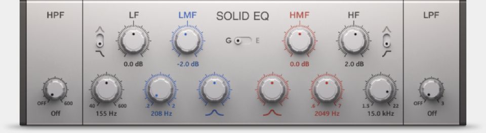
Even such a small thing like the color coding in NI's Solid EQ makes using the plugin so much quicker and more convenient than other EQs.
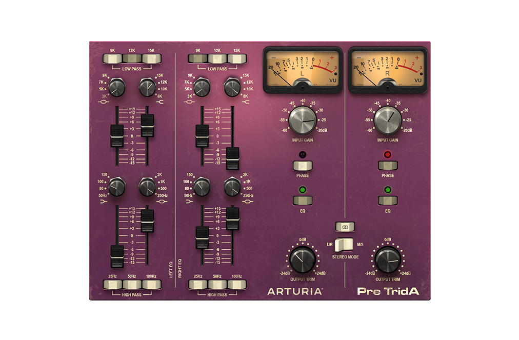
I actually like the sound of Arturia's EQs/preamps more overall, but I don't really like using them because I always have to take a moment to figure out what is where. Not a deal-breaker, but enough that I find it annoying:
Many analog EQ designs simply cannot be converted to a digital interface yet companies insist on doing it anyways. I feel like I'm crazy not being able to understand wtf is going on in some of these plugins.
These "outer ring" freq select EQs in particular are absolute hell. There's a few other designs where the font is even smaller and with less contrast.
-

- KVRAF
- 4079 posts since 28 Jan, 2011 from MEXICO
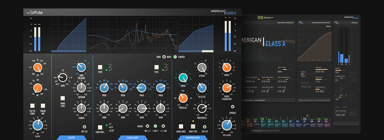
I normally don't like softube GUI but even them show it can be done elegantly, pretty and functional if you are doing a channel strip.
dedication to flying
-

- KVRist
- Topic Starter
- 376 posts since 12 Oct, 2020
I agree ! I own their Hybrid Filter and it's really good and a pleasure to use.billinder33 wrote: Sun Feb 02, 2025 1:45 pm Minimal Audio makes exceptional UIs. Very usable and well thought out, with just enough eye candy added to make the plugins pleasant to look at. Great visual feedback as well.
The visual feedback is something that's too often overlooked by plugin devs.
You are right about visual feedback and I believe there is NO REASON not to be able to mix old school hardware looks with some modern helpful elements.
That's why I posted about the guitar amp sims that stick to hardware thought and lack modern workflow.
-
- KVRist
- Topic Starter
- 376 posts since 12 Oct, 2020
Yes those outer rings aren't easy to see and the font is small indeed.DNAudio wrote: Sun Feb 02, 2025 5:48 pmI think it's funny that Arturia did nothing but add the worst aspect of digital EQs, the curve analyzer, without improving the actual EQ controls at all.concealed identity wrote: Sun Feb 02, 2025 7:43 am I have no idea why, but in particular my eyes always have trouble with reading console style EQs, since the knobs related to each frequency can be on top of each other, side by side, or positioned diagonally.
Even such a small thing like the color coding in NI's Solid EQ makes using the plugin so much quicker and more convenient than other EQs.
I actually like the sound of Arturia's EQs/preamps more overall, but I don't really like using them because I always have to take a moment to figure out what is where. Not a deal-breaker, but enough that I find it annoying:
Many analog EQ designs simply cannot be converted to a digital interface yet companies insist on doing it anyways. I feel like I'm crazy not being able to understand wtf is going on in some of these plugins.
These "outer ring" freq select EQs in particular are absolute hell. There's a few other designs where the font is even smaller and with less contrast.
You can see they added fake screws lol, and with the desk tape Left Right labels and the on off switch, quite a lot of fake hardware style to justify the price tag .... I'd rather more focus on usable controls and added modern visual cues.

 Just sayin
-
- KVRist
- 343 posts since 11 May, 2010
Well, "cool" is subjective so saying form vs function isn't enough.
I definitely lean toward the simpler, flattened "vector" type interfaces. I happen to find them more pleasing visually but more importantly they are easier to use.
For example: I use Lindell 80 (channel strip) from Plugin Alliance quite a bit, but it's strictly because I like how it sounds. I don't like using it, and the only reason I don't ditch it is that I don't really use the EQs much on it. It's a 3d dented old console which I guess looks cool at first and I guess is authentic to the hardware, but then you try to turn the digital knobs or the teeny tiny preamp level. I have to squint to see where the freaking EQ is set to.
On the other hand, the newer Logic plugins and ones like Tai Chi (Reverb Foundry) or Valhalla's plugs are much preferred by me. I don't need my digital plugins to look like some old piece of rack gear. That said, I don't mind skeuomorphism to a point as long as the artwork doesn't eat up too much space, isn't distracting, and is usable easily with a mouse.
But different strokes.
I'd like to see more plugins with easily-changeable skins or themes actually.
-
- KVRist
- Topic Starter
- 376 posts since 12 Oct, 2020
Tai Chi does look good, clean pro design, pro price tag tooStokely wrote: Mon Feb 03, 2025 4:50 pm Well, "cool" is subjective so saying form vs function isn't enough.
I definitely lean toward the simpler, flattened "vector" type interfaces. I happen to find them more pleasing visually but more importantly they are easier to use.
For example: I use Lindell 80 (channel strip) from Plugin Alliance quite a bit, but it's strictly because I like how it sounds. I don't like using it, and the only reason I don't ditch it is that I don't really use the EQs much on it. It's a 3d dented old console which I guess looks cool at first and I guess is authentic to the hardware, but then you try to turn the digital knobs or the teeny tiny preamp level. I have to squint to see where the freaking EQ is set to.
On the other hand, the newer Logic plugins and ones like Tai Chi (Reverb Foundry) or Valhalla's plugs are much preferred by me. I don't need my digital plugins to look like some old piece of rack gear. That said, I don't mind skeuomorphism to a point as long as the artwork doesn't eat up too much space, isn't distracting, and is usable easily with a mouse.
But different strokes.
I'd like to see more plugins with easily-changeable skins or themes actually.
I would also support dual GUI, skeuomorphic to "promote the hardware-like quality" if they wish but with an added "focused version" with more readable fonts and more modern digital visualisations and helpers.
Kush plugins are on my radar. I love what Greg Scott is doing with his productions for his band Sneaky Little Devil.
-

- KVRAF
- 14476 posts since 16 Feb, 2005 from Planet Earth, Somewhere
This thread for me highlight the issue.
We all have different tastes.
I personally dont particular like the look of valhalla or kilohearts.
Functional? Yes but if i am going to spend time with it open in my DAWz i prefer something way more attractive like the Tal stuff.
rsp
We all have different tastes.
I personally dont particular like the look of valhalla or kilohearts.
Functional? Yes but if i am going to spend time with it open in my DAWz i prefer something way more attractive like the Tal stuff.
rsp
sound sculptist
-
- KVRAF
- 1903 posts since 8 Jan, 2022
I do think there's a lot to be said for having something that is aesthetically pleasing to go with the music.
I think Beam by Lunacy is a great example of a flashy UI but gets all the information across. Particularly things like routing are conveyed really well.
I think it's a false dichotomy to say that you can't have something beautiful to look at and also be perfectly functional.
It doesn't have to be as flashy as Beam but it definitely helps. Pro Q 4 is a great example of a plugin that has quite a lot of visual flair but also remains very functional.
-

- KVRist
- 481 posts since 26 Jun, 2024
UAD Topline plugin is, to me, a good example of skeuomorphic design blended with a modern interface that is clear, to the point, easy to look at and easy to operate. Which is pretty rare for UAD because most of their stuff is based on old hardware and they insist on the plugin GUI’s being a 1:1 copy of that.

-
- KVRAF
- 4079 posts since 28 Jan, 2011 from MEXICO
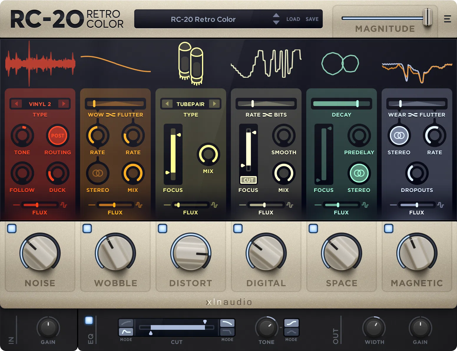
Haven't seen it before, quite good for UADMorty-C-137 wrote: Tue Feb 04, 2025 6:10 pm UAD Topline plugin is, to me, a good example of skeuomorphic design blended with a modern interface that is clear, to the point, easy to look at and easy to operate. Which is pretty rare for UAD because most of their stuff is based on old hardware and they insist on the plugin GUI’s being a 1:1 copy of that.
It seems to take a few cues from XLN Rc20
dedication to flying
-
- KVRist
- 481 posts since 26 Jun, 2024
Yeah, love what XLN did for RC20 too!rod_zero wrote: Tue Feb 04, 2025 6:15 pmHaven't seen it before, quite good for UADMorty-C-137 wrote: Tue Feb 04, 2025 6:10 pm UAD Topline plugin is, to me, a good example of skeuomorphic design blended with a modern interface that is clear, to the point, easy to look at and easy to operate. Which is pretty rare for UAD because most of their stuff is based on old hardware and they insist on the plugin GUI’s being a 1:1 copy of that.
It seems to take a few cues from XLN Rc20
-
- KVRist
- 481 posts since 26 Jun, 2024
One thing I hate with UAD though GUI wise (their synths too) is the blurred out GUI when instantiating the plugin. Feels all very clunky and not snappy. That's the only thing that lessens the experience.
