
Lets please skip any functionality aspects for now and purely talk about the looks.
NB: i've updated the reaper screenshot.
MuLab & MUX UI Looks
-

- KVRAF
- 13863 posts since 24 Jun, 2008 from Europe
-

- KVRAF
- 7412 posts since 8 Feb, 2003 from London, UK
The new screenshot's removed the Reaper menus - those, plus right click, are pretty much how I navigate it. I don't use the toolbar at all. I don't even know if the tools would be useful!  (I'm very text-oriented, really.)
-

- KVRAF
- 5381 posts since 25 Jan, 2014 from The End of The World as We Knowit
Looks only. Both have similar functions, and modules communicate similar info but in different ways.mutools wrote:Michael are you talking about functional design or about the looks? If you're talking about looks then do you see so much difference between MUX and, for example, Oscillot?
Some Oscillot differences from a quick look-over: most modules have a different layout but 'graphic standards;' all modules are tones of grey and there is consistent use of font changes; largest fonts are for the module name; fonts are limited to two sizes, u/l case, reg/bold, grey/colour; colours in modules are used only to show parameter changes, and use of colours is consistent; many modules have a graph (eg envelope) to illustrate the key parameter change, and different types of graphs are used depending on the parameter; every feature is labeled; controls are grouped and the groups are named; and modules include explanatory pop-up notes (good idea!).
I think Oscillot and Max7 design are the best examples; Reaktor6 displays good info but 3D knobs and multicolour backgrounds are distracting. All are better than Audulus, Hollyhock, Bidule which don't show enough info.
Disclaimer: I became familiar with the above enough to know that I preferred MuLab, so I don't own them. However, if new users could more quickly 'read' the meaning and status of each Mux module, and get a popup explanatory note (from MuTools Docs) with a single click, it may reduce the learning curve.
F E E D
Y O U R
F L O W
Y O U R
F L O W
-
- KVRist
- 388 posts since 28 Oct, 2002
I like the studio one 2 look not the v3 look. Out of those displayed Reaper looked best to me. I dont dislike MuLabs "look" but it does look old or outdated. I'm not much help at explaining why, but could be the depth of the colours or that MuLab has a "soft" look about it. 
-
- KVRAF
- 1925 posts since 29 Mar, 2013
Out of those daws listed I think Mulab in its current form more than holds its own visually.
Now, I say in its current form because older versions do look a little dated and if you simply do a search for mulab images then its nearly always older versions that pop up.
Whether people see those and think thats how it still looks and are put off I dont know, just an observation.
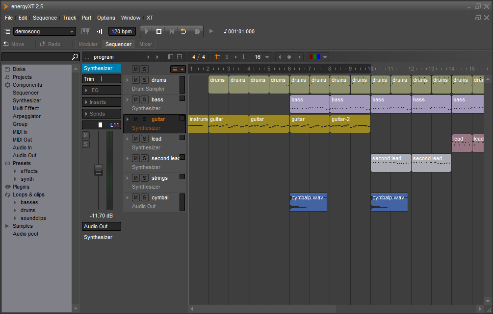
As a side note, going off that shot of mulab, I think there could be more "features" in the track headers, they look like a big block of colour and a little empty when enlarged.
But on the whole and as I have said in past posts I like the looks.
Now, I say in its current form because older versions do look a little dated and if you simply do a search for mulab images then its nearly always older versions that pop up.
Whether people see those and think thats how it still looks and are put off I dont know, just an observation.
As a side note, going off that shot of mulab, I think there could be more "features" in the track headers, they look like a big block of colour and a little empty when enlarged.
But on the whole and as I have said in past posts I like the looks.
Beauty is only skin deep,
Ugliness, however, goes right the way through
Ugliness, however, goes right the way through
-

- KVRAF
- 3157 posts since 28 Mar, 2008 from a Galaxy S7 far far away
I like studio ones toolbar, very minimalistic. I also agree with pljones about the mulab's window border, as has also been discussed. It needs to go full screen instead of maximised.
I also believe one of the main things that may put people off could be one of mulab's strengths, it's minimalistic interface. The emptiness makes you wonder how to use it! But get used to its different ways and it's far better.
I also believe one of the main things that may put people off could be one of mulab's strengths, it's minimalistic interface. The emptiness makes you wonder how to use it! But get used to its different ways and it's far better.
-
- KVRAF
- 5573 posts since 30 May, 2006 from Hollow Earth
The look and feel of MuLab has been the one thing always present in my mind while working work it and switching between apps.
There is nothing really "wrong" with it but at times it reveals a sense of being in a state of catching up with the technical aspect of MuLab and it gives you a feeling of missing invisible details that are very hard to point out.
In regards to the screenshots of the other DAWs, S1 v3.0 doesn't given me the feeling that I'm looking at a DAW but rather at a medical research device. I liked better the previous version. Better but still not my favorite.
Live, I'm very comfortable with it and it's appropriate for what it does.
Reaper.... I can't find a single theme that is capable of giving any justice to the hidden power and flexibility (for the money) of it.
BitWig is too uniformed if you ask me. Not enough dynamics between form, 3D and colors.
I think MuLab could benefit (grabbing more attention) if the interface (in its minimalist way?) could reveal more of the "ways" and "tools" available for its modular tridimensional workflow at first glance.
For me though, MuLab is still a wonderful tool no matter what.
ABEFLGMOPPRRST 

-
- KVRist
- 139 posts since 15 Dec, 2014
Like many others here I am also fine with the looks and prefer the fun mux development stuff but I also agree that improving the looks would bring more sales which would be great.
I think a big issue is the gradients and mixing grey with the colours. Taking a look at live or bitwig for example, there certainly is a lot of grey but where colours are used, the colours are used more boldly. In Mulab/mux, looking at the rack for example, there is a lot of washy grey colour and in different tones.
(I've actually replaced the gradient background images in Mux with flat grey which helps but you still get the colour mixing.)
I will have a think more about anything else to offer when I get home later but this is the first thing I thought of. I actually think that Mulab/Mux is so close to looking really great. Graphic design is such an art form.
I also would like an option of darker background in the modular area with option to switch off gridlines, it remimds me of my old school maths book whereas mux is actually endless fun for me!
-
- KVRAF
- 5381 posts since 25 Jan, 2014 from The End of The World as We Knowit
Quick Mux thought: to fully enjoy MuLab freedom, users need deep knowledge of synthesis. Right now, we get most of that knowledge through books and websites. New users might benefit from learning step-by-step knowledge through the joyful process of exploring Mux. Custom front panels can be a useful tool for learning-by-doing because sonic changes can be seen and heard. Pop-up information inside the synth (as in Oscillot PatchNotes) or inside the DAW (as in Ableton Live's InfoView and Live9 Lessons) can teach background info.
Perhaps as a MuLab 'usergroup' we can update the Mux modules with more informative front panels (following graphic standards set by Jo), and select pop-up info notes from the Docs or Wikipedia?
Also, perhaps the default MuLab Demo song can be annotated with notes at each level (eg Compose/ Edit/ Modular/ Rack/ module settings) to explain how that song was built in MuLab.
You do not have the required permissions to view the files attached to this post.
F E E D
Y O U R
F L O W
Y O U R
F L O W
-
- KVRist
- 139 posts since 15 Dec, 2014
I have spent some time playing around with Mulab to try and better explain what I think could be improved with the interface. I guess it goes without saying that this is only my personal opinion and I hope it is taken as an attempt to be helpful.
on close inpsection, I'm actually really impressed with how good it looks. Almost! It really is those few elements that ruin the feel. I feel that the changes required to make MUX/Mulab awesome wouldn't require changing to much.
Observations in no particular order:
The digital clock font for the metronome etc should be replaced .
I also agree that the main font could be better. I'm no font expert so don't know what to suggest.
There are a lot of curved edges in MUX/Mulab. This looks good in some areas like the buttons at the top of page ('compose' 'edit' etc).
The default yellow colour behind knobs isn't nice. I know this can be changed and I have changed it, but again, from a new user perspective, the default is the first thing they see.
The yellow colour for a selected icon (ie 'compose' 'edit' 'modular') is also a little bit garish against the grey. Slightly brighter and/or more orange perhaps. Or maybe it's that slight feather gradient that is off-putting.
I'll just restate what I was saying earlier about the overuse of gradients and mixing selecteable colours with different amounts of grey.
On second inspection, I'm happy with the background colour of the modular area but would still like to be able to switch off gridlines. I also think that should be the default option. Gridlines are great for editing the front panel as well as indicating you are in edit mode, but I think they are unnecessary and uninspiring when in the patchbay. An option would be great.
Group frames. It's quite hard to pick a colour for the group frame that works well for both the title and main frame area of it. Perhaps either the main body or title could remain grey while the other can be coloured. Perhaps other users will disagree and like to be able to colour the whole thing but I would be happy if only the title of the group frame would be recoloured. Perhaps the darkness of the title background could be adjustable?
I have always disliked the look of the rack and have tried to pinpoint what it is. I'm still not 100% so may elaborate later. I think the downward pointing triangles on the rack are a bit out of place, perhaps should be curved to fit the rest of the theme or should be more bold. The other way of thinking is that there are too many curved edges in the rest of Mulab, as mentioned earlier, and this doesn't work with the triangles.
Perhaps the tracks along the left could have a title bar that is coloured while the rest of the track graphic stays in a grey. Again, it's the washiness of mixing the selected colour with grey that I think could be improved upon.
I also don't like the centralized gradient on the mudrum pads.
In terms of user skinning, a little while ago I tried hacking the theme but came a bit unstuck when thinking about re-designing the knobs. I realised I would have to render any new knob design in several different rotated positions and I couldn't figure out a quick way to do that. Seeing as the knob design was going to be a bit of trial and error anyway, would there be a way for us to simply create one position of the knob and have MUX/Mulab do the rotations. Or is there a method you use for creating all those rotated position efficiently?
The splash screen also has too much gradient and the colours are a little dull. (Did I mention I'm not a fan of gradients?:) The main design behind the logo is cool but could be a lot bolder. Perhaps you could even have a splash screen contest where you hand out the basic images with any technical or design requirements you have and let people loose. I would be game. You could always reserve the right to not use any of them in case they are all terrible!
I think I'll stop for now. Let me know if you would like any more feedback, otherwise I will keep my big trap shut.
Besides anything else, THANK YOU for MUX, it is so cool.
-

- KVRian
- 1037 posts since 21 Feb, 2015
Well, I could go on and on about fonts but I have done so in another thread. 
 I think MuLab's fonts are weak, don't help the program's looks at all, and more options would be fabulous.
Overall though, I find MuLab to be very pleasant looking. The difference between MuLab and the others in terms of looks is not equal to the difference in popularity.
So it is probably advertising, and even if the budget was available there are no guarantees, as big, well funded ad campaigns fail all the time, so it isn't only about money!
The biggest, boldest move would be to make MuLab user skin-able, with similar flexibility to REAPER. Then we might see some new directions for how MuLab could look.
By the way, I like how the mixing desk looks! It's unique.
-
- KVRAF
- 3157 posts since 28 Mar, 2008 from a Galaxy S7 far far away
Improve fonts.
Skinnable interface, though I'd be happy for the rest of the interface to allow colouring. Would be nice to have full skinning ability too.
No gradients.
Bolder colouring.
Less rounded corners but not quite square.
Improved buttons, I like the 'glow' effect on the play button.
And, personally I'd like the transport bar moveable to middle of screen, I feel this would mean less mouse movement as generally the mouse is required mostly centrally onscreen.
These are all my personal preferences.
Last edited by sl23 on Sun Sep 20, 2015 9:50 pm, edited 1 time in total.
-
- KVRer
- 18 posts since 17 Aug, 2015
IMHO, the main things to improve in terms of UI are:
- The native windowing system for each OS
- A flat design (no gradients)
- Squared elements (instead of rounded)