That whole section will be filled with knobs and stuff.pdxindy wrote: Wed Jan 30, 2019 4:17 pmPerhaps the FX could go in the WIP instead? Not sure how to do the ordering... hmmm

Hive 2 is coming!
-

- u-he
- 30254 posts since 8 Aug, 2002 from Berlin
-
Funkybot's Evil Twin Funkybot's Evil Twin https://www.kvraudio.com/forum/memberlist.php?mode=viewprofile&u=116627
- KVRAF
- 12515 posts since 16 Aug, 2006
Yep. Urs made the same point. The Plugmon UI solves for that by having the mod matrix on the left, but that wouldn't work for this UI. Realize that. Wasn't thinking about it in those terms at the time though.pdxindy wrote: Wed Jan 30, 2019 4:09 pmIf the FX were in a bottom tab, then you could not have Matrix and FX at the same time and you lose drag-n-dropFunkybot's Evil Twin wrote: Wed Jan 30, 2019 2:58 pm My quick impressions:
2. Effects would be better suited in a tab at the bottom of the GUI and laid out horizontally like RePro or the Plugmon Hive skin IMO.
Also when I said Wavetable Editor, I meant the existing wavetable screen from Hive with the position, loop, etc. Wavetable options screen I guess? What do we call that? Didn't mean building a full blown editor.
Last edited by Funkybot's Evil Twin on Wed Jan 30, 2019 4:24 pm, edited 1 time in total.
-
- u-he
- 30254 posts since 8 Aug, 2002 from Berlin
Depends. If we add Serum-style drag'n'drop directly from modules, either the sequencer or the FX could go into the bottom tab. I'm just not sure how viable it is to add another kind of mod assignment functionality.pdxindy wrote: Wed Jan 30, 2019 4:09 pmIf the FX were in a bottom tab, then you could not have Matrix and FX at the same time and you lose drag-n-dropFunkybot's Evil Twin wrote: Wed Jan 30, 2019 2:58 pm My quick impressions:
2. Effects would be better suited in a tab at the bottom of the GUI and laid out horizontally like RePro or the Plugmon Hive skin IMO.
-
- u-he
- 30254 posts since 8 Aug, 2002 from Berlin
Thank you! Yes, this is my gut feeling as well. I think the old one looks a lot less usable in comparison.chk071 wrote: Wed Jan 30, 2019 4:21 pm The GUI is really good, especially when you compare it to the former GUI. It looks clear, had good contrast... looks more "professional", if anything.
-

- KVRAF
- 27005 posts since 3 Feb, 2005 from in the wilds
-
- KVRAF
- 27005 posts since 3 Feb, 2005 from in the wilds
I like the use of space much better in the new GUI. The old one wasted too much space imo.
and besides some obviously unfinished stuff, I think the new GUI looks better.
The one thing about the old GUI is I liked the brightness. It kinda matched Hive's character. I think the new one could use just a bit more boldness. Maybe a touch of eye-candy. Like an inner glow on the edge of the hexagon or something.
I also wonder what it would look like with the Hexagon with a lighter background.
The only potential concern with the new one is whether the Osc and Filter controls are a bit too squeezed. But I have to try it before I would know.
-
- KVRAF
- 2418 posts since 9 Nov, 2016
I would not visualise everything but start from the 'mental image' people have from a synth and the importance values have there. E.g the osc waveform and filter graph/cutoff are very important.Urs wrote: Wed Jan 30, 2019 3:36 pm I was going to check out options to do something similar to Serum, but I still can't cope with dancing/orbiting parameter visualisation balls. There is an idea for an optional detailed modulation overview on each knob, but I'm not sure how to do that for controls which are not knobs.
Pigments even shows these in the preset browser so you immediately see the osc warping and filter modulation that is going on without opening the synth pane.
Not knobs. You mean like sliders?
Pigments does not show the values of the seperate A D S and R sliders but shows the actual envelope as it changes through time.
Don't think in terms of individual parameters but in terms of the mental image people have of how it works.
-
Breach The Sky Breach The Sky https://www.kvraudio.com/forum/memberlist.php?mode=viewprofile&u=427486
- KVRist
- 64 posts since 8 Oct, 2018
I like the layout! I actually think it looks more professional than before. Osc and filter section might be a little cramped though, but I don't think that wouldn't bother me with 100% zoom on my monitor.
The colors: Idk if I like the current green tint... The grey background also seems to have a slightly greenish yellow tint to it. It doesn't look very "fresh" for a lack of a better word. Maybe try a green-blue tint like teal or aqua? Imo, of course.
I like the color coded FX section, excellent!
The modulator thingy looks cool, but hard to say much about it in this state There's a lot of space on the sides in this section tough?
I spot new stuff in the mod matrix. Some kind of visual thing for the slot modifiers?
The colors: Idk if I like the current green tint... The grey background also seems to have a slightly greenish yellow tint to it. It doesn't look very "fresh" for a lack of a better word. Maybe try a green-blue tint like teal or aqua? Imo, of course.
I like the color coded FX section, excellent!
The modulator thingy looks cool, but hard to say much about it in this state
I spot new stuff in the mod matrix. Some kind of visual thing for the slot modifiers?
-

- KVRAF
- 19896 posts since 16 Sep, 2001 from Las Vegas,USA
Sorry to the artist and it may be harsh but it's my opinion. I don't find that skin in it's current mockup state to be professional looking. But if everyone disagrees with me then you're on to a winner there.Urs wrote: Wed Jan 30, 2019 4:17 pmHmmm... you do realize that someone else might find that a very harsh assertion...?
No offense taken, just saying that we're expecting a lot of critical feedback, we always do when even if we change a few pixels.
We're not pre-schoolers so we shouldn't need everything color coded to make it functional....or maybe some people do.
I personally find a lot of different colors visually distracting. As an example Hive's default blue skin works well for me because it's not colored like a box of crayons exploded.
But April is a long way off so I'll see what the final version looks like then and take it from there.
None are so hopelessly enslaved as those who falsely believe they are free. Johann Wolfgang von Goethe
-
- KVRAF
- 19896 posts since 16 Sep, 2001 from Las Vegas,USA
You'd better have that gut looked at by a Doctor.....Urs wrote: Wed Jan 30, 2019 4:23 pmThank you! Yes, this is my gut feeling as well. I think the old one looks a lot less usable in comparison.chk071 wrote: Wed Jan 30, 2019 4:21 pm The GUI is really good, especially when you compare it to the former GUI. It looks clear, had good contrast... looks more "professional", if anything.
For an example of what I consider professional look no further than the Spartan Gray skin by satYatunes:
To me it looks like a proper synth and not a video game. Now of course it's not updated to Hive 2 level but the overall appearance is very professional....in my opinion.
Not to once again state the obvious but appearance and function are two different things.
But then I grew up using hardware and not watching the teletubbies so that might explain why the new mock up appeals to some........
You do not have the required permissions to view the files attached to this post.
None are so hopelessly enslaved as those who falsely believe they are free. Johann Wolfgang von Goethe
-
- KVRian
- 818 posts since 18 May, 2007 from Berlin
Can you not start with that, please?Teksonik wrote: Wed Jan 30, 2019 4:52 pm But then I grew up using hardware and not watching the teletubbies so that might explain why the new mock up appeals to some........
-
- KVRAF
- 27005 posts since 3 Feb, 2005 from in the wilds
Oh, please no... there is no visual differentiation. I don't like that skin at all. If I had to work with that skin I would go in and change the backgrounds of the different modules and make them color coded so that there was visual separation.Teksonik wrote: Wed Jan 30, 2019 4:52 pm
For an example of what I consider professional look no further than the Spartan Gray skin by satYatunes:
-

- KVRist
- 171 posts since 2 Apr, 2017
I like it!Urs wrote: Wed Jan 30, 2019 1:25 pm Not finished in terms of contrasts and stuff, but a rough glimpse at what we're going for:
Thoughts?
(we've got until, say, early April to change things...)
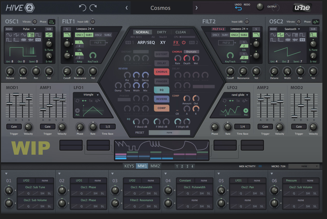
But... I think it is strange that almost every module (OSC, FLT, LFO) has a 'graphic' display, but envelopes (MOD and AMP) have not, and here a 'graphic' display would really helpful... maybe those sould get the same 'love'?
Regards,
Joris
-
- KVRAF
- 19896 posts since 16 Sep, 2001 from Las Vegas,USA
Like I said....pdxindy wrote: Wed Jan 30, 2019 5:11 pm If I had to work with that skin I would go in and change the backgrounds of the different modules and make them color coded so that there was visual separation.
Ok I'm done here....I've already triggered some snowflakes.Teksonik wrote: Wed Jan 30, 2019 4:40 pm We're not pre-schoolers so we shouldn't need everything color coded to make it functional....or maybe some people do.
Let's see where Hive 2 is sound wise and in regards to function and appearance when it's released and then we can discuss it further. Right now I'm going to go have a play with the current Hive.....
None are so hopelessly enslaved as those who falsely believe they are free. Johann Wolfgang von Goethe