Hive 2.1 Izmo skin by Plugmon

-

- KVRist
- 396 posts since 3 Mar, 2015 from Japan
This has not been discussed between me and u-he side, but I think it should be free for everyone to modify & share my skin as derivative works. There're tons of modified Gearporn skin out there, which I think is a good culture.
Ah, so after all you will be able to get many variations of IZMO, some will have more hardware-ish look, some totally dark, totally light, etc.
That thing considered, such discussions like which color is the best for OSC/Filter graphs is actually a bit trivial, since you can change it easily afterward.
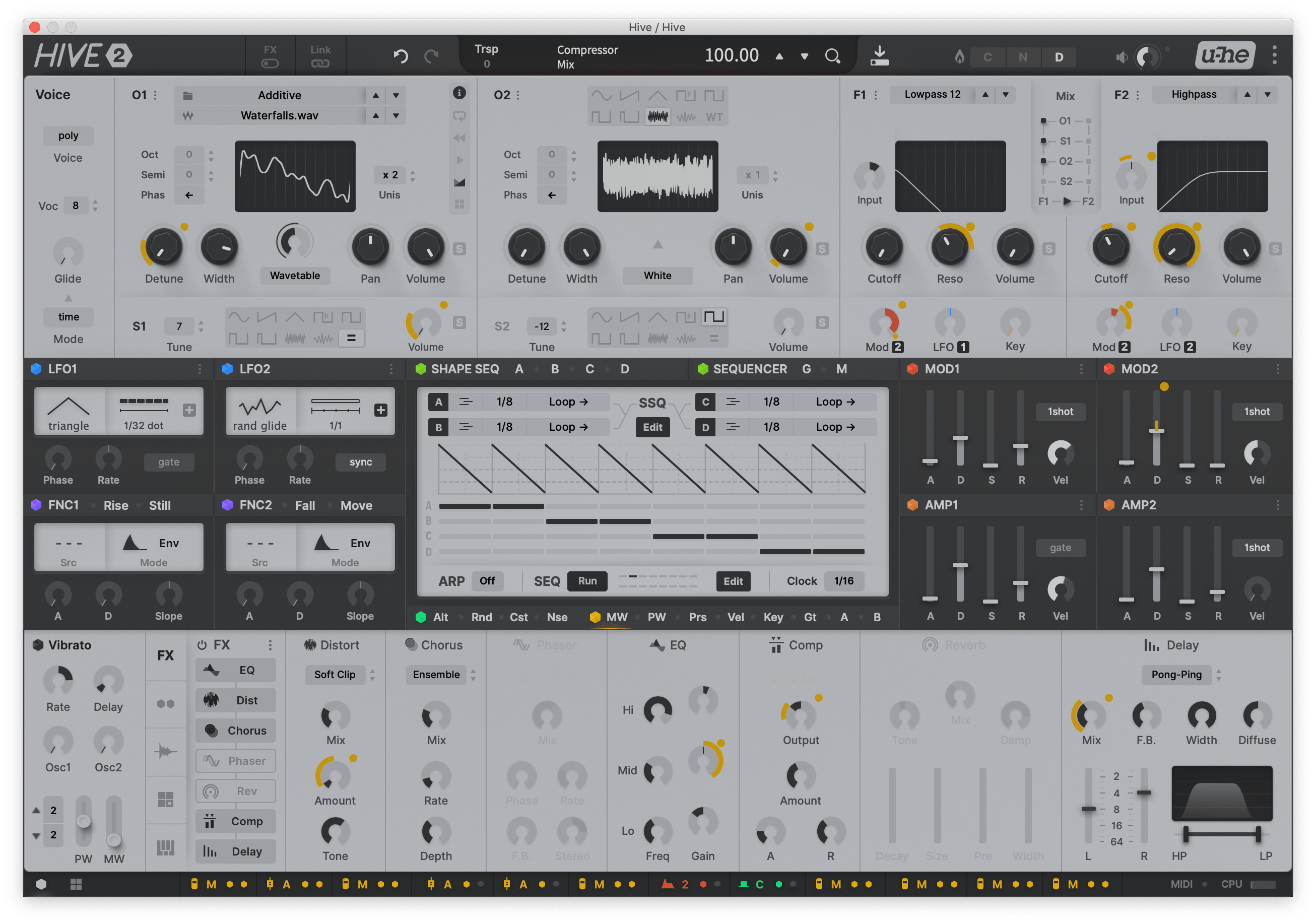
So what is to be discussed here with higher importance is things related to functionality / layout, which requires complexed script editing to modify.

-
- KVRist
- 396 posts since 3 Mar, 2015 from Japan
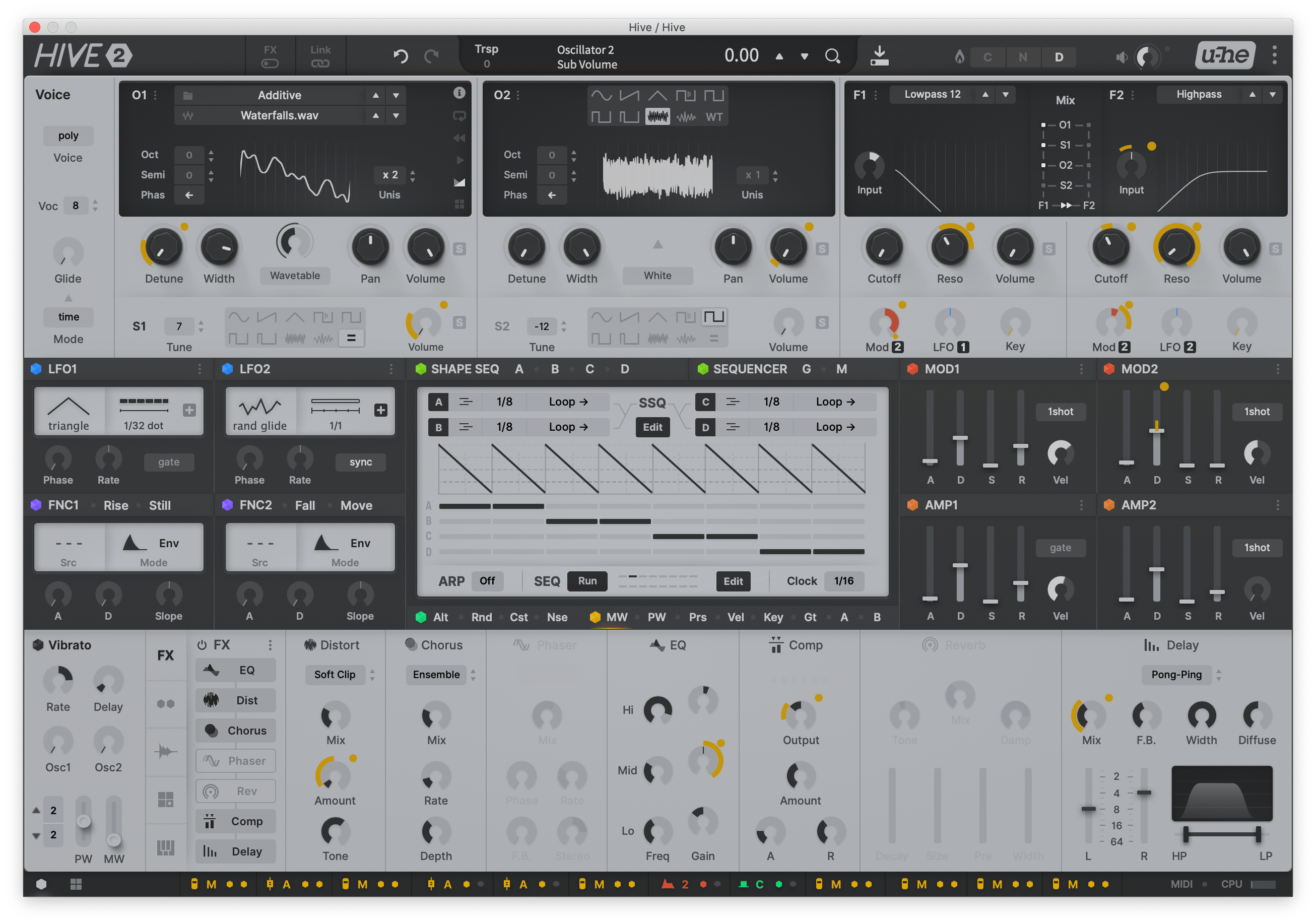
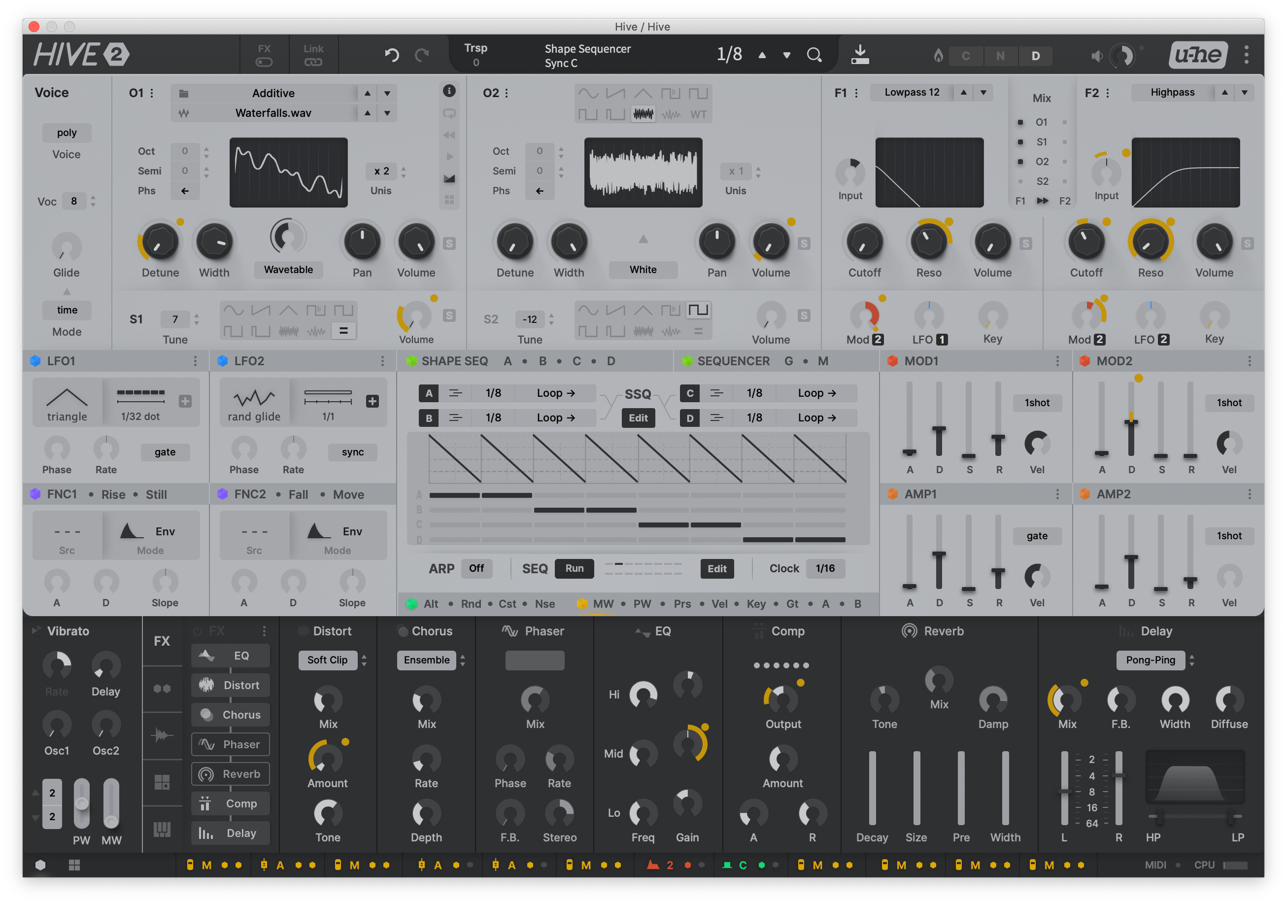
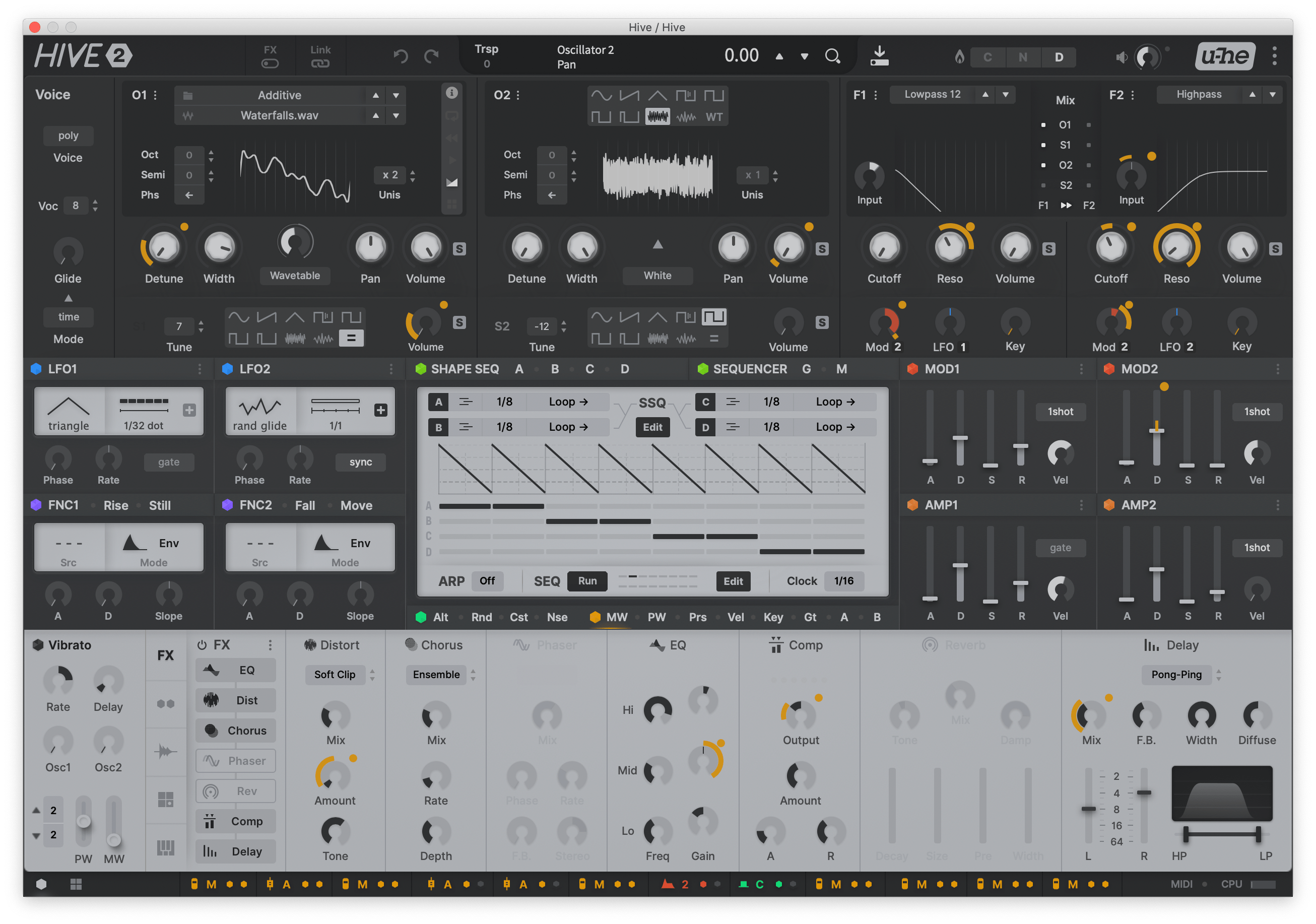
That said, I'm experimenting literally every possible patterns regarding light/dark.
Light-Dark-Light
Light-Dark-Light with Displays
Light-Light-Dark
Dark-Dark-Light
Total Dark
(The dark version of bottom third is very rough sketch tho.)
Light-Dark-Light
Light-Dark-Light with Displays
Light-Light-Dark
Dark-Dark-Light
Total Dark
(The dark version of bottom third is very rough sketch tho.)
-

- KVRAF
- 2960 posts since 9 Dec, 2011 from falling
Total dark! 

Bitwig Certified Trainer
-
- KVRist
- 75 posts since 2 Jan, 2021
all looking amazing as ever
i still the original!
(light-dark-light with displays and regular knobs throughout)
i actually don't completely dislike:
Dark-Light-Dark
i still
the original!(light-dark-light with displays and regular knobs throughout)
i actually don't completely dislike:
Dark-Light-Dark
You do not have the required permissions to view the files attached to this post.
-
- KVRist
- 33 posts since 21 Apr, 2020
I think functionality is there. What is needed is just documentation about where to find things, since the small icons and abbreviations can be a bit cryptic at first.
Is it possible to implement tooltips?
Is it possible to implement tooltips?
-
- KVRist
- 396 posts since 3 Mar, 2015 from Japan
No. Actions interactive to mouse hover is what I've been wishing there were for years... Currently the main info display is kinda alternative to it, telling you what parameter it is when you hover on an element (though sometimes not informative enough).
-
- Banned
- 252 posts since 14 Oct, 2020
I think the dark light and dark are the best but in general for some reason I think that light color doesn't fit as a color (except for displays).
My suggestion is to make oscillator/filter dark
and modulation/sequencer section fake wood (like in previous skin sketches), but fx section same as oscillator just use gradient.
But all in all i like the layout much better then factory skin but in the end I'm using factory skin because colors of it and display colors are easier on the eyes. In this skin colors are just a bit of an eye strain (not sure why, but just looking at it makes me tiring rather then inspiring) and unpleasant. Maybe it's too monotone, blue, red displays might give a bit life.
-
- KVRian
- 600 posts since 1 Jul, 2009
Light-Light-Dark (with dark displays) would be interesting to see, it would be probably the best one. Otherwise, now the Dark-Light-Dark by octaveup is the one.
What I don't like are the LFO's and FNC's displays being white with a black panel. It would look much cleaner and better if those displays would match their panel color, so black display with black panel and vice versa, like in the Light-Light-Dark version.
What I don't like are the LFO's and FNC's displays being white with a black panel. It would look much cleaner and better if those displays would match their panel color, so black display with black panel and vice versa, like in the Light-Light-Dark version.
-

- KVRAF
- 4197 posts since 23 May, 2004 from Bad Vilbel, Germany
So much discussion about light vs dark... but nothing about background colour. I would like to see some subtle COLOUR in those (imho) rather dismal grey panels!
-

- KVRAF
- 24458 posts since 7 Jan, 2009 from Croatia
DING DING DING we have a winner indeed!
-

- KVRAF
- 37547 posts since 14 Sep, 2002 from In teh net
-
- KVRist
- 396 posts since 3 Mar, 2015 from Japan
I'm quite impressed by this and thinking of using this manner.karlfranz wrote: Mon Feb 01, 2021 11:08 pm One of the things I love about u-he plugins is how we are able to customize the UI any way we want to suit our needs and our sense of aesthetic.
Here, I changed the look of Plugmon's Mixcontrol using the same pretty slider elements he used elsewhere in the Izmo design. I also came up with different icons for representing if a sound generator is plugged-in to the signal path or bypassed. (I didn't care too much for the 3D arrows floating on top of the graphic).
Opinions are always welcome.
.
Serial.png
.
Parallel.png