They are Retina-ready for most parts.raikard233 wrote:Holy shit! (Just seen the 1:1 image http://www.u-he.com/img/BazilleB4Messe.png)
Oh, and something interesting about skinning: it will be possibile to make "retina" compatible skins with your new UI framework?
Anyway can't wait for it!
u-he @ Musikmesse 2013
-

- u-he
- Topic Starter
- 30208 posts since 8 Aug, 2002 from Berlin
-
- u-he
- Topic Starter
- 30208 posts since 8 Aug, 2002 from Berlin
I'll just say: Wait and see.moscom_electronics wrote:I also loved the rather spartan and minimalistic look of the GUI of Bazille Alpha, but let's see how this one goes on a daily basis.
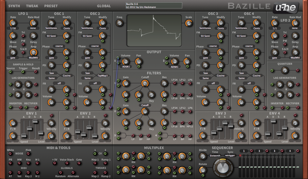
I had to fake the shadows in Photoshop because my 3D-renderer is a tad to slow. We'll have full control over all those nuances in a few weeks, so the GUI you see now is rather preliminary and needs tweaking.
While it may look unfamiliar, we spent weeks (!) on the layout alone. I think it has become absolutely brilliant and a huge step ahead of the alpha version.
FX and voice control are on the Tweaks page.
Later,
Urs
-
- KVRian
- 867 posts since 26 Jul, 2009
i thought the same thing....loved the previous bazille GUI much more.Kriminal wrote:You killed BazilleUrs wrote:
Still need to do switchable panels, and loads of fine tuning...
Not to my taste, especially the knobs. Sorry.
but like other u-he products the GUI will be skinnable so no biggie.(i bet one of the first skinned GUIs will be "original bazille")
the 3d render though on the first page looked super amazing...don't know why that didn't translate in an equally stunning GUI.
anyway it will all be about the sound for me (if it has an improved filter then it's a must buy for me, if not not. ).
-
moscom_electronics moscom_electronics https://www.kvraudio.com/forum/memberlist.php?mode=viewprofile&u=269081
- KVRist
- 255 posts since 21 Nov, 2011 from France
That is what I meantUrs wrote: I'll just say: Wait and see.
Urs
-
- KVRian
- 724 posts since 15 Feb, 2012 from France
I really like the new GUI. The module layout seems more logical too. Subtle differences I know, but still.
Urs, will there be some kind of Divine mode for Bazille ? Bazilline ?
No matter the CPU hit, I've become addicted to that kind of insane quality option.
Urs, will there be some kind of Divine mode for Bazille ? Bazilline ?
No matter the CPU hit, I've become addicted to that kind of insane quality option.
-
- u-he
- Topic Starter
- 30208 posts since 8 Aug, 2002 from Berlin
Not yet, but we'll see... the tweaks page is still a mess... I'll certainly need those two more months...nilhartman wrote:I really like the new GUI. The module layout seems more logical too. Subtle differences I know, but still.
Urs, will there be some kind of Divine mode for Bazille ? Bazilline ?
No matter the CPU hit, I've become addicted to that kind of insane quality option.
-
- KVRian
- 714 posts since 1 Dec, 2005
Afraid to say I much prefer the old Bazille GUI too, the whole 3D hardware look works for Diva and ACE, but the flat more utilitarian look fits more with Bazilles concept I think.
Plus it was just darn lovely.
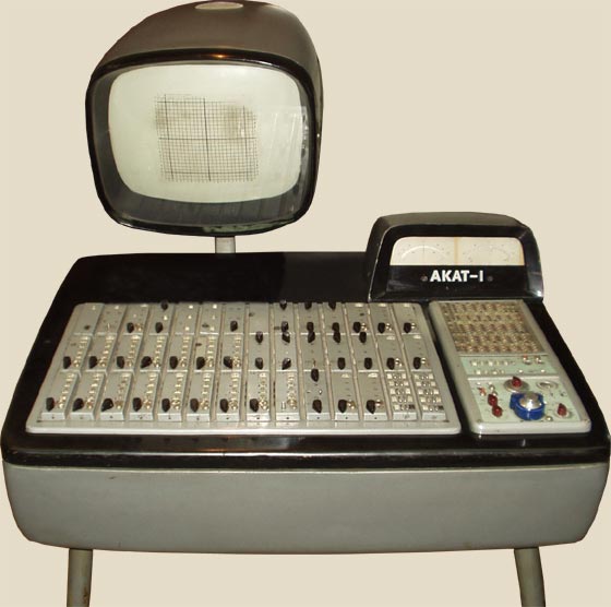
Also reminds me of this
Plus it was just darn lovely.
Also reminds me of this
-
- KVRAF
- 3817 posts since 8 Mar, 2006
I can't believe I failed to realize how cool Bazille actually is until now...
I mean, I always had a good impression about it and kinda liked it... but now I'm beginning fall in love!
Sounds great, can't believe how easy it is to get and modify timbres + I love flexible modulation options!
Urs, can I just pay you now, so that I won't waste the money until the release?
I mean, I always had a good impression about it and kinda liked it... but now I'm beginning fall in love!
Sounds great, can't believe how easy it is to get and modify timbres + I love flexible modulation options!
Urs, can I just pay you now, so that I won't waste the money until the release?
-
- KVRAF
- 3817 posts since 8 Mar, 2006
I also like the look and feel of the alpha version... but I bet Urs will work on the new one to get it even better!
Wishing Urs and the u-he team a good time @ the MMesse!
Wishing Urs and the u-he team a good time @ the MMesse!
-
- KVRist
- 96 posts since 17 Jun, 2010
I for one am immensely attracted to Bazille. Though I think that the new knobs looks a tad busy, but only on the lighter "elevated" area. To me, at the bottom darker area (where multiplex is the only example), there is a definitely better contrast to the knobs, which I think fit them better.
-

- KVRAF
- 14465 posts since 16 Feb, 2005 from Planet Earth, Somewhere
I just downloaded Bazille for the first time. AFter looking at the alpha Gui and the fantastic GUI above, might I suggest that some may have just gotten accustomed to the older GUI?
rsp
rsp
sound sculptist
-

- KVRist
- 416 posts since 17 Oct, 2006 from Franche-Comté
You're probably right: no idea of vexation for designers, it's been almost two years that I try with .zvenx wrote: AFter looking at the alpha Gui and the fantastic GUI above, might I suggest that some may have just gotten accustomed to the older GUI?
rsp
Imac M4 24" under Sequoia 15.7.7, D.P. 11.36 & Kontakt 8.10.2 _ Gibson ES 295 & Explorer _ FilterBank2 Sherman & PolyEvolver Keyboard _ Altiverb 8_ Explorer Loïc Le Pape
https://loiclepapesteelguitars.com/
https://loiclepapesteelguitars.com/
-

- KVRAF
- 1617 posts since 11 Dec, 2008 from Minneapolis
Really deftly refined and It feels maybe more familiar, certainly more navigable and readable, to me.Urs wrote: While it may look unfamiliar, we spent weeks (!) on the layout alone.
-

- KVRAF
- 24415 posts since 7 Jan, 2009 from Croatia
The new GUI is much better than alpha version. Much more logical.
Small fonts? Where? Everything is perfectly legible.
One thing I'm not fond of is the location of LFO 2 label - if u-he logo wasn't as big it could've been placed symmetrically to LFO 1 label, it would make more sense. Also seems like Env 3 Velocity label is a bit misplaced
And "Semitones" option barely fits in the rounded rectangle frame below the knob - either make the frame wider or make it say "Semi" or something.