
SPC ArcSyn
-
- KVRist
- 455 posts since 16 May, 2012 from Antwerp
I may be old-fashioned, but I buy synths for their sound, not for their looks. And ArcSyn is so far out & original that it is in pole position for April, together with Simon's soundbank for it.
Last edited by ErikH on Wed Mar 16, 2016 7:47 pm, edited 1 time in total.
Windows 7, Cubase 9.5 and some extra plug-ins | Takamine EN-10C and PRS Mira
-

- KVRAF
- 3878 posts since 28 Jun, 2009 from Wherever I lay my hat
I can readily identify with not liking a synth because of the UI. Nothing in this world will get me to touch Poly-Ana, for example. Now, that one is a (good sounding!) vanilla subtractive, and Arcsyn is much more complex and, in its way, kind of unique. So if you're letting yourself get put off by the look, you're really missing out. Your loss.
"so many complaints"... hmmm, from what I gather, most posters in this thread are not in the griper's corner. And no one here knows diddly squat about the actual sales figures, so maybe you can try, no, DARE to imagine that the synth is selling well despite its UI?
The new knobs are definitely an improvement, though. I'll miss those Rochers, but the grocery store just had a sale, so no worries there.
-
 Sampleconstruct Sampleconstruct https://www.kvraudio.com/forum/memberlist.php?mode=viewprofile&u=191286
 - KVRAF
- 16804 posts since 12 Oct, 2008 from Here and there
It's the same with Melda plugins, many people avoid them like the plague due to the kind of special UI, but they don't know what they're missing sonically.

-

- KVRian
- 1188 posts since 24 May, 2006 from Our Amazing Oasis in Space - USA Section
I like the updated GUI much better! I still find the yellow a but annoying, at first, but after a few minutes working with it, it's no biggie. Besides, all synths can't look alike. And like the SOUND of the synth, the look is unique as well. I do wish all the labels were a little brighter! As for the utility of the layout, I haven't worked with it long enough to notice any real issues yet.
I do think the few "complaining" about the GUI could be more helpful and give specific changes to be considered in improving the GUI! Nothing is easier (and more popular these days, IMO) than saying, "It sucks!". How would you improve it - other than having it look exactly like your favorite synth(s)?
For me, at least it's much easier to play and use now. Could it look better? Of course, as most things could! I love Synth1 (10k+ patches), but there's plenty of room for improvement in that GUI too.
It's workable, and SOUNDS great and different (not an easy task these days!) - that's close enough for me! And it's not a $99 GUI, it's a $99 SYNTH, with a GUI that will never be everyone's perfect solution.
-

- KVRAF
- 3664 posts since 6 Aug, 2009
am a long-time user of spc's gater-pro, so...decided to check this out. fwiw, it seems fine here in logic X. it is on the ugly side (but all i have to do is open an instance of izotope's DDLY, and suddenly arcsyn looks beautiful). def like the sound so far, the bottom line after all...
_______________________
https://upstatebrooklyn.com
https://upstatebrooklyn.com
-
- KVRian
- 1451 posts since 1 Jun, 2008
Just wanted to add that I care about the interface because I think it's an amazing plugin and deserves to be taken seriously. Also have to add that the built in effects are amazing! You should release the modulation, delay and reverb effects as a separate multi effect plugin.
-
- KVRAF
- 4720 posts since 26 Nov, 2015 from Way Downunder
Good point! It's unconstructive.SciFiArtMan wrote: I do think the few "complaining" about the GUI could be more helpful and give specific changes to be considered in improving the GUI!
OK - some disclaimers: I haven't bought this synth. I think it sounds pretty amazing in clips so it interests me for sure. I do find the GUI, though now slightly improved, still quite ugly. I am a graphic designer with a bachelor's degree and almost 15 years professional experience. Here's my opinion...
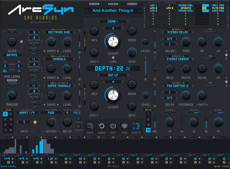
- Fonts: Lighter grey text on darker grey background isn't good in terms of contrast and therefore readability. Also on the readability front, the font used is less than ideal - see the "K" in "LINK" just above the ARCSYN 1.3... perhaps over-sytlised - it's got that dated, retro-future novelty feel to it - not modern at all. See the "R" in "RELOAD" next to the Preset name, "E" in "EFFECT", "SEQ" etc for further problems with this font.
- Colours: Very dark overall... lacking contrast (grey on grey) which gives it no depth or vibrancy - is uninviting to me. The yellow is garish. Bee Movie quote: "Black and yellow, hello!" though not quite as jovial here
- Knobs: Definitely improved! The shading/light might be a bit exagerated and cartoony though. Not a fan of the embossed "SPC" knobs... not a fan of Photoshop-style embossing in general though as it's too easy to spot.
The cheesey 80s digital font is the biggie for me - the other stuff is marginal. This is just my opinion and I hate to sound all self-important. Please disregard as you see fit
-
- KVRAF
- 3878 posts since 28 Jun, 2009 from Wherever I lay my hat
MogwaiBoy, aside from the cool band referenced in your moniker, I agree with all your points. You don't sound self-important, you're being constructive.
To me, it's a bit like icing on the cake. The aesthetics don't get in the way of usability, so I'm not bothered by them. Eye candy is always welcome, but not a necessity to me.
To me, it's a bit like icing on the cake. The aesthetics don't get in the way of usability, so I'm not bothered by them. Eye candy is always welcome, but not a necessity to me.
-
- KVRAF
- 4720 posts since 26 Nov, 2015 from Way Downunder
I wish the developers every success and can almost guarantee that a slicker GUI would increase sales - and would be a worthy investment. I would even recommend Satyatunes or similar (his work on Dune 2 and Synthmaster skins is very, very impressive).
-

- KVRAF
- 23167 posts since 8 Oct, 2014
Okay, somebody wanted constructive criticism so I'm going to give it. This is what I find off putting about the GUI.
1) The yellow lines and the gray letters. This makes it very hard to even look at the synth. It just bothers my eyes. I can't explain why but it makes it hard to focus. Something about the contrast I guess.
2) It's cluttered. There's too much on one screen. I know a lot of people hate tabs and want everything on one screen (I prefer it too) but for whatever reason, again, might be the contrast in colors, I find this one screen too cluttered. I can't find things.
3) The mod matrix is too small. It's difficult to work with. Sadly, once you click on a box to access a drop down, the drop downs are actually easy to read. But the matrix box itself simply needs to be bigger.
Those are my main issues. Now I don't know what's been addressed in the new GUI (I didn't download it) but this is what I have a problem with in regard to the one I did download a week or so ago.
-
- KVRAF
- 23167 posts since 8 Oct, 2014
Let me add that I just went back in and played around with it some more (mostly presets because I don't like programming this thing because of the look) and I can honestly say that I don't have one synth that sounds like this. This goes on the short list of truly unique sounding synths that I own.
Mr. Alias Pro
Wavemapper 2
Scrooo
Bazille
Cycle
Omnsiphere
Serum
The Mangle
I would easily add this synth to the list if I enjoyed programming it. The way it looks now, I don't. It's too hard on the eyes.
Mr. Alias Pro
Wavemapper 2
Scrooo
Bazille
Cycle
Omnsiphere
Serum
The Mangle
I would easily add this synth to the list if I enjoyed programming it. The way it looks now, I don't. It's too hard on the eyes.
-
 thecontrolcentre thecontrolcentre https://www.kvraudio.com/forum/memberlist.php?mode=viewprofile&u=76240
 - KVRAF
- 37262 posts since 27 Jul, 2005 from Scottish Borders

-
- KVRAF
- 3959 posts since 10 Sep, 2010 from A shit hole (Ireland).
This is it...Sampleconstruct wrote:It's the same with Melda plugins, many people avoid them like the plague due to the kind of special UI, but they don't know what they're missing sonically.
I will take the Lord's name in vain, whenever I want. Hail Satan! And his little goblins too. 
-
- KVRAF
- 3664 posts since 6 Aug, 2009
spent an hour with the demo, and just added this to my arsenal. impressive, since i've been 'house-cleaning' this year, getting rid of lots of synths; simplifying. def need to explore the GUI, am a bit lost! and hope we see some skins for this, it's hard to look at. but the sound is dope.
_______________________
https://upstatebrooklyn.com
https://upstatebrooklyn.com
-

- KVRAF
- 7903 posts since 24 May, 2009 from Nationalism isn't my thing...
This is certainly in my top three must-have-next plugs. It's tied between second and third at the moment, but that's only because number one is on sale for a limited time, and I'll be getting it later today. 
After that is either this or the upgrade to Reaktor 6. Either way, I should have this within a month or two, if not less.
To be honest, the GUI doesn't bother me as much as it does some, however it probably would be taken more seriously if it had a major facelift with changes such as MogwaiBoy and wagtunes pointed out.
Blue Phase Music